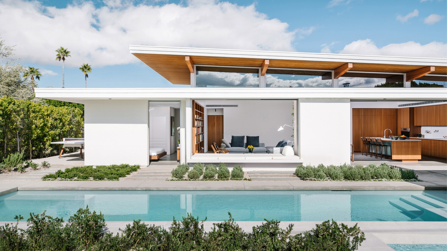
Chase Daniel Takes Us Inside a Perfect Palm Springs Residence
It’s official. I want to be Chase Daniel when I grow up. I could go on and on about his work forever, but it’s probably just easier to show you how beautiful, clean, and well thought out each of his compositions are. I drooled over Chase’s website for an absurd amount of time — scrolling through Japanese/Texas fusion restaurants, smokey bars, cowboy boot peddlers, cabins, and ranches. One of my particular favorite projects though was a bit different from the eclectic mix of the rest.
Enter the Axiom Desert House by Turkel Design. ADH sits in the illustrious town of Palm Springs, California. We were given a taste of this neighborhood in a past Project of the Week with Tom Blachford’s Midnight Modern. Thanks to Chase though, we get to go inside!
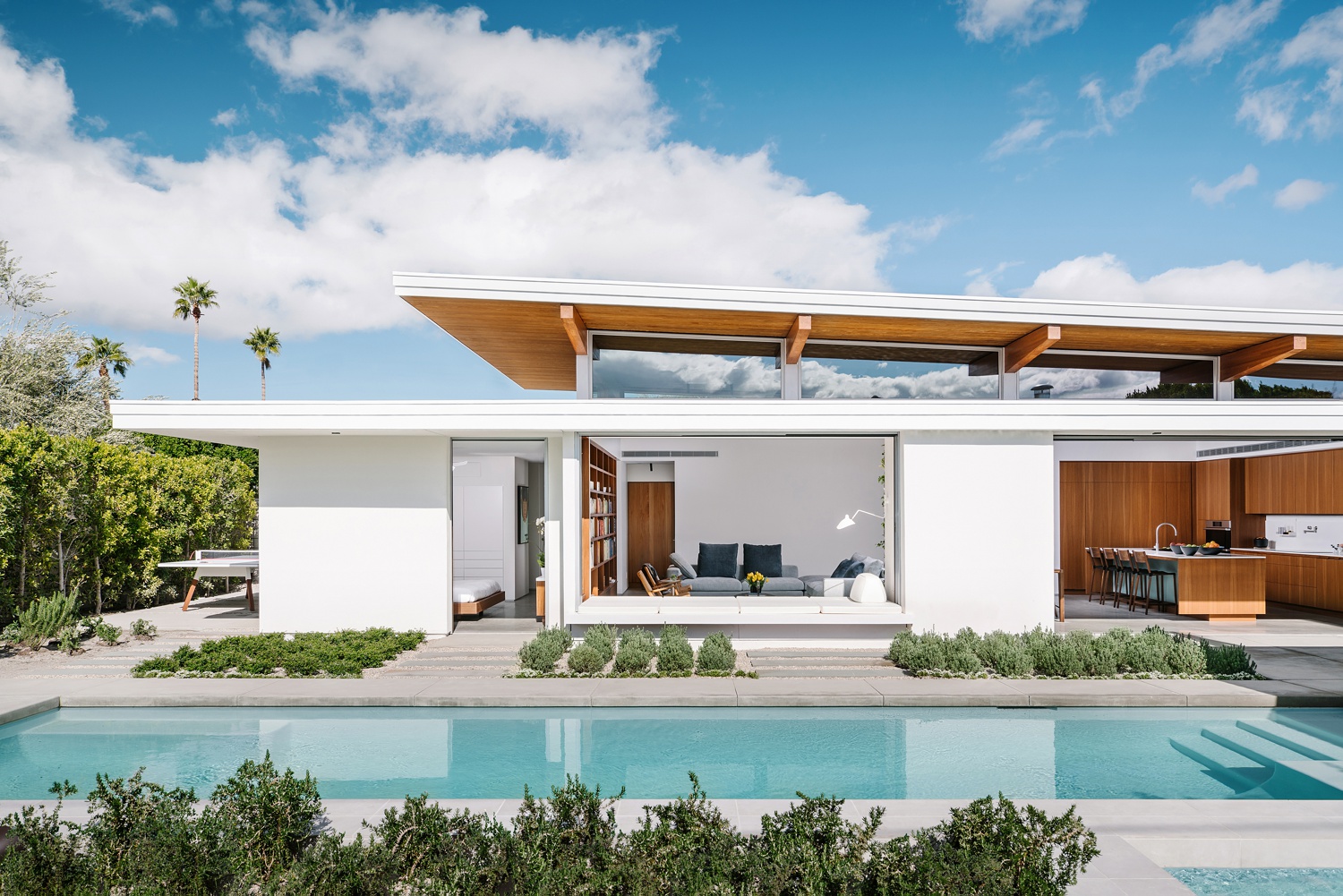
Let’s kick off with this great image that maps out Axiom’s layout, and ultimately sets the scene for us. Right off the bat, I love how Chase used the shrubs to frame this shot. We catch the inkling of a spa in the corner before our eyes move to the next layer up, the pool. The reflections in the pool, the color balance and saturation here, it all feels very real. Nothing looks exaggerated or holds our attention for too long, which is great because the subject is the house. There are awesome hard shadows on the facade, adding to the modern and linear feel. The balance in exposure between the outside and the interior looks proper.
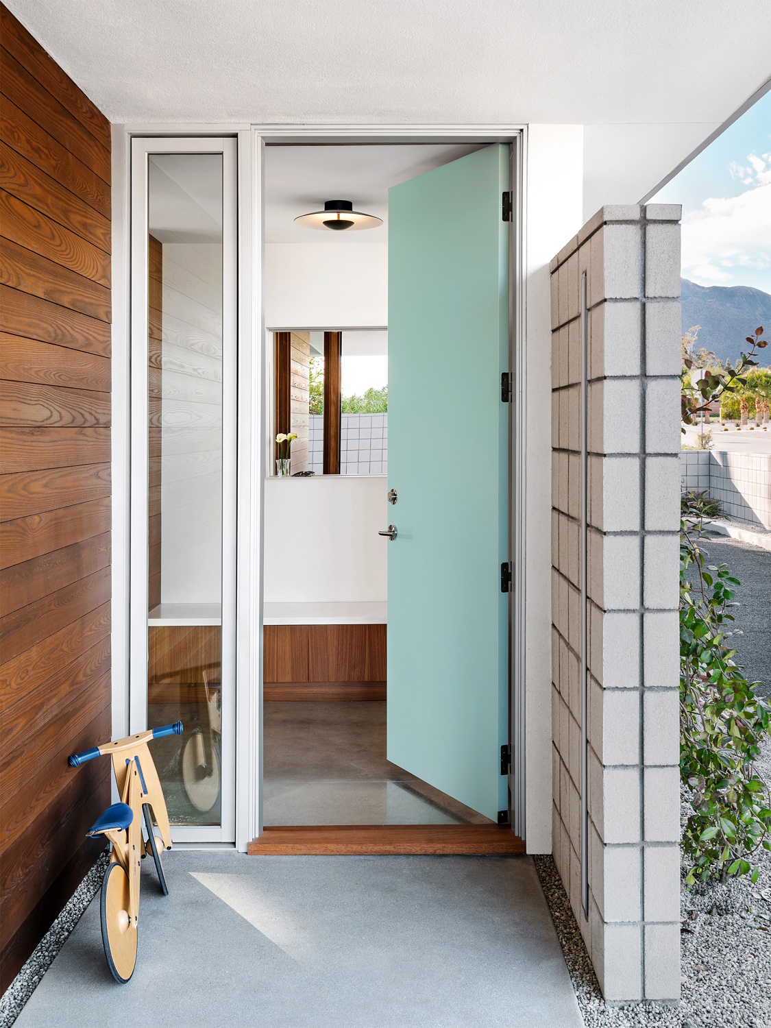
A perfect entryway image, Chase cracks the door to lead us into the home. Our eyes are also drawn inside by the leading lines that converge in the center of this one-point perspective. I appreciate Chase’s decision to include the bike in this scene. It creates a lived-in look and sets a down-to-earth tone for the project.
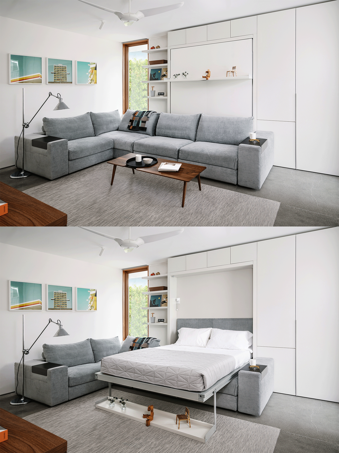
These images of the den highlight the usability of the space, putting emphasis on both its form and function. Showcasing careful design features like this can go far with your architect and designer clients. What I love most of all is how Chase moved the trinkets from the shelf down to the floor instead of just completely removing them. It gives off a light-hearted feeling that I can’t quite put my finger on.
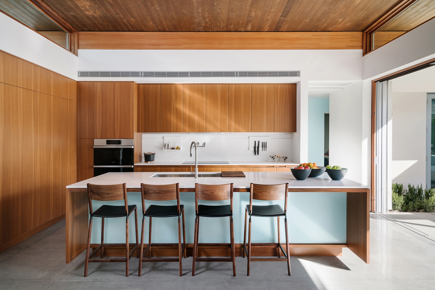
In this well-appointed kitchen, Chase ties in the soft blue color under the island with the little slice of the wall visible through the doorway. This composition also allows us to see the open-air capability of the space. Beautiful light streaks across the cabinets, pulling out the texture in the wood grain. The minimally styled kitchen looks great. I love how he pulled the chairs to be even with the faucet while giving a bit of asymmetry yet equal weighting with the bowls of fruit on the island.
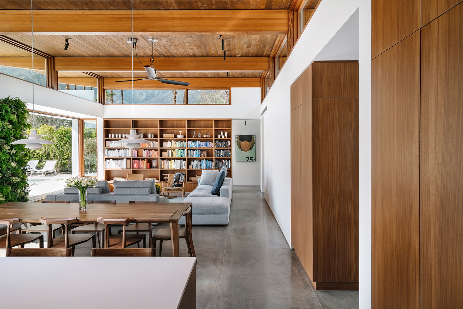
On the flip side of the kitchen, Chase uses the top of the island and the cabinetry as visual anchors. We are able to look beyond them, out across the dining space and into the living area. It’s a wide and encompassing composition, yet it still feels intimate and tidy.
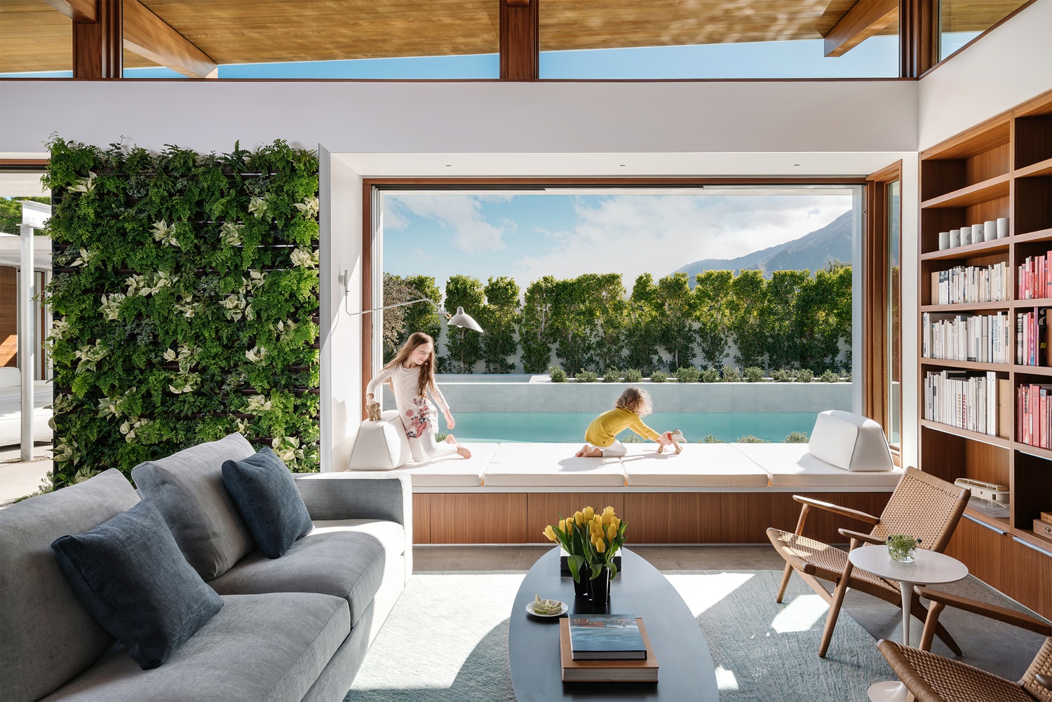
Playing off the lived-in vibe, Chase uses the children to emphasize the usability and scale of the built-in window seat. The vertical garden contributes to the fresh and organic feel of this home. Chase allows the sunlight hitting the window seat and the rug to be pretty hot, but it balances out with the darker components of the rest of the scene. It comes across just as it would look if you were actually standing in the living room.
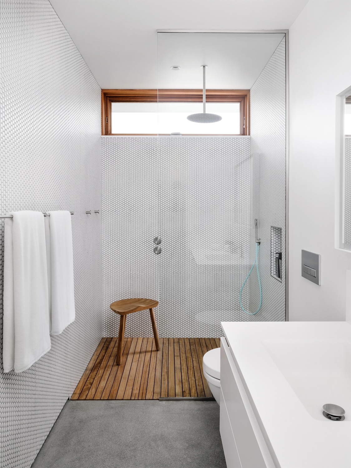
This tight bathroom shot is framed up nicely. I appreciate the sliver of the mirror and the breathing room he gave to the towels in this composition. Reflections in the glass contribute to the realism of this scene, as well as the light pouring in around the rain shower head. Bathrooms are tricky spaces to work in, but he nailed this one.
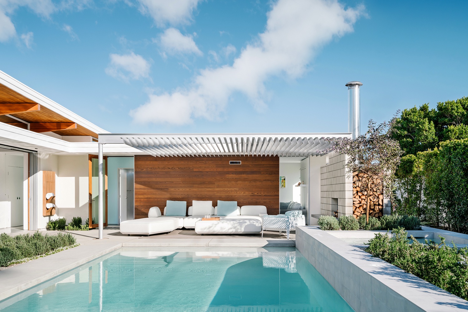
Back outside, you couldn’t ask for a more high-def, beautiful day. The contrasting blue sky pulls out the orange tones in the wood. The aqua pool water pulls out the same color in the pillows and interior wall. It all feels very harmonious and ideal — which is exactly how you want to display Palm Springs living!
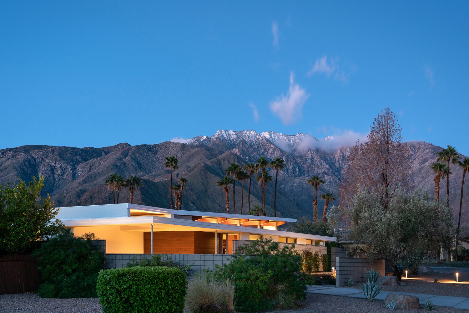
Chase leaves us with this twilight scene of Axiom Desert House. A simple sky lets us focus on the beauty of the mountains and how they frame the house. The tonality of the lights in and around the house looks true. The angle of the composition allows us to see the complex geometry of the home and its rooflines. What a beautiful send off for a beautiful project.
I can’t thank Chase enough for sharing his project of Axiom Desert House with us, and for being such an easy guy to work with! If you need to distract yourself from your responsibilities, I would heartily recommend looking through every single one of Chase’s projects on his website: chasedaniel.co. You can also follow along on Instagram at @thevuvobandit!
If you have a project you’d like to be considered for Project of the Week, you can submit it here.
