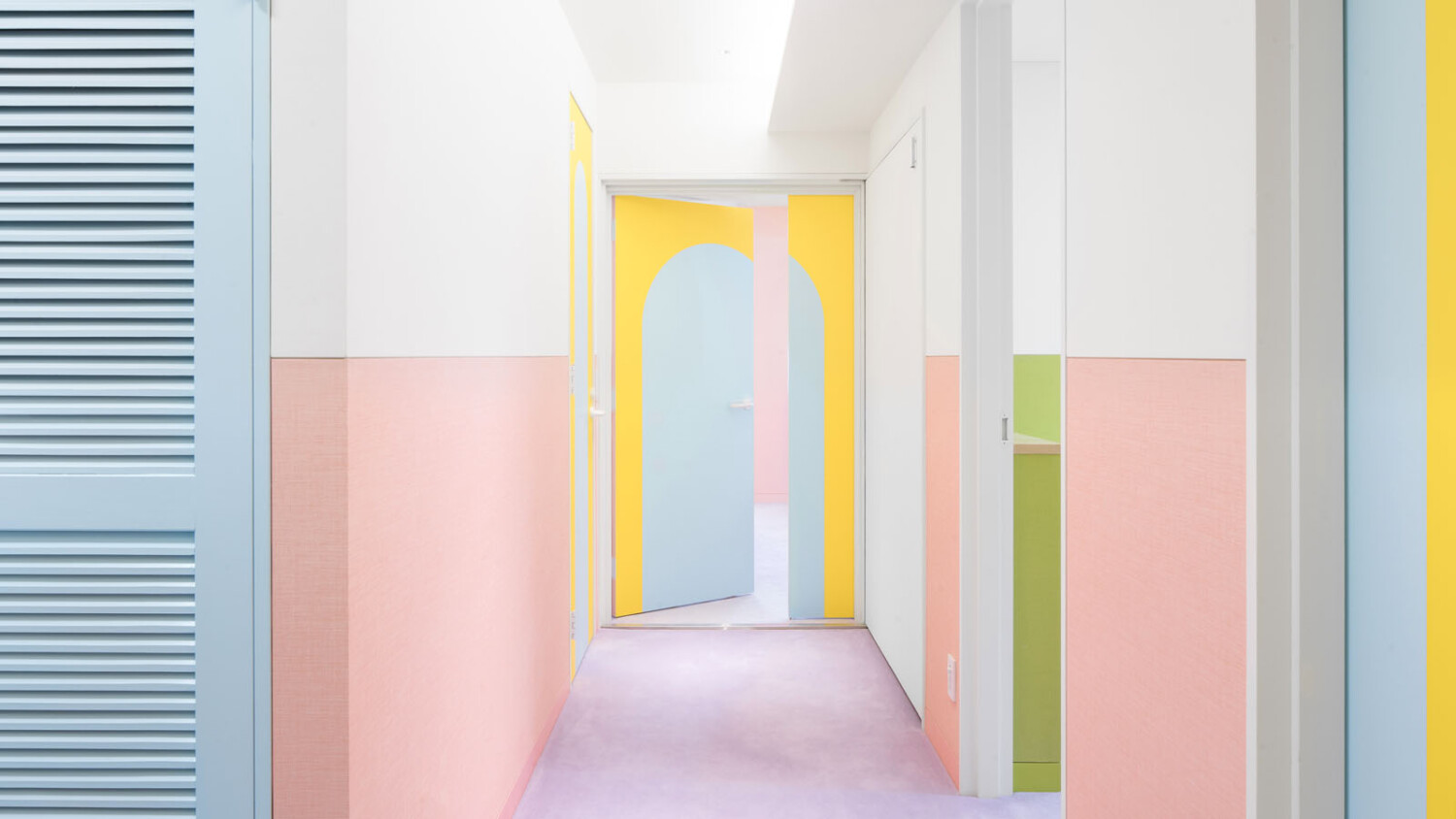
“Architecture Starts as a Mental Snapshot and is Finished by Taking an Actual One” – Jan Vranovský Shares His Photographs of a Playful Apartment in Central Tokyo
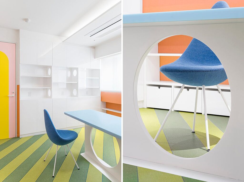
This week’s featured project is such a joy to take in. Feast your eyes on Nagatacho Apartment – a myriad of pastel colors, textures, and shapes, all packaged up into one vibrant apartment in Tokyo’s governmental administrative district.
Nagatacho Apartment is the wonderful creation of Atelier Adam Nathaniel Furman – known for their stunning use of color and materiality throughout all of their projects. This vividly cheerful project was photographed by Jan Vranovský. Jan is an architect, designer, and photographer at VVAA, and was assisted by his project manager and fellow photographer Chiawen Lin Vranovská. Jan kindly breaks down his photographic process and shares a behind-the-scenes look into the shoot day for this Project of the Week.
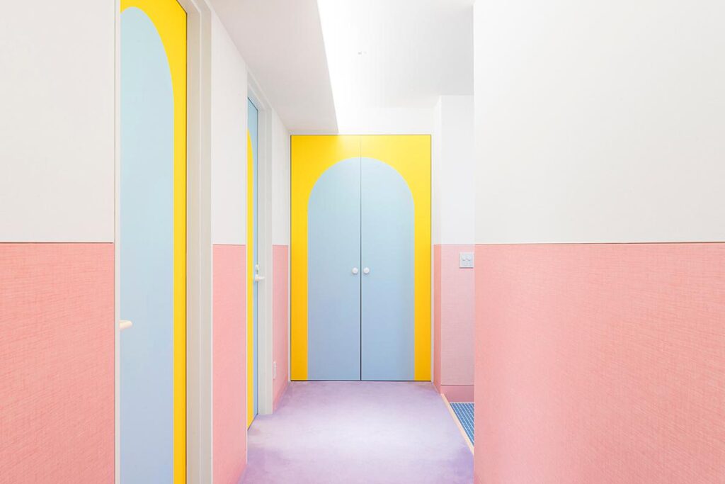
Jan kicks things off by setting the scene “This was the very first time Adam and I worked together, and the first time we met. I recall being quite busy and stressed about an architectural project I’d been working on at that time and hesitated to take the job initially.
It was all very fast, with no time for long preparations. Adam sent me a few construction drawings and snapshots the day before the shoot, but my first visit was on the [actual] shoot day.
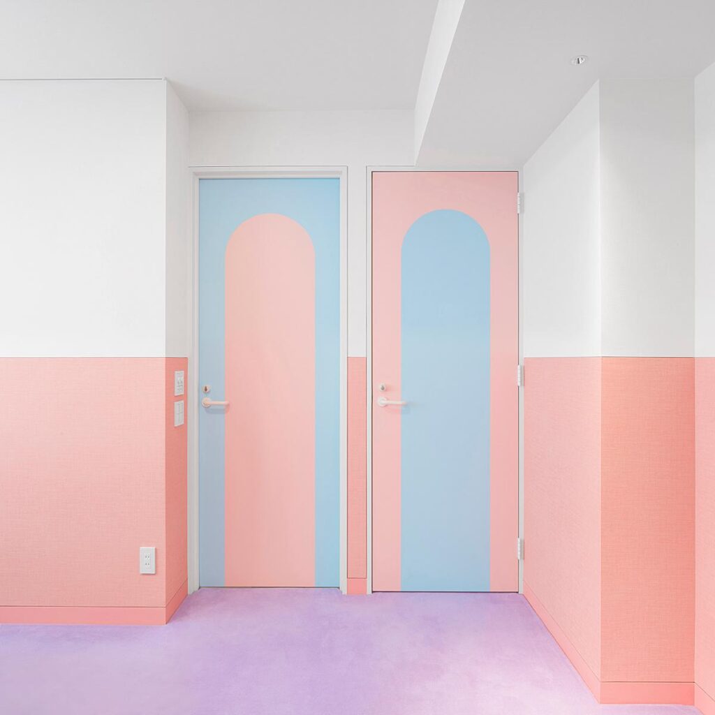
I remember thinking the design is quite lovely, carefully conceived, and well executed immediately after entering. It was a renovated apartment in a relatively old 1970s residential complex in Nagatacho – an upscale area in central Tokyo. It was all about Adam’s ‘signature’ use of bold color combinations, soft finishes, patterns, and a lot of details, but still somewhat minimal. The colors actually didn’t feel nearly as overpowering in reality as I would expect them to be. There was something quite British and quirky about the design. I remember thinking how un-Japanese it feels in there.”
“Nagatacho was a smooth and pleasant shoot, all finished in a single day,” Jan tells. “I enjoyed discussions with Adam, the architect: it was one of those moments you immediately ‘click’ and find out having a lot in common. Getting a little distracted by the conversation was the only ‘challenge’ to overcome, so really it was a pleasure.”
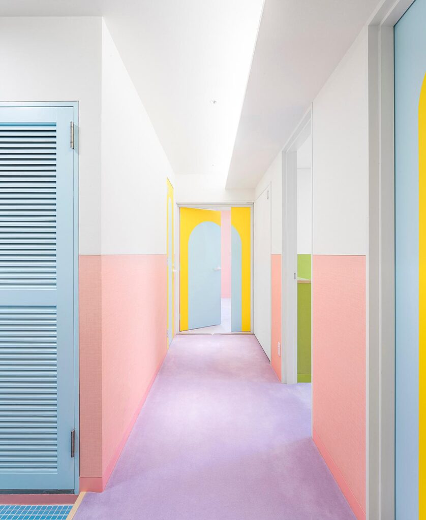
What immediately drew me into Jan’s documentation of this space was his ability to make such graphic compositions. Jan masterfully displays the colors and lines and details, making each scene feel as if it hangs in the perfect balance between being an architectural recording and abstract art.
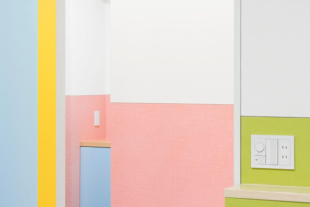
He gives insight into how being trained as an architect informs his work as a photographer, saying “I often think and speculate about the relation between being a photographer and an architect – it’s a surprisingly complex one.
Fundamentally, I think both the architect’s and photographer’s jobs revolve around framing existing, concrete spaces. Unlike in design or fine art, seeing and understanding an actual place is an absolute must, a common starting point. There is a certain humbling lack of freedom in both. I feel a similar tingling sensation when entering a future construction site and a space to be photographed – it’s about looking but also about finding ways to re-frame what is there. In this sense, I believe photography is closer to architecture than any other field.”

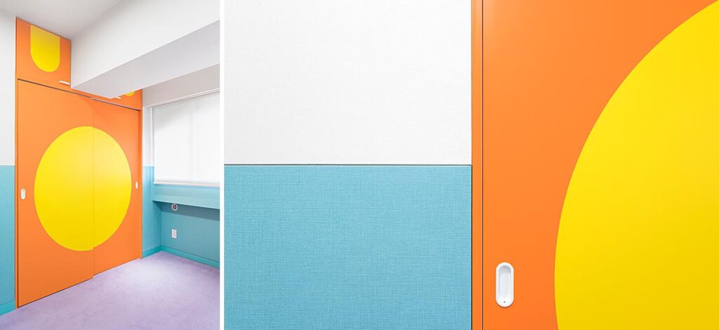
He continues “The obvious difference lays in that architecture generates spaces, infinitely ambiguous in how we read them given the large number of constantly shifting variables (viewer’s position, movement, light, individual perception and frame of reference etc.), while photography freeze spaces, turns them into two-dimensional, fixed images which can be easily shared and used as a baseline for interpreting and understanding spaces.
The two are fundamentally interlinked and dependent on each other. Architecture starts as a mental snapshot and is finished by taking an actual one. Having experience with both seems like a natural full circle. When shooting, I work very similarly to when creating renderings. Viewpoints and compositions are extremely important, but so is understanding and capturing the concept behind the design.”
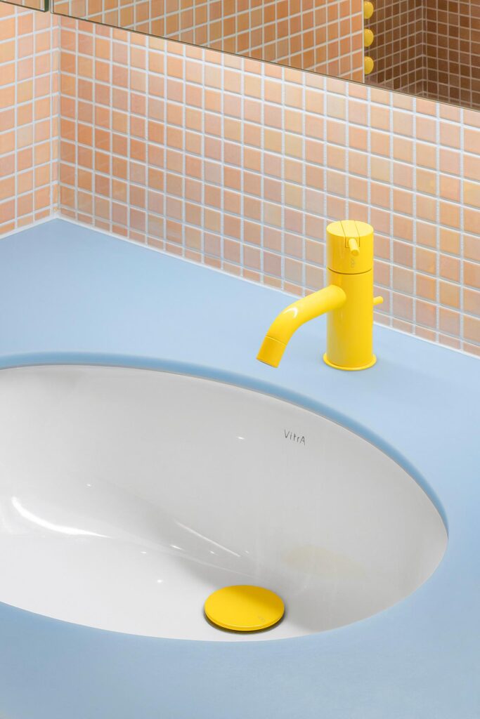
Jan breaks down the steps behind making one of his favorite images from this shoot, saying “It’s made the same way as all the others (with exception of a few detail shots): following a strictly fixed level in which the camera sensor is positioned above ground – a simple rule to tie everything together. A higher level of control over composition is achieved via shifting the lens rather than shifting the camera. This follows the design of the walls, which were all split into two parts, each in a different color. The splitting line appears perfectly horizontal in the shots, lending the set that slightly surreal, rendered-like appearance.”
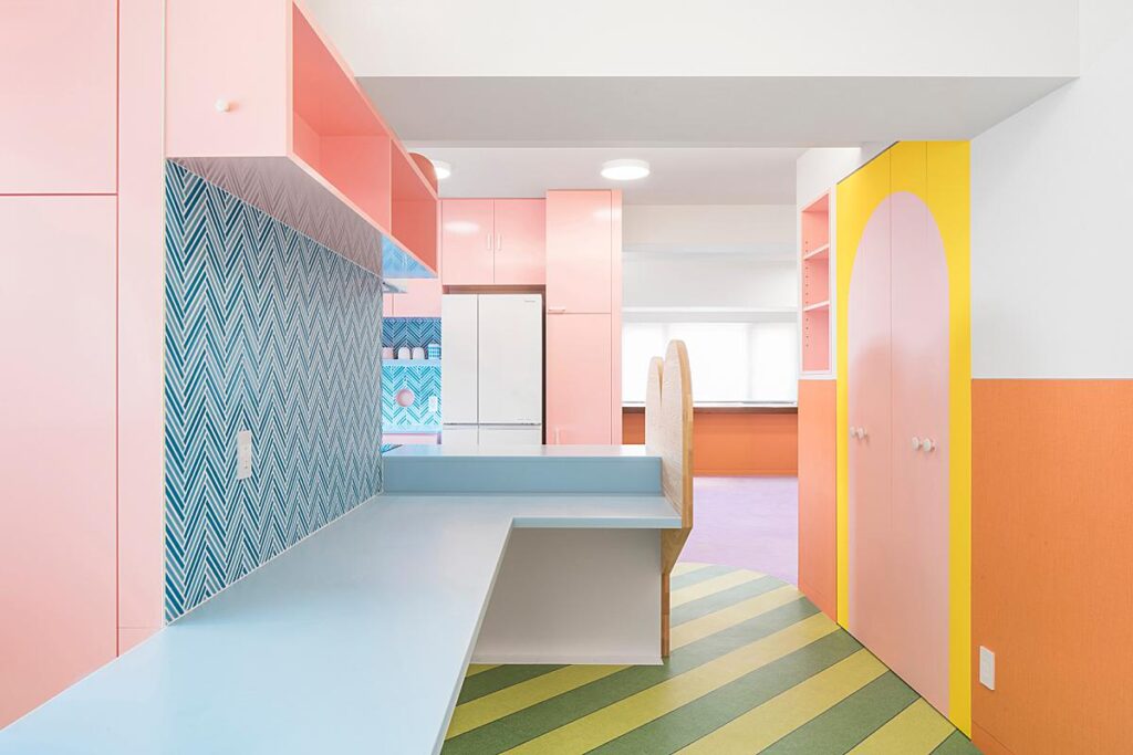
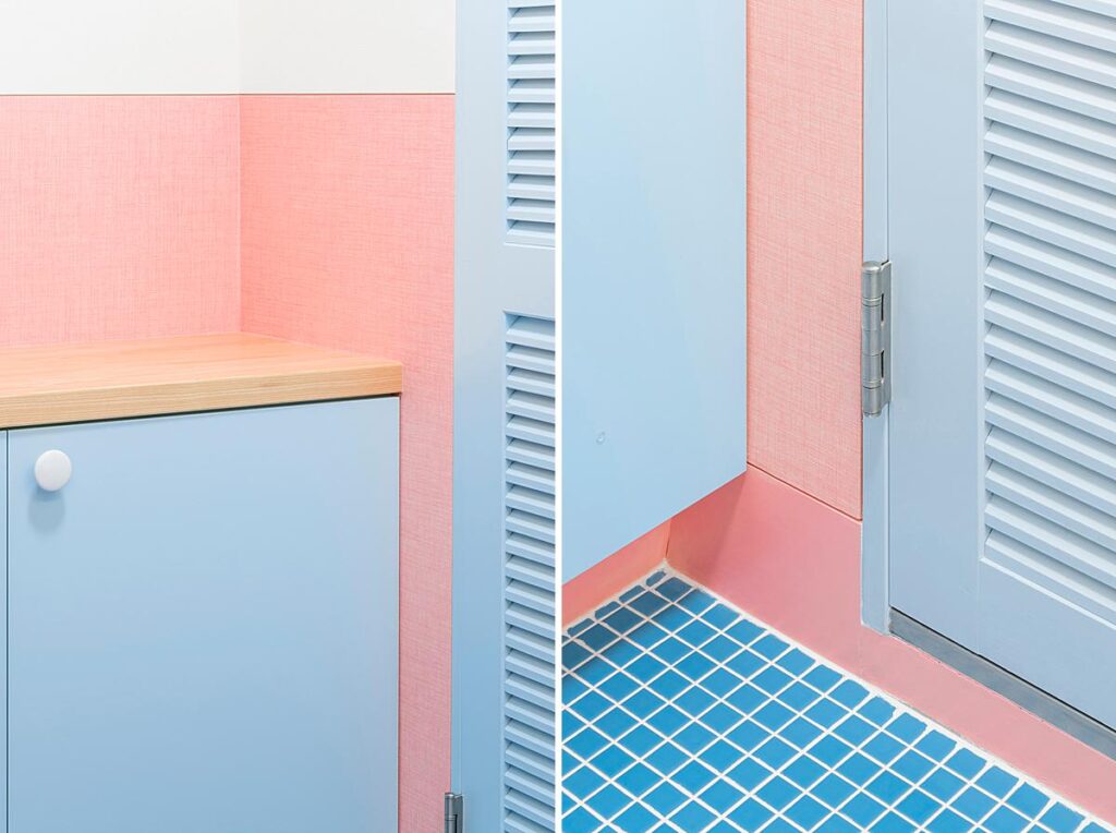
I appreciate the way Jan not only photographs the larger, overall scenes but also pairs down his photographs onto the details that communicate the craftsmanship and design throughout the apartment. He shares the full story of the space in a way that feels so fresh and playful.
I was curious about what takeaways or advice Jan had for photographers shooting a similar project where there is an emphasis on such vibrant colors.
He shares, “I’d say obvious one would be careful post-editing with focus on color rendition and a cohesive outcome. I do feel that the presence of strong, vibrant colors automatically places more emphasis on the composition of the images – one has to frame extra carefully. On the other hand, colors make achieving this easier since the compositions are more pronounced, graphic, and apparent. The transition from space to image feels clearer and easier to anticipate.”
Many, many thanks to Jan for sharing this awesome project with us! You can see more of Jan’s work at vvaa-studio.com and on Instagram @janvranovsky.
If you have a project you’d like to be considered for Project of the Week, you can submit it here.
