A ‘Cardinal’ Highlight of Kansas City’s Artisan Home Tour (story behind the photos)
I think in any metropolitan area, the old 80/20 rule applies to the uniqueness of its home builders. For a majority of them, they seem extremely similar with design elements that show up in new builds over and over again. The other side of that coin though, are custom home builders willing to be different. Whether it’s implementing a unique floor plan layout, design that isn’t “modern farmhouse” (in KC “modern farmhouse” new builds are a dime a dozen), or a combination of both…some builders do an amazing job at creating standout projects.
And as a photographer who shoots a lot of new home builds, those standout projects are the ones I love to work on! In Kansas City, one such builder is Cardinal Crest Homes.
Several areas in the US put on what’s often referred to as the ‘parade of homes’. On top of that, Kansas City puts on what’s called the ‘artisan home tour’. Every two years a handful of local home builders showcase their top tier projects. I won’t go into everything that makes these projects unique, but let’s just say “modest” is not a word typically used to describe these homes.
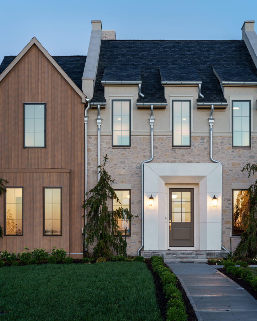
This year, Cardinal Crest showcased what they call the Hamilton Estate model – a home that looks like it was plucked right out of the English countryside and dropped in Liberty, Missouri. It really was a blast getting to photograph this incredible property, so I wanted to showcase some of my favorite images and give you a bit a background on how I put them together.
I’ll start right off with a photo that I’ll probably get the most criticism for…
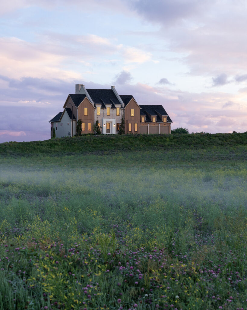
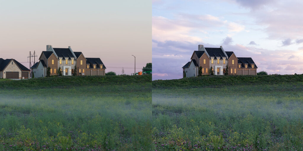
So I knew the front of this house would look amazing around morning twilight/sunrise. Plus before the shoot, Joe Christensen (one of the owners of Cardinal Crest Homes) had posted an iPhone pic similar to this stating how he loved that it looked like it belonged alone on a hill in the English countryside. The problem was (as you can tell in the original raw photo below) that the adjacent home and construction side take away from that “alone on a hill look”. So with the help of one of the photos in Mike Kelley’s sky library, I could add a little bit more interest to the image and remove the distractions.
Yeah, overall the final edit is a bit surreal, but it lines up with the builder’s vision of the project…don’t @ me
Moving on…
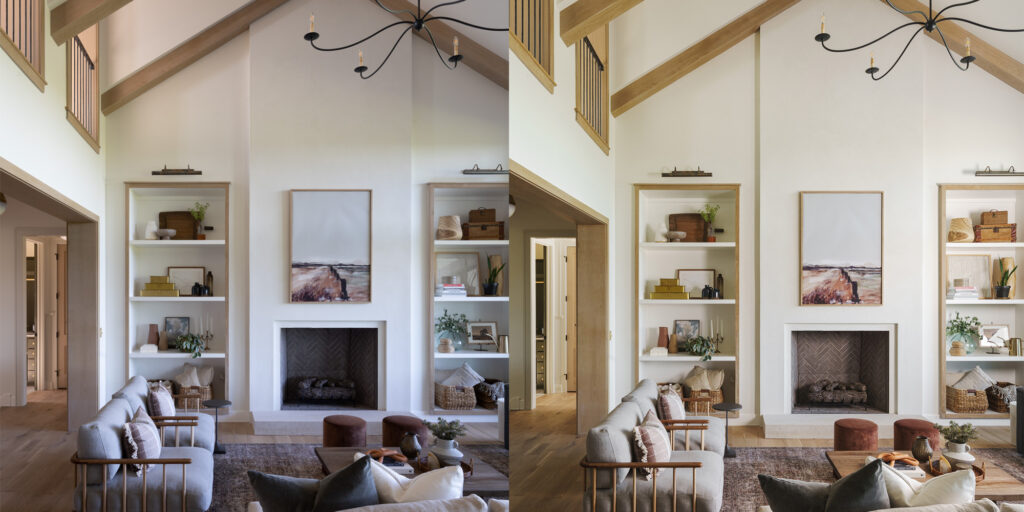
The living room shot. Now before I go any further, you’ll notice most (if not all) of the images in this article are vertical/portrait. And there’s good reason for that. Long, tall vertical lines were part of the theme of this home. The other obvious reason is to showcase the height of the space. One such space? Yes – the living room.
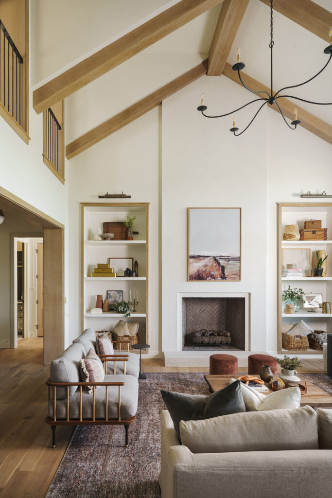
This one was definitely a challenge. As you can tell in an unedited raw image (below) the color casts were all over the place. The wall color was an off-white, light cream color but clearly, I was getting greens, blues and magenta from the natural light. As I’ve stated in a YouTube video before, I definitely want to tone down color casts in my images, but I don’t want to remove them 100%. Removing them completely (IMO) makes a photo look over-processed, fake, and sometimes sterile.
My solution with this shot was to lower the ambient light with a quicker shutter speed, and bring it back up with a 7-foot Westcott umbrella & flash. I placed the umbrella on the deck just outside the living room windows, and took three separate shots with the umbrella in 3 different positions. I blended the 3 layers using ‘lighten mode’ to make it appear I had 3 flashes firing at the same time and – voilà!!!
The home office – my 2nd favorite shot from the whole shoot. The design of this office is amazing! There’s a slight industrial feel with the exposed ceiling joists and you have an entire wall of metal and glass (chef’s kiss).
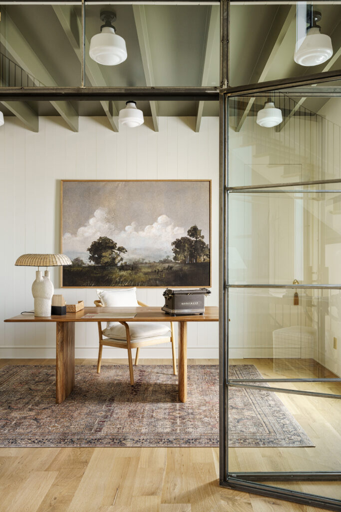
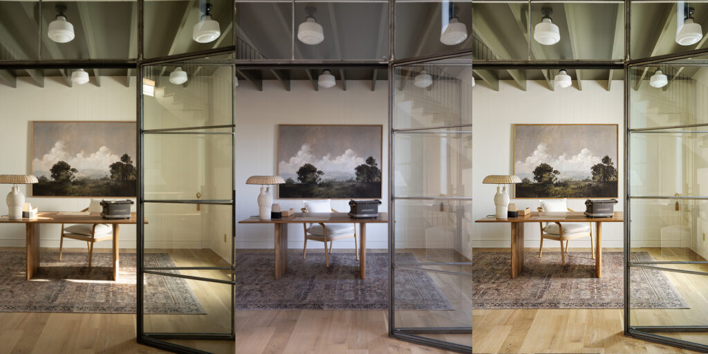
Now full disclosure, this was my second time taking this same shot. I had taken it on the initial shoot day but realized I forgot to rotate the chair facing the window. (facepalm!) I was going back on a different day to take some evening shots, so when I went back, the re-do of the office shot was the first thing I knocked out.
Once again, a softbox/flash out the window helped add some more drama to the shot by embellishing the natural light. By cutting down the ambient light a bit, it also helped me to tame the reflections in the glass. I didn’t want those gone completely but I didn’t want them to be a distraction.
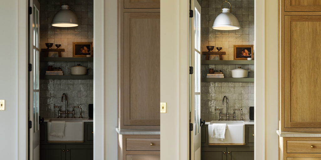
Next up, the butler’s pantry. THIS space was the hidden gem of the home. During the tour, SO many people took photos and video of this area. The major and subtle design details were above and beyond what normally goes into an area of the house that’s typically considered hidden.
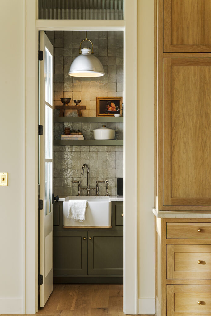
Plus, as I type out this article, I realize that softboxes and umbrellas outside the window were my secret weapon on this shoot. Once again, I used my 3-foot octo-softbox to give the natural window light a boost.
And my #1 favorite photo from the whole shoot…
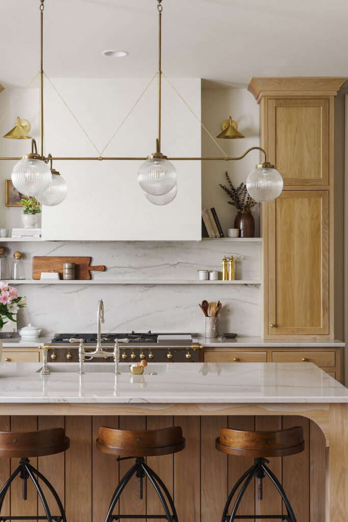
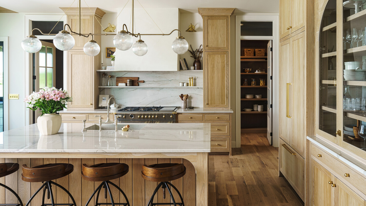
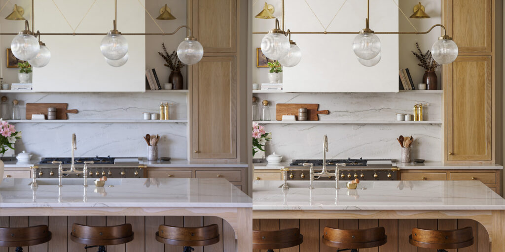
I. WAS. STOKED. on how this photo turned out!!! Taken at 55mm on a Sigma 24-70, this is probably a bit more compressed than your average architecture/interiors photo. While I was getting a decent amount of natural light traveling from left to right across the frame, I just wasn’t getting the mood and overall feel that I was wanting. Time to bring out the 7-foot Westcott umbrella!
I set the umbrella up in a couple of spots in the adjacent dining/breakfast area. I pointed it toward the kitchen to mimic the natural light and BOOM! I was able to get the look I was hoping for. All the details, colors, and textures were really able to stand out in a way that I otherwise wasn’t able to do as well using ambient light only.
And now for a little self-indulgence, here are a few other shots from this house…
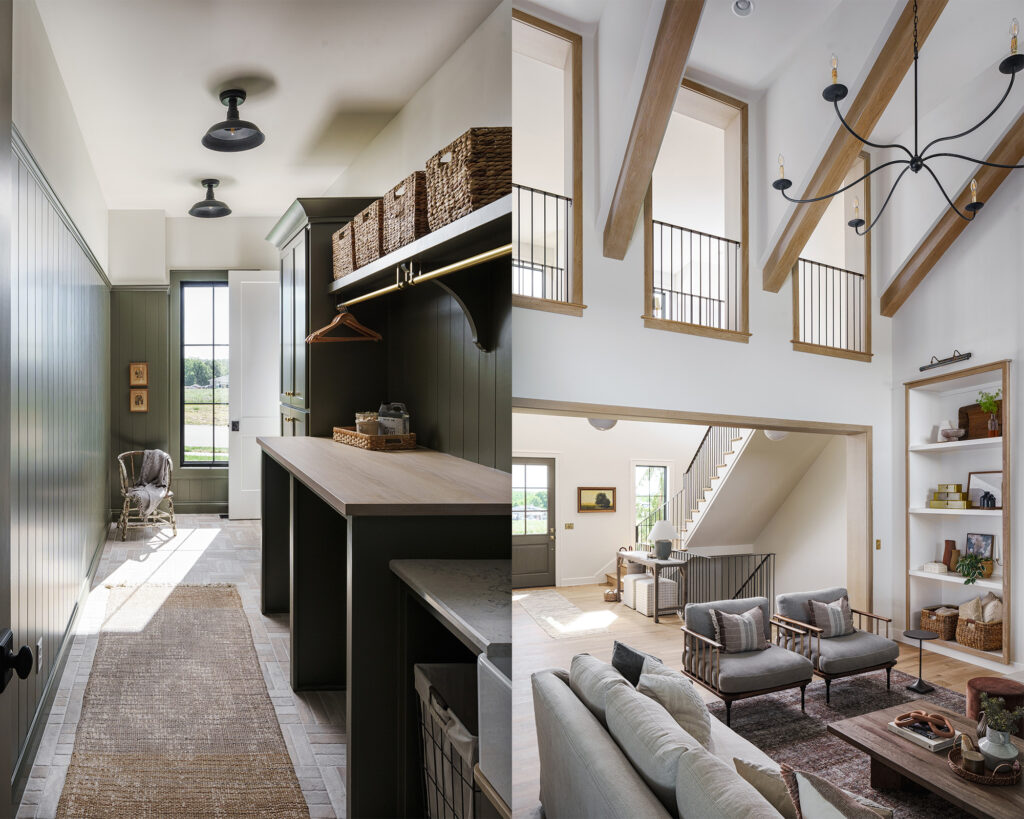
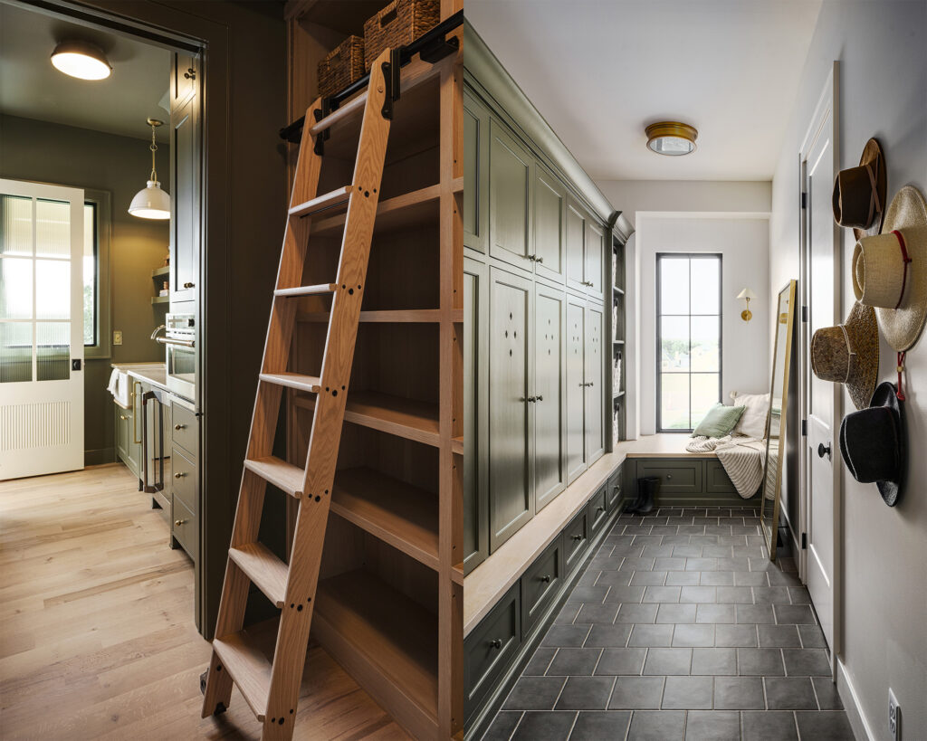
Fortunately, here in Kansas City, I get to shoot some pretty amazing houses for some pretty amazing home builders. And although I’ve been shooting for years now, it still feels like a privilege when I get to photograph a place like this. Especially when a majority of the surrounding new builds feel like the same cookie-cutter home showing off the newest shades of grey and beige :-/
But (as you can see) even when you have a picture-perfect place to shoot…there’s still quite a bit of work that goes into it.
