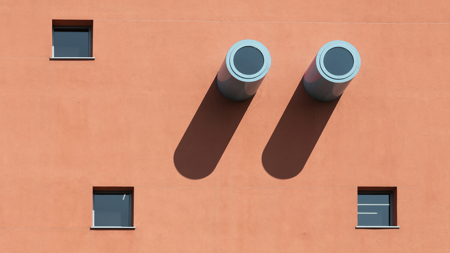
Russian photographer Dmitry Yagovkin makes graphic design worthy photos in Italy
What do you get when you mix an incredible photographer from Russia with a premier design school in Italy? Nope, this isn’t the start of a joke. It’s this week’s featured project!
The Scuola Politecnica di Design (affectionately known as SPD) is a postgrad design school in Milan, Italy. It would make sense then, that a school who teaches good design, operates out of a beautifully constructed building. Couple this with architectural photographer Dmitry Yagovkin, who is a master at documenting powerful and dramatic building exteriors, and you have a series worthy of the title “Project of the Week.”
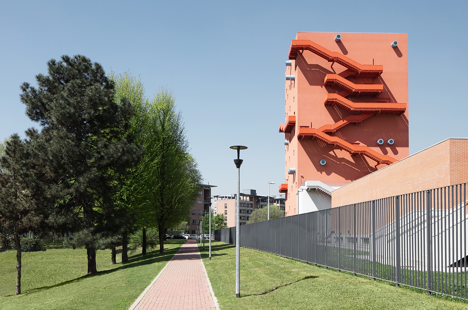
In this wide opening shot, Dmitry gives us some context of the SPD and how it fits in the surrounding neighborhood. There is great color work going on here between the greens, blues, and oranges. The scene as a whole feels vibrant, but if you look at each hue individually, none of them are overly saturated or overdone. Awesome use of color theory and restraint in your post-processing here Dmitry!
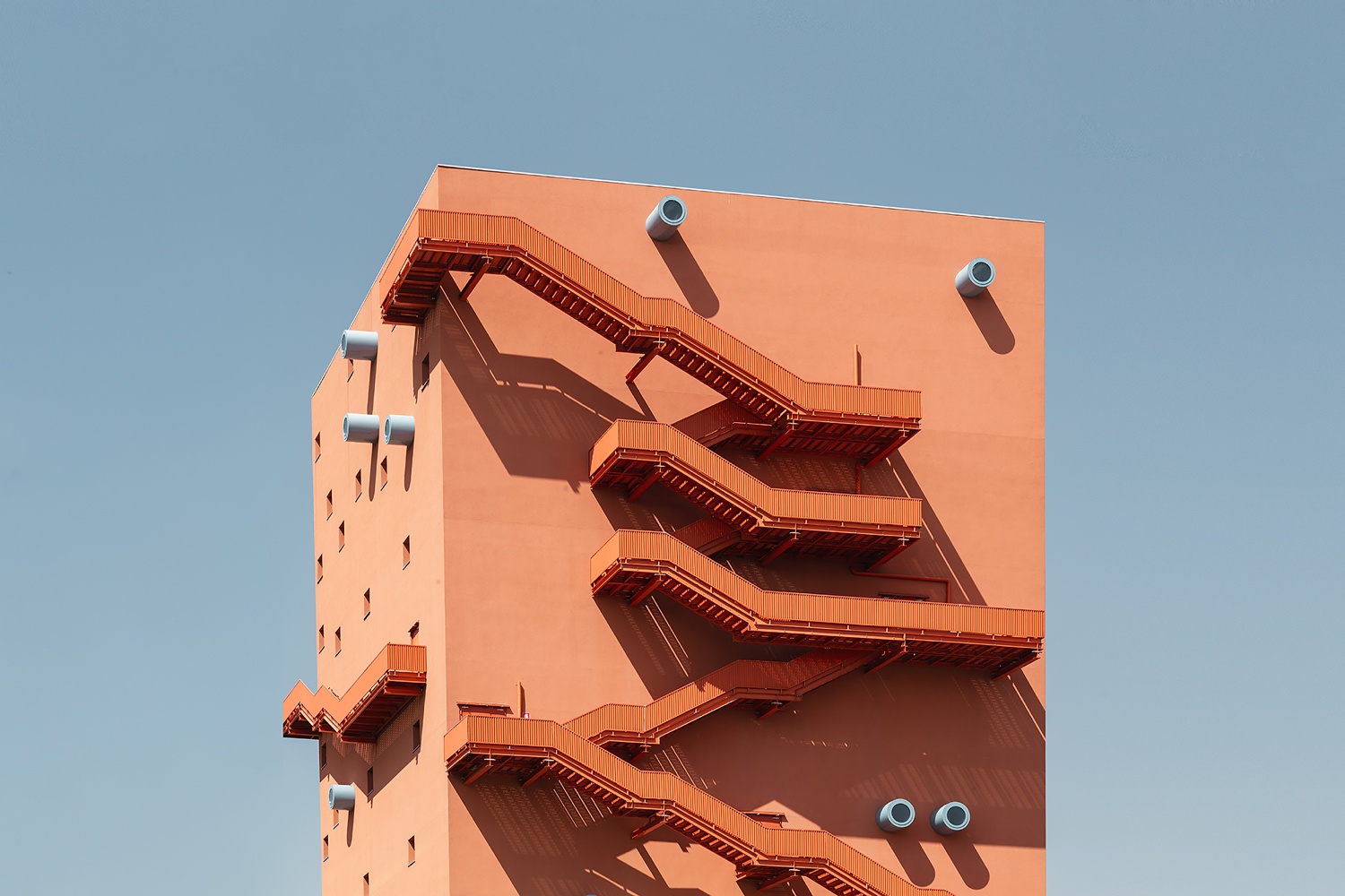
Dmitry really shines with his closer crops. I love the striking simplicity here. A hero shot of the illustrative feeling exterior puts emphasis on the shapes and details found on SPD’s facade. With no background distractions, our eyes hone in on the shadows and areas of contrast.
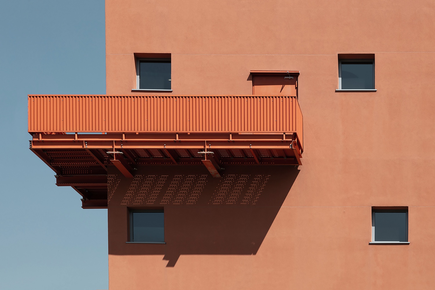
Enhance! A closer vignette pulls our eyes to the rhythmic repetition of the vertical lines on the fire escape railing. Check out those delicate spots of light from the grates streaming down into the shadows on the facade. This series is full of little details that add whimsy to an otherwise rigid building.
The long shadows here are the real show stoppers of the project. They emanate a feeling of playfulness. This shifts our focus away from the typically stuffy air that universities have, and put our attention on the beauty of the interesting design elements here.
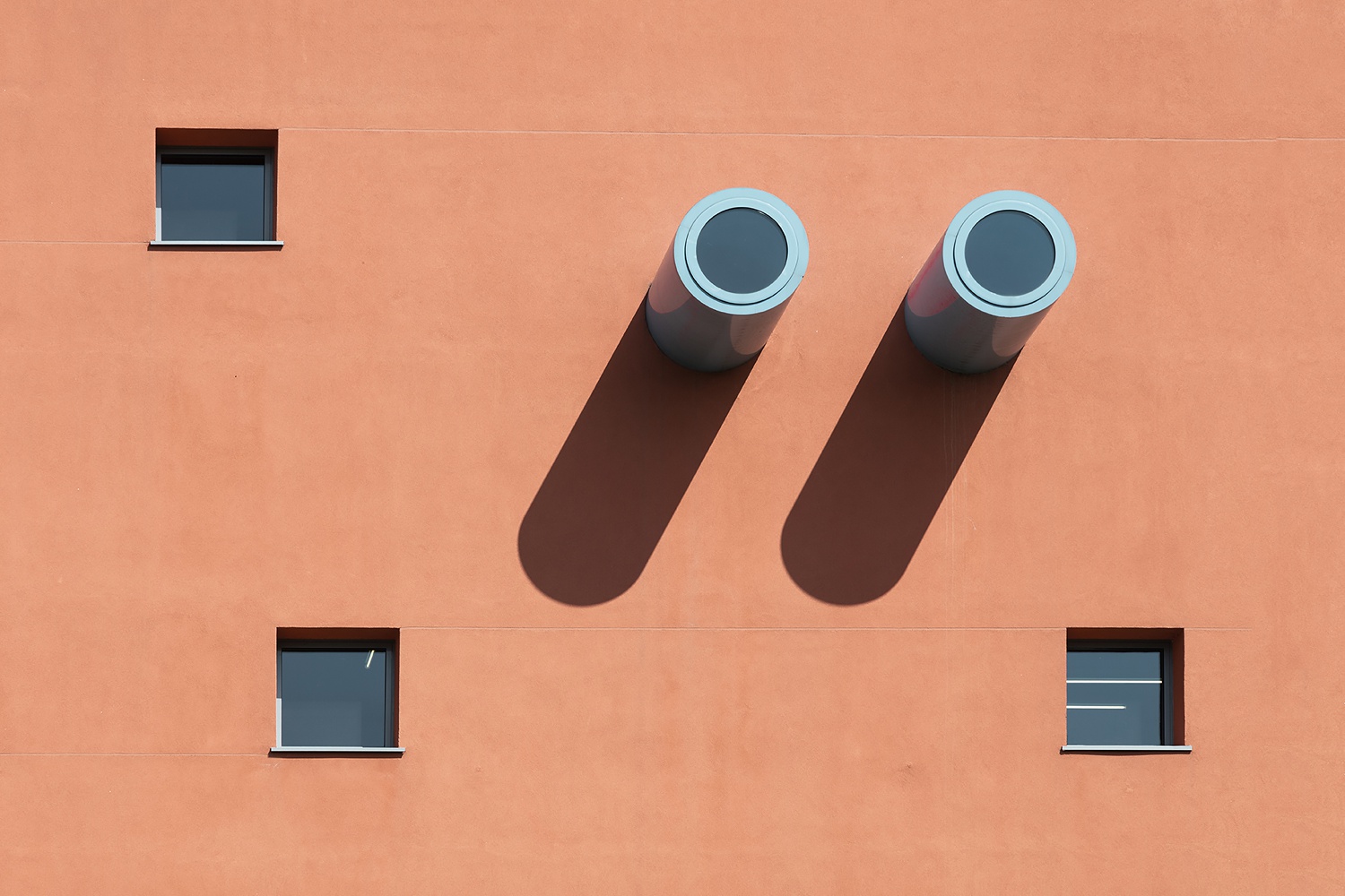
I appreciate Dmitry’s use of vignettes and close crops on the details of SPD. The beauty is in the details here, and Dmitry makes sure to incorporate them. On the left, our attention is grabbed by a rarely-seen perspective. The rhythm of these abstract glass block (pyramid?) windows carries our eyes up through the frame. On the right, we are able to closer inspect the qualities of these windows.

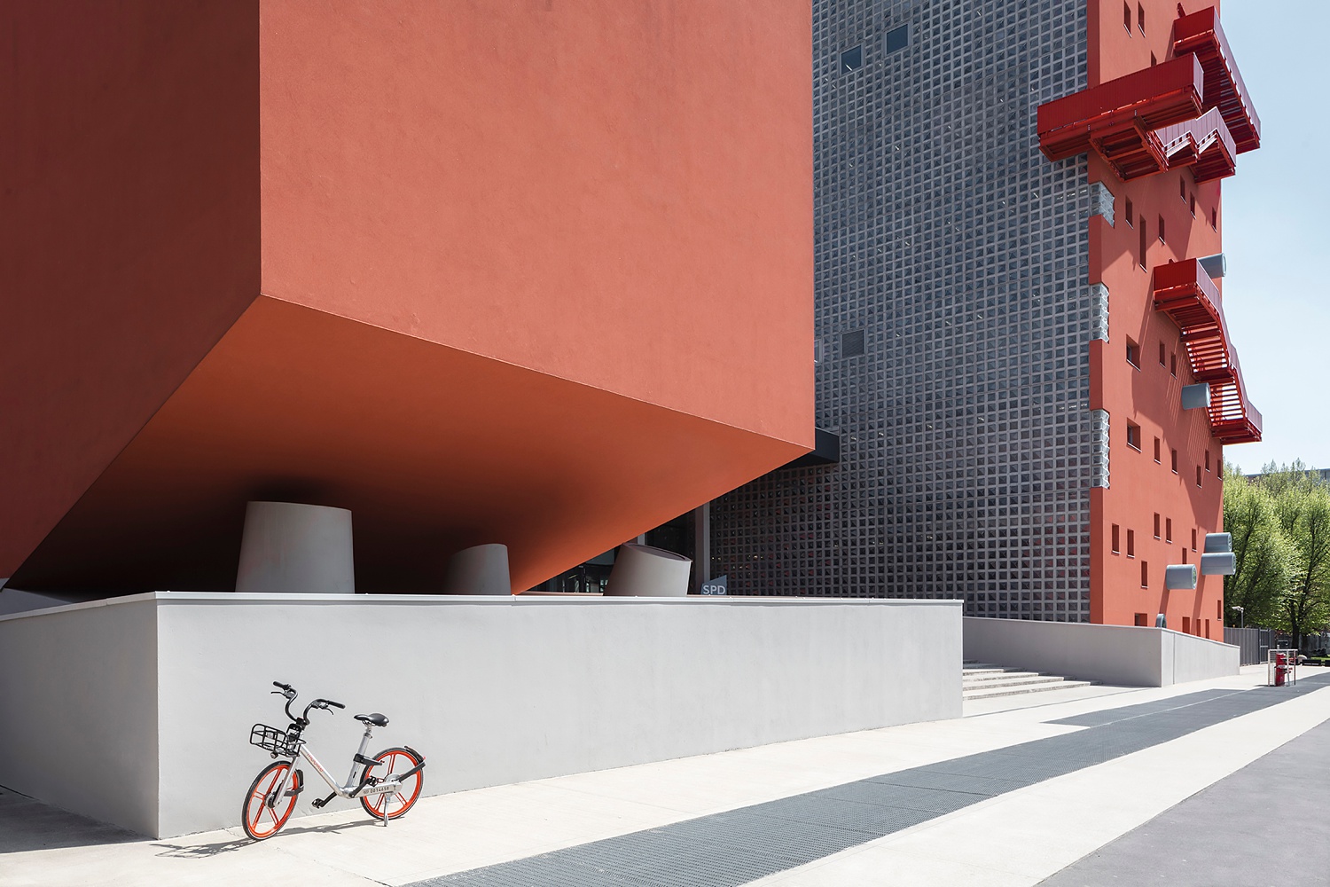
As we back out into a wider and more encompassing shot, Dmitry shows us the location of that wall of windows. Strong and sharp leading lines act as a tract for our eyes to follow while scanning through the image. I love the light on the closer of the two buildings. Look at that gentle gradient below. It feels more like a sculpture than a university. I can’t forget to mention the great color play between the bike and the tones that make up SDP. It adds to the fun feeling.
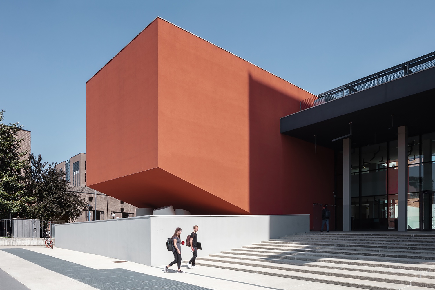
Now The Scuola Politecnica di Design is starting to look a bit more like a university. The great lighting present emphasizes the orange facade and produces some nice crisp shadows. The students are framed nicely by the concrete wall, drawing our eyes to them. The use of models gives us some perspective on the functionality of the space, and how it is used by the people who attend SPD.
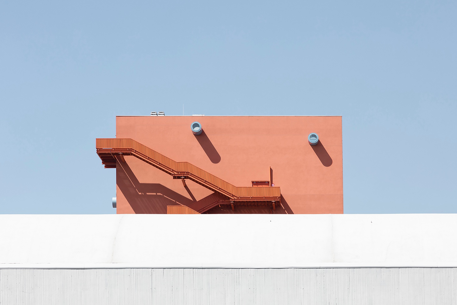
This week’s featured project’s departing shot encapsulates the graphic qualities and playful feel of The Scuola Politecnica di Design. We are given one last peek at the rich color contrast, beautiful long shadows, and interesting details from over the wall below.
A big thanks to Dmitry Yagovkin for sharing his project of The Scuola Politecnica di Design! You can see more examples of Dmitry’s punchy and exciting architectural work on his website.
If you have a project you’d like to be considered for Project of the Week, you can submit it here.
