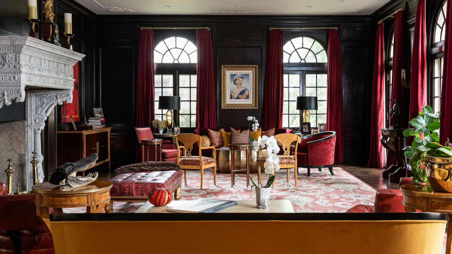
“My Inner Voice Asked Me Why Not” – Architectural Photographer Karen Palmer Dissects Her Strictly Dictated Shoot for The Wall Street Journal
A few days ago, an intriguing message landed in my inbox. Long-time APA friend Garett Buell dropped me a line, sharing a project by his friend and fellow architecture and interiors photographer Karen Palmer.
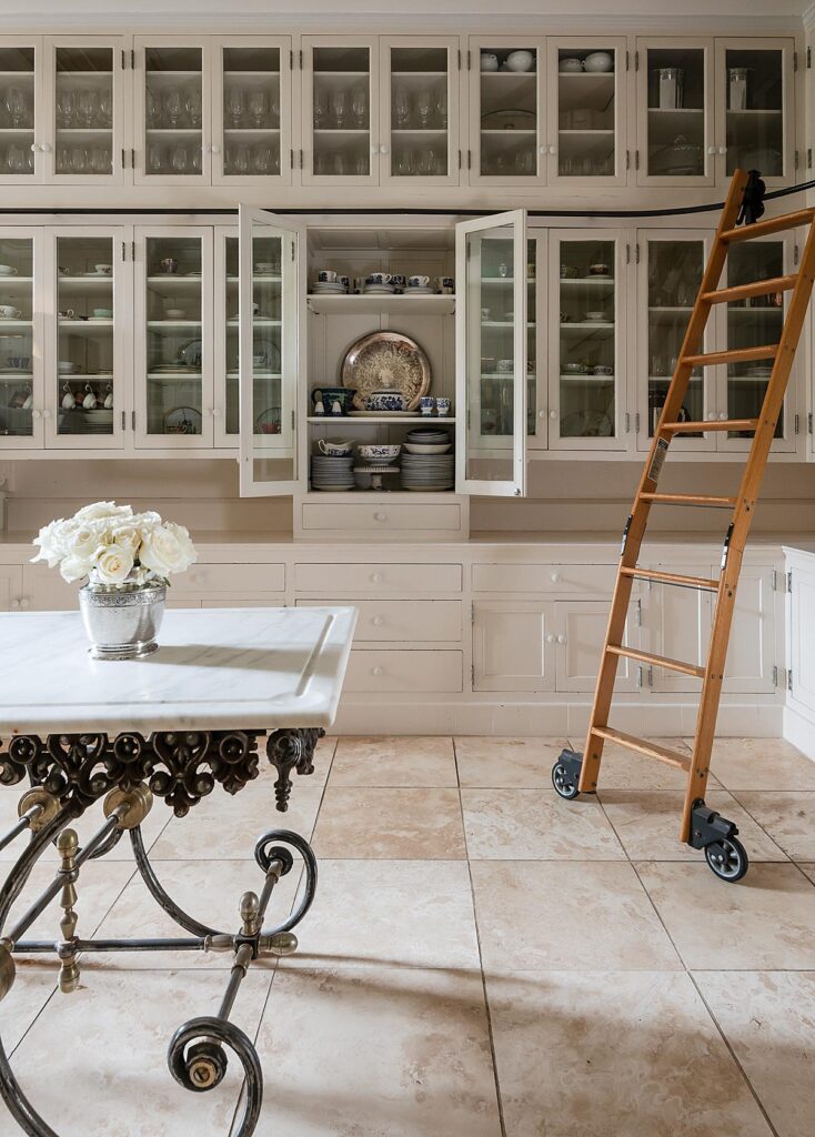
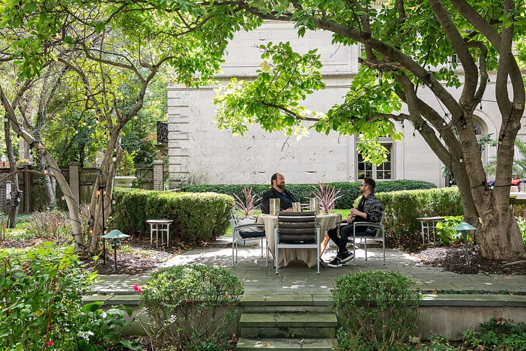
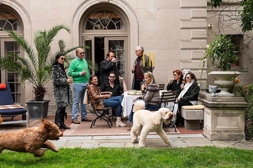
Last year, Karen photographed a project for the Wall Street Journal. Portland Place was to be photographed under incredibly strict guidelines – Karen had to deliver a minimum of 40 images, and was directed not to do any compositing or styling.
“I was blown away by her final deliverables and after finding out what she had to utilize on-site – lighting, composing, and shooting with the best ambient possible and no more post-processing than a little RAW file massaging,” Garett remarked.
Armed with historical information about the home by owner Russel Jackson, and with the space pre-styled by his housemate Alex Gutierrez, Karen set off to work making the 40+ images for the WSJ. She was assisted by her husband who helped flag reflections and haul gear around the massive mansion.
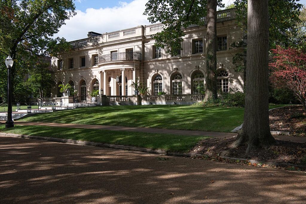
“I do like the front exterior shot a lot,” Karen explains, sharing how she made one of her favorite images from this shoot. “As an opening image, it sets the stage for the interior and people shots. I can’t imagine the project complete without it. The weather forecast was rain all day, and the photoshoot couldn’t be rescheduled. Dreading a downpour, I took some front exterior shots earlier in the morning, but they were sad-looking with no dimension and one of those terrible gray skies.
Finally, the sun was out close to sunset, and there was color in the sky. The shadows were changing fast, the clouds were moving fast, and I was thrilled. I had to find the best angle with the trees, light pole, etc. I’m short, so I stood on my mini step ladder, had my Nikon d850 on a tripod with the Acrca-Swiss cube, shot around 35 mm, and checked focus with my loupe. I bracketed so I’d have some choices when I went back to review and edit in Lightroom.”
Karen divulges how the shoot came to be, sharing, “I received an email from Kat Malott, photo editor for the Wall Street Journal. I scanned over her request for photography of a historical home with a blurb that there would be exteriors, as many interiors as possible, portraits, and lifestyle images of the homeowners. There were also exclamation points: ‘We are a newspaper, and not permitted to retouch images in any way …. NO retouching!!’ Their standard day rate was shockingly low, so I almost trashed the email.
Later, my inner voice asked me why not, so I responded that I would accept the assignment. That is how we connected, and I found out the photographs would run online and in print for Mansions, a new section of the WSJ.
I requested creative direction to see what type of images she hoped to have. Kat sent over a few past articles, which were very helpful, so I had a loose idea of how I would approach the shoot. I also had to keep in mind that they preferred vertical images for the mobile app and horizontals elsewhere.
A few days before the shoot, I got another email with the assignment details, including the directive that I could not style or restage the home. I would also have to write AP captions, which I needed to learn how to do, etc.
After reading the details, I felt unsure that I would be able to deliver 40 images that met my standards, but I told myself that others had done this before me, so I could, too.”
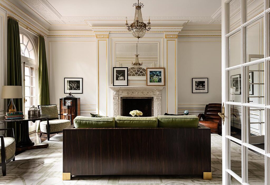
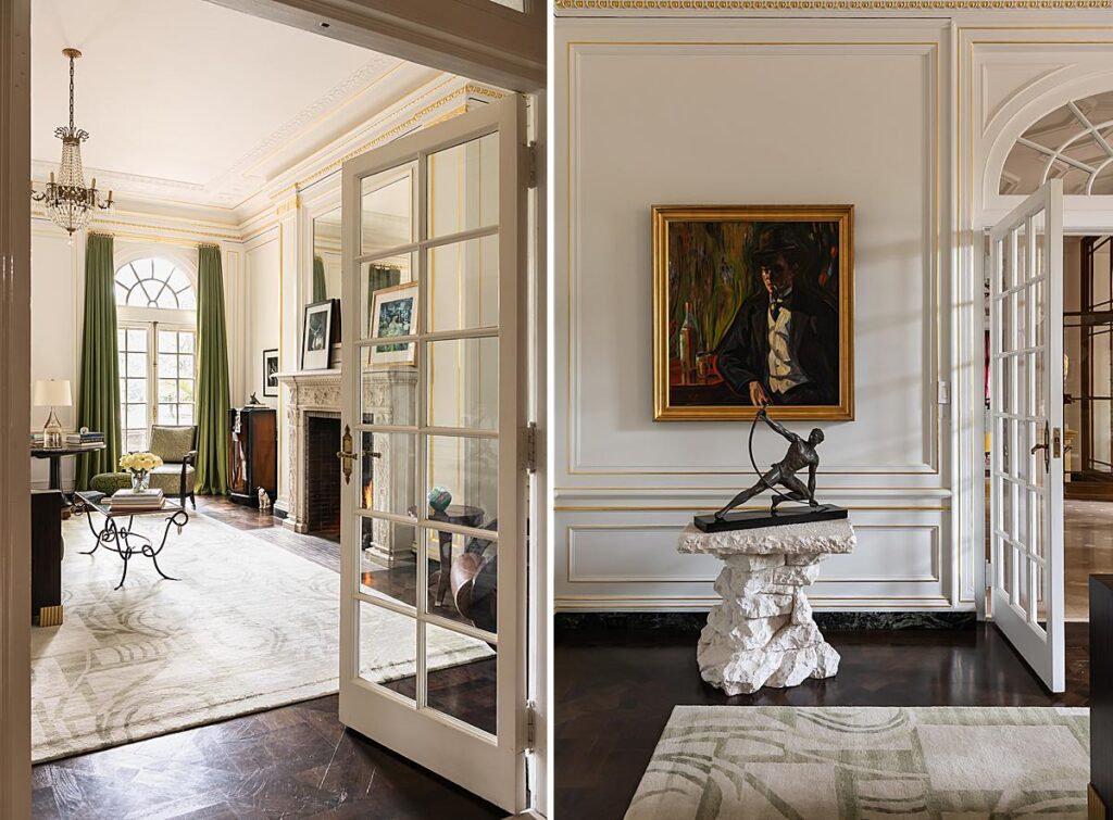
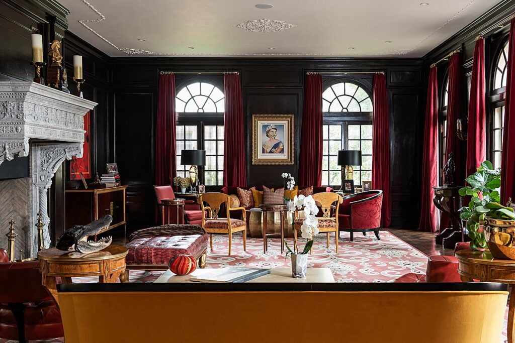
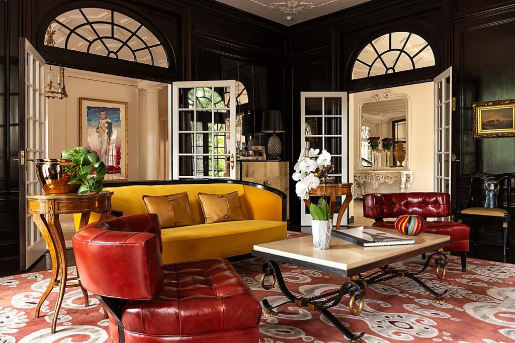
Karen mulls over why this project feels special to her, saying “The subject matter was grand—a 13,000-square-foot historical mansion built circa 1914 in the style of Louis XVI. The homeowner, Russell Jackson, emailed me pages from three books, which discussed and showed photographs of his home. The people residing in these mansions were living high during pretax days and booming St. Louis wealth. The architect of the mansion, William DeForest Crowe, received his formal training in France and when I stepped inside of Russell’s home I felt like I had been transported to Europe.
Also, to have the privilege to photograph the estate, restored and loved, was a wonderful thing. And to know that it would be seen by the many readers of the WSJ made it more special.”
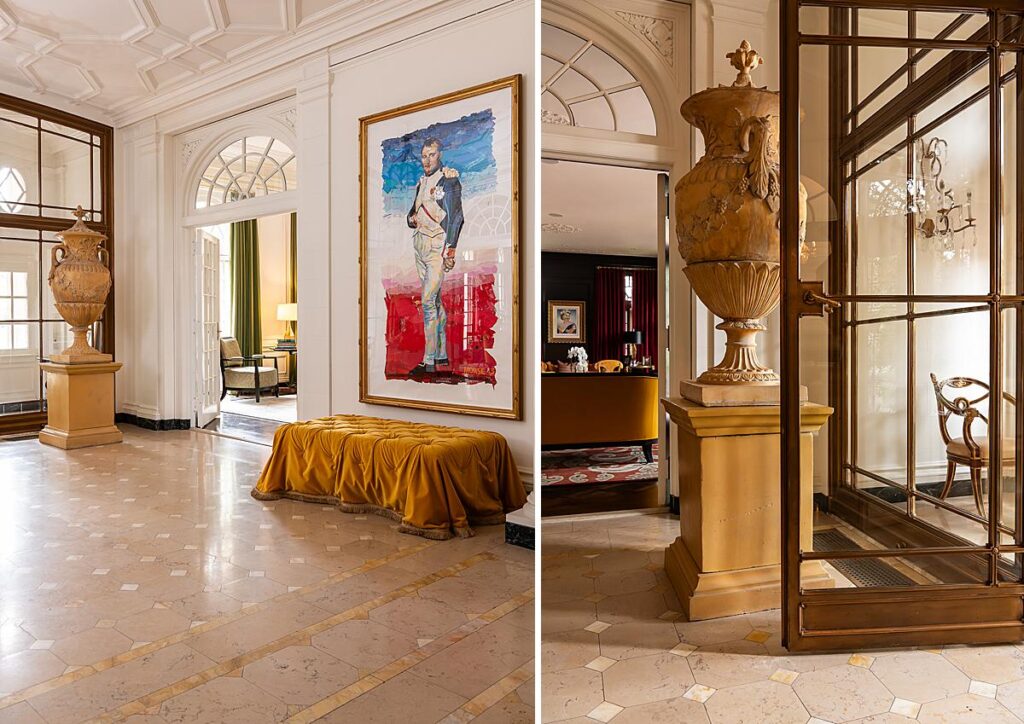
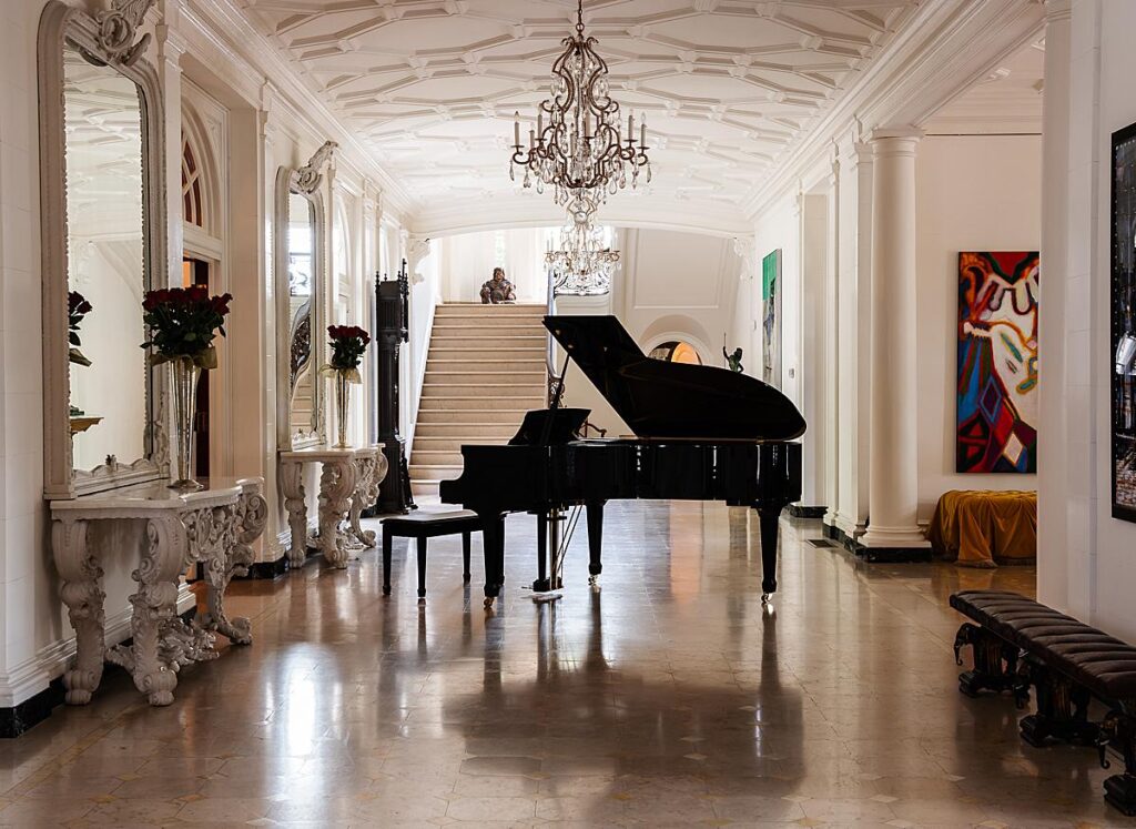
“[The photograph of] the central corridor I believe was an important shot. I think the scene epitomizes the grandeur of the estate. It took some thought finding the right balance of foreground and background, and dealing with reflections. A small version of this shot also happened to appear on the front page of the WSJ,” Karen explains.
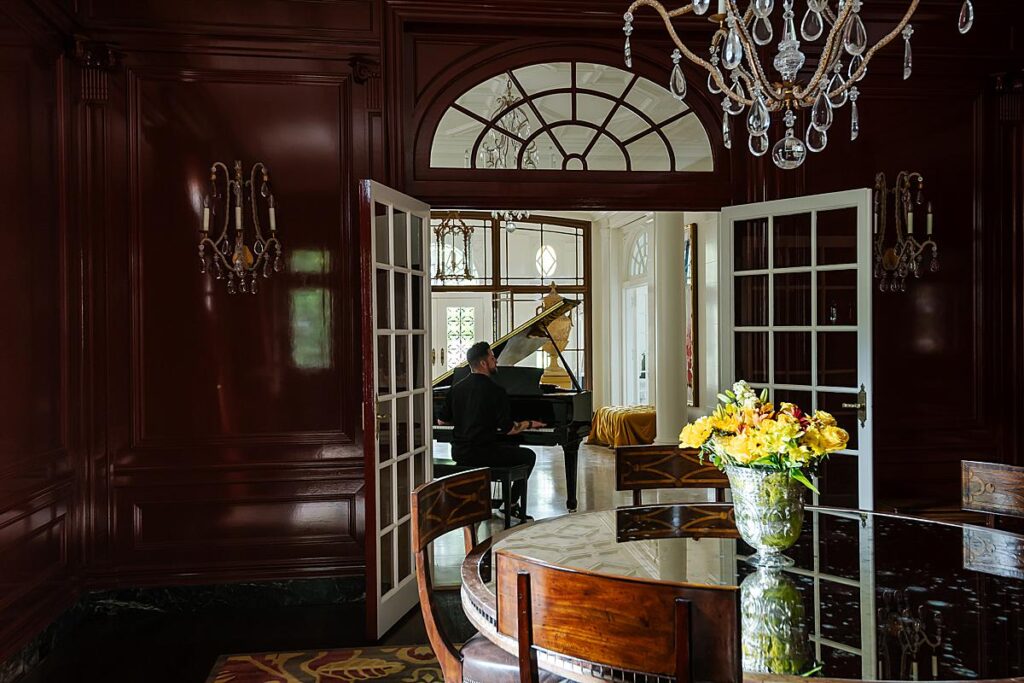
I asked Karen to tell us a bit about the logistics of the shoot day and any challenges she had to troubleshoot.
“Time management was a huge concern for me,” she explains. “We started by touring the house. This also allowed me to understand which rooms were most significant and which I’d put on the shot list. Besides the architectural shots, there were quite a few requirements for the number of portraits and different settings I had to provide the editor. I knew I needed to complete the posed shots early so Russell and Alex had enough energy before the day wore us down. Thankfully, they were fun to work with, and I like photographing people.
Even though, for most of the day the overcast skies hindered the front exterior shot, they helped to keep the interiors’ dynamic range manageable. Russell has an incredible art collection, so distracting reflections were the main problem. A polarizer usually didn’t help, so we tried sheeting or reflectors, which had to be out of frame.
There were a few occasions when a light was thrown into an interior, which was allowed.”
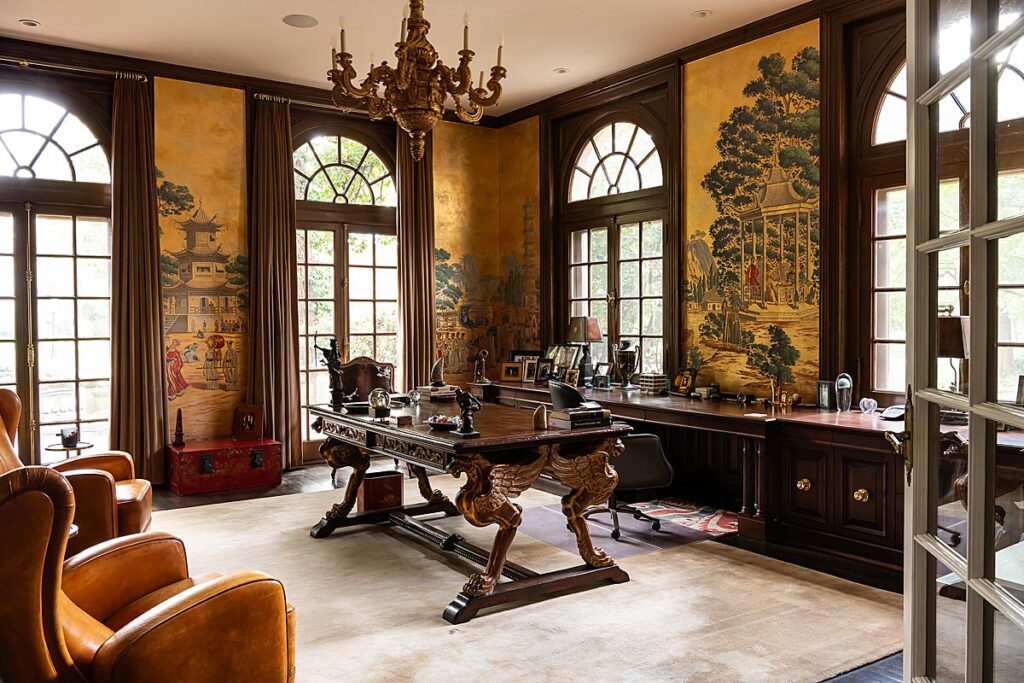
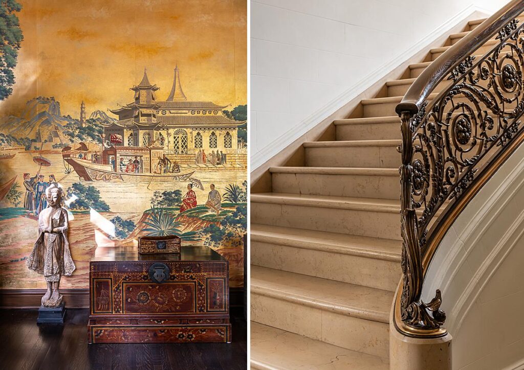
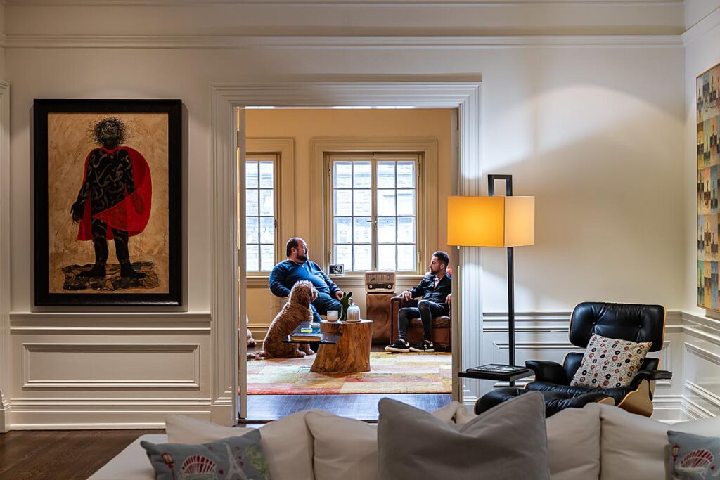
“For the interior shots, I worked tethered, using Lightroom. Newspaper rules meant no compositing, so I was always aware of whether or not I could get what I wanted in one shot and have a suitable image with just Lightroom slider adjustments.
It took me a couple of days to select images, do the Lightroom edits, and write the AP captions,” Karen says.
While we were chatting, Garett said “Karen’s talent and her sheer will to accept the challenge is inspiring in an all-digital and compositing age for most of us,” and I couldn’t agree more.
Both Karen and I would like to thank Garett Buell for linking us up. APA is very grateful to Karen for sharing this wonderful project with us and our readers!
Visit karenpalmer-photography.com to swoon over more of Karen’s work. You can also follow her on Instagram @karenpalmerphotography.
If you have a project you’d like to be considered for Project of the Week, you can submit it here.
