“Everything Always Works Out” – Christopher Barrett Talks Flexibility and Quick Thinking on His Shoot at Western Michigan University
Today’s featured project takes us to Western Michigan University, where we’ll be checking out the work of Christopher Barrett. Christopher is a Chicago-based architectural photographer who sports over 25 years of experience!
Throughout this project, you can expect to see emotive lighting, rich colors, and plenty of great details peppered in – from joggers to perfectly timed moonrises.
While documenting the student center, Christopher was working for the architect of record, Cannon Design. The project architect was Robert Benson who now heads up Racer Design.
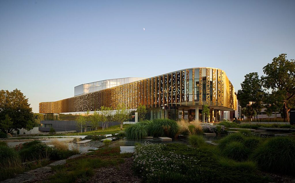
Christopher photographed the student center over multiple days, allowing him to work with the temperamental weather and lighting conditions.
Christopher explains, “As we pulled up to the building, rain was pouring down. The architect and I just looked at each other, smiled and shook our heads. I wasn’t worried in the slightest. Everything always works out. The building is a student center and school was on break, so that was a challenge since we wanted it to feel in use. Also, since it wasn’t open to the public, we kept getting locked out, and oh… we were notified as we began drone coverage that we couldn’t fly on campus without special permission, which we were never able to secure.”
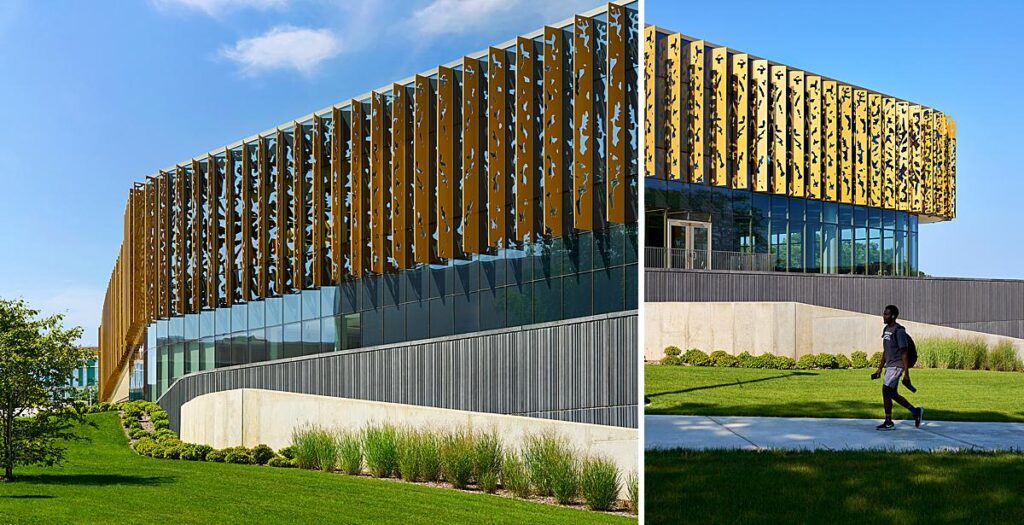
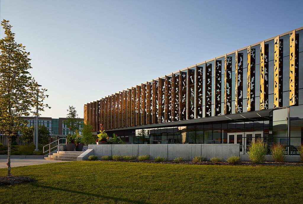
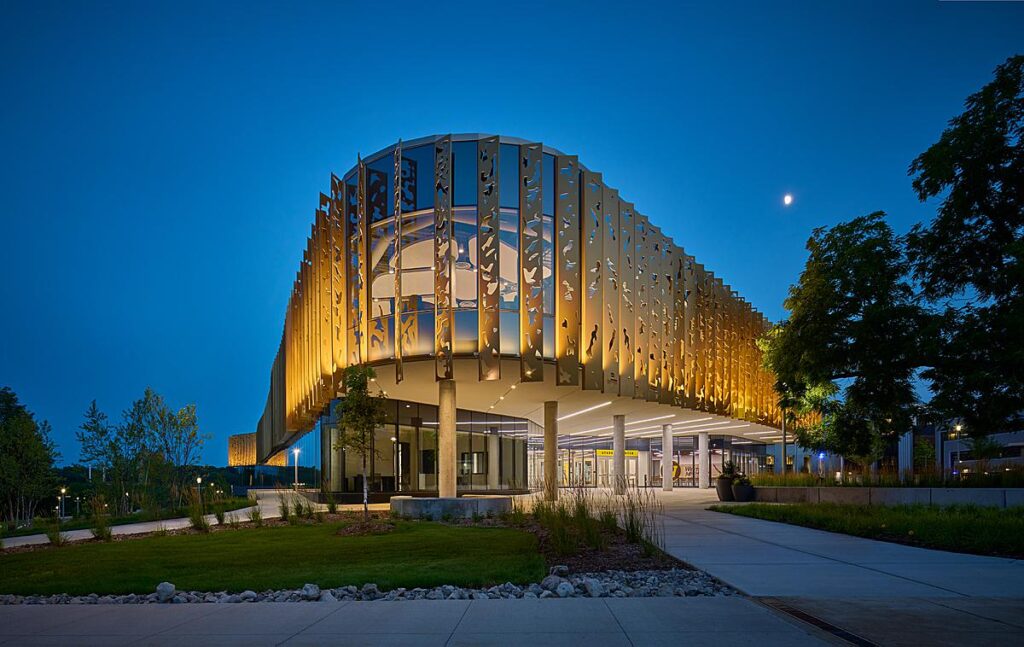
“I was on site for about 2 1/2 days. In that time, I only got about 4 hours of good weather,” he goes on. “Architectural photographers have to be flexible and think on their feet. We focused on interiors until the sun broke through and then we chased it around the building until it set. The cutouts in the louvers around the façade were inspired by dappled light through tree foliage. It was really important to capture the building in various lighting conditions to reveal and enhance that.”
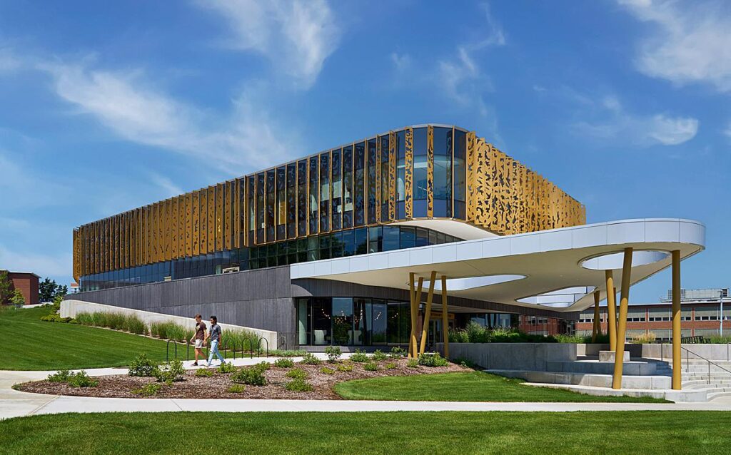
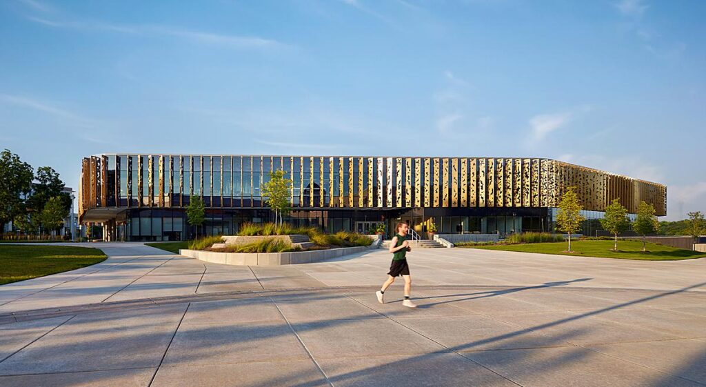
Scoring some blue skies, the building’s golden “fins” stand out nicely. There is great color theory at work here!
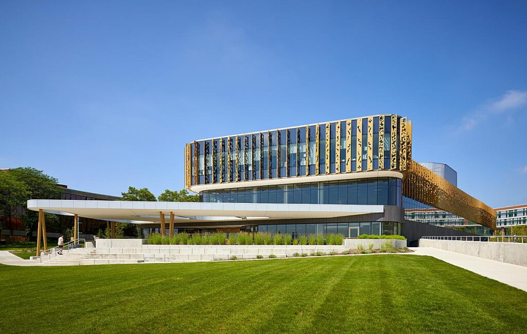
I appreciate how Christopher lines up his compositions, always leading our eyes toward the student center, whether that be by use of vignetting, a leading line like a path, or the movement of a figure. In the case of this next shot, it’s all three!
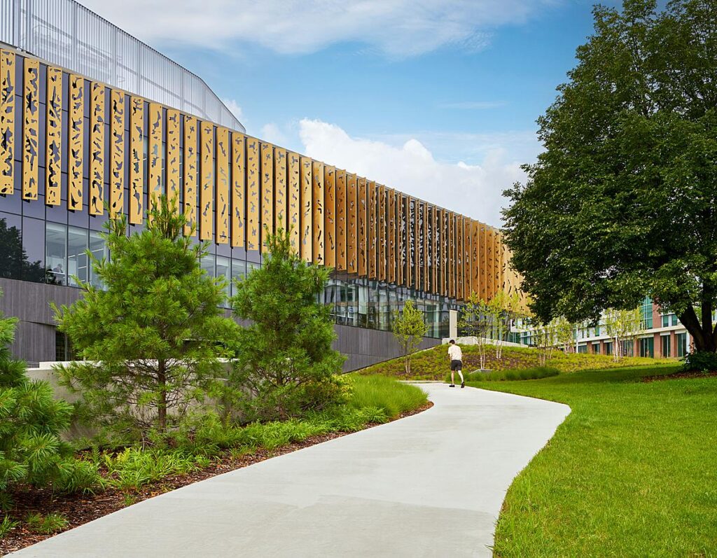
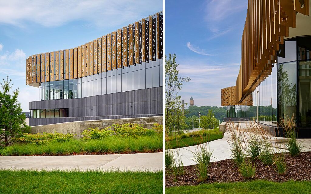
Speaking of vignettes, these tighter detailed shots of the exterior help us understand the materiality used in the student center’s construction. We get a good look at all the surfaces, and how they interact both with each other as well as the landscaping.
As we head inside, we are met with more gorgeous light and well-placed “models.”
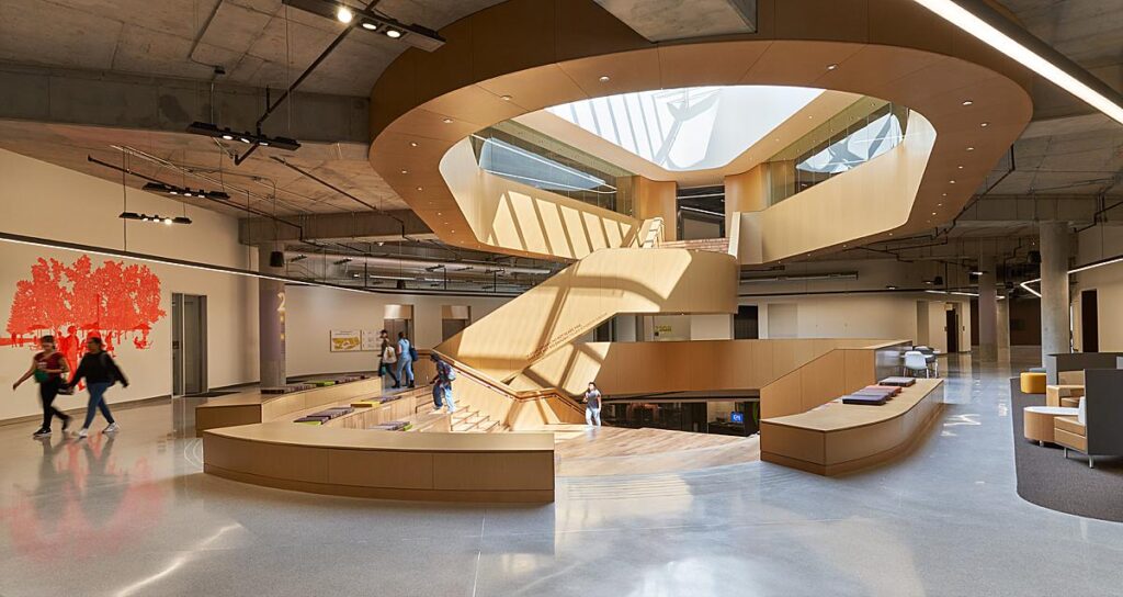
These next two shots are some of my favorites from this project. How can you not love that light?!
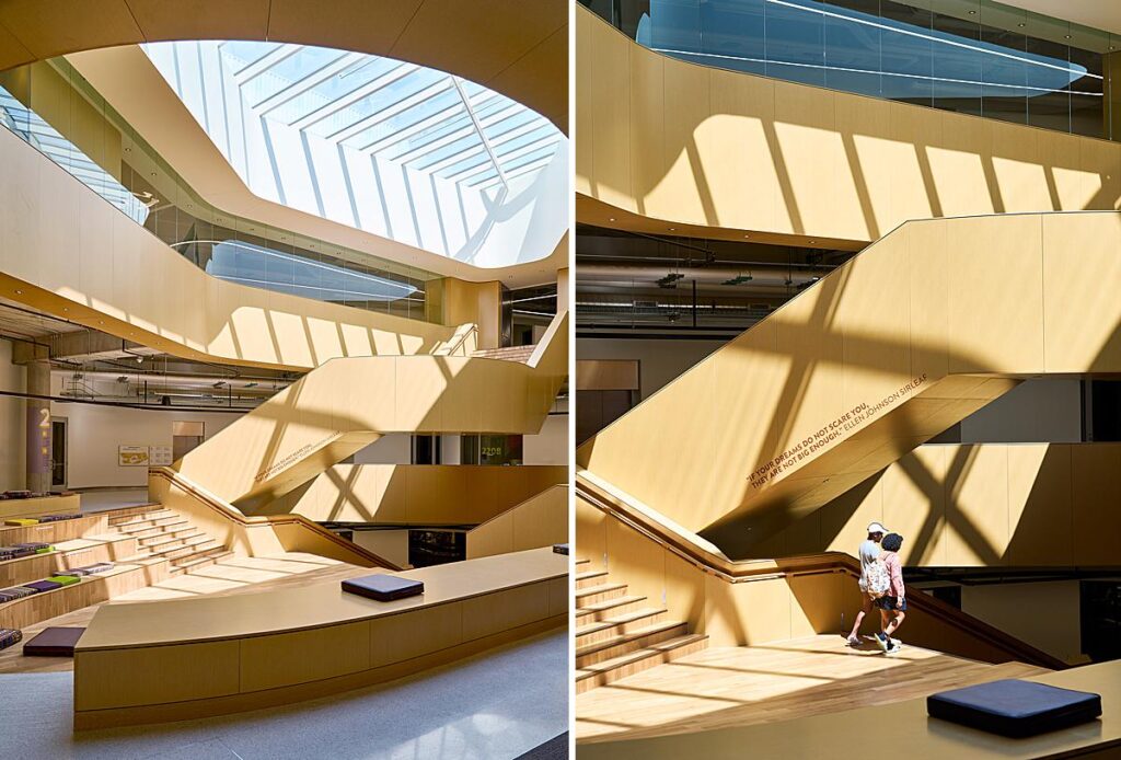
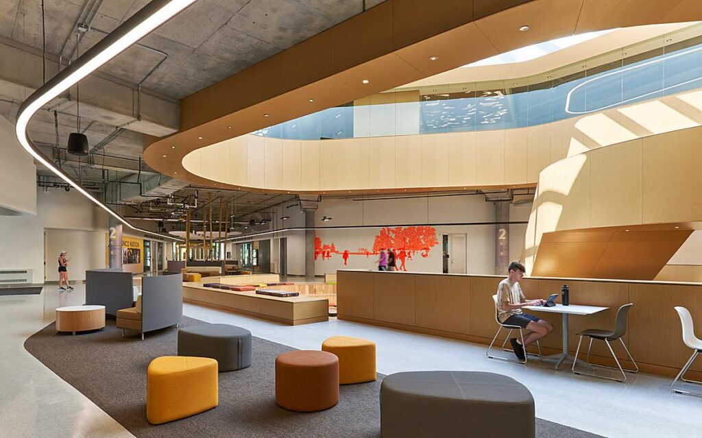
Christopher explains, “The project architect was Robert Benson. He’d already left Cannon by the time I shot this. I’ve actually photographed his projects at three different firms and he told me when we were out for drinks recently that I’ve pretty much photographed his entire career. We never actually set out to work together, it was kind of random, but I feel enormous responsibility in representing my client’s work. For me, a shoot is just a few day’s work. For my clients, my photographs are the culmination of hundreds of hours of their life, so… you know… no pressure!”
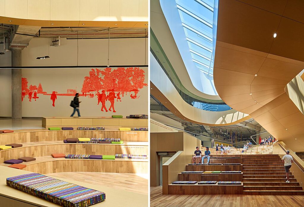
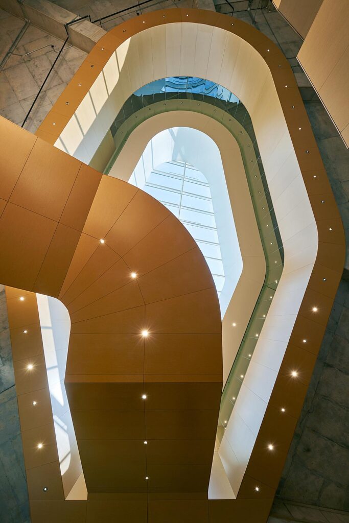
Photographs that feel a bit more abstract, like the one below, help flesh out the overall story of the student center.
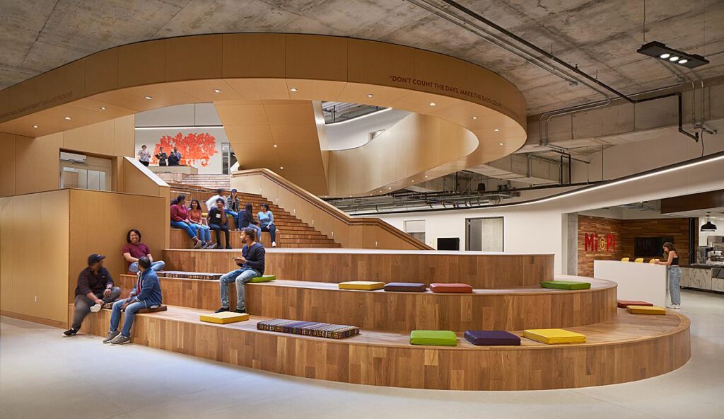
Including students in the – well – student center, communicates purpose and scale. We see the functionality of the design, and can appreciate the warmth and life that they give that balances out the concrete and piping/utilities overhead.
Back outside, sunlight from the edges of the day creates long shadows and little pools of light that add that special magic to these shots.
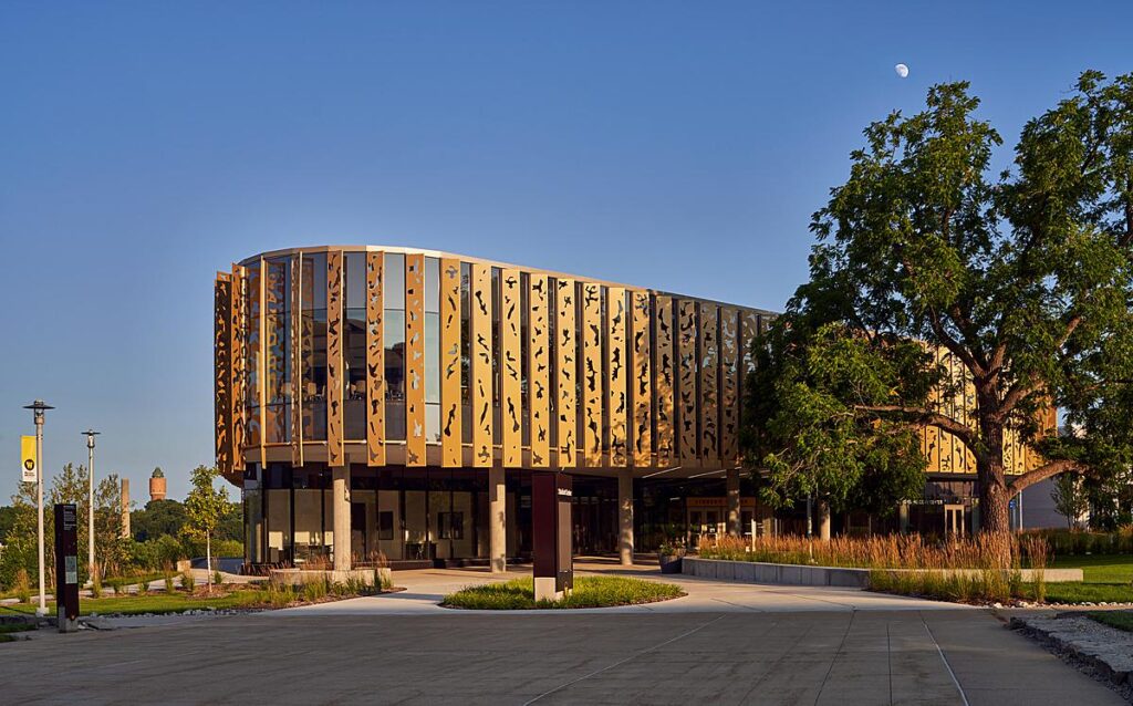
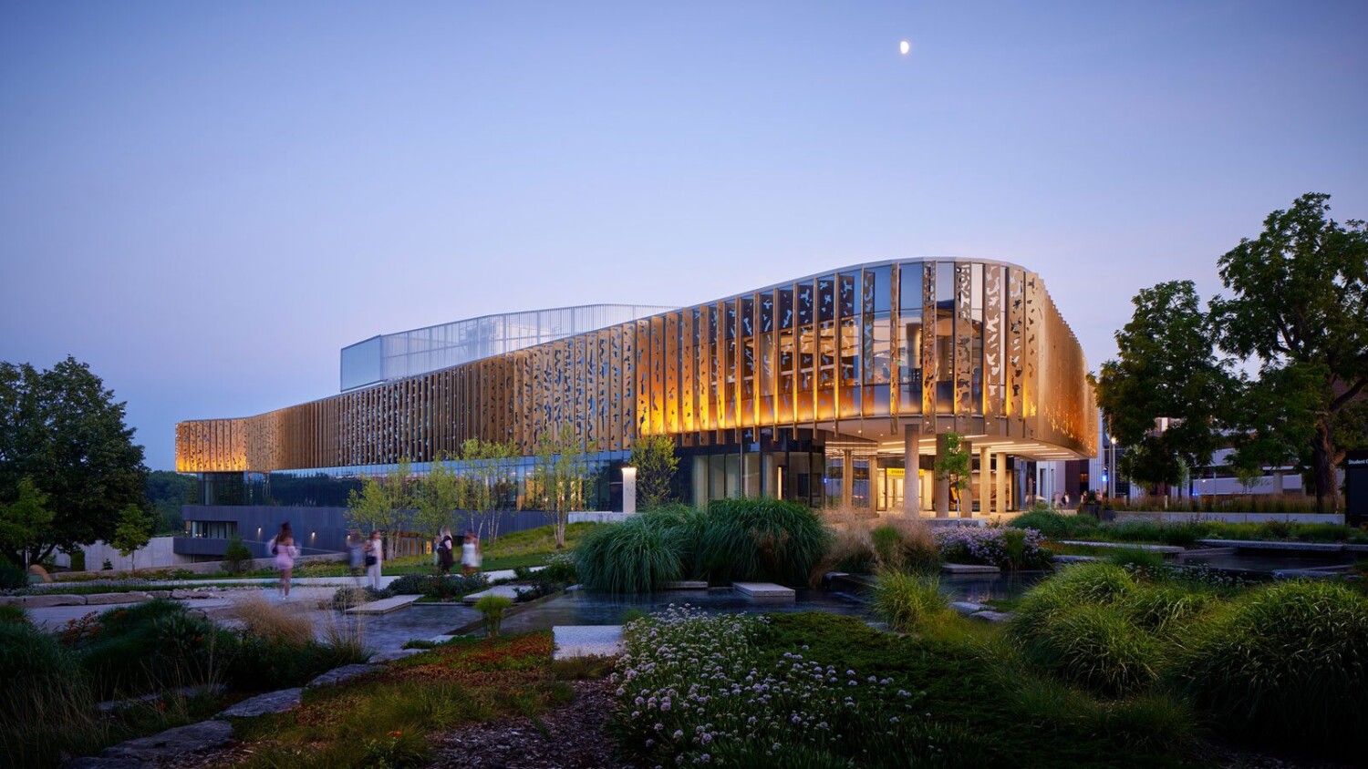
Christopher shares, “My favorite shot is the dusk exterior of the entry. We had a beautifully clear night, the moon rose into the shot and the building lighting accented the fins along the façade nicely. There was a group of young women who’d just left that night’s dance and wandered through my shot for a bit of serendipity. The foreground landscaping is all lit with a strobe and blended in post. I set this shot up in late afternoon, so that I could also capture a daylight version and I used a little bit of that later afternoon sun to highlight the trunk of the tree on the right.”
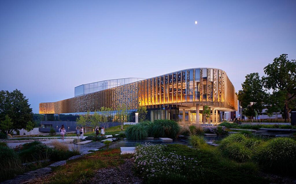
How epic! Many thanks to Christopher Barrett for submitting this project in!
Head over to Christopher Barrett’s website christopherbarrett.net to see more of his work. CB’s Instagram can be found @christopherbarrettphoto.
If you have a project you’d like to be considered for Project of the Week, you can submit it here.
