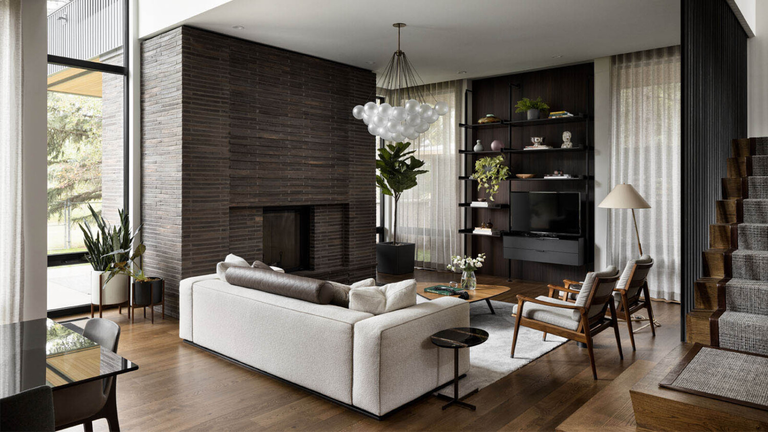
Calgary Based Architectural Photographer Eymeric Widling Shares His Approach at The Lakeview Residence
You might remember this dreamy project from the 2021 Project of the Year Award longlist. This series is by the fantastic Calgary-based architectural and interiors photographer Eymeric Widling. Eymeric’s thoughtful approach makes it easy to see why the judges held his work in high regard. I personally fell in love with this selection of works for the heavy contrast, dark and moody subtractive lighting, and strong shapes that Eymeric capitalized on. Let’s take a look and get to know Eymeric’s methodology a bit more!
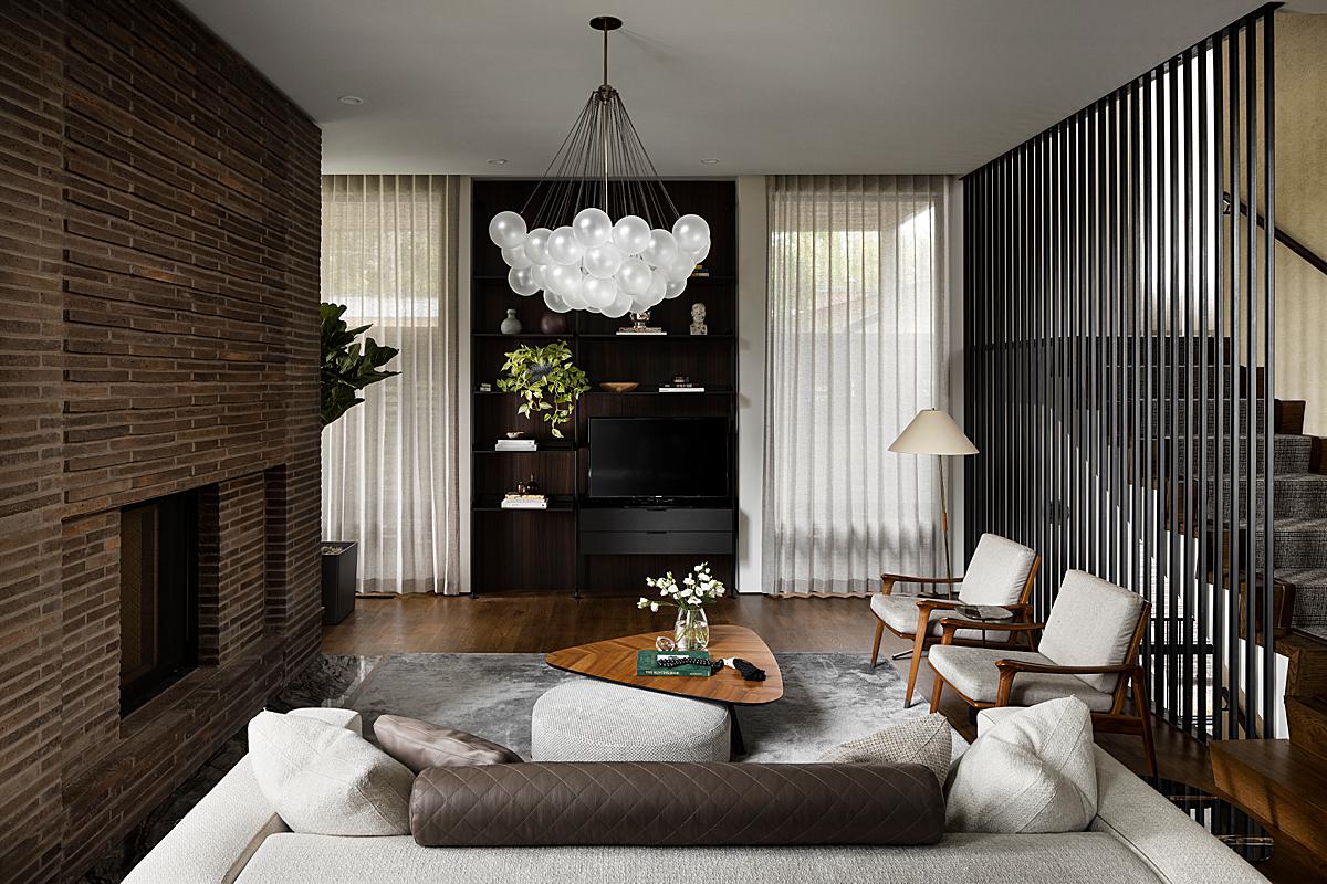
He starts out by telling “This Calgary, AB Canada home was designed by Shaun Ford & Co. The architect is DeJong Design Associates, and it was built by Waterford Homes. All three were clients on this photoshoot. This was my first shoot with Shaun Ford, but I have worked with the architect and home builder many times before.
I did a location scout with Shaun a couple months prior to the shoot, where we discussed the details of the home, what his vision was for the photos and the logistics of photographing it.
The shoot itself was planned for two consecutive days, both as a precautionary measure in case the weather didn’t cooperate, and because the shot list included over 50 images. Having this much time on location gave us flexibility for changing light conditions, and allowed time to really focus on the composition and lighting for each shot, without ever feeling rushed.”
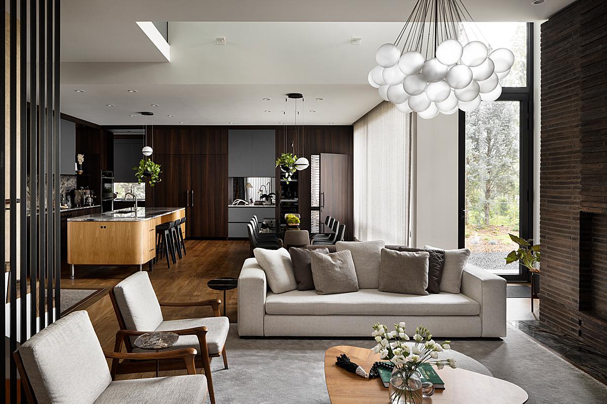
“I really try to let the space I’m photographing somewhat dictate, or inform, the photographic style. In this sense, every home I shoot should look a little different, because each one influences to a certain extent how it should be approached. Another way to look at it is trying to keep the photographic style out of the way of the space. A bit of a litmus test is, if I look at an image, and the first thing that I see or think is how it was photographed, or processed, then it has not achieved this. So for this home, which is so rich in natural materials and tones, and has this soothing zen feeling to it, I really wanted the images to reflect that,” Eymeric explains.
We can see that he accomplished his goal, as the space speaks for itself. Each image is easy to read, feels true to life, and is void of any kind of trendy or over-stylized post-processing.
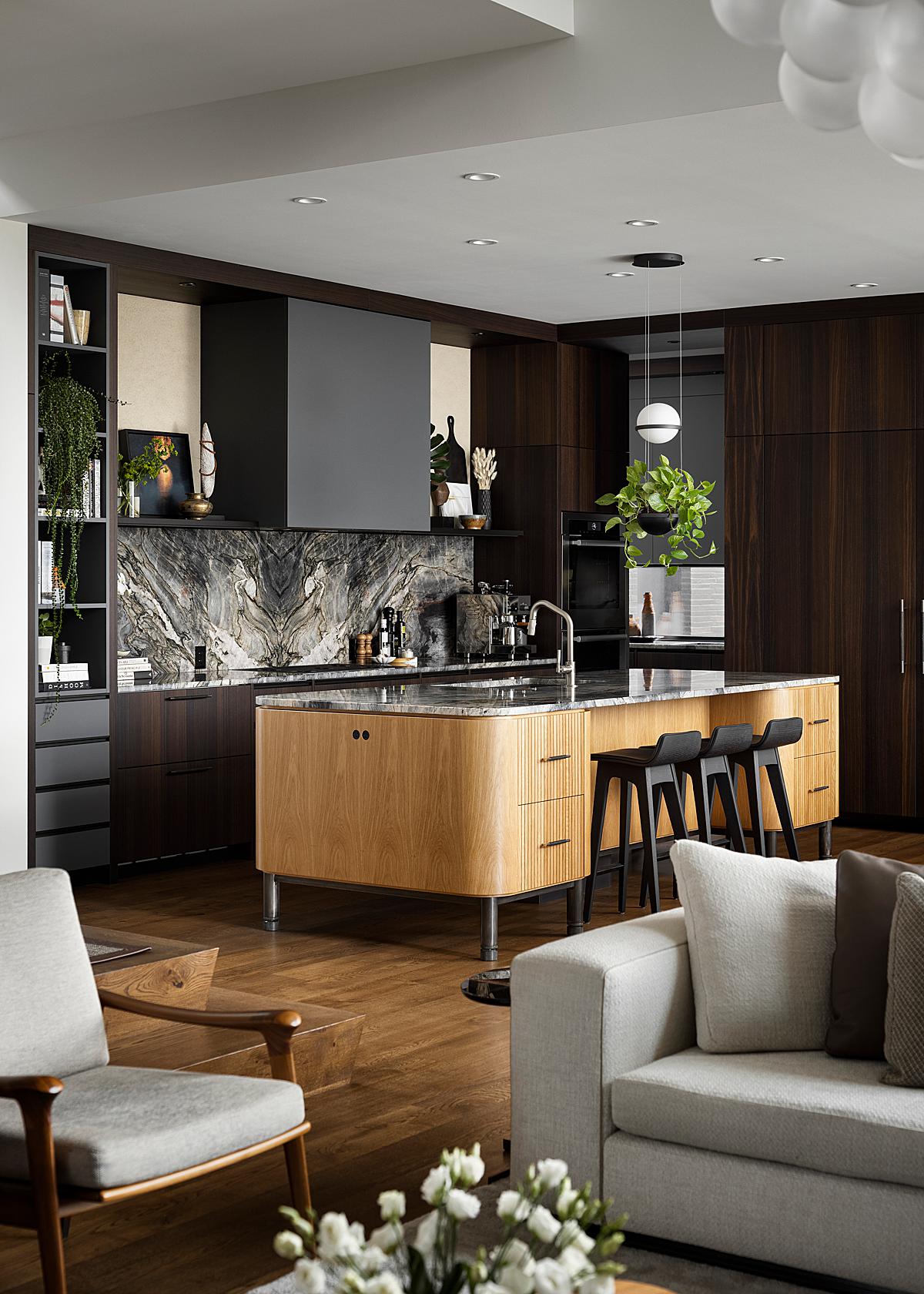
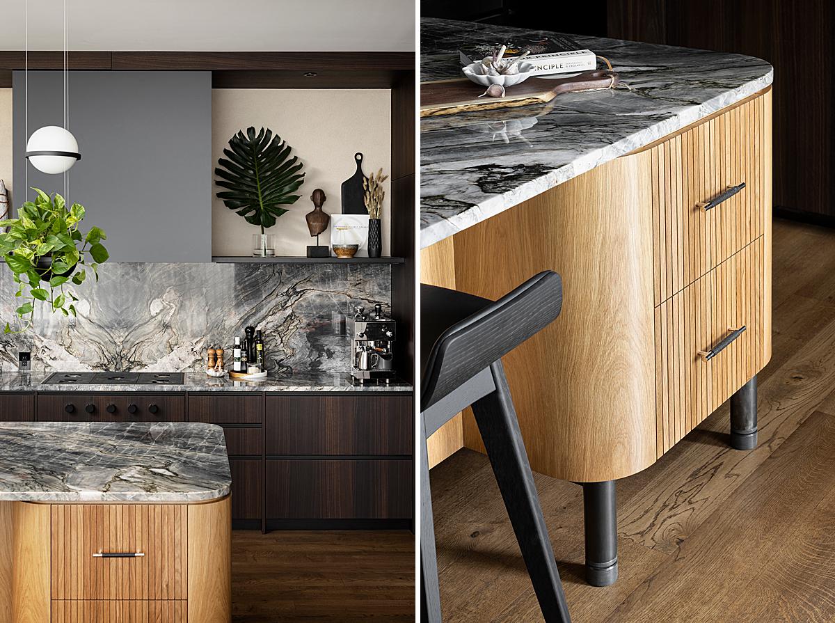
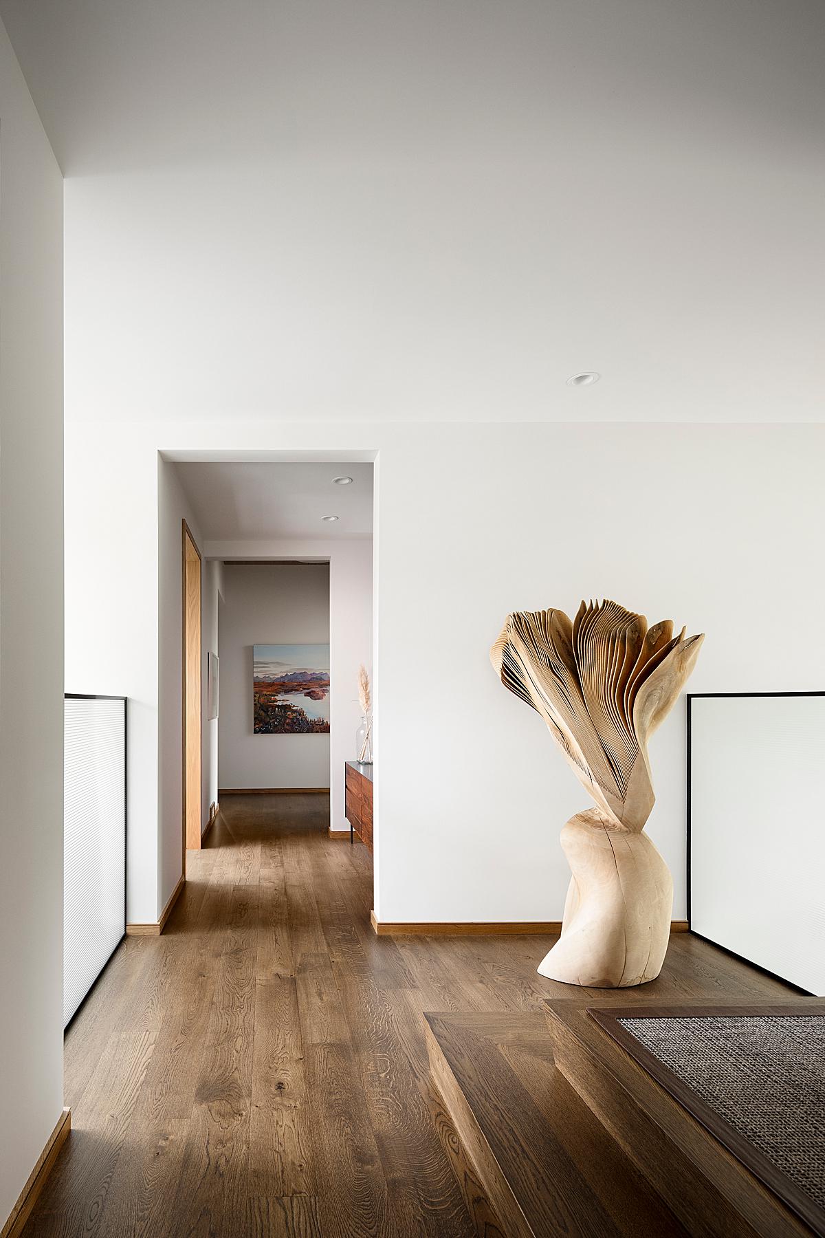
He says, “Compositionally, I try to keep things simple and natural. I think we gravitate towards images that we can relate to, so shooting from a height that’s realistic helps the viewer get past the format and really see the space as it is. Most of the details are photographed with this philosophy in mind, so they are primarily taken from above, as if you were really standing there looking at them.”
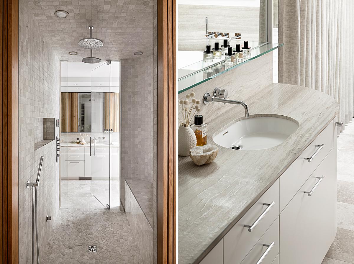
Eymeric’s approach to photographing the details of this beautiful home helps us understand the rich textures and bespoke elements that set each space apart. I appreciate how his vignettes are as carefully composed and lit as each overall or hero shot. It is obvious he puts the same TLC and time into all aspects of his work.
“My favorite space in the home to photograph was the hidden library/ office,” said Eymeric.
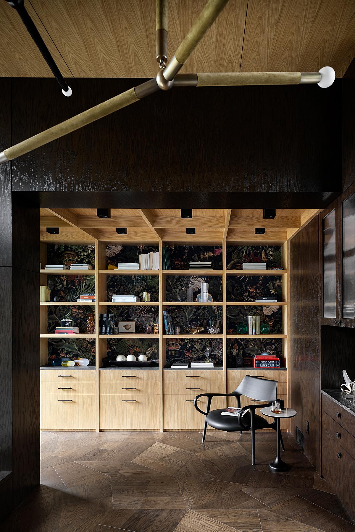
“The wall of the dining room opens to a short hallway that leads to the space. Even though it’s so central in the home, it really feels isolated. The high ceilings and large windows that flank each side of the space make it feel so spacious and calming. We ended up shooting seven shots of just this space, which is more than I probably would ever take of a space that size, but it’s just so photogenic it could be the subject of an entire shoot itself.”
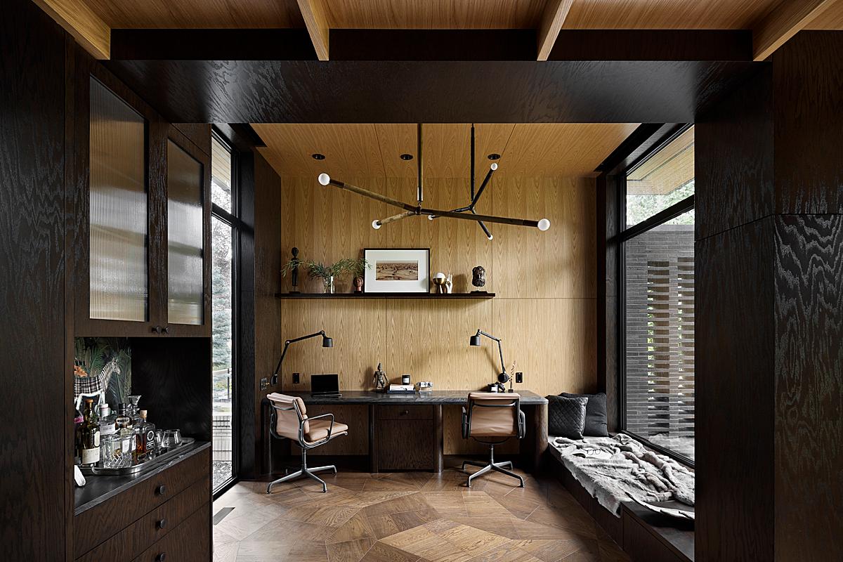
If you are a veteran POTW reader, you know that I love dark trending spaces and bold graphic shapes. This entire project, but especially so the “secret office” tick those boxes for me. The scene below is chock full of powerful leading lines, contrast, and texture. I feel like I could just touch my screen and feel the texture of the lighting fixture, the glossiness of the black wall, and the smoothness of the chair. Eymeric delivers a beautiful sense of place and helps us put ourselves into each room of this house.
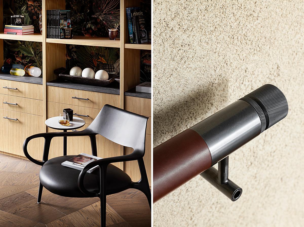
“Details were a large focus throughout the photoshoot. It was important to the client to capture the finishings that you might not notice in the wider establishing shots. I personally love detail shots, they’re a great compliment to a set. Since we interact with homes, rather than simply look at them, it’s important as interior photographers to be able to translate that tactile element to the viewer. I love the seemingly mundane experiences we have interacting with homes; the weight of a heavy door or the ‘click’ of a quality metal switch, it’s all part of the home’s soul, and detail shots help translate that to the viewer,” he shares.
He goes on, “I almost always use a bit of off camera lighting, bounced here and there, but for this project it was dialed way back. We shot the main spaces when it was overcast, which we were lucky happened to be most of the time, and really tried to let the shadows dominate when processing.
There were times when the sun came in, and the space looked great then too, but it felt distracting through the lens. When the sun was out, we focused on spaces that weren’t affected, like the basement or other rooms without windows showing. The space may look simple from far, but up close it’s a symphony of contrasting wood grains, leather, plaster and different metals; it’s truly a work of art, and it really benefited from a calm soft light to let those elements be heard.”
When it comes to gear, Eymeric keeps it simple. “I can focus on feeling the space rather than worrying about gear,” he explains.
“That said, I shoot solo for almost all shoots. I have my camera tethered wirelessly to an iPad to facilitate styling shots. I personally love the styling process, I think it has more impact on the success of an image than most of us might think. I carry three lenses for all shoots, the 17mm TS-E, 24mm TS-E, and 50mm TS-E, plus the 1.4x extender which gets used a ton (please make a 35mm TS-E Canon!) It all goes in a backpack with all my other important gear like black cards, batteries etc. that way I can move around quickly if necessary. I love subtractive light, so I always carry a few big black-out scrims in my roller bag too.”
His simplistic approach extends itself to Eymeric’s time at his desk as well. He shares, “Post-processing starts with sorting in Adobe Bridge, then moves to Photoshop where I blend ambient brackets using various luminosity masking techniques and add some flash frames where necessary. I keep this step simple as well, even though it is incredibly time-consuming. I typically budget the same, up to double, the time spent on location to process the images. So, a full day shoot will be a full day to two full days to process.”
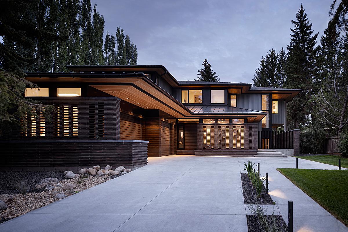
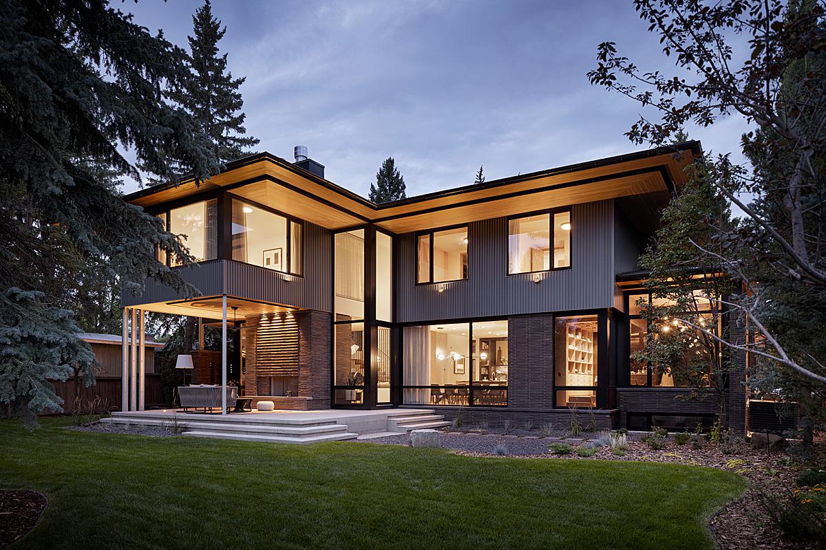
“For the exterior, it was important to show the home in the evening, with the interior lights shining through the breeze blocks. This illustrates how they provide privacy without blocking natural light. For continuity, and due to weather conditions, the entire exterior was photographed during twilight. No additional lighting was used outside, the home’s exterior lighting is so beautiful it would have been a shame to interfere.”
I agree – the naturally lit exteriors are perfect. The careful attention to the lighting design and shapeliness of the house is evident, and Eymeric conveys it well.
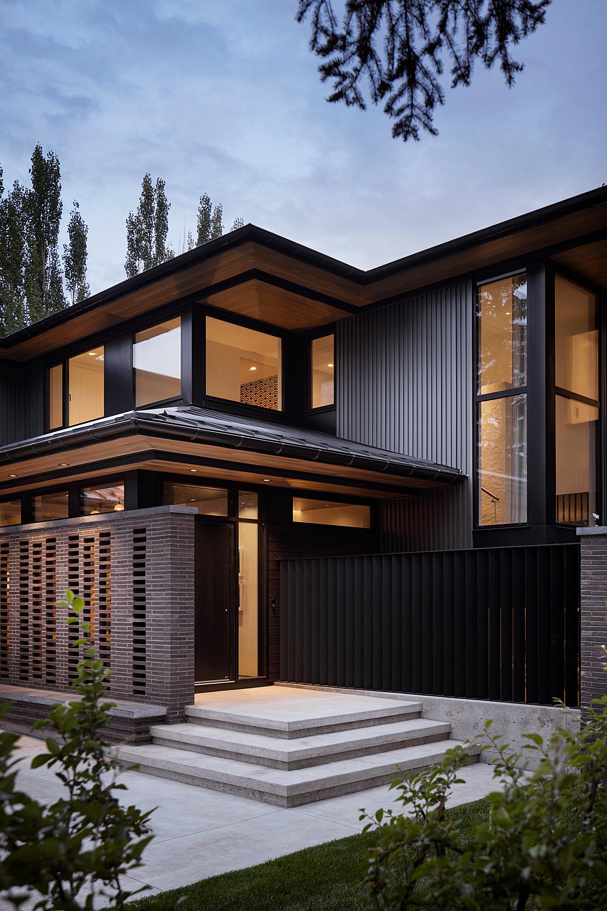
He breaks the exterior down for us into a bite-sized chunk, where we can laser our focus onto the massive glazing, rectilinear shapes, the texture of the cladding, and of course, the breezeblock design. While there is a lot to take in, this simplified composition is easy to read and a joy to view.
Eymeric closes out this project by sharing some words of wisdom:
“In summary, I think it’s important to try and “read” the space before shooting. It’s tempting to just start shooting everything immediately, but try to take a minute to feel the space. Every home has a feeling, and it should inform the photographic process so that you can pass that feeling along to the viewer.”
A huge thank you to Eymeric for sharing this project and diving into his approach with us!
Head over to eymericwidling.com to see more of Eymeric’s dreamy work, or pop over to his Instagram @eymeric.widling
If you have a project you’d like to be considered for Project of the Week, you can submit it here.
