Peter Molick’s Meticulous Work Leads To Success At Home in Houston and Abroad in Venice
Instagram seems like an endless pool of finding exceptional photographers and when by chance I came across Peter Molick’s profile, I was immediately enamoured by his very clean and crisp interiors photography and by his architectural art photography which has been exhibited at the Venice Biennale. His inspirations and methods, which result in some incredibly clean work, deserve a deep dive, so let’s jump in.
Hey Peter, thanks for taking the time for this interview. To kick off this interview, tell us a bit about yourself? What led you to study architecture then transitioning into architectural photography?
Thanks for the opportunity, Veeral. Well to start, I chose to study architecture as a way to bridge the gap between my interests in the arts and more technical subjects. I enjoyed the study of architecture a lot and thrived at design and visualization, but had a sense fairly early on that it was likely not my final path. After school I bounced around at a variety of firms, trying to get a feel for which scale of project type and the office environment was the right fit for me – eventually coming to the realization that my best fit in the architecture world was more architecture adjacent. About midway through my time with those firms and have had a little insight into the expectations of an architectural photographer, I began trying my hand at photographing projects for friends and colleagues.
I had always been someone who had a camera and experimented a lot with techniques and understanding composition. Growing up my dad had built a darkroom in our basement to support his passion for photography, which was a great way to learn and experiment early on. Despite having a pretty good technical foundation of photography, those first sets of project photos were pretty rough. Lighting and colour were all over the place and composition often left something to be desired. With time and a lot of practice, I was able to refine my technique and vision into a place where I had the confidence to go after more work at varying scales.
Having studied and practiced architecture in the same city (Houston, Texas) I had a unique advantage of having a pretty sizable network to draw from and eventually grew a decent client base and could see this new fit for myself within the world of architecture. In 2014, I left my career in architecture and began photographing full time and haven’t looked back.
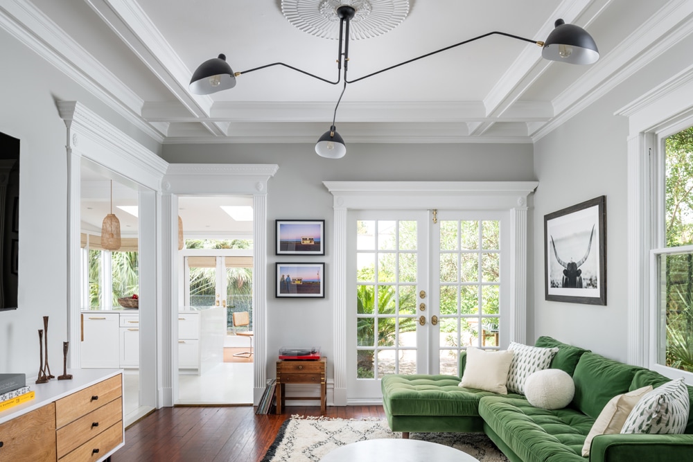
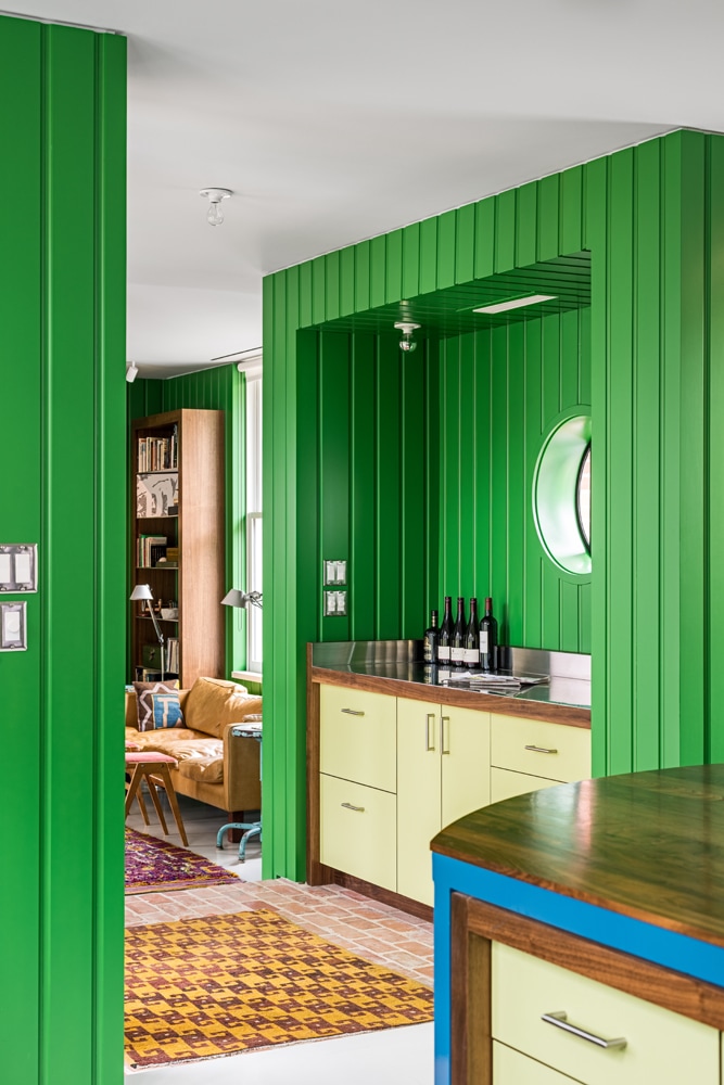
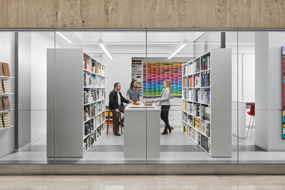
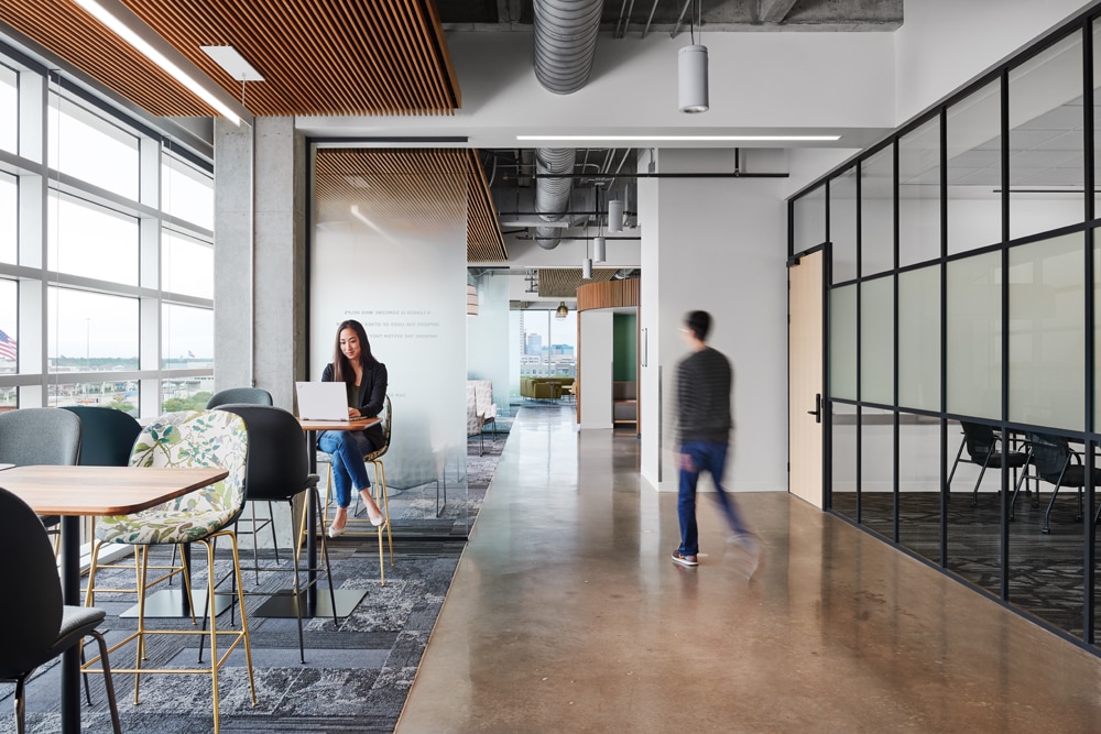
I have to really commend you on your work especially your interiors projects. More specifically, your workplace interior projects whereby the talent is perfectly positioned, and the overall look is so clean and crisp. Can you share some of your working processes during the shoot on how you achieve this evocative look?
Thank you! It always means a lot to me to hear that because early on, I was quite intimidated by photographing interiors in general. As I’m sure anyone reading this knows all too well, interior spaces often have many varying light sources and spatial challenges when trying to create a story that ties them all together. When I began trying to learn about lighting interior spaces, I would often place lights with large modifiers just outside of the frame on both sides of the camera to simply fill the space with light, not being conscious of what the direction of light actually meant to the scene and if it made sense in relation to the light sources existing in the space.
Nowadays I think I’ve come to a place where I really understand how light works and how, when applicable, adding our own light sources can not only help complement the existing conditions but also bring truer colours and textures to the finishes within a space. Bringing people into shots was a slow process for me. When asked, I used to say, “I photograph architecture because buildings don’t blink”. I’ve since learned to really embrace having people in our photos and think I’ve gotten very good at taking the time to ensure that they’re in a comfortable place that’s not overly distracting to the space, but also shows it’s scale and function. It’s also been helpful having an assistant to work with whose focus is on photographing people (shoutout to Spencer Young).
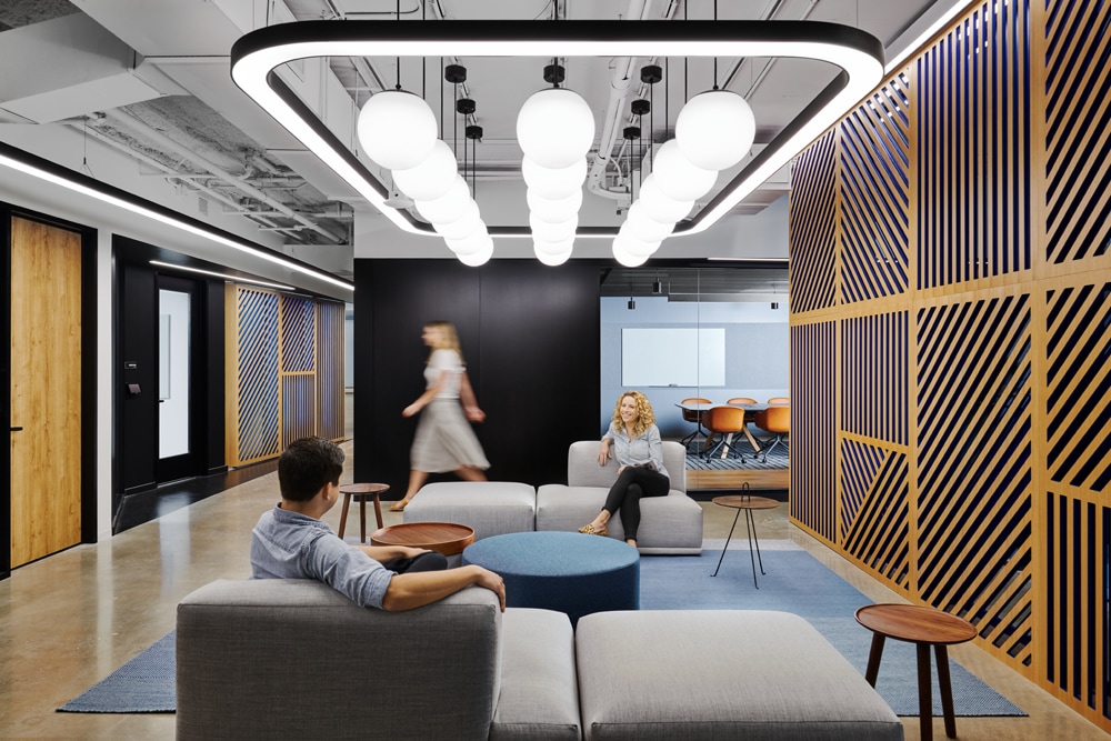
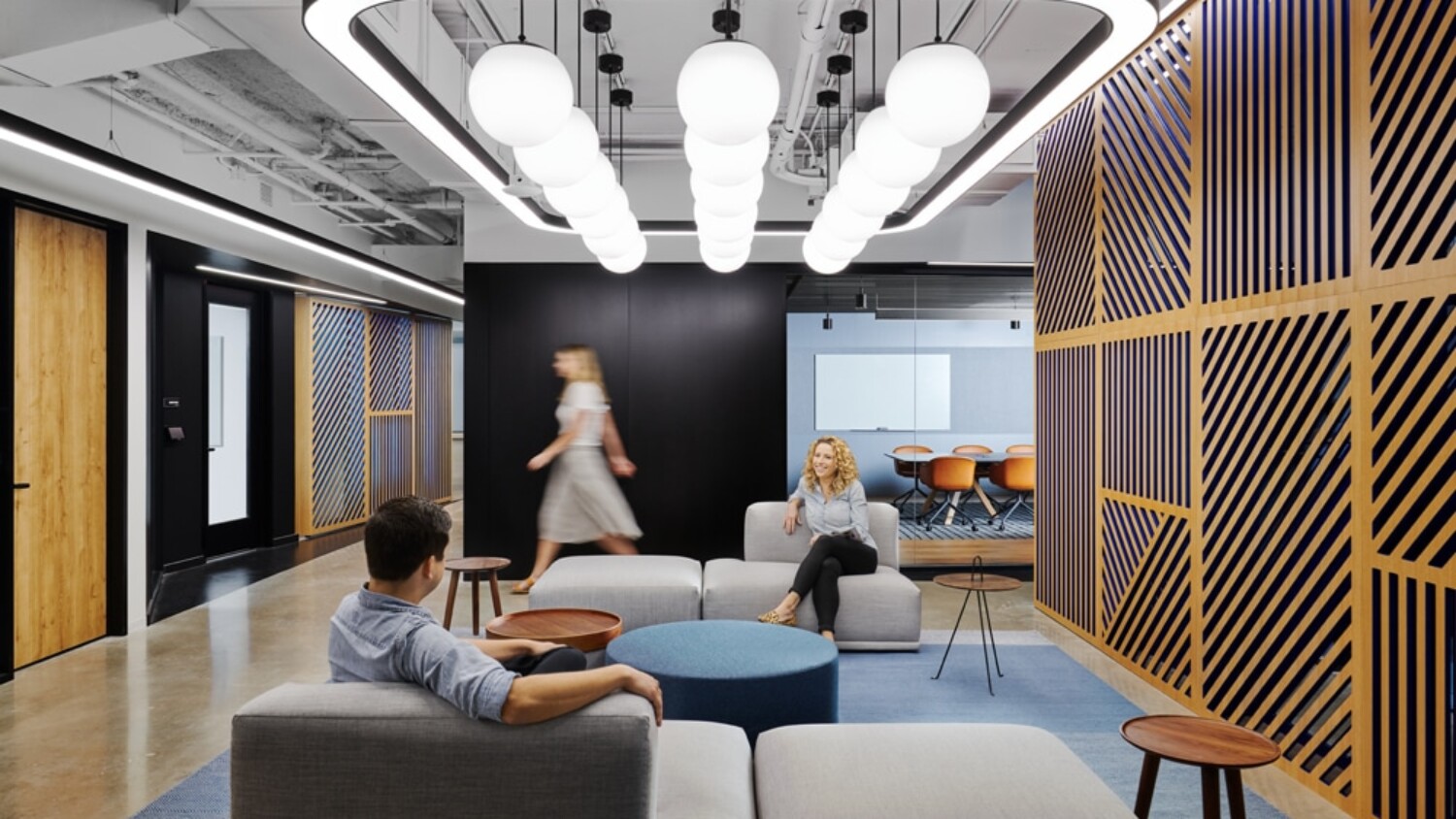
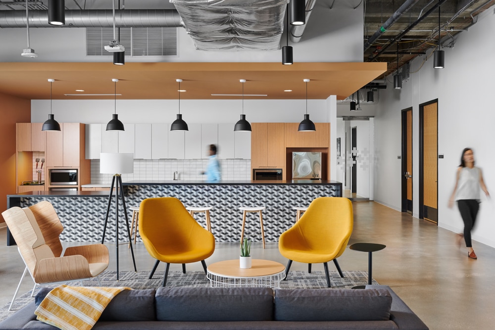
In the photo above which is the common space in an office designed by IA Interior Architects, the overall lighting design of the space actually did the heavy lifting. Before beginning, the biggest step for me is to ensure that the scene is exactly as I want it, so we spent a significant amount of time obsessing over getting first the rug, and then the couches and accessories perfectly placed within the frame. After things are all set in place, we’ll run through a bracket of shots without people and then will take a handful of flash frames that help to accentuate the finish textures and furnishing forms that will later be blended in.
The rear conference room is also flashed separately at a fast shutter speed allowing a pretty simple blending of that area in post. Once finished with all of that, we bring in models which in this case are members of design and construction teams. I’ll decide where the models best fit to add personality and scale to a scene and we’ll tackle them in groups – first the two people on the couch chatting, and then the blurred figure walking in the background. (This would be a good time to pause to point out what a huge difference it makes when a project team understands the value of bringing their own people to this type of shoot to help create warm and inviting images.
There is an obvious sacrifice on a companies part when asking staff to take time away from their billable projects, or in this case their free time, but the difference cannot be overstated. I believe this shoot was on a Saturday and IA had several teams members there at various times throughout our shoot day to help out, be in photos and keep things light and fun.) Anyway, to wrap up the process on this photo, once shooting is complete and I’ve moved on to the computer, this one actually came together very quickly.
The biggest final step that I think can be attributed to the look you’re referring to is cleaning up the colours so grayscale materials don’t have too much colour cast on them and that textures like the wood or the blue finishes are consistent and true to life. This can be achieved by creating selections and overlaying either desaturation or colour layers accordingly to the desired effect. The pen tool is your friend – master it and you’ll be amazed at how quickly these sorts of tasks become.
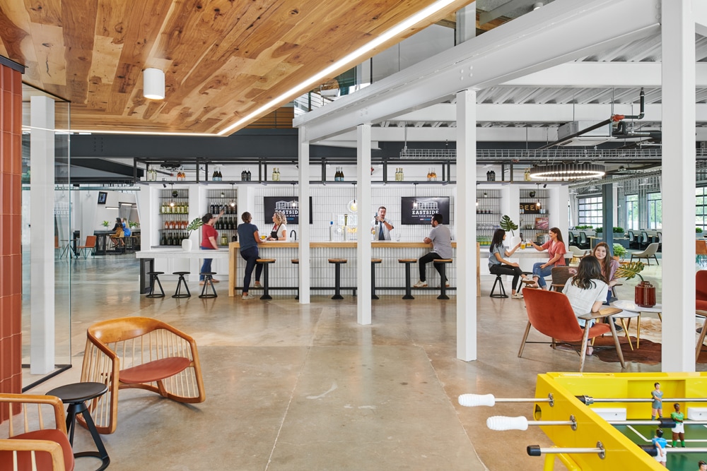
The second image above was also created for IA Interior Architects, was technically quite a challenge. As you can likely see from the image, this space is very dynamic. There’s a floating board room above to the right, a dropped wood ceiling above the gaming area where the camera is placed, double-height space in the far left and finally the low bar area that we are focused on. Similar to the last shot, we spent a lot of time staging, which meant moving the foosball table and pretty much every piece of furniture, accessory, bottled beverage and cup you can see.
After this, we go through the same process as above, just with several more flash shots to try and evenly light each of the areas as naturally as possible. Once that was complete, we set a game plan for where people would be best placed and focussed on each grouping independent of one another so we could ensure that their demeanour and expressions felt comfortable in the scene. Some we used flash for, others the natural light was sufficient. This was another project that we were very fortunate to have such an abundance of help with lots of options for models, helping hands during shot setup and providing great energy during the days of shooting. With significantly more post-processing time, this scene was able to come together really nicely and I think has a ton of personality and is very informative about the space.
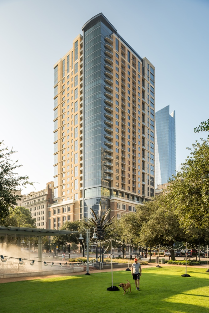
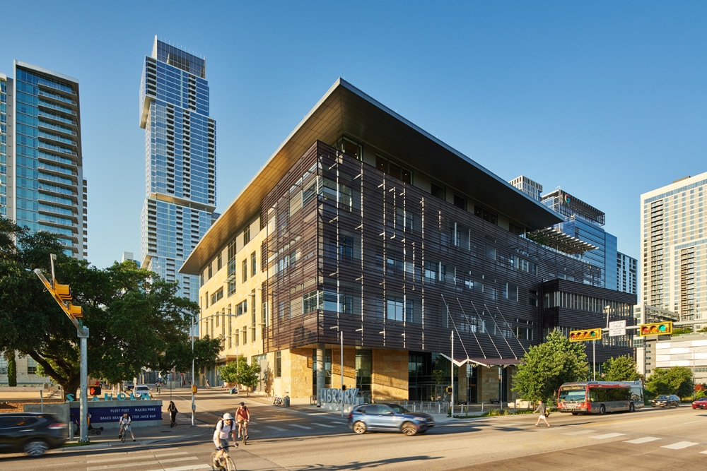
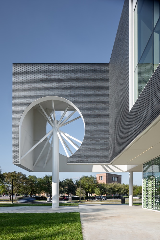
Talking about a clean and crisp look, I am assuming post-production plays a heavy role in your workflow. Do you have any tips you can share with our readers on how you perform your base corrections in Capture One before getting into Photoshop? Have you always used Capture One or were you a prior Lightroom user?
Post-production absolutely plays a big role in my workflow. Over time I’ve become very confident in my process and have a pretty logical way of working through shots on-site knowing how they’ll come together in the end. Earlier on I remember feeling self-conscious about the images I was creating on set not looking perfect in camera when sharing with my clients, but now I know they trust that the end result will come together nicely and can put that out of my mind.
I actually switched to Capture One fairly recently, maybe 2 years ago, after performing some tests between it and Lightroom where I exported unedited raw images from each into Photoshop to see how they process colour and other variables. I found that C1 had much more natural colouration and between that and the control within the program, decided to give it a go. I don’t tether to a computer while shooting, so that aspect of the program was not a factor in the move. Deciding to switch was definitely a challenge because I felt I was a pro at Lightroom and knew that a change in your main software can be a huge disruption in workflow. Aside from a few small frustrations, I have been very pleased with the move. My raw processing tends to be fairly minimal, adjusting mainly contrast, highlights/shadows, clarity/structure, sharpening/noise reduction on higher ISO shots and minimal colourwork. Most of those settings don’t vary too much, so once I found a recipe I liked, I use that as a starting point and adjust accordingly to taste.
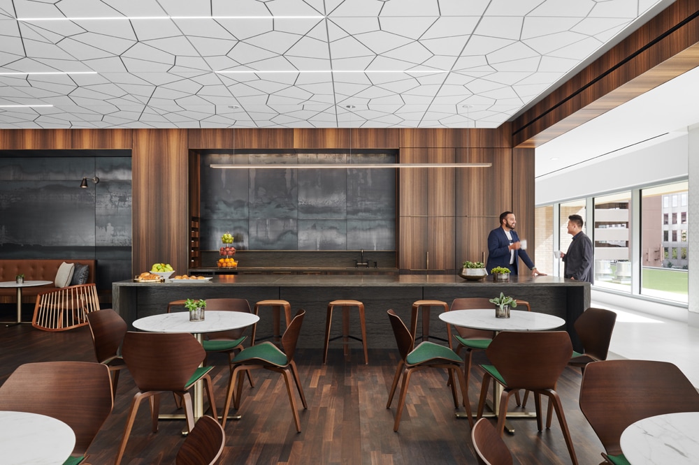
Though I don’t often do that much colourwork in C1, the things you’re able to do can make a huge impact. With selective colour adjustments and adjustment layers, you’re able to select a very specific range of colour to either adjust the hue of or add/subtract saturation. This along with the normalize white balance tools can help to quickly create a consistent look across any frames that will be combined in PS. Once those things are done, I export to TIF’s into Photoshop. This is one of my most frustrating gripes of the software – the fact that there’s not a more integrated way to export raw files into a layered TIF file. Instead, I export to a TIF subfolder and then have an action in PS to merge and align those files. I’ll later go into the TIF subfolder to delete those large extraneous files to at least pretend like I’m saving hard drive space.
For additional insights into Peter’s post-processing workflows, you can view one of his Instagram stories that run through a few examples.
Going back a few years ago you had one of your projects, Crossings, exhibited at Venice Biennale. Can you talk about how you came up with the narrative for your exhibition? Has this been a good talking point when meeting new clients (architects/interior designers)? Do you have any other personal projects you are working on currently?
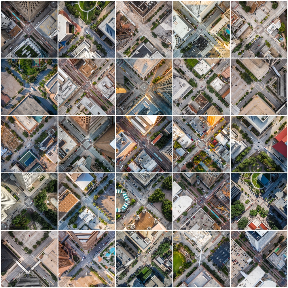
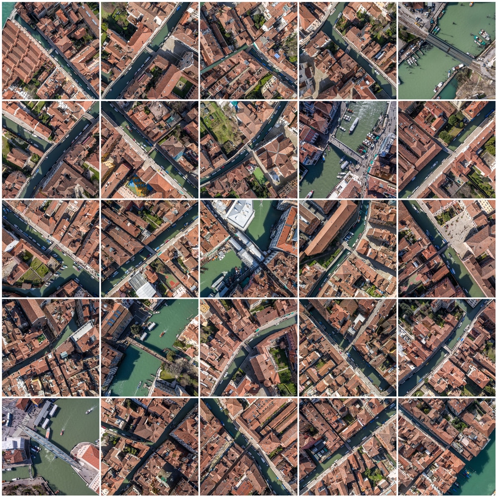
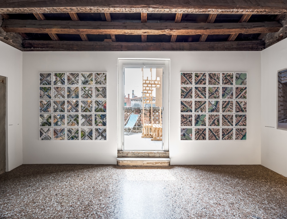
Crossings is a series that came about pretty naturally from my early interest in aerial photography and the development of drones. In 2013 I got my first drone and was thrilled at the prospect of being able get such a unique vantage point that I had only dreamt of before. I had been a fan of the work of Yann Arthus-Bertrand and Alex MacLean for quite a while leading up to this and really admired the compositions calling attention to natural patterns they were able to show from above. After a while of experimenting, I discovered a typology that I really liked where I shot intersections from directly above at a fixed height that I could later tile together at random to create a sort of quilted view of a city. Over time I had a pretty large collection of these images and had a fair amount of recognition on social media and locally. I was invited to exhibit the work at the Venice Architecture Biennale in 2016 and jumped at the chance. While planning what that might look like, a mentor of mine suggested I investigate similarities and contrasts between Houston and Venice from this perspective which led to creating a complimentary series where I showed the two side by side. Though instinctively the two could not seem further apart, after doing some research there are actually some interesting connections one can draw between the two.
Both were developed based on their natural waterways but at wildly differing scales. Houston from above shows a rigidly gridded metropolitan area built for vehicular traffic where Venice is much more human-scaled and has a far more organic layout. They both have a feeling of uniformity when seen from the same height. From above, Venice’s warm terracotta rooftops and complimentary building facades create a look of uniformity where in Houston, the order is created by a modern Cartesian grid. Placing the two side by side definitely proved to be a great conversation piece both with clients and in the arts community, of which I was pretty involved at the time. I participated in the FotoFest Meeting Place, a portfolio review for photographers at the FotoFest Biannual here in Houston and had some very encouraging conversations with the reviewers about my vision for where the project could go. I’ve had visions of documenting cities of all shapes and scales in the same format to show alongside one other – imagining a desert border town contrasted with an arctic town covered in snow, and so on. Of course, since 2016 the regulations around drones have made this quite difficult, but it’s always in the back of my mind as something I might pick up in the future.
Clients have always been very supportive and encouraging of my personal photography pursuits and this was certainly no different. As a creative community, I’ve found that the line between the practice of architecture/interior design and the arts is very blurred and love hearing about the personal endeavours of my friends and colleagues in the community as well and think it’s a great thing to be able to share.
Currently, my focus is primarily on my architectural work, but as someone who has always sought to reenergize myself in nature, shooting landscapes is an outlet that I really enjoy. I’ve got a growing collection of landscapes from West Texas to New Mexico to New Zealand that I really love and don’t plan on slowing down any time soon.
What has been your favourite architectural/interiors shoot to date? What were your favourite aspects or elements of the shoot?
That’s really tough! A project that comes to mind though was a shoot that we did last year for Lake Flato of the Museum of Fine Arts Houston Center for Conservation. Programmatically it’s a fairly simple project, but truly an honour to be invited to the space where the MFAH Conservators do their work repairing and conserving objects and works of art. Lake Flato designed an incredibly peaceful, light-filled space that is divided into several rooms based on the conservators’ specializations – painting, sculpture, decorative arts, paper, photography, science and imaging. One of the Center’s conservationists specializes in Rembrandt’s so when staging the space for images, they were able to place a Rembrandt (very carefully!) that was under restoration in our field view. A really unique opportunity.
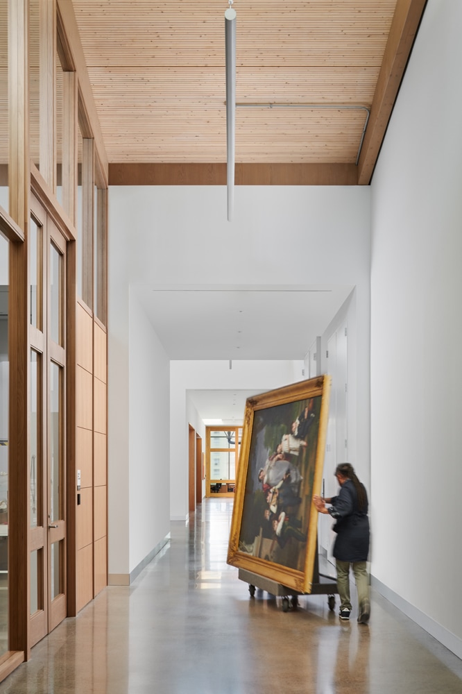
A couple of others that really have stood out are two high schools for the arts, the High School for the Performing and Visual Arts here in Houston by Gensler and the New Mexico School for the Arts in Santa Fe by Lake Flato and Studio Southwest. Art students are so eager and willing to participate and bring so much personality to space. From dance rooms to theatre support areas, the schools offer a ton of fun and unique spaces to focus on.
I’ve also had the unique pleasure of shooting a couple of projects that I was very involved with the production and project management of while on the architecture side of things for Dillon Kyle Architects, so those projects will always be very meaningful to me.
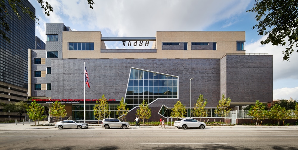
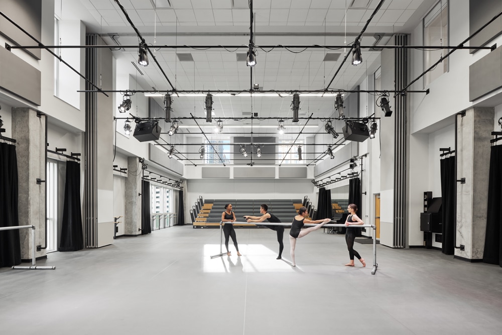
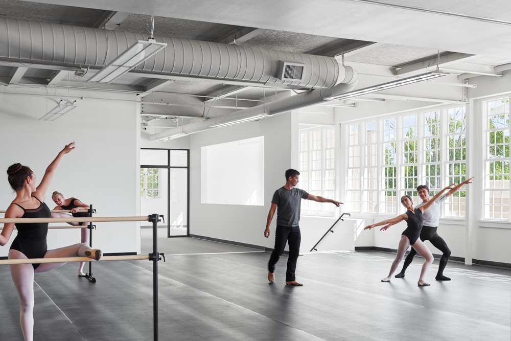
Lastly, what would be your dream project to photograph and which architect in the world you would like to work with and why?
For a long time, I’ve been fascinated by some of the large scale work that WOHA has been designing in Singapore. They create these buildings with lush, living facades that I’m just personally fascinated by and would love to geek out over with my camera. I’m also equally fascinated by the work of LBR&A Arquitectos in Mexico City and while I’ve taken a few pictures while travelling of their work, would love an opportunity to work with them and have a more intimate view of the projects. Generally, I’ve got an interest in photographing architecturally interesting cultural and civic projects in addition to the type of work I’m currently shooting. I love the contrast of the very technical aspects of shooting something like workplace interiors with that of a cultural piece of architecture where you are documenting life as it occurs naturally in and around the space.
Thank you, Peter, for taking the time to share insight into your work and processes. You can see more of his work on his website and feel free to follow him on Instagram.
