On Film-Making and Soundtracks for Architecture with Multi-Disciplinary Artist Nikolas Strugar
I had come across Nikolas Strugar by way of Andy Macpherson talking about Nikolas on his BAAM podcast when discussing architectural filmmaking. Nikolas is based in Brisbane (Australia) and looking at his LinkedIn page, and I was intrigued by how varied his career was and the diversity of skills he has picked up along the way, especially how he manages to fuse his various skills on projects.
Hi Nikolas, Thanks for taking the time for this interview. You have quite the background! Can you talk about your venture into architecture, then into graphics & communication, and now a filmmaker — along the way picking up new skills such as web design, music production and film making?
Hey Veeral, no problem and thanks for the chance to chat. My career started in architecture. I completed my Masters at the University of Queensland and worked for a number of years in small practices in Brisbane. Throughout that period I developed an interest in photography and graphic design, and that influenced my work and how I thought about architectural drawing and communication.
In 2011 amidst travelling I started Ravens At Odds, and began working as a freelance graphic designer, still maintaining a connection with an architectural practice.
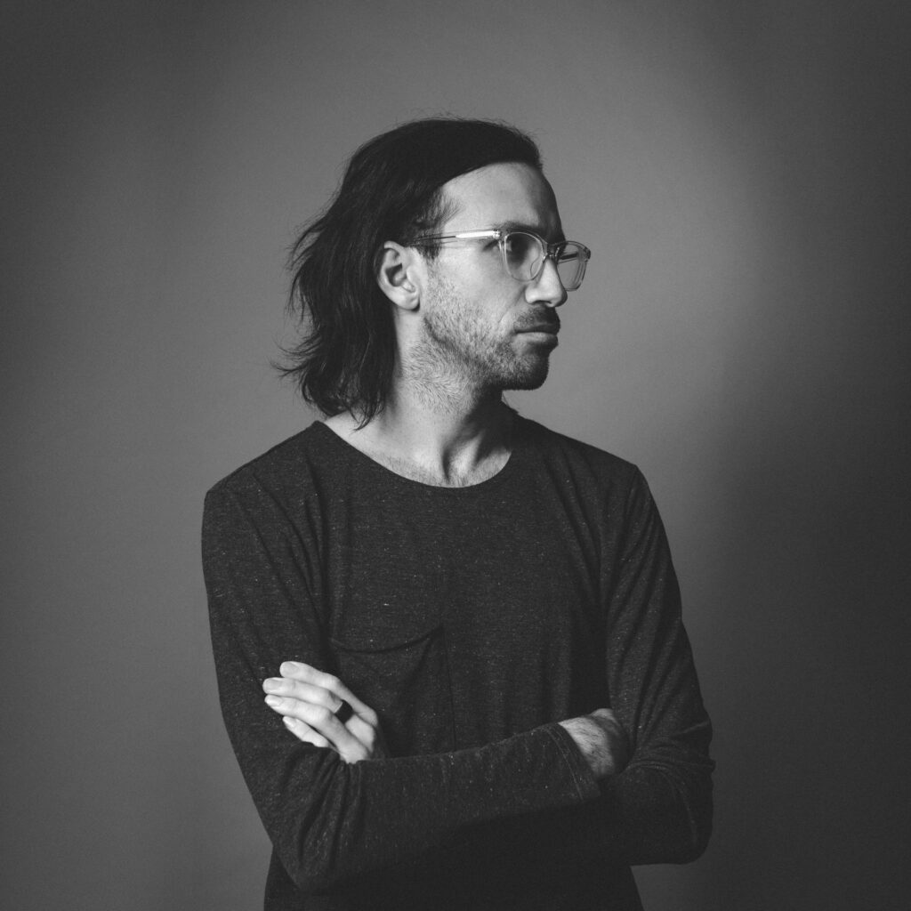
But throughout my career, I’ve been obsessed with music. I’ve played in bands, and I write and produce frequently. In 2013 I released an independent album under the guise Crow Do Not Loiter Here (everything I do is named after birds). This pursuit eventually led me back to university to study Audio Production at SAE Institute.
At the end of 2013, I moved to Slovenia for a year. It was during this period that I embraced a multidisciplinary approach, combining skills and interests, and developing new ones along the way. I worked in live sound, as a recording and mix engineer, continued to pursue graphics and branding, and ventured into web design.
After returning to Brisbane, I found a role in a company as a video content producer. I’d never actually produced a film professionally at that point, but my boss had a listen to my album and figured I’d be up to the task. That role then evolved to include aspects of digital marketing and managing their website.
So over time, I taught myself front end code, learned how to develop on WordPress, and eventually took on more web design work. I find coding strangely satisfying; fulfilling both the technical and creative aspects of my personality.
I returned to architectural practice about five years ago, working with BVN and other small practices as a specialist contractor in graphics, communications, and film production.
But it wasn’t until I moved back to Europe in 2017, this time-based in Dublin, Ireland for two years, that I began pursuing film production more seriously.
What was about filmmaking that you got interested in pursuing it as an art form?
Ultimately I think it was my love of music that sparked my interest in film.
I wrote my master’s thesis on the relationship between sound and architecture, which looked at the long history of architecture and film. It comprised a series of audio-visual investigations that explored the role of sound in cinema, which served as a proxy for how we might begin to think about the impact of sound in spatial experience.
It also looked at the work of French film critic Michel Chion. In particular, the shift in thinking towards cinema like an experience with the introduction of sound in film; that is, cinema as an experience that has a direct impact on the sensory system. These ideas had a profound influence on what I was doing as a musician. I write mostly instrumental music, so it got me thinking about the spatial dimensions of the sound I was creating, as well as how music could be affective rather than merely something enjoyable to listen to.
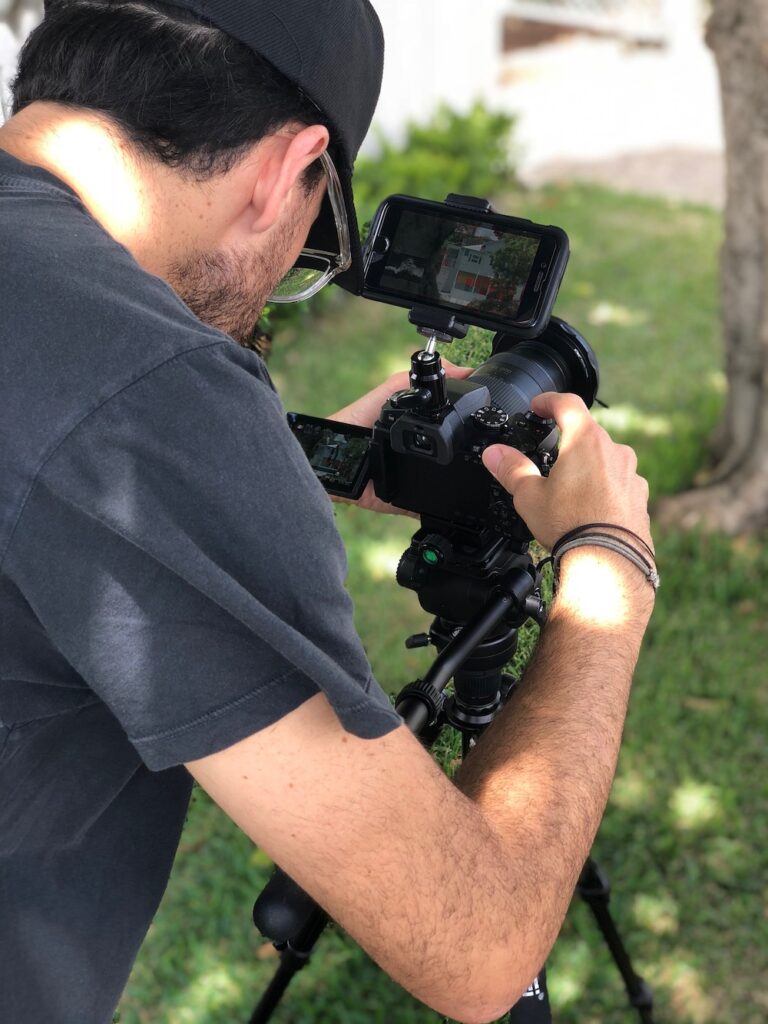
Around the time I was writing my album, I was also experimenting with short films, putting imagery against music and seeing the impact that had got me more and more interested in film as an art form. But the programmatic nature of music and film, its ability to tell stories also piqued my interest. Not necessarily stories with plots, characters or dialogue, but stories conveyed through the inherent nature of sound and visuals, sequencing and montage.
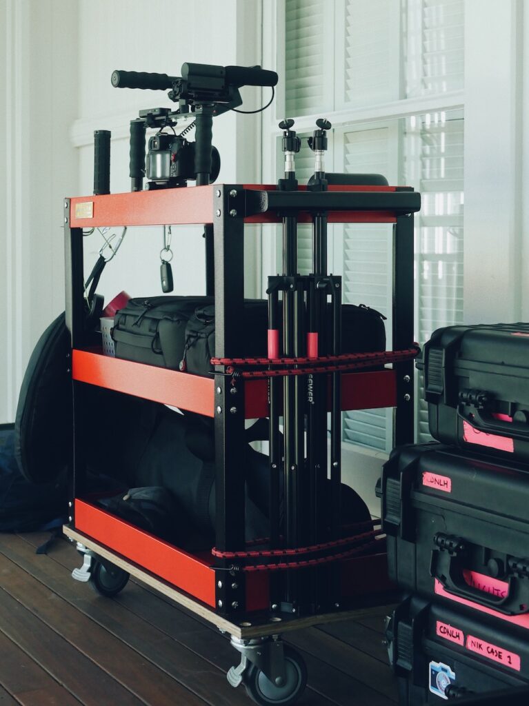
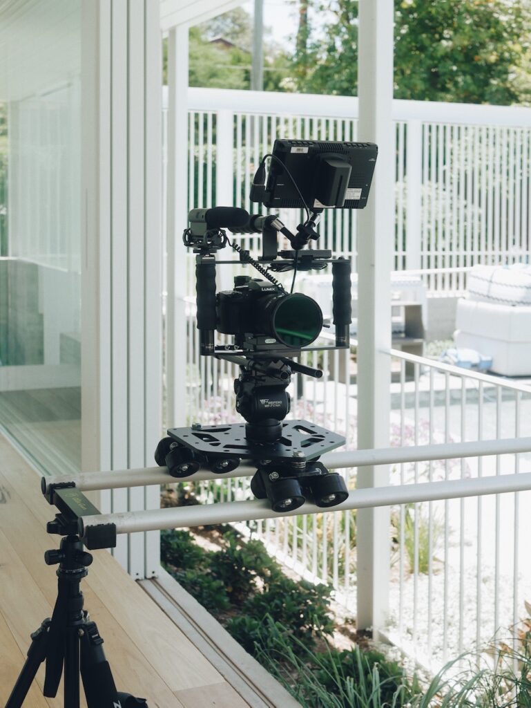
And of course, cameras. I love tinkering with gear and building camera rigs and complex recording setups. I find the mental and physical act of shooting a fulfilling process too. Again it’s that synthesis of a technical and creative craft.
Last year you had done a short architectural film on a project, Stack Street, by Lineburg Wang. Can you walk us through how you approached making this video?
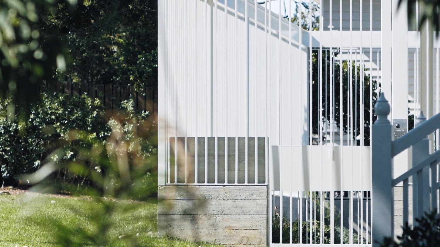
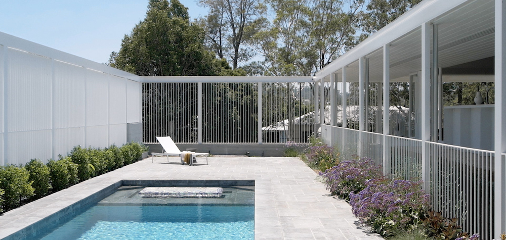
In a way, Stack Street was the perfect amalgam of architectural and cinematic experience, albeit on a small residential scale. The project is an addition to a cottage in Brisbane’s north. Essentially, two corridors on two levels, flanked by a series of bedrooms downstairs and the main bedroom and ensuite upstairs. Each affords glimpses to the yard and the surrounds through a highly orchestrated screen that wraps the new build.
Conceptually, the cinematic sequence—a series of dolly and truck shots—echoes the architectural experience of moving through the linear space. The cut jumps between the upper and lower levels as it works its way along the corridors before returning via the exterior by the screen.
As for managing expectations and the outcome, Michael Lineburg, Lynn Wang, and I studied architecture together. So I was well aware of their architectural and aesthetic sensibilities and them of mine. Once we discussed what they wanted to achieve with the project, they entrusted my vision for the film, and it was a reasonably smooth process.
From the film, there are a lot of different vantage points you had featured. How did you plan your shot list and the detail you went into?
The idea of cutting between the linear journeys of the upper and lower floors was established at the outset, so I had a good idea of how the edit was going to come together. All technical aspects like lens choice, shot type, depth of field, time of day, sunlight, and shadows are taken into consideration and each scene is planned out before the shoot. B-roll I typically film handheld because I love the way natural camera movement pulls the viewer into the frame. And it’s nice to be a little more spontaneous with these shots so they were shot in a more ad hoc fashion amongst the main scenes.
Toby Scott was photographing the project, so I shot the film over two days so that I had a full day with the house to myself. Otherwise, I’d normally shoot a house or smaller projects in a single day.
You recently released a trailer for Lineburg Wang’s Park Road House project, what were some of the lessons learned from Stack Street that you applied in this project, and how did you approach this differently?
Like Stack Street, Park Road was filmed over two days, and Christopher Frederick Jones was photographing on the first day. Park Road is a much larger project than Stack Street, so it was crucial to keep to a schedule.
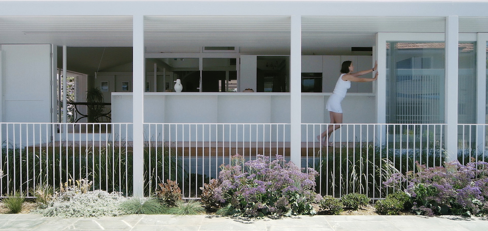
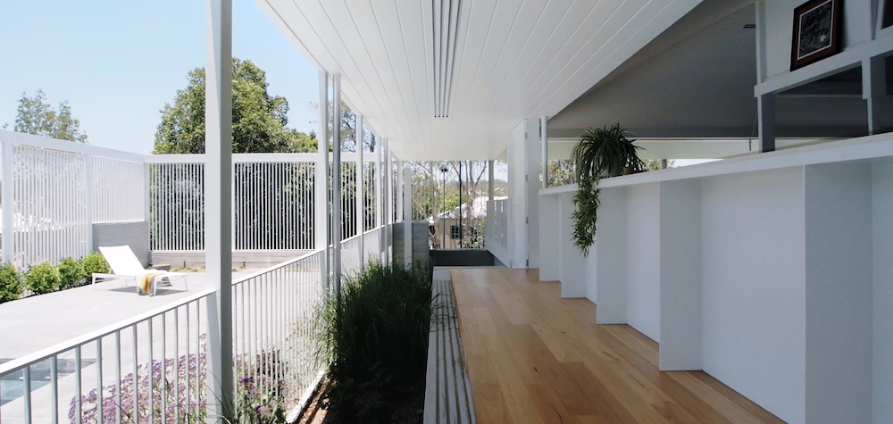
For this film, we decided to intertwine two journeys through the house, one via the formal entry and pool, the other through the informal entrance via the back garden and planters. I planned every shot using a spreadsheet so that I was able to sort and group scenes based on gear and lens choices, the time of day, and which part of the house Christopher would be shooting, to minimise changeover time, maintain visual continuity and avoid conflicts. So everything was shot entirely out of sequence, much like a feature film. For the edit, each scene was clearly labelled and separated into bins, which made establishing a rough cut very expedient.
Every time I do a shoot, I learn something new. Whether it’s my art films or a commercial project, quite often, I come away with one or two obvious ideas about how I might approach things next time. Sometimes they’re technical aspects like camera settings or lighting, other times more creative.
Planning every shot in incredible detail was one, but that was out of necessity more than anything else due to the size and time constraints for Park Road.
Following Stack Street, I was thinking about a concept relating focal length and aperture, as both a technical and compositional consideration.
At the level of the individual scene, wide shots—either static or utilising subtle dolly motion—would have very deep depth of field, where everything is in focus, providing an objective overview of the scene. Whereas tight shots would employ a shallow depth of field, and shot handheld with natural camera movement, to pull the viewer in and create a more intimate scene.
This, in itself, is not a groundbreaking idea. It’s in part working with the inherent characteristics of lens optics; wider lenses produce a deeper depth of field compared to longer lenses. And these ideas also have a more ideological place in film theory, the concept of deep focus editing versus the Soviet cinema style of montage, how the spectator creates meaning differently in each, etc.
But there was a creative concept at play here too. It was about establishing a visual language and creating contrast between the two types of shots in the edit.
This contrast extended to lens choice. Wides were shot on modern glass, either a Lumix 12-35mm f2.8 or a Sigma 10-20mm f3.5 (stopped down to around f8 or lower). Handheld tight shots were shot on a set of vintage Zuiko primes, which have beautiful contrast and detail but are much softer and less refined than modern lenses, exhibiting some beautiful halation and aberration, particularly when wide open.
There are several different cinematic techniques to film an architectural or interiors project, what techniques would you recommend and which ones to avoid to create a compelling narrative?
I recently came across Roger Deakins quoting Freddie Francis, “There’s good cinematography and bad cinematography and then there’s the cinematography that’s right for the film.”
Whether I’m shooting architecture, an event or a promo film, the type of technique, whether it’s the gear I’m using or the style of shot, should align with the subject matter and the message or feeling you’re trying to convey.
Lately, I see a lot of stuff shot on gimbals, where the movement is hyper mechanical, unnaturally fluid, and lacking personality and nuance. Sometimes every single scene in production will be shot this way, mimicking slider and dolly movements for no particular reason, unrelated to the subject or narrative, and offering very little contrast and dynamic.
I often say (facetiously) that I don’t use gimbals. Granted, gimbals are very useful if you’re hanging out the back of a car doing a high-speed chase. They’re also helpful for longer tracking shots where laying down dolly tracks would be too time-consuming or impractical.
But my gripe is that they’re overused. I think this is in part because there’s a misconception that you’re more professional if you’re filming on a gimbal. There’s also a misconception, particularly among beginner filmmakers, that anything other than super-smooth camera motion is undesirable, but that’s simply not true. Next time you’re watching a film, really pay attention to the camera technique, and you’ll notice how often handheld techniques are used, where natural camera movement and ‘shake’ is part of the storytelling language.
I pretty much avoid all kinds of fancy transitions when cutting scenes in an edit. Things like zoom and rotate-transitions, pan/whips and time-ramps have been popularised in recent years by YouTube producers and have made their way into films for specific industries. I think if your cinematography is good enough, you don’t need to rely on fancy cut techniques. A normal cut will suffice most of the time, or else a simple dissolve or fade to black.
And I always say never underestimate an excellent locked-off shot on a tripod. Static, motionless, just allowing the scene to unfold.
Specifically, for architecture or interiors, I draw upon an aesthetic that relates to the project. This generally involves precise composition, considered colour, slowness, and subtlety. A sequence of scenes that echo the project’s spatial experience.
And an appropriate soundtrack.
How space sounds like is an essential attribute of architecture, what are your thoughts on sound design for architectural films in contrast to overlaying a music track?
In an architecture film, as in cinema, both diegetic and non-diegetic, onscreen and offscreen sounds are important. For smaller films, I tend to rely more on a music soundtrack and incidental sound from the scene. Sound design and foley can have a huge impact though. It’s said that sound renders the scene, making up for the senses that are not easily represented in film; smell, taste, touch. Though I think it’s important not to overuse sound design elements as the film can quickly become gimmicky.
What has been your experience with architects embracing video as a means to showcase their projects, considering it is a new medium for many architects?
Most architects I’ve spoken with are interested in it. It’s certainly not as widely accepted as architectural photography. It’s not something that will replace photography, rather work with it. The two media allow you to tell the story in different ways, or focus on different aspects.
Video content is becoming more prolific in other industries, and we’ll inevitably see an increase in its use within architectural media. I do hope that film eventually forms part of the Institute awards and that magazines and blogs welcome it as part of their digital strategies.
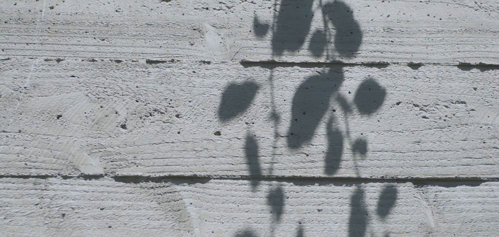
One thing’s for sure, film is the perfect medium to describe some of the more temporal aspects of architecture; the changing quality of light, the play of shadows on materials, the way you move through space. You can attend a little more to the incidental areas, and subtle moments a project has to offer, cutting them with the grand gestures. This is what makes filming architecture exciting.
You recently released a trailer about Claypave, a brick and paver manufacturer in Queensland. Can you tell us what led to this and when will we see longer format documentary about it?
Sadly, Claypave is shutting down. I was recently invited to see the site before it closed and decided to document it. The production facility at Ipswich has been out of action for some time now. It’s barren, a little desolate—a sobering reminder of what was once a Queensland institution. I reckon just about every home in Brisbane has a patio made from Claypave pavers.
I have a fascination with empty and disused industrial spaces. It’s an ongoing theme in my own photographic and film work. I think it’s something to do with the way they tie into the human story of progress and consumption. But it’s not like I’m trying to make a socio/political documentary out of it. I love the aesthetic of Claypave, and I wanted to capture the place and a bit of its story before it’s gone forever.
As for when? It’s a personal project which means I’ll labour over it, so I don’t know when it will be released. Stay tuned…
You can see more of Nikolas‘ work on his website and follow him on Instagram as well as check out his Vimeo account.
