Why Every Architectural Photographer Needs a ColorChecker Passport
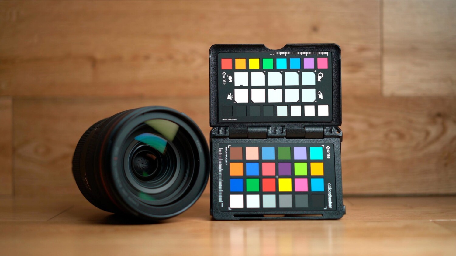
One of the things that I’ve struggled with as an architectural photographer is managing color. This is especially true when shooting interiors because most interiors tend to have a wide range of different colors and shades. For a long time, I’ve been using the ColorChecker Passport and recently X-Rite released their new version 2; so I decided to cover this subject again.
In the video linked above I discuss why you should use the ColorChecker Passport. I also briefly demonstrate how to use it in Lightroom and compare results. The examples in the video aren’t specifically related to architectural photography however the points remain relevant. Camera sensors have limitations when it comes reproducing accurate color. Essentially there are no cameras currently on the market that are going to be absolutely perfect in this regard. Cameras like the Phase One Trichromatic and The Sigma Quattro come close, however, one of these is an ill-informed “investment” and the other one is far too niche. I’m assuming most of the photographers reading this article will be using a full frame camera with a bayer sensor. These types of sensors are brilliant, however, the issue is that most of the colors that bayer sensors produce are interpolated, or in layman terms, they’re an educated guess.
For the most part, this is completely fine and modern cameras do perform quite well, although issues will inevitably arise. For example, colors like red and yellow are actually pretty difficult for modern cameras to produce properly and accurately. Red as a color is also very vibrant and eye-catching and getting it wrong will show up very clearly. In the video, above I demonstrate how the red dress that the model was wearing appears very orange and correcting white balance wasn’t a way to fix this. Creating a profile in Lightroom fixed this issue and the whole process is fairly painless. If you’re shooting interiors having your reds appear as orange may not be something your client is going to be happy with. If you’ve ever worked for an interior designer that’s difficult to please, I’m sure you’ll attest to the fact that colors are going to be extremely important to them.
If the color checker passport is far too fiddly for you and you don’t mind spending that little extra for something better, I highly recommend the X-Rite Digital ColorChecker SG. With this color reference tool, there is a required amount of initial effort, however once completed, it’s a lot easier when it comes to your workflow. Personally, I use this tool in Capture One with Lumariver only. The reason for this is because the results I can produce there are always far better than what I can produce in both the X-rite software and Lightroom.
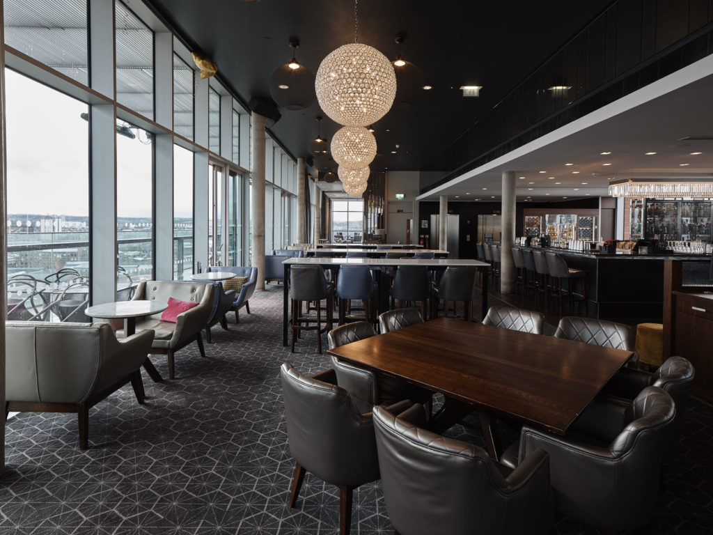
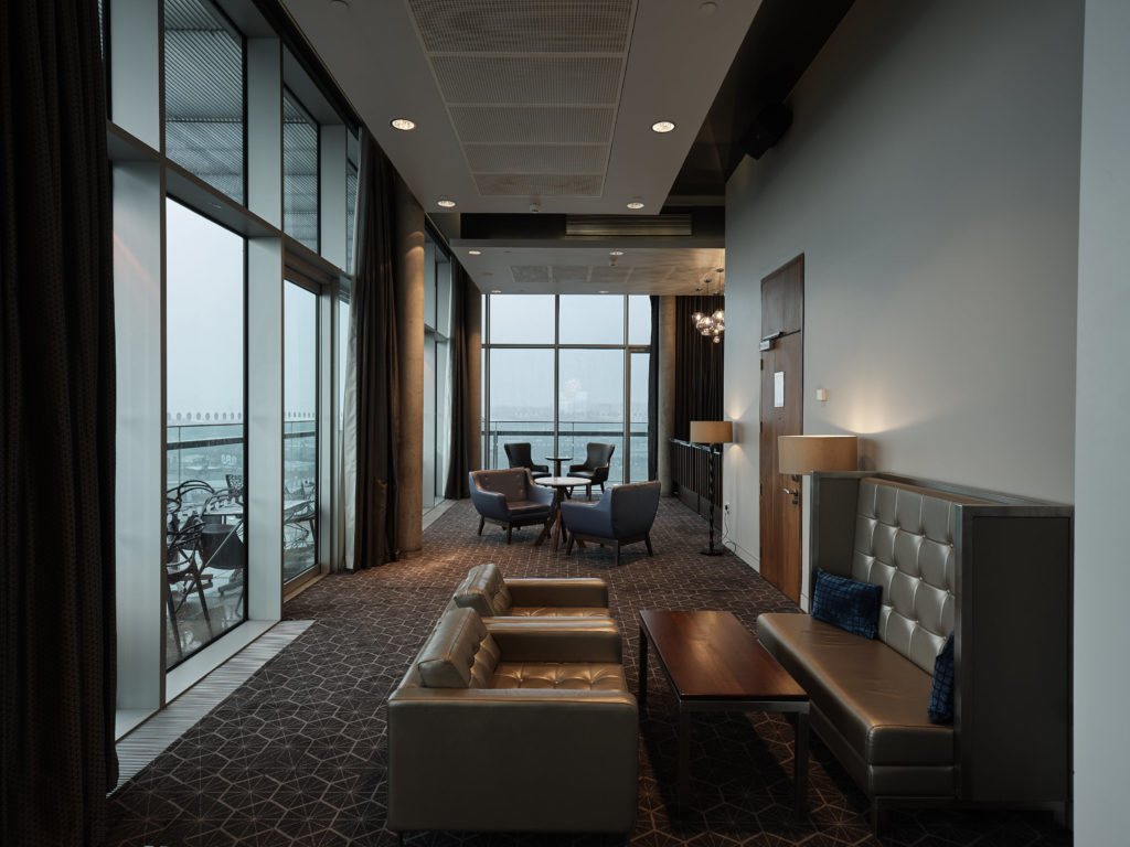
The two images below were both shot with the Fujifilm GFX 50S and the Canon TS-E 24mm lens. The GFX is actually pretty good when it comes to color in most instances, however looking at the comparison below, you may notice why the ColorChecker profile is better than the Fuji built in one.

First thing you may notice is the amount of contrast that in the standard profile image. Some of you may like this but it doesn’t really work for this image. The highlights are far too harsh and certain areas are a tiny bit blown out. Also, I prefer to control the 0amount of contrast there is in an image myself. The color of the nearest square table is also a little off in that it’s leaning a little too much into the reds which isn’t as accurate. The pillow on the chair is leaning a little too much into pink and the orange lights look a little too yellow. All of these differences were simply due to the profile I created using the ColorChecker SG.

The differences in the second comparison above may be more apparent. Once again the closest table is leaning too much into the reds and the blue tones in the sky are very faded and difficult to see. The teal stained section of the windows is also more obvious in color in the ColorChecker image. The Fuji profiled image is quite muted and lacking in tones and vibrancy. The highlights are much harsher in the standard profile image and once again all of these differences are only due to the color profiles used for each image.
The difference and improvement you can see in your images just by using a color reference tool like the ColorChecker Passport and the digital SG, is immense. A lot of times when we photographers tend to talk about gear we focus on things like megapixels and dynamic range. Personally, I think color is far more of an important factor when it comes to photography than having an extra stop of dynamic range. This is because color is one of the fundamentals of photography. These reference tools are relatively inexpensive and the impact they can have on your photography is well worth the cost. For that reason, I highly recommend them and I believe that every professional architectural photographer should have and use one.