The Story of an Image – GMP’s Bund SOHO
This edition of Story of an Image is not necessarily a showcase of how you should go about creating a beautiful image, but rather an exercise in being resourceful if you ever find yourself unprepared and without the proper tools. This is the story of a somewhat random outing in Shanghai which led to the creation of one of my favorite images I have ever taken.
The backstory is that I was in the market for more of a medium/long range focal length lens, and a good friend of mine had generously lent me his Sony FE 85mm F1.8 prime lens. I decided to head out one Spring afternoon to test it out. With no predetermined itinerary of where I wanted to go, I hopped on my bike to explore the city I had called home for many years. Photography, when done on your own terms, really does have this wonderful ability to lead to new discoveries and open up hidden parts of your city that may otherwise go unexplored.
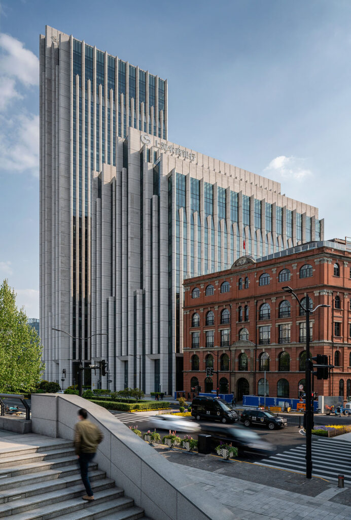
The Building
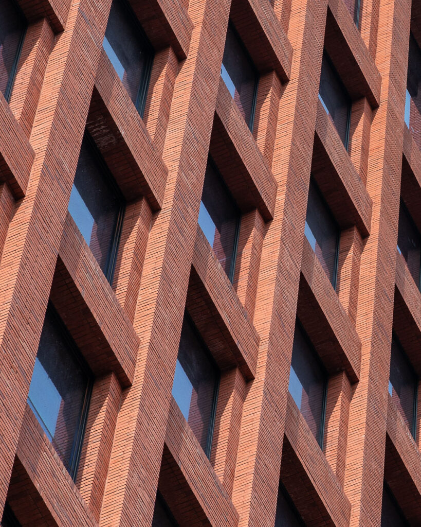
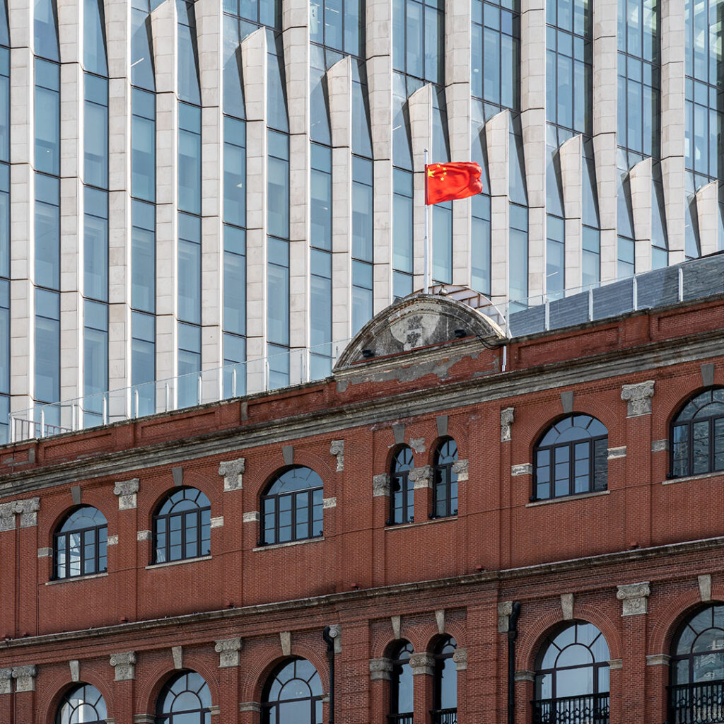
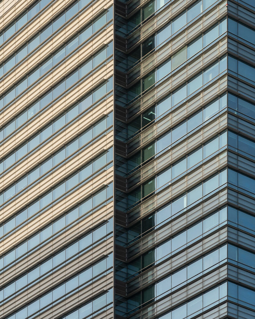
Hailed as the only ground-up building project on Bund in the past 60 years, Bund SOHO anchors the southern end of Shanghai’s historic riverfront promenade. Designed by German firm von Gerkan, Marg and Partners Architects (GMP), the development consists of six buildings in total. The four high-rise office buildings ranging between 60 and 135 meters in height form a distinct edge to the development towards the south and help ease the transition between the colonial-era buildings, whose style range from Neo-Gothic to Art Deco.
The Shot
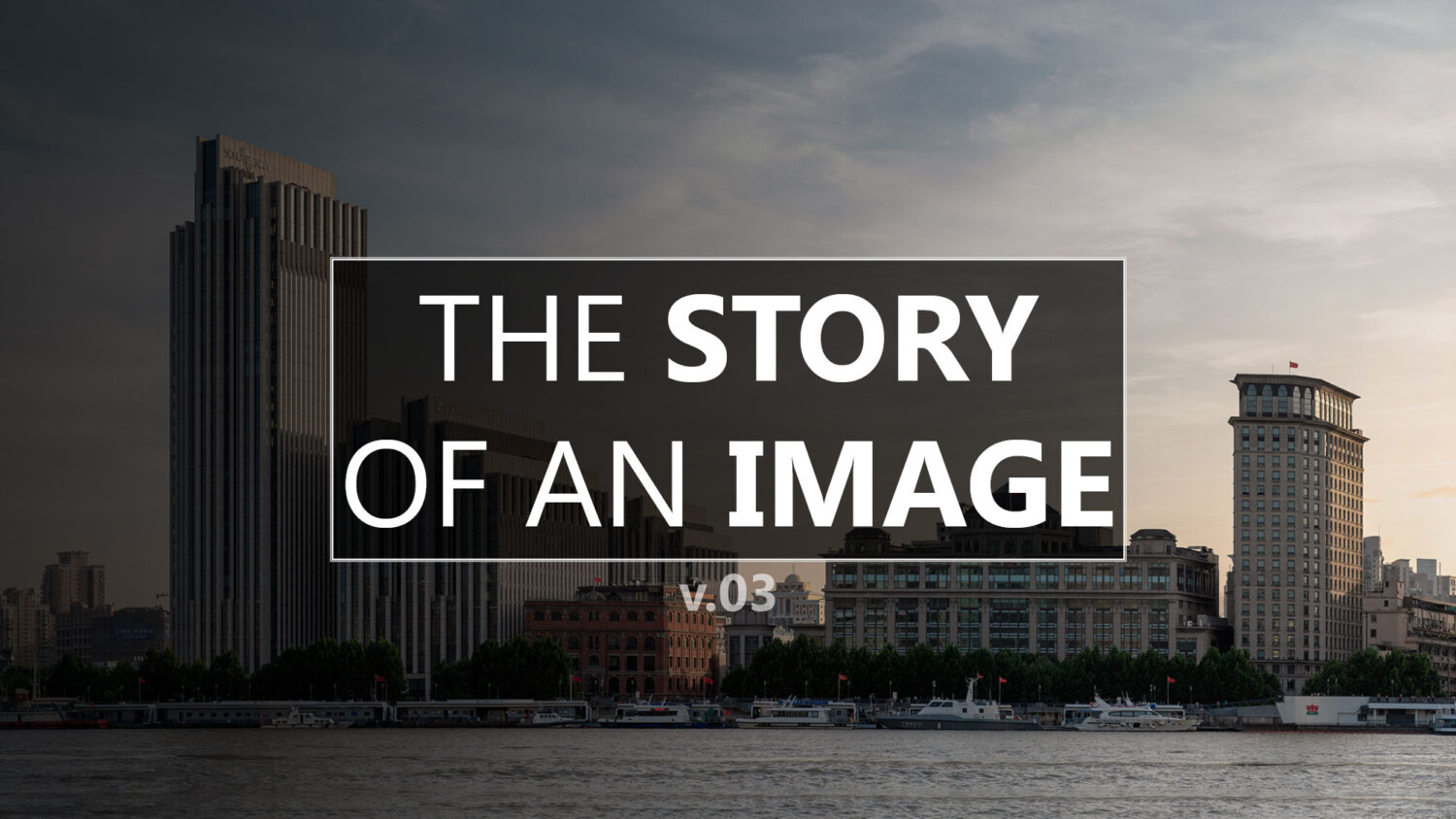
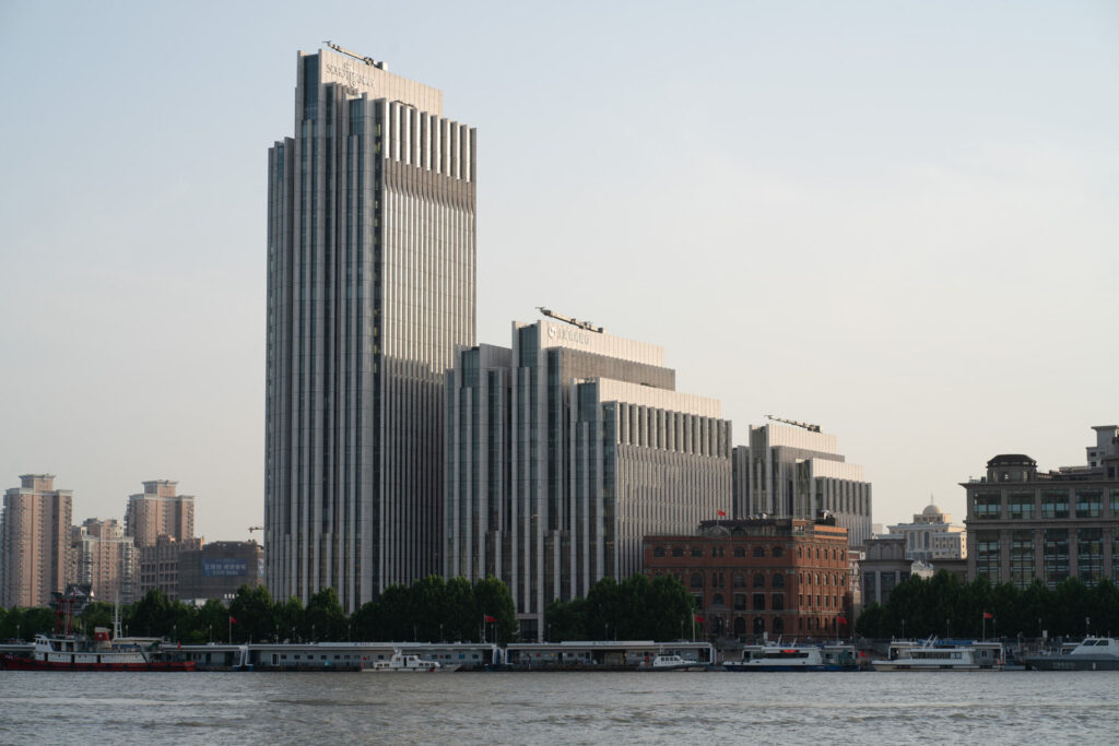
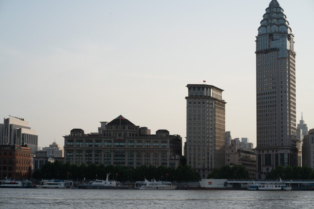
After meandering through several different neighborhoods on the western side of the Huangpu River, I ended up hopping on a ferry to the opposite side where you can get a fantastic vantage point of the more historic parts of the city. I made my way to the river’s edge as the late afternoon sun began to set beyond Bund SOHO and its nearby colonial neighbors. I immediately zoned in on a composition I felt would best illustrate how the building anchors the Bund to the south while showcasing it as a modern addition that sits comfortably within a historic context.
The only problem…I couldn’t fit the composition I wanted into the frame using the 85mm lens – the only one I had on me at the time. Without a tripod, I ended up sitting the camera on the top of the balustrade that lines the edge of the riverfront promenade, taking two shots that I would eventually stitch together in post when I got back home.
The Lightroom Edit
Alright, let’s fire up Lightroom and see what we can do. First things first, after importing our RAW files, we need to combine the two separate images into one by using the Photo Merge / Panorama function. After doing so, we’re left with a deliciously detailed, 11,000+ pixel-wide stitched image.
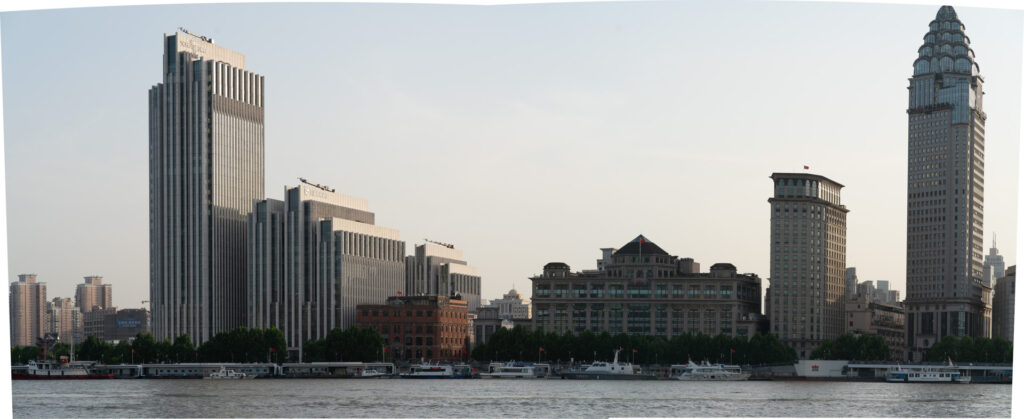
Right away, I noticed I didn’t really like the composition with tall towers bookending both edges of the frame (which is a good thing since I chopped off the top of its spire anyway – whoops). Since Bund SOHO was our main subject and we wanted to show how it anchors the riverfront streetscape, we cropped in on the right side of the image, helping to create a much more pleasing composition whereby our subject is by far the tallest building in the frame giving it a heightened sense of importance. We then make a few basic adjustments to the exposure and white balance before heading into Photoshop.
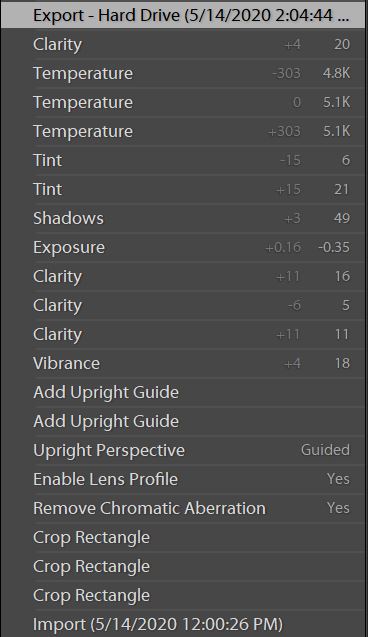
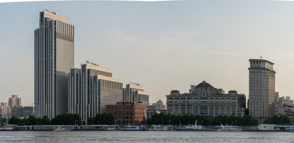
The Photoshop Edit
Once in Photoshop, the adjustments are fairly minimal. First, I wanted to add a bit more space both above and below the buildings to let them breathe in the frame a bit. The Crop + Content-aware combo served me well here, with minimal cleanup required. I photograph a lot of high-rise buildings and have become a bit OCD when it comes to the building maintenance units atop the towers – so I clone those out so that the skyline is kept pure.
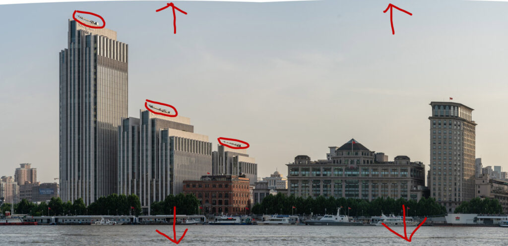
Finally, even though I think the sky suits the image quite well, I wanted to explore adding just a bit more cloud texture into the sky to balance out the texture we see in the foreground water. Since there was already a good amount of contrast in the image between the buildings and the existing sky, it was quick to make a channel mask to isolate the sky.
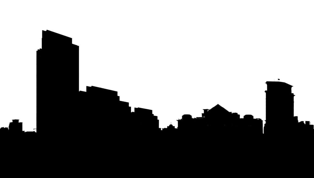
I tested out a handful of sky options before settling on one I felt served the image well. You be the judge…
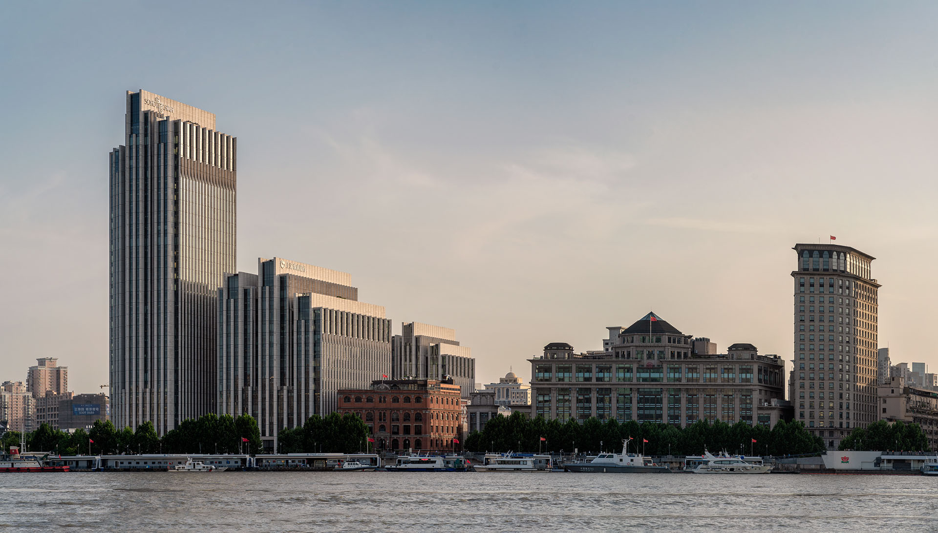
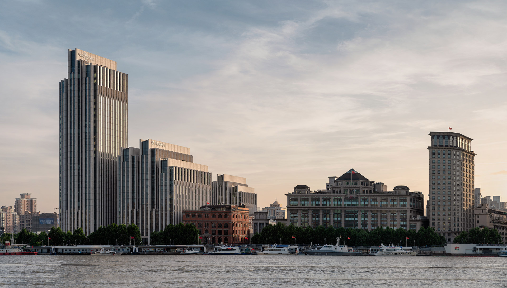
And that was that – here is the final image:

There’s something about the way the image captures the majesty of Shanghai’s historic riverfront that I love. Postcards of Shanghai will more often than not showcase the opposite view – that of the glitzy new CBD and its iconic skyscrapers. I’ve always preferred vantage points back towards its more historic side, and was happy to find one that allowed me to create an image I’m satisfied with.
