Studying Light & Mood with Luis Gallardo at Casa H
On this episode of Project of the Week, we delve into an exploration of how light changes over the course of a day, and its effects on the mood of architectural photographs. Photographer Luis Gallardo of LGM Studio is showing us how it’s done through his photos of Casa H by Weber Arquitectos. Let’s get studying!
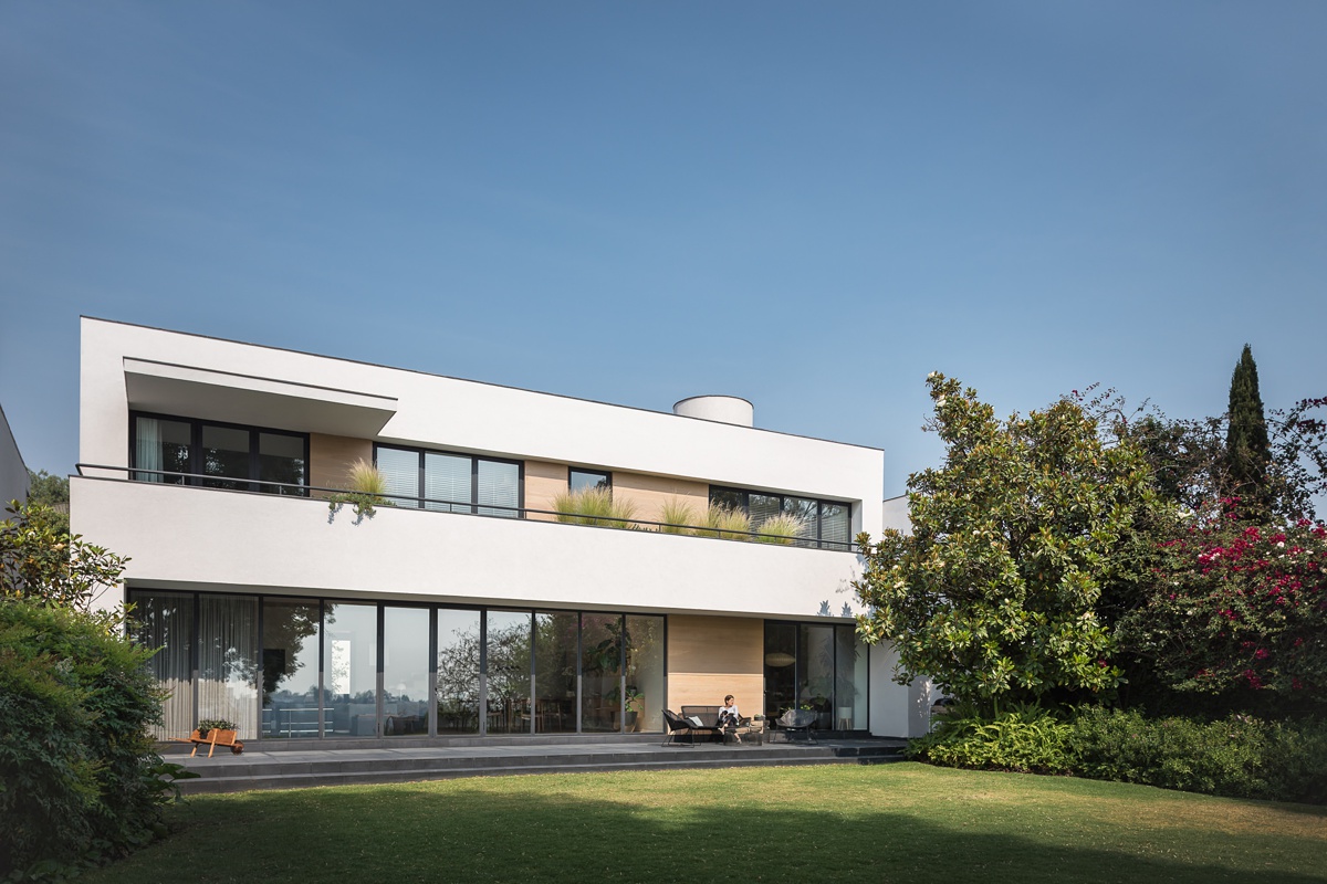
Luis sets the stage for us outside of Casa H where it looks to be about mid-afternoon. Notice the hard, rigid shadows jutting down from the slight overhangs on the facade. These shadows give a nice dimensional quality to the image and accentuate the rectilinear massing of the home. I’m a sucker for little fun details, and my eye is drawn right on over to the figure sitting out on the patio furniture. I love the slice of light she is sitting in, as well as how she serves as a marker for scale in this scene.
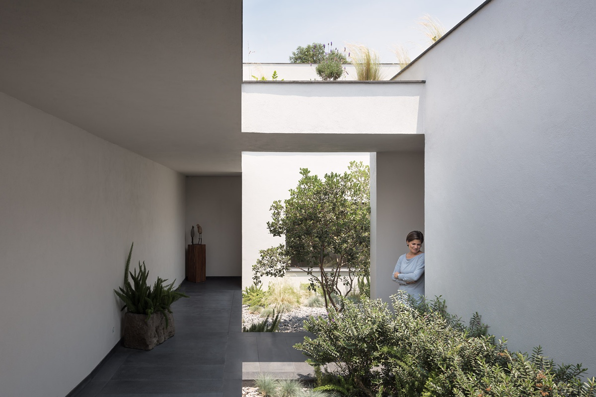
My favorite thing about Luis’ work is his use of lighting to give mood and depth to each image, and in turn, each project. Here, he uses a funky but beautiful mix of hard and soft light that creates an interesting (almost optical illusion-esque) feel. Apart from the quality of the light here, there’s also an interesting disparity between the exposure of each side of the image. All in all, it’s a really fun picture to look at, and it shows off the quirky modern design of Casa H.
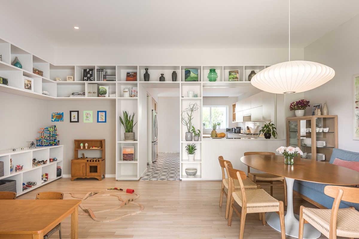
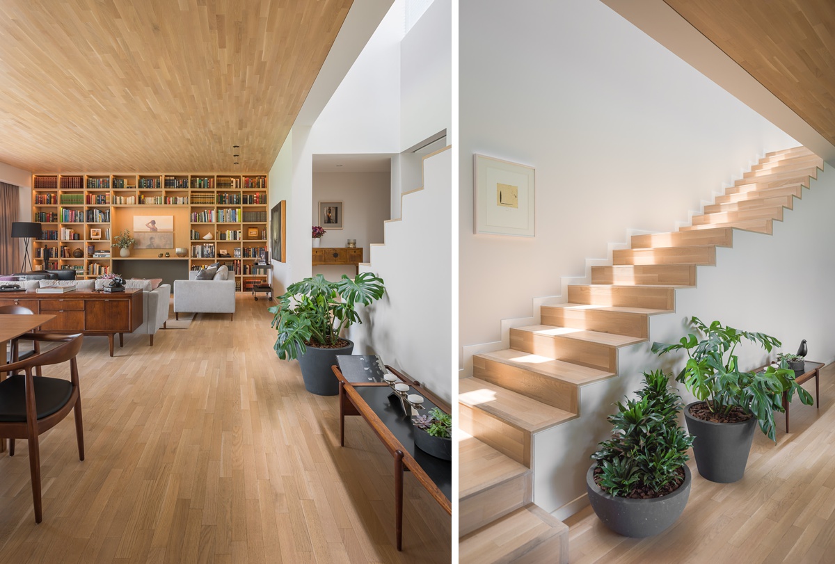
Inside Casa H, we start our tour with a clean evenly lit scene. It feels light and bright and happy. The styling of this scene is on point, with each of the built-ins perfectly appointed and tidy. This gives Casa H a “lived-in” look that showcases its functional design but doesn’t overwhelm or distract us.
As we move throughout the house, the quality of light begins to change. Luis pulls out the texture in the wood ceiling with a nice raking sidelight. As our eyes scan the scene, we notice the shadows beneath the furniture and in the doorways that create depth in the image. I love this photograph of the stairs. That highlight running down the middle is the creme-de-la-creme of visual interest. Notice how it amplifies the repetition and the movement that we find here. This is an awesome detail that turns a picture of some steps into a truly beautiful photograph that captures the nature of the space.
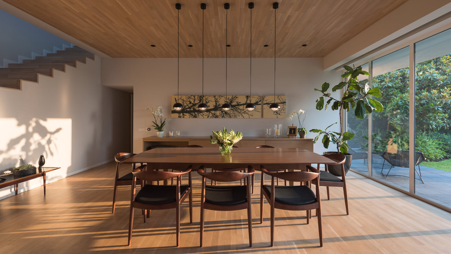
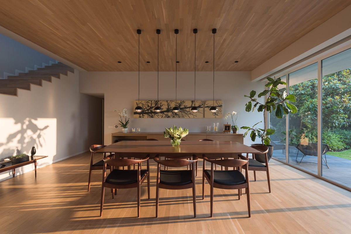
Here’s the show-stopper folks! The list of things going right here is infinite. Let’s start with the obvious though; that dappled light. In conjunction with the long shadows being thrown by the furniture, the dappled light on the wall gives us an immediate sense of the time of day this photograph was made. It teleports us into the room and produces a familiar — almost tangible — quality. It’s hard not to feel like you’re standing right there! Next, let’s talk about perspective. Shooting this as a one-point perspective heightens the symmetry and repetition found throughout the room. Look at the way the pendant lights line up perfectly, framed by the art in the background. This creates a very satisfying quality and plays off of the square modern nature of the home.
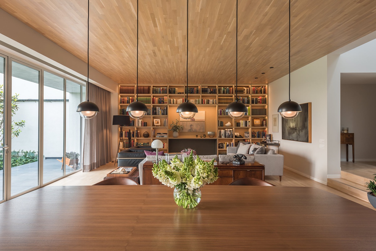
With the view reversed, Luis shows us the flow of the dining area into the living room. The warm tones and soft light emanate a warm and homey feel. The perspective creates a converging point at the center of the frame, and our eyes are driven there by the seams in the wood ceiling (anybody else catching a jump to hyperspace vibe here?)
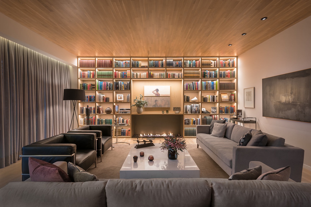
It’s rare these days to see interior photography done at night. In the Business of Home article “A shot in the dark: Who killed nighttime photography”, it has been speculated that you don’t see this look much anymore because not many photographers know how to knock it out of the park tastefully, and most publications push for light and bright spaces. Luis has mastered both, producing this superb photograph that is dripping with mood. The light in the built-in’s draw our eyes like a moth to the flame. That sexy soft light spills out on to the rest of the scene. It feels cozy, and it looks perfect!
A huge thank you to Luis Gallardo & LGM Studio for sharing this beautiful project with us. You can see more of Luis’ incredible work at his website www.lgmstudio.com as well as his Instagram @lgmstudio.
If you have a project you’d like to be considered for Project of the Week, you can submit it here.
