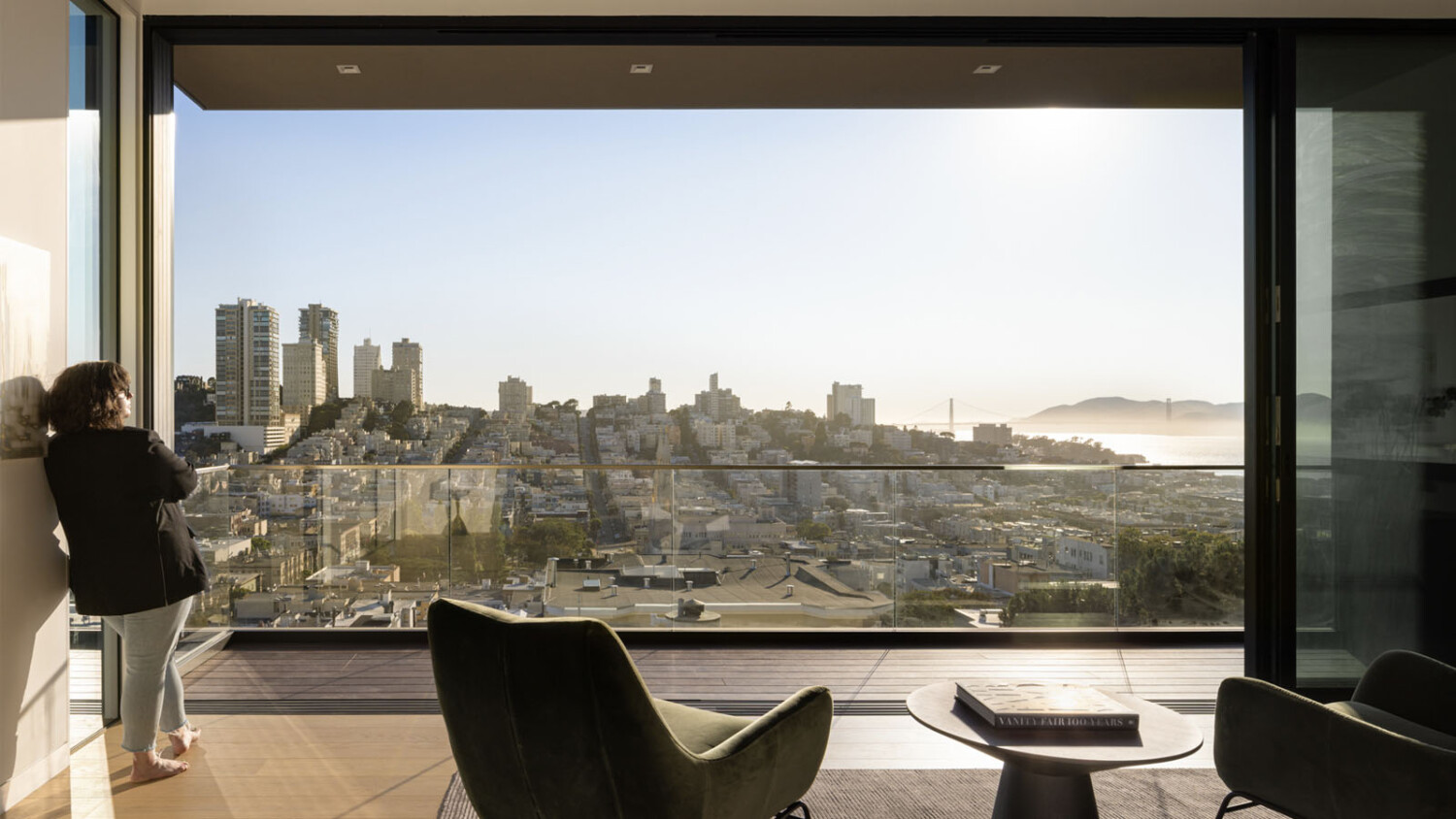
Steven Magner Photographs the Controversial Yet Beautiful 119 Telegraph Building
The three-building development at the base of the Coit Tower in Pioneer Park, San Francisco has a storied history of intense pushback and great controversy since the plans for its development started in 1997. In the mid 2010’s, the developer and Butler Arsmden Architecture were granted permission to begin development. Eight long years after that, 119 Telegraph – the first of the three buildings below Coit Tower – was listed for sale.
Steven Magner, an architectural photographer working in California was enlisted by Studio D Home, an interior design and staging company, to photograph 119 Telegraph. Steven’s photographs are a stunning example of making images at the right time of day – in the right lighting – to make the most mood and give the best sense of place. His careful timing and mastery of light and composition bump these up from just-another-apartment-photo to truly beautiful and inspiring imagery.
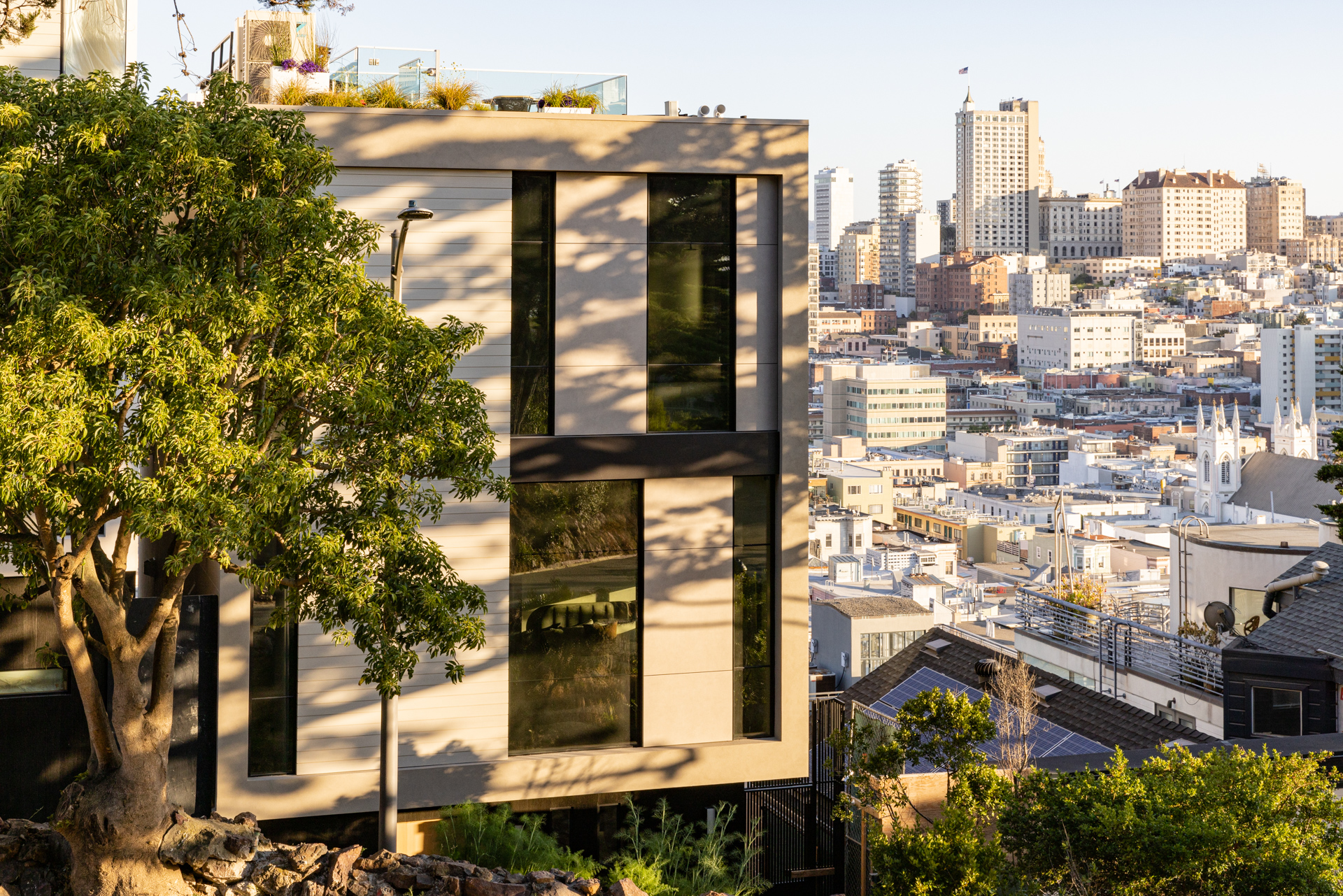
Steven shared that he made 19 photographs of 119 Telegraph in just 4 hours of work. He had a scout day beforehand to make sure he was in the right place at the right time.
I appreciate Steven’s tight compositions. Throughout this project, you’ll note that he never goes too wide or shows extraneous parts of the scene. This keeps our attention on the staging details (lest we not forget who his client is) and the bespoke craftsmanship found throughout the apartment.
Working carefully around the light and careful to avoid the ongoing construction outside, Steven mentions another challenge – “the building is actually on a pretty heavily trafficked footpath up to Pioneer Park. San Francisco photographers have had to be on high alert for theft in the last few year, and with no parking on site I was extra cautious about being inconspicuous.
I use the Photopills app to determine when the best light will be for a given space, and 2 of the 4 floors had their opportunity at the exact same time. So juggling 2 spots at the same time was a fun time.”
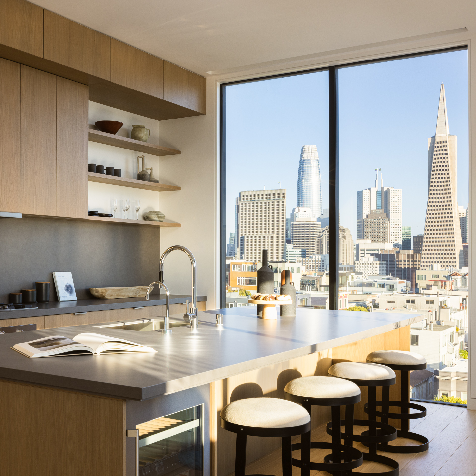
Each scene reads incredibly well and incredibly easily. Things feel tidy and make sense. We are able to be enveloped in the warm sunlight and deep shadows, taking in what it feels like to be at 119 Telegraph in an intimate way.
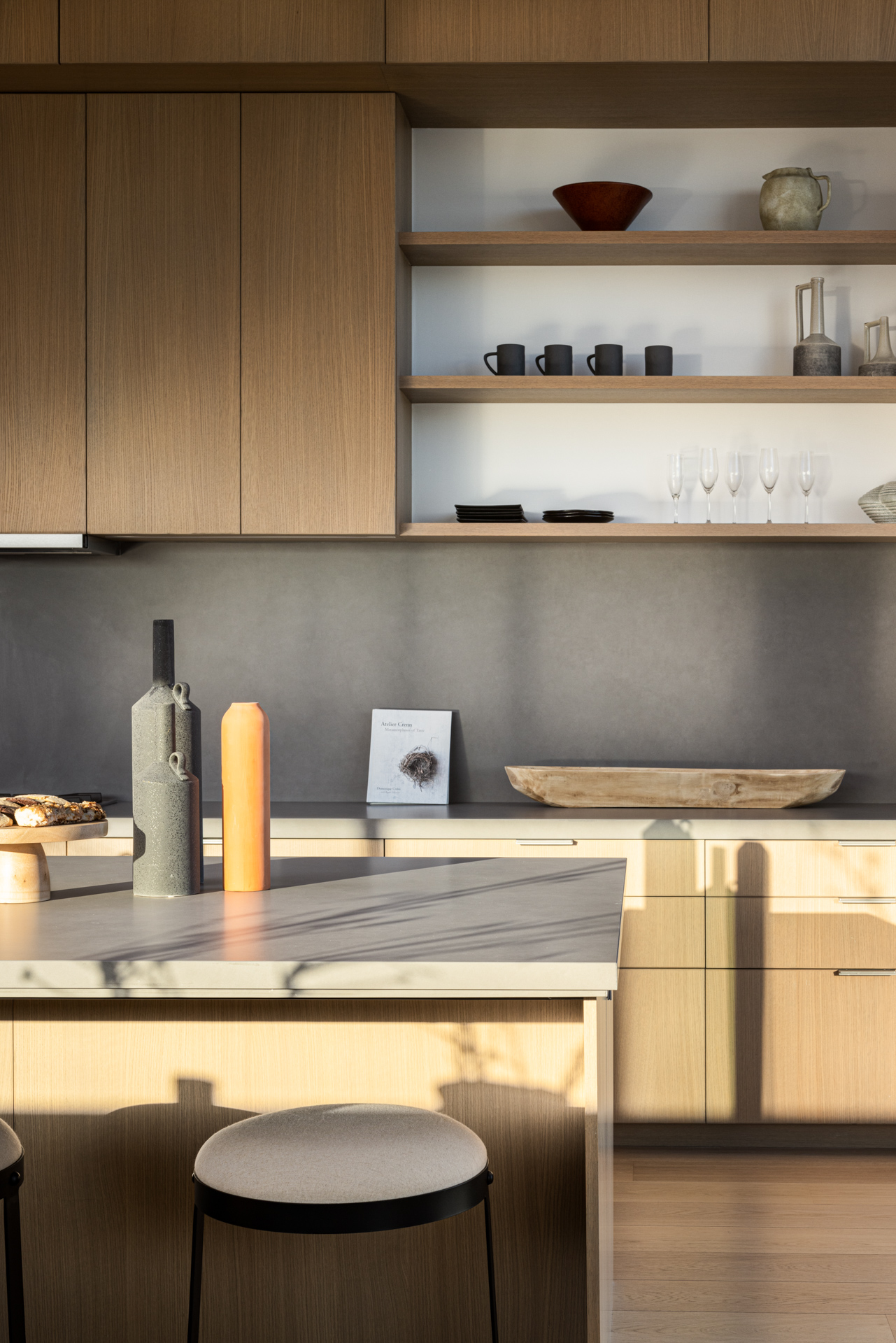
I appreciate how Steven lets his darks go dark and his highlights be bright and specular. It brings a sense of heat and time to the scene.
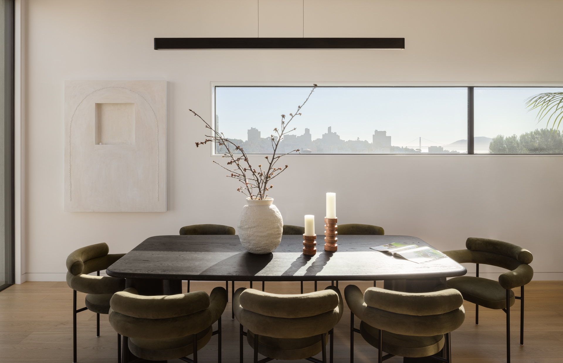
His balance in exposures feels right. Our eyes are pulled through the dark(er) living room out to the view beyond.
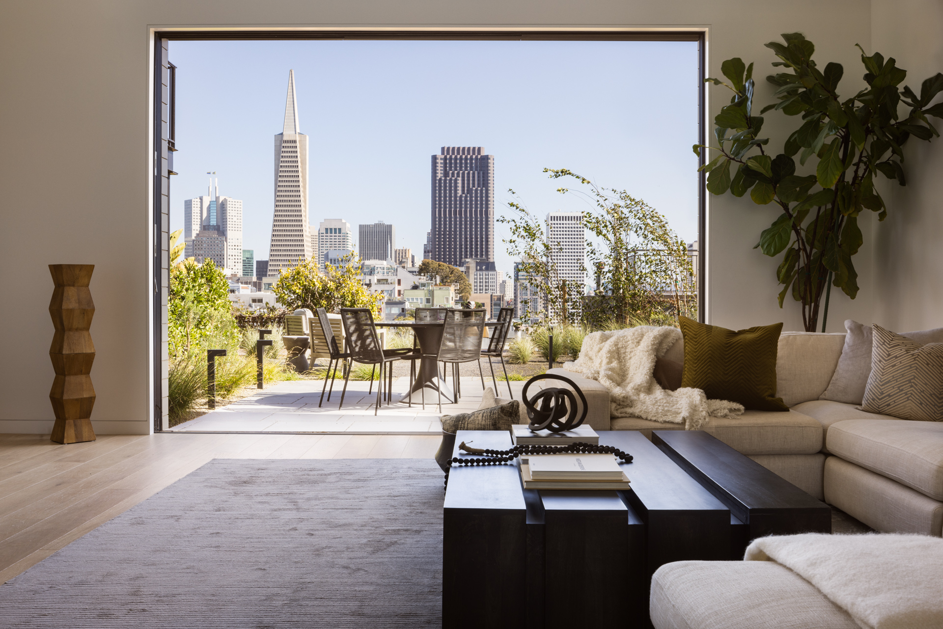
His emphasis on the details throughout this space is a testament to his ability to keep his client’s goals and purposes in mind. He could have come in, stood in the corner, and blasted a couple of wide views of each room, but instead, he focuses us on little chunks of each room, allowing us to note the textures and materiality of each object in the room and how they work well together.
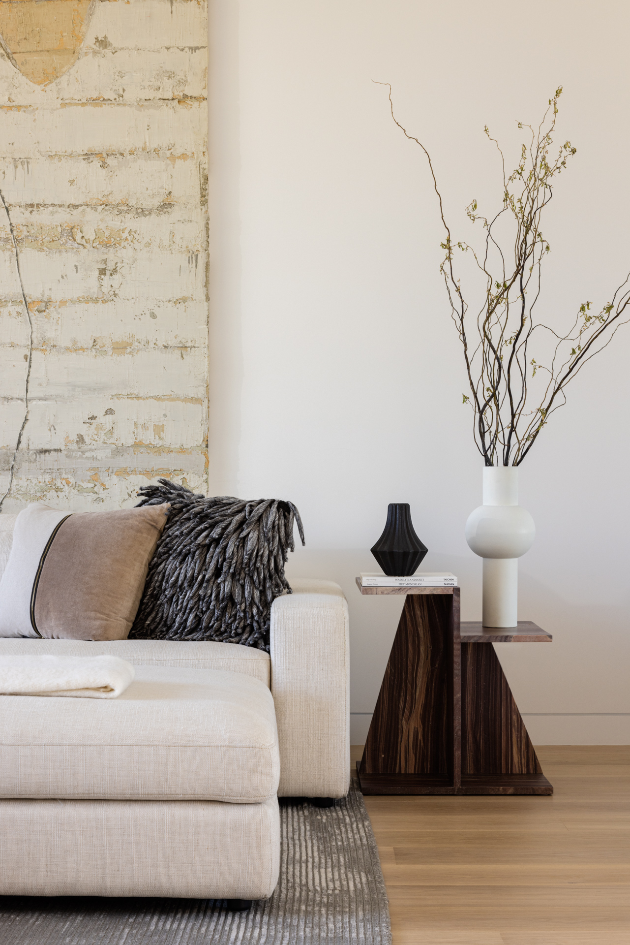
I absolutely love this next shot of the stairwell. The light play is beautiful. The shapes and colors produce a very bold and graphic scene. I appreciate how Steven shows just a slice of the bedroom off the stairwell, helping us locate ourselves in the space and make sense of things without giving too much away.
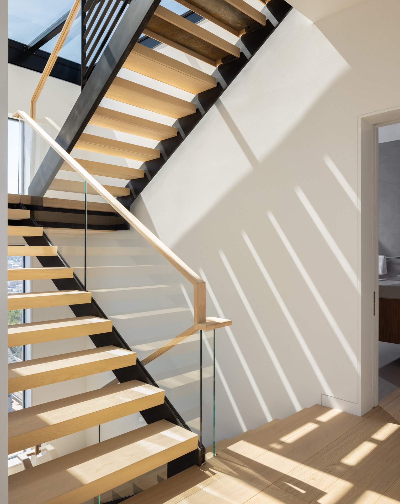
Let’s take a look at Steven’s favorite photo from the set. He says “Part of the controversy of this development was the views from Pioneer Park that would be covered up, and from the master bedroom you can see why. Being able to have the light stream cross from the right side all the way over to the left side was instant love for me. I actually shot the shot twice (within 30 minutes of one another) because the light had shifted way further than I was anticipating, and had to ‘correct’ the view to the way I envisioned it.”
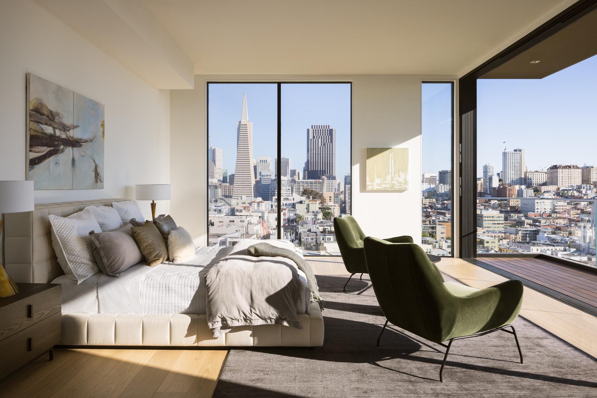
What a view! Steven’s warm color grading here washes the images with rich, toasty light. It’s as if we can feel the sun on our faces as we stand in this bedroom.
Steven tells “When I first dove into photography in 2017 I was mostly capturing astrophotography — specifically the milky way galactic core. For someone like myself who was a bounce-off-the-walls kid into my early 30’s it helped me slow down and wait for the right moment to strike. I take this same approach to architectural photography and try my best to plan when a room will have long, deep shadows streaming from light flowing into a master bedroom, kitchen or living room. Because of this I always encourage a scout day ahead of time to better plan for those, oftentimes, fleeting moments.
Photopills (or sunseeker) can get me a good idea of when I need to be somewhere from its planning app. But without physically being on-site using the Augmented Reality, I feel like I’m a chicken with my head cut off running around.”
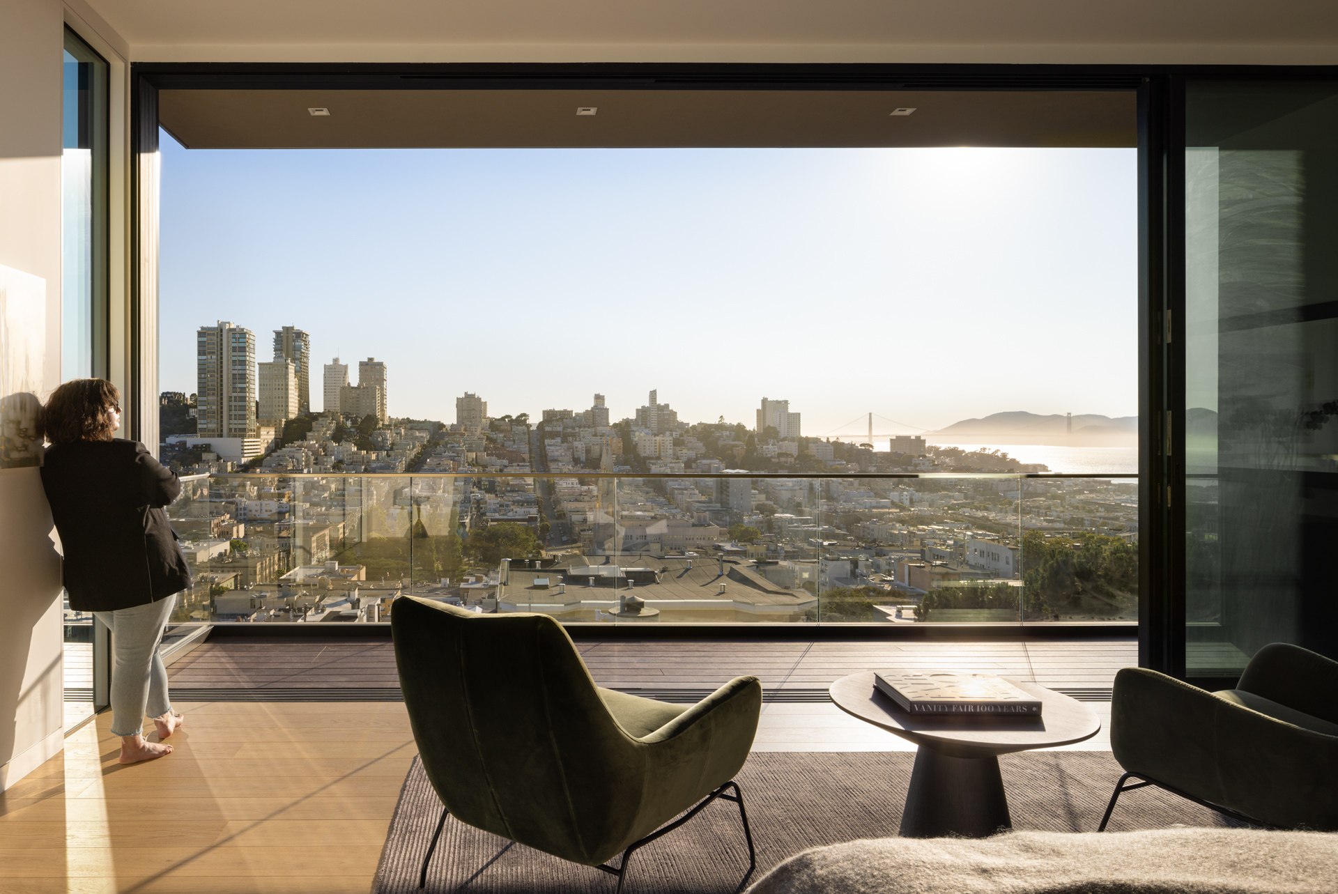
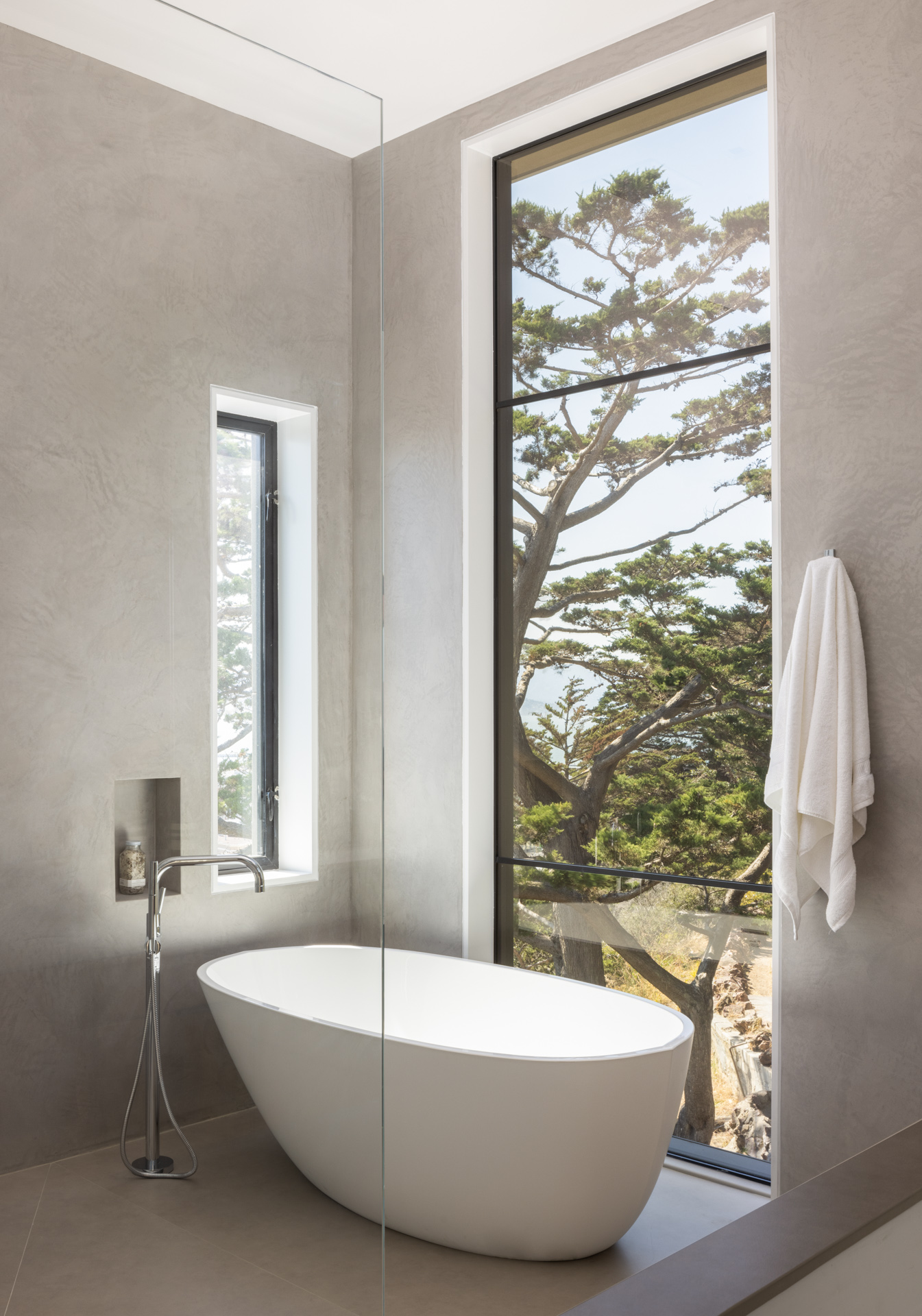
Quiet and contemplative scenes of this primary bath offer the same rich feel as the other images in this set, linking all aspects of this shoot together. By carefully showing the greenery and landscape out the bathroom windows, we get a little bit of a different feeling here though than the images with the cityscape in the distance.
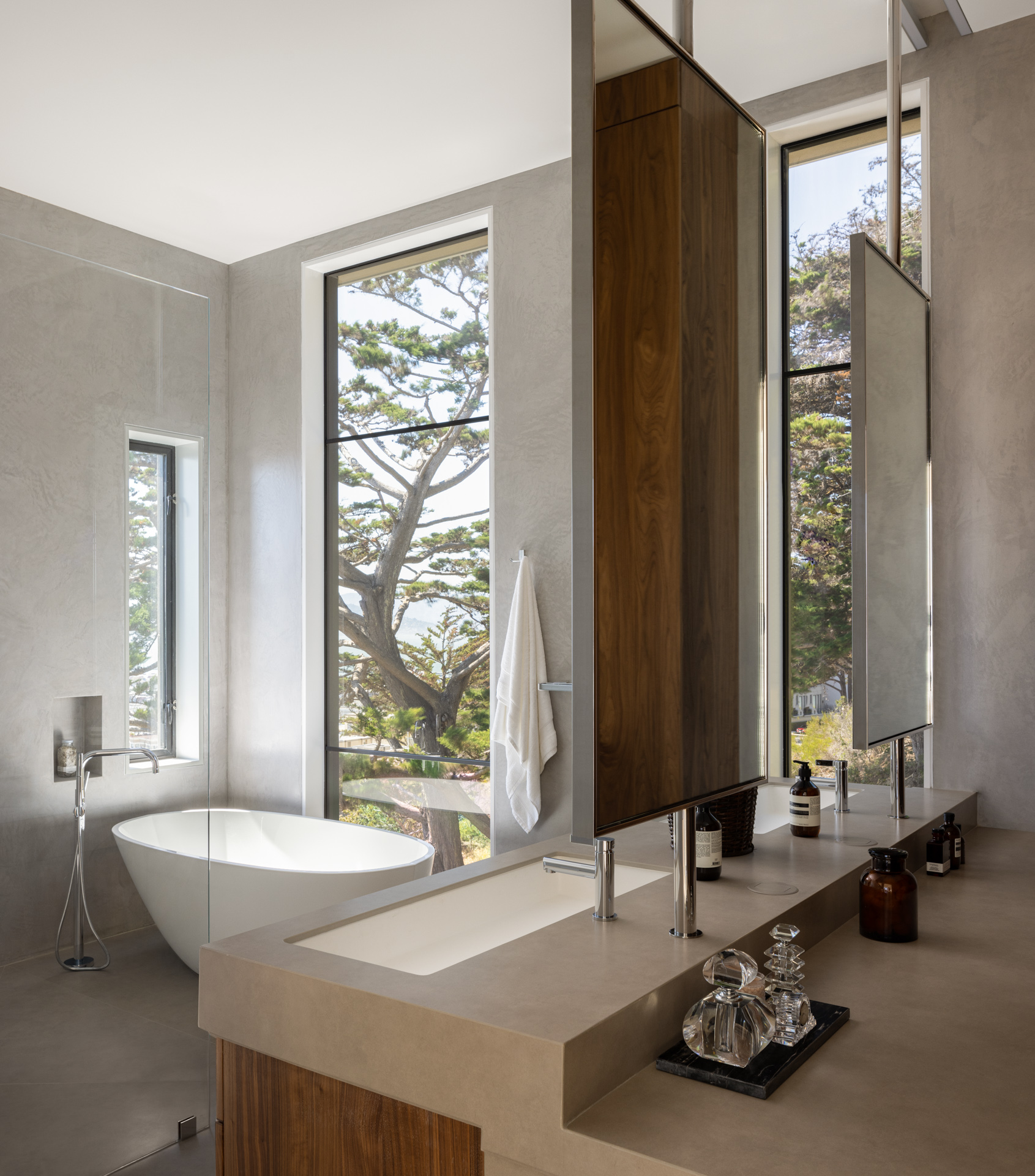
I love everything about Steven’s photographs from this project. The compositions, the treatment, his attention to detail, his methodology – it’s beautiful.
Working with the design and staging company just goes to show that there is such a wide gamut of potential clients out there aside from just architecture firms. A big thanks to Steven for sharing this with us here at APA!
See more gorgeous work on Steven’s website stevenjmagner.com as well as on Instagram @stevenjmagner.
If you have a project you’d like to be considered for Project of the Week, you can submit it here.
