Project of the Week: Simone Hutsch | heysupersimi
There are so many more facets of architectural photography than just shooting sublimely lit modern homes or hotel exteriors; in fact, even the most beautiful of those can start to feel a bit stale after a while. When I saw German photographer/designer Simone Hutsch’s minimal architecture photos, I couldn’t get enough of them. They’re refreshing, they’re interesting, heck, they’re fun!
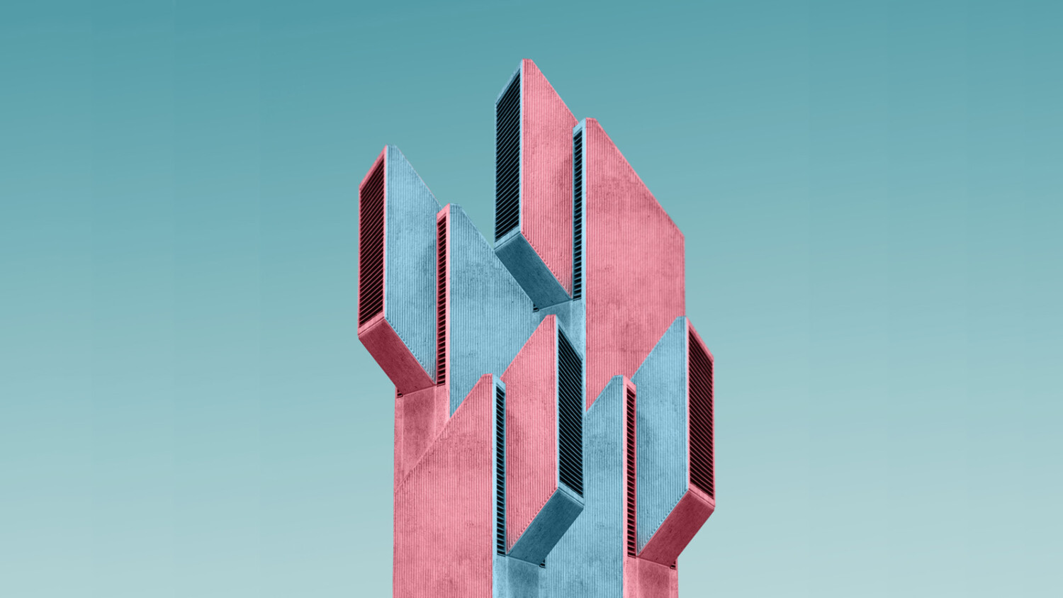
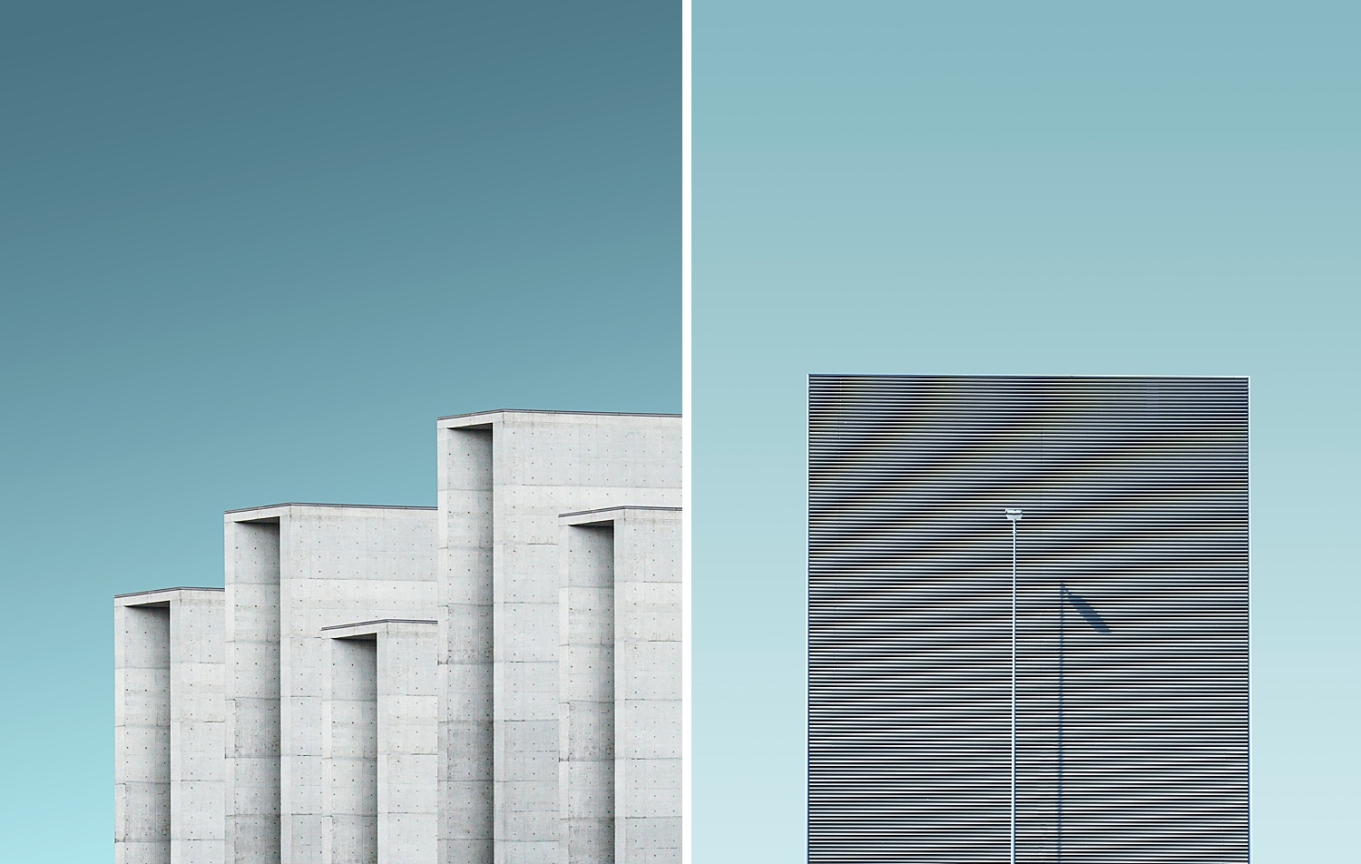
If we’re being honest, the world of architectural photography can be a bit – er – stuffy. That’s just par for the course in a niche that is so technical, gear-centric, and melded together with architecture (another typically straight-laced field). Simone’s work is quite the opposite: it’s simple yet punchy. The color and angular details, all against a plain or subtle gradient background feel like pop art. And this simplicity and lack of fuss is what makes it so striking.
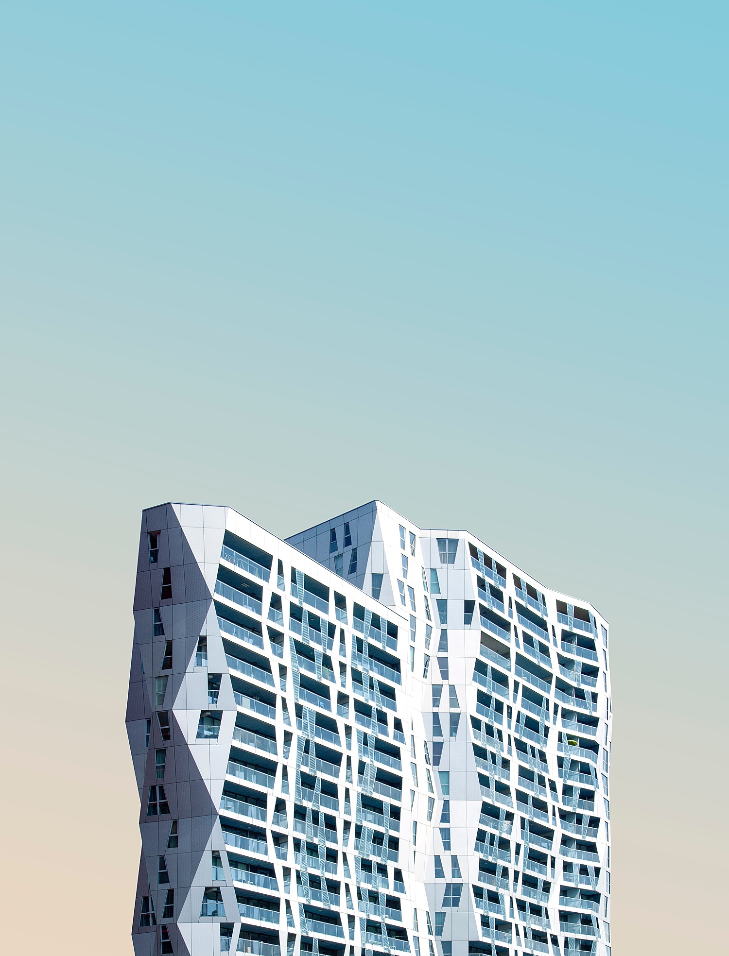
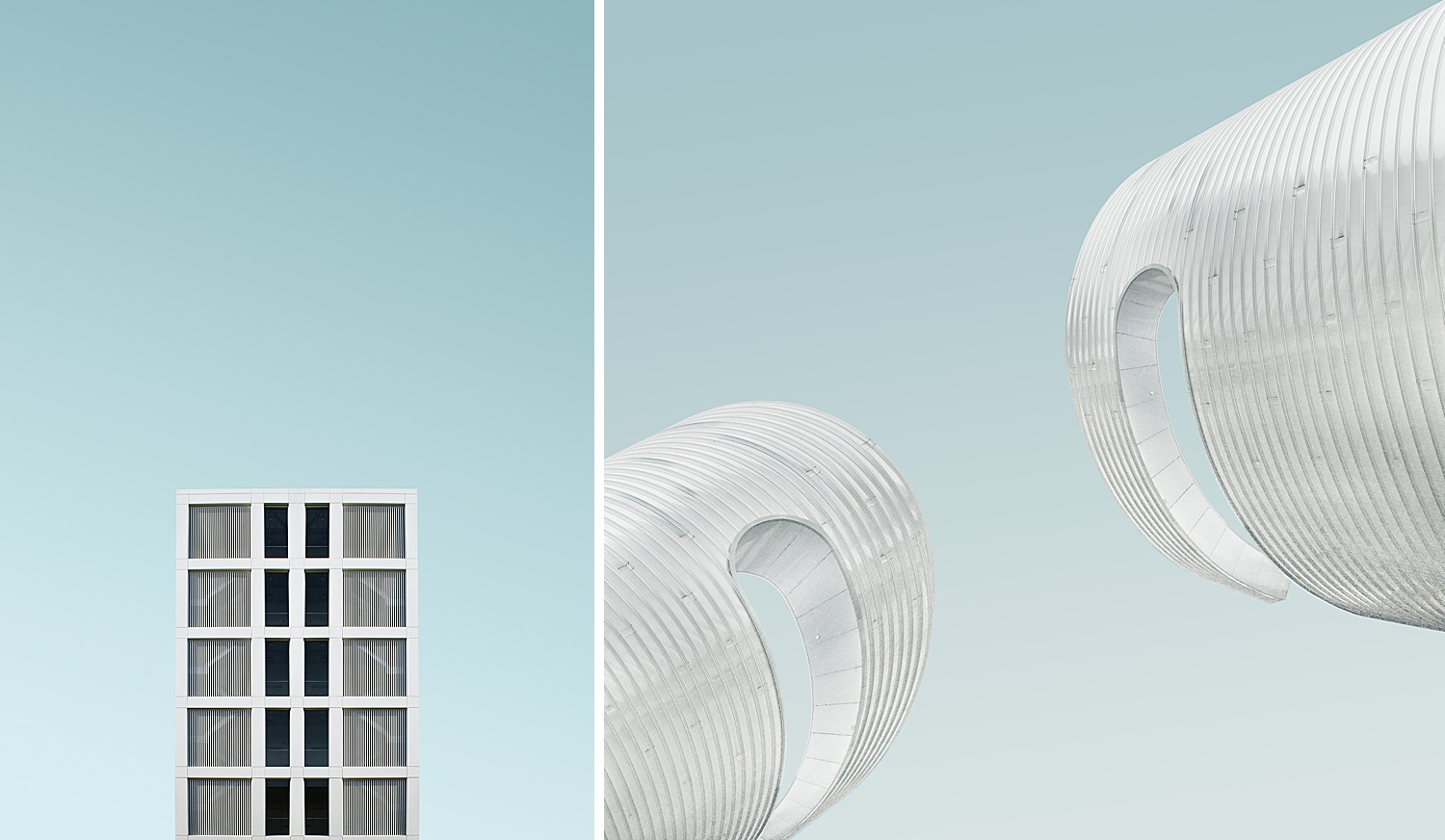
The chosen perspectives mixed with the use of shadows creates a depth that shows off the simplicity found in these subjects. Above, the wiggly child-like appearance contrasted by the soft and serene background gradient is a breath of fresh air and just plain fun to look at.
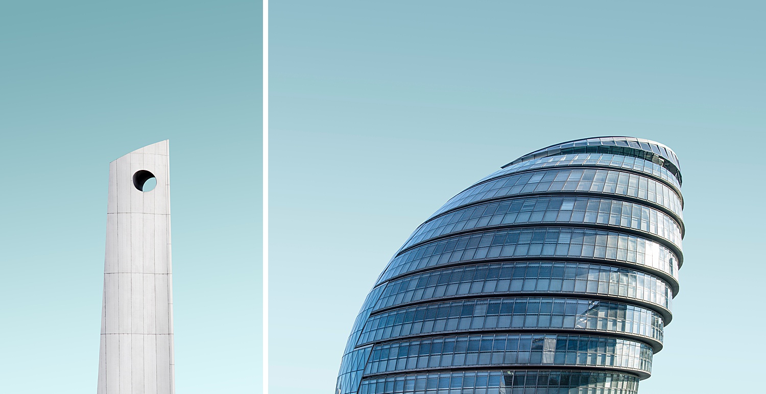
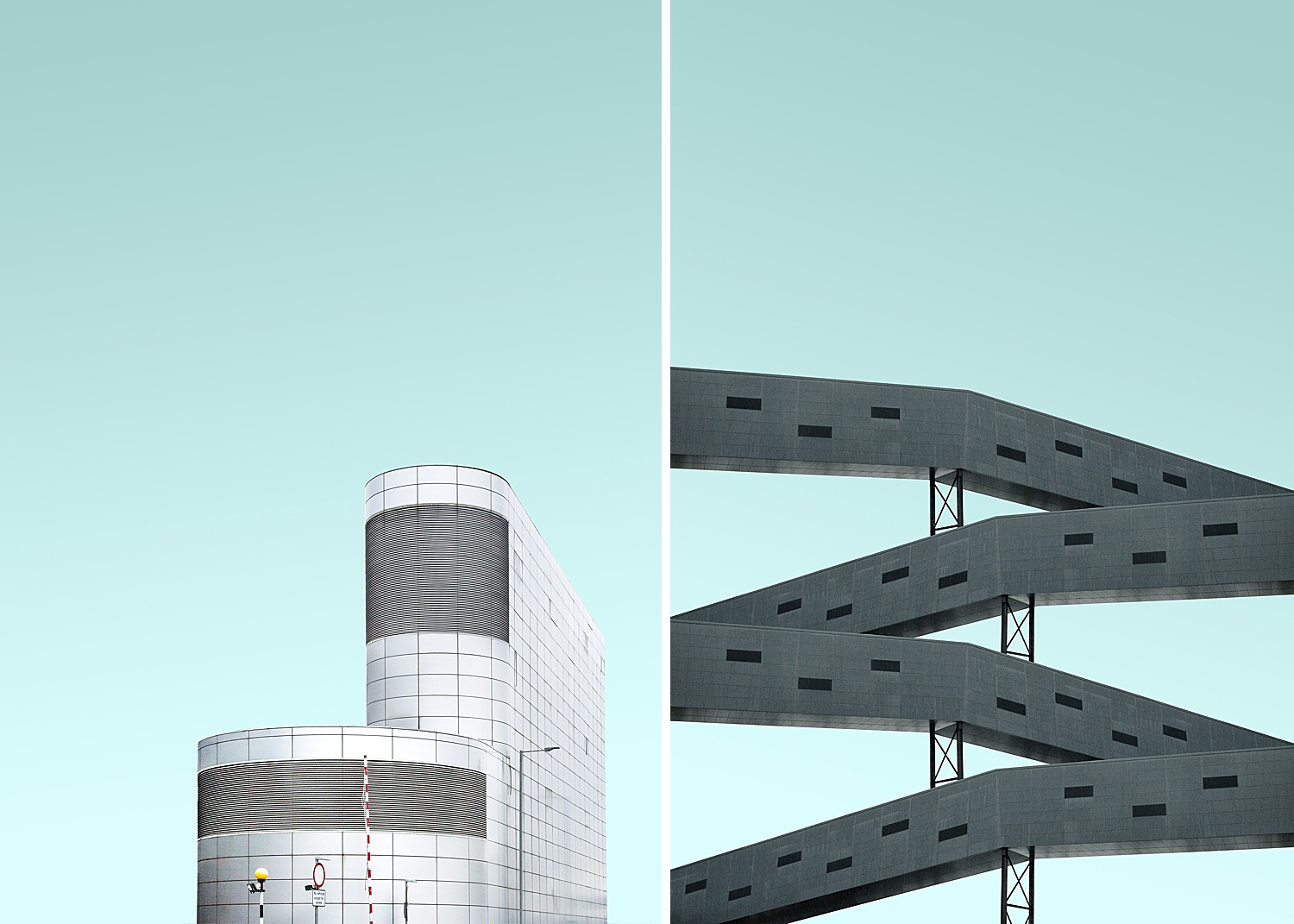
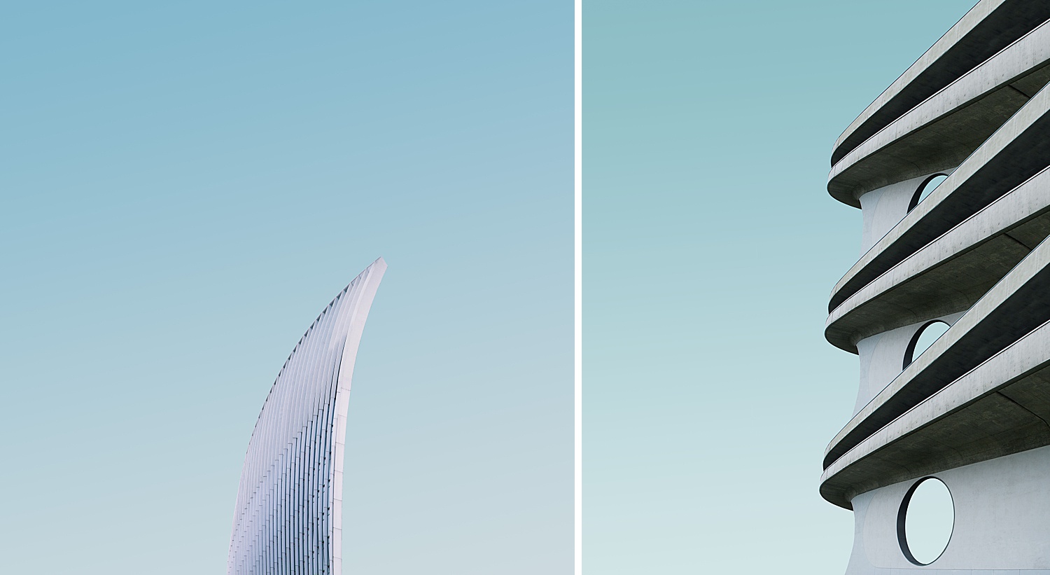
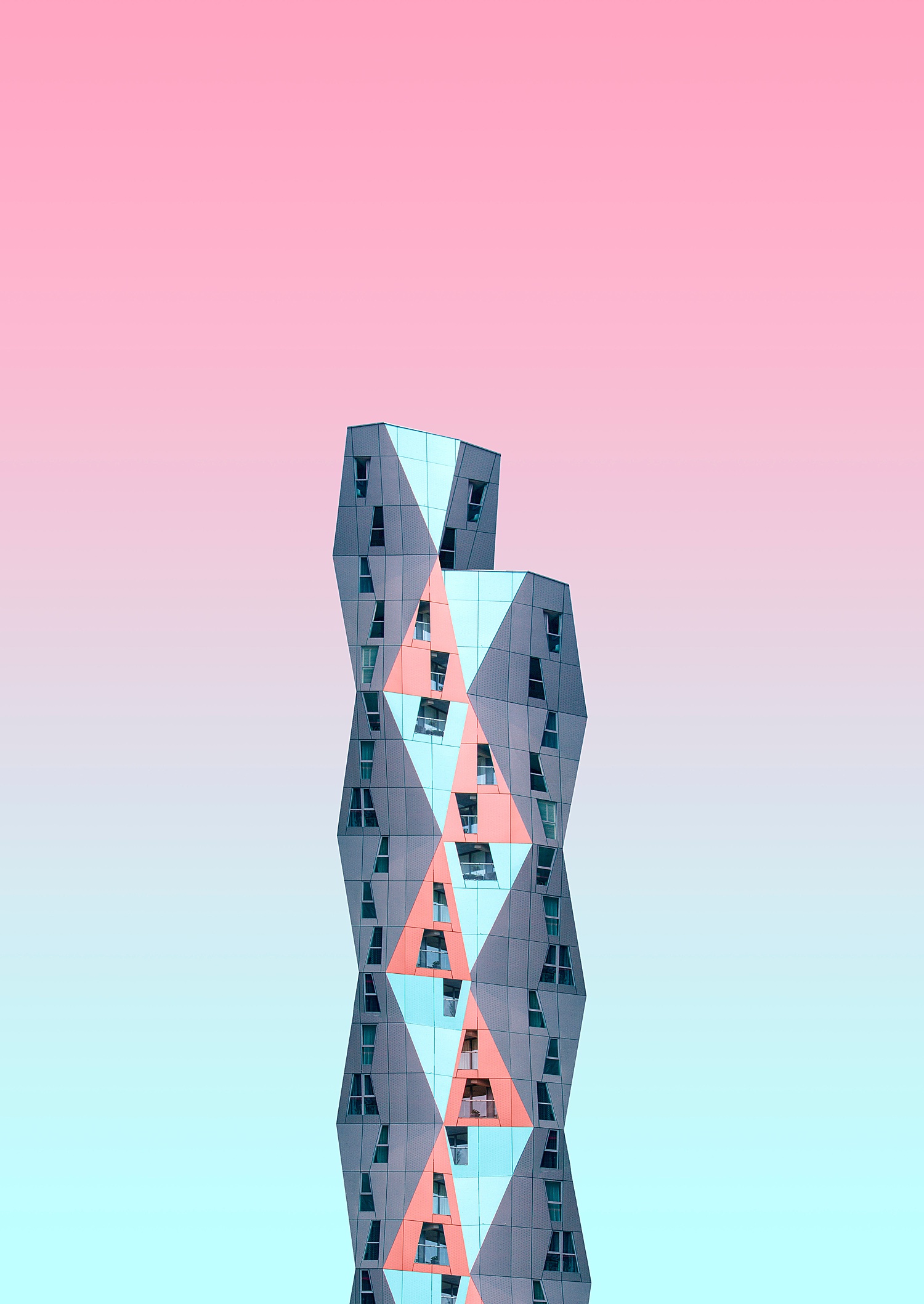
What first stopped me when looking through Simone’s work was how she typically captures these massive, stark, imposing buildings jutting up into the sky. Each building is essentially getting a powerful hero shot; with no surrounding buildings or background distractions, these photographs have a clean, utopian air about them.
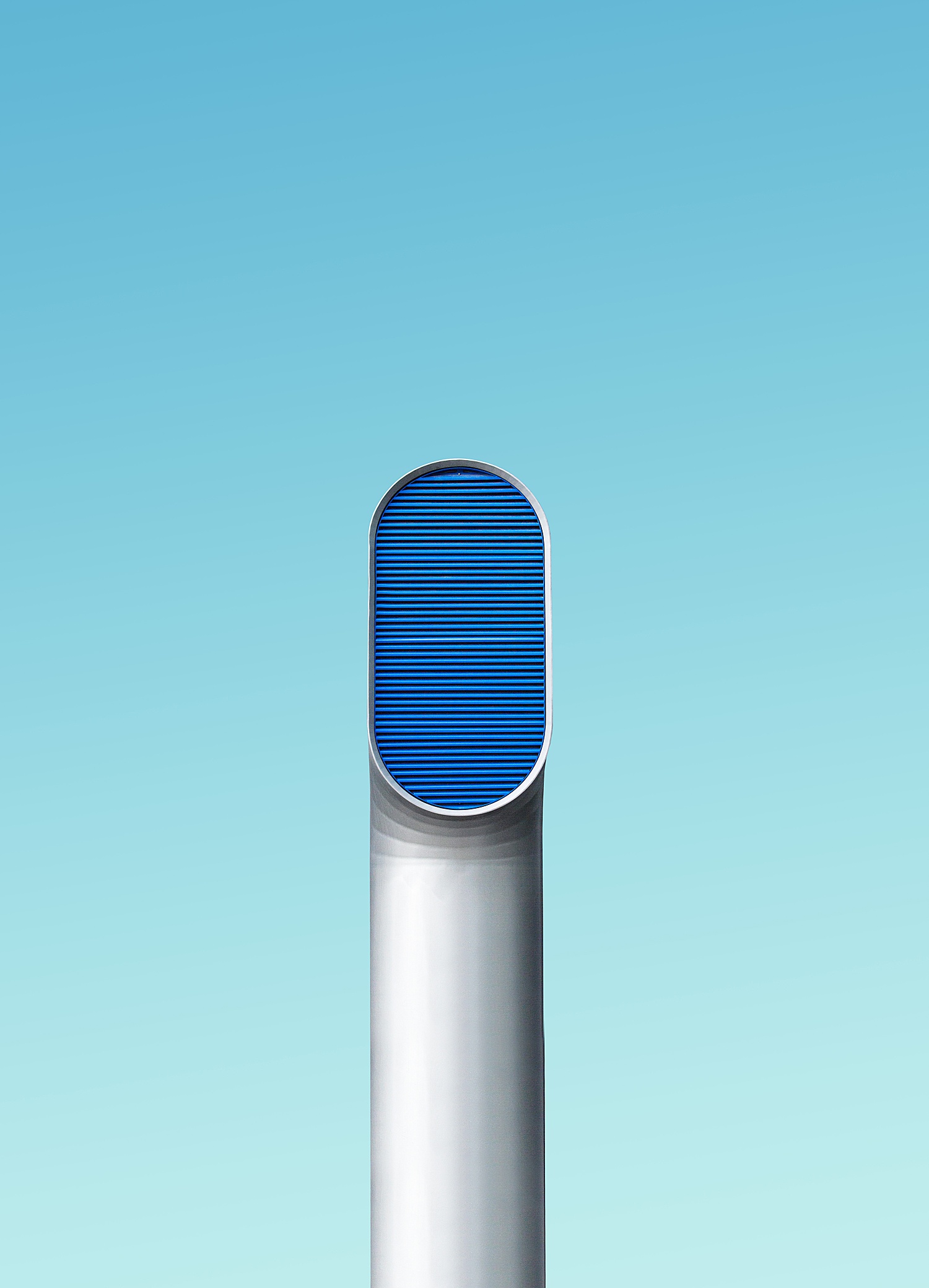
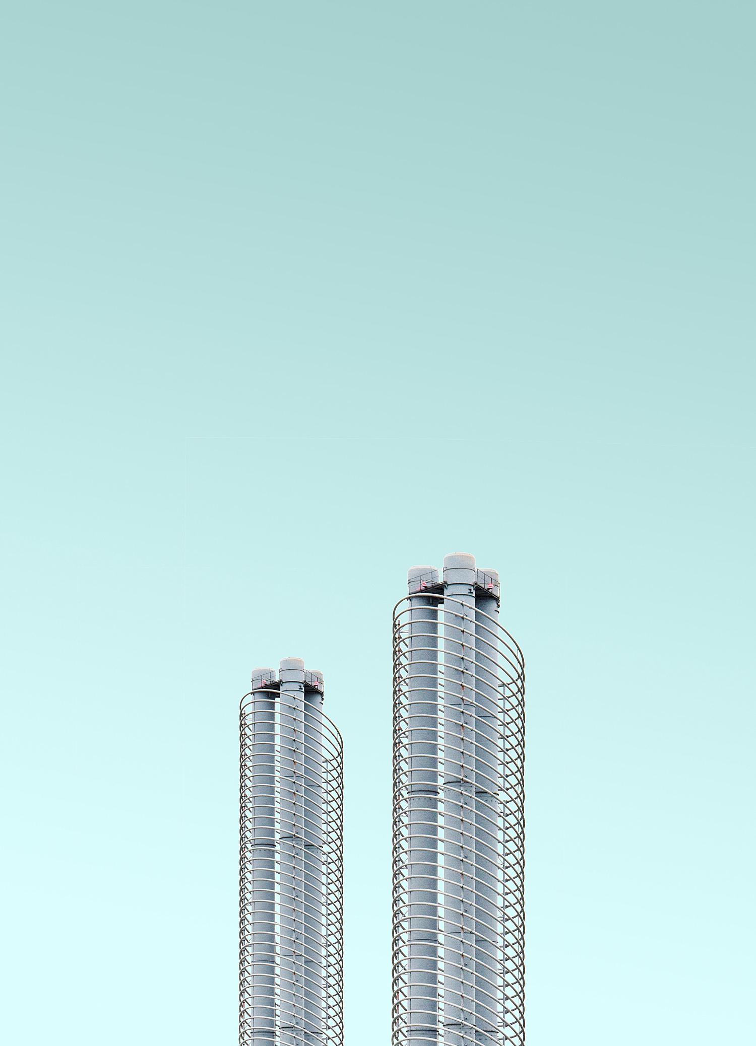
This image below, LND RND | Single Pipe, is possibly my favorite from the entire series. I love everything about it. The simplicity, the symmetry, and most of all, the color: it almost reminds me a bit of a toothbrush or a Dyson vacuum. One of the best things about abstraction is that the viewer is left to find their own meanings and interpretations of an image, something that this series does brilliantly. Hey, beauty is in the eye of the beholder! Often in architecture photography we tend to be a bit too literal about our subjects: “this is a picture of a house. This is a picture of an office. This is a picture of a chair.” This approach leads the viewer into quickly swiping through photos, not really engaging – which is not a problem in this series!
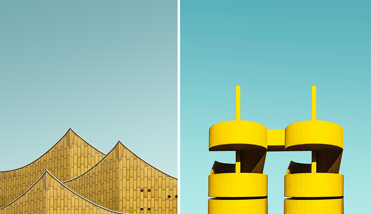
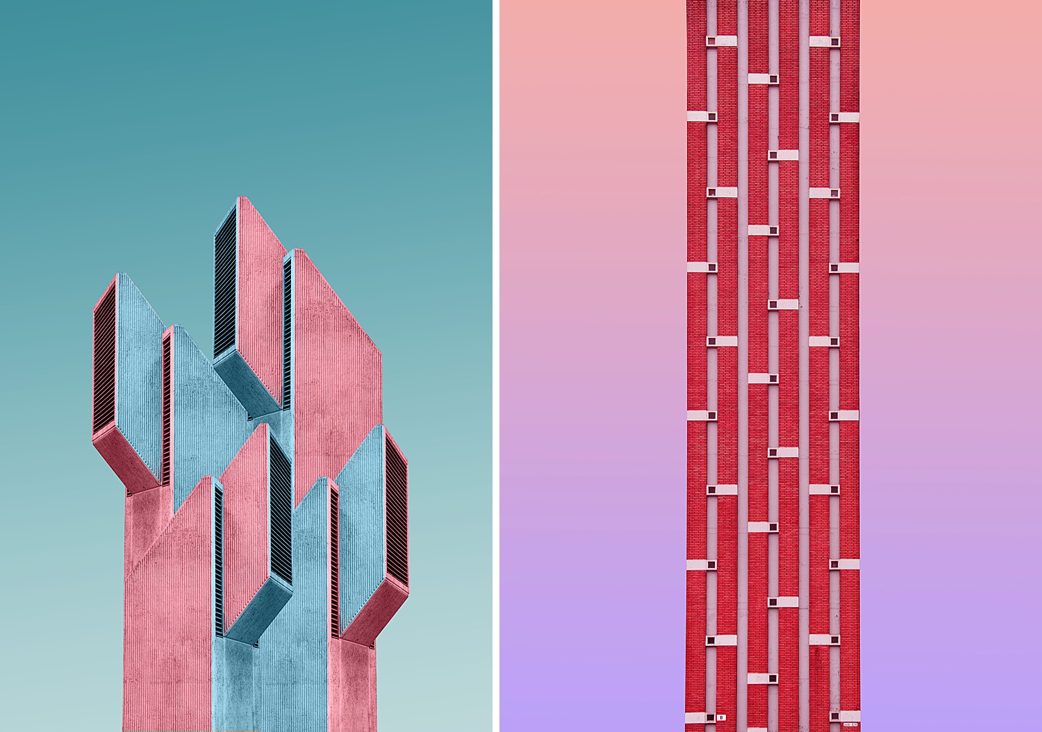
Simone Hutsch is primarily a graphic designer, which explains why her work really shines when she begins to introduce color and shape. Whether true to how the buildings look in real life or not, you have to admit that she is a master of implying mood through color theory. Just look at how lively these yellow buildings look against the cool blue backgrounds, and how the pinks and blues contrast each other. The result is incredible contrast and mood, and I can’t help but love it.
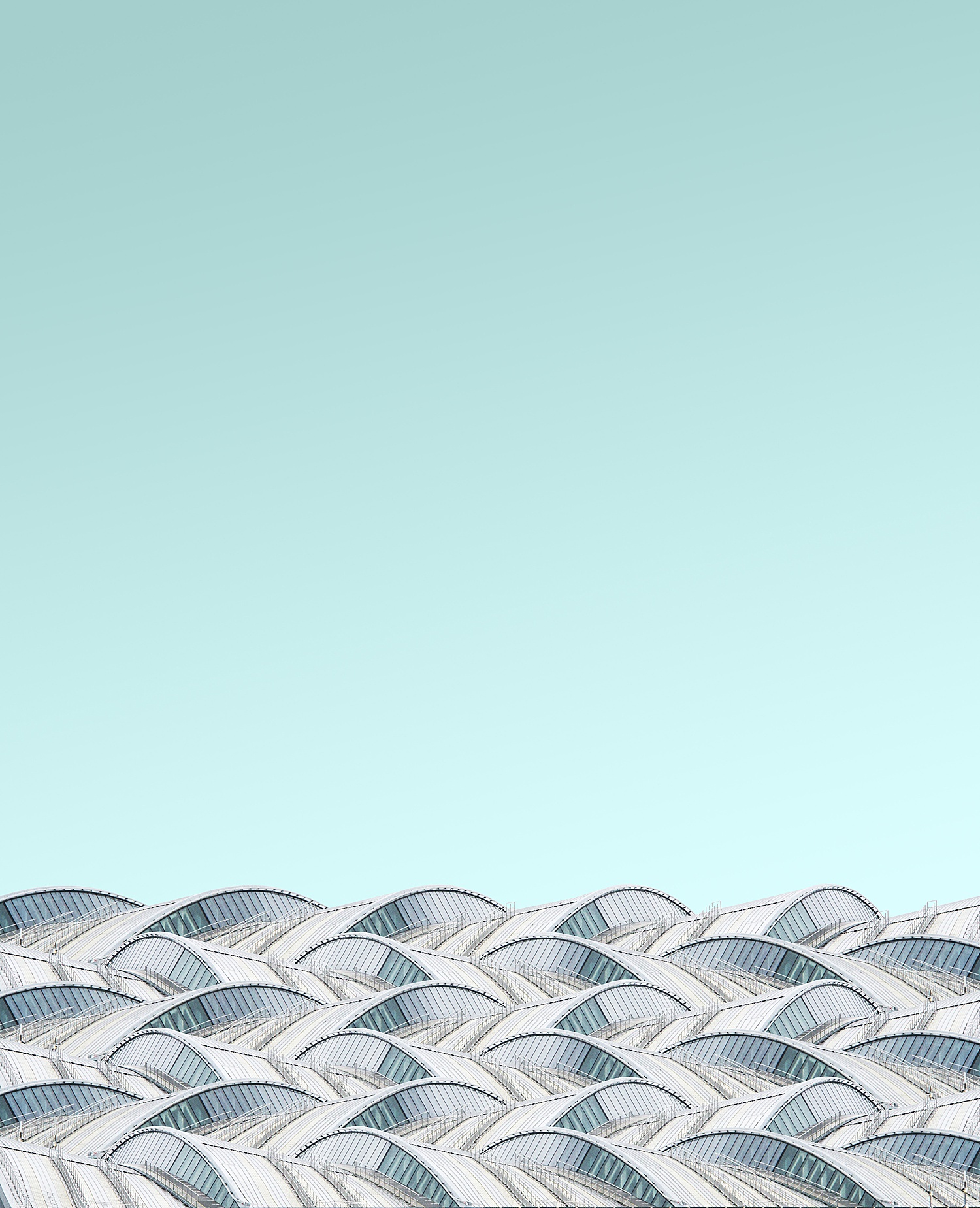
Aside from color, Simone shows a knack for showcasing patterns and textures. Repetition creates rhythm; when paired with strong directional lighting, wonderful textures appear to pop off the page (screen?) and I feel like I could reach out and touch each one of these building facades as a result.
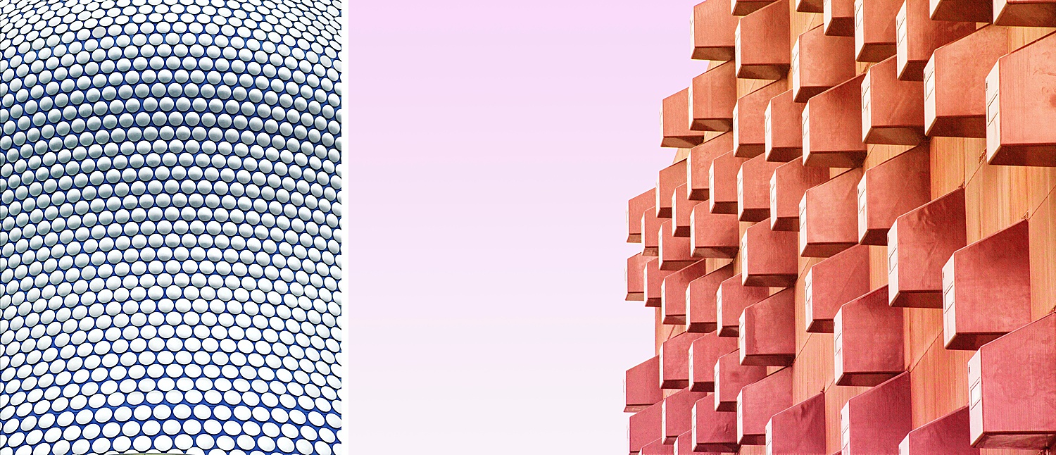
When sharing her project with me, Simone said “I love exploring the geometry or pattern in buildings.” It absolutely shows, and there is such an interesting cadence throughout her work.
“I started the project a couple of years ago as part of my graphic design studies and somehow minimal architecture photography became a passion. Being creative for myself outside of work is much fun and keeps my creative juices flowing. I’m doing it as a personal project while being full time employed as a graphic designer” says Simone.
A big thanks to her for sharing her work with the world, and us at APALMANAC. You can follow along with Simone Hutsch and her minimal architecture photos on Instagram at @heysupersimi.
If you have a project you’d like to be considered for Project of the Week, you can submit it here.