
Project of the Week: Maíra Acayaba / Frederico Sabella Arquitetura
There must be something in São Paulo’s water, because the photographers there are incredible! This week we’re back in Brazil, but this time with the great Maíra Acayaba.
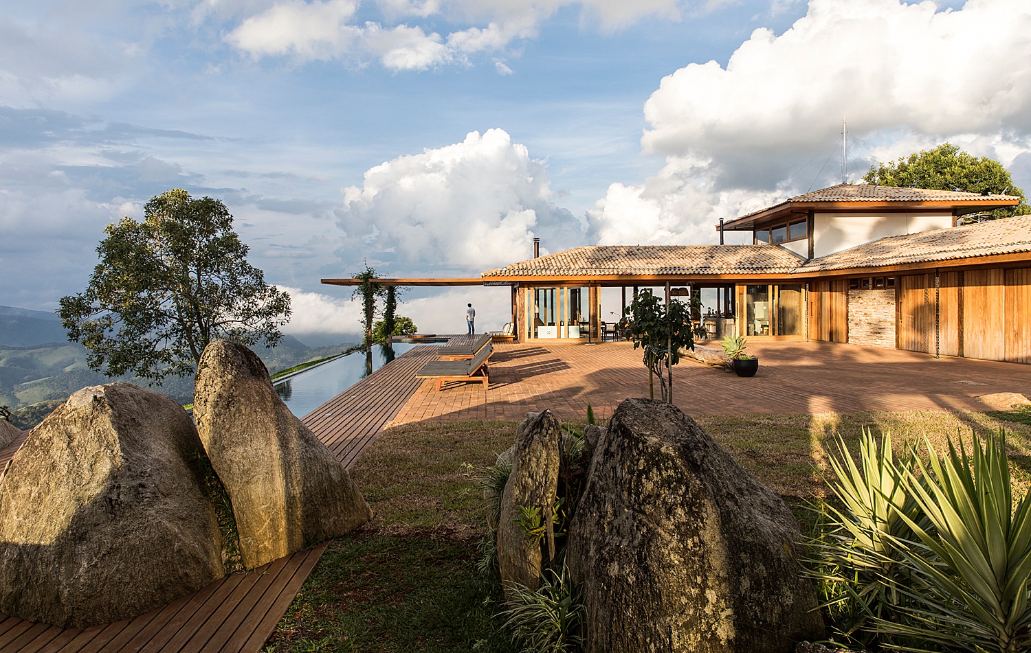
Three hours outside of São Paulo lies the Gonçalves municipality, home to our featured project, Casa Gonçalves by Frederico Sabella Arquitetura. Maíra Acayaba has a stellar body of work as a whole, but Casa Gonçalves is hands down my favorite series. Perched on top of the highest mountain in the Gonçalves region, the house sits among the clouds. Maíra had to split the shoot into two days to combat the fast-moving fog and cloud cover that came and went.
It’s easy to love this first image. Maíra has done everything right here. Let’s start with framing and placement. The rocks and plants in the foreground add visual interest and lead our eyes to the back of the photograph. I love the placement of the figure, who gives us scale in the scene. By placing him essentially in a cloud, Maíra shows how high the house is situated.
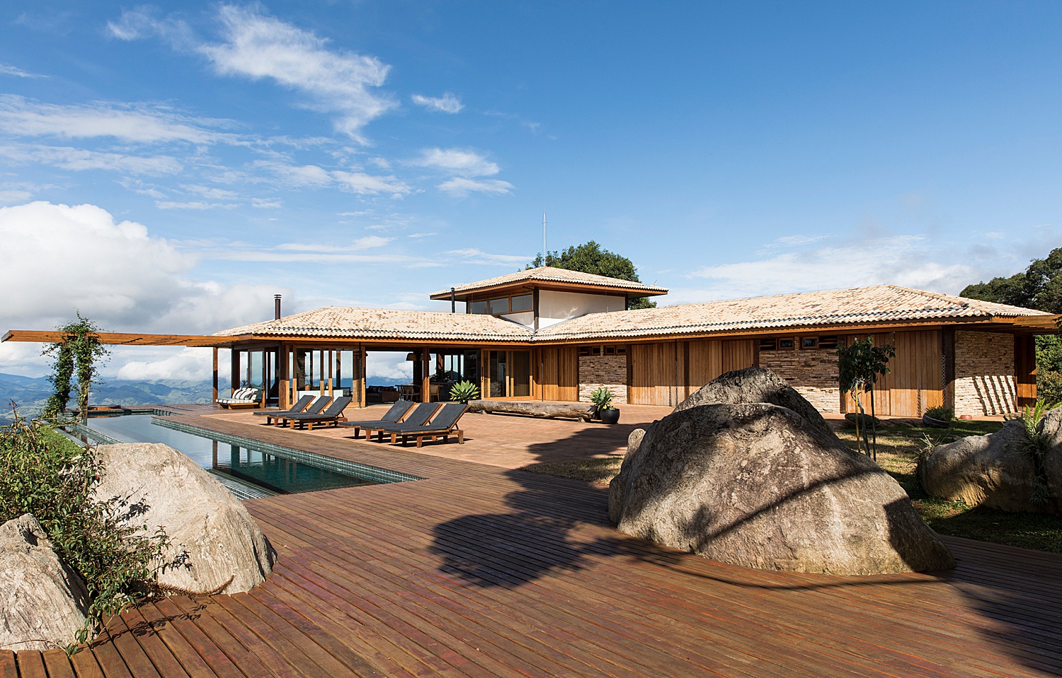
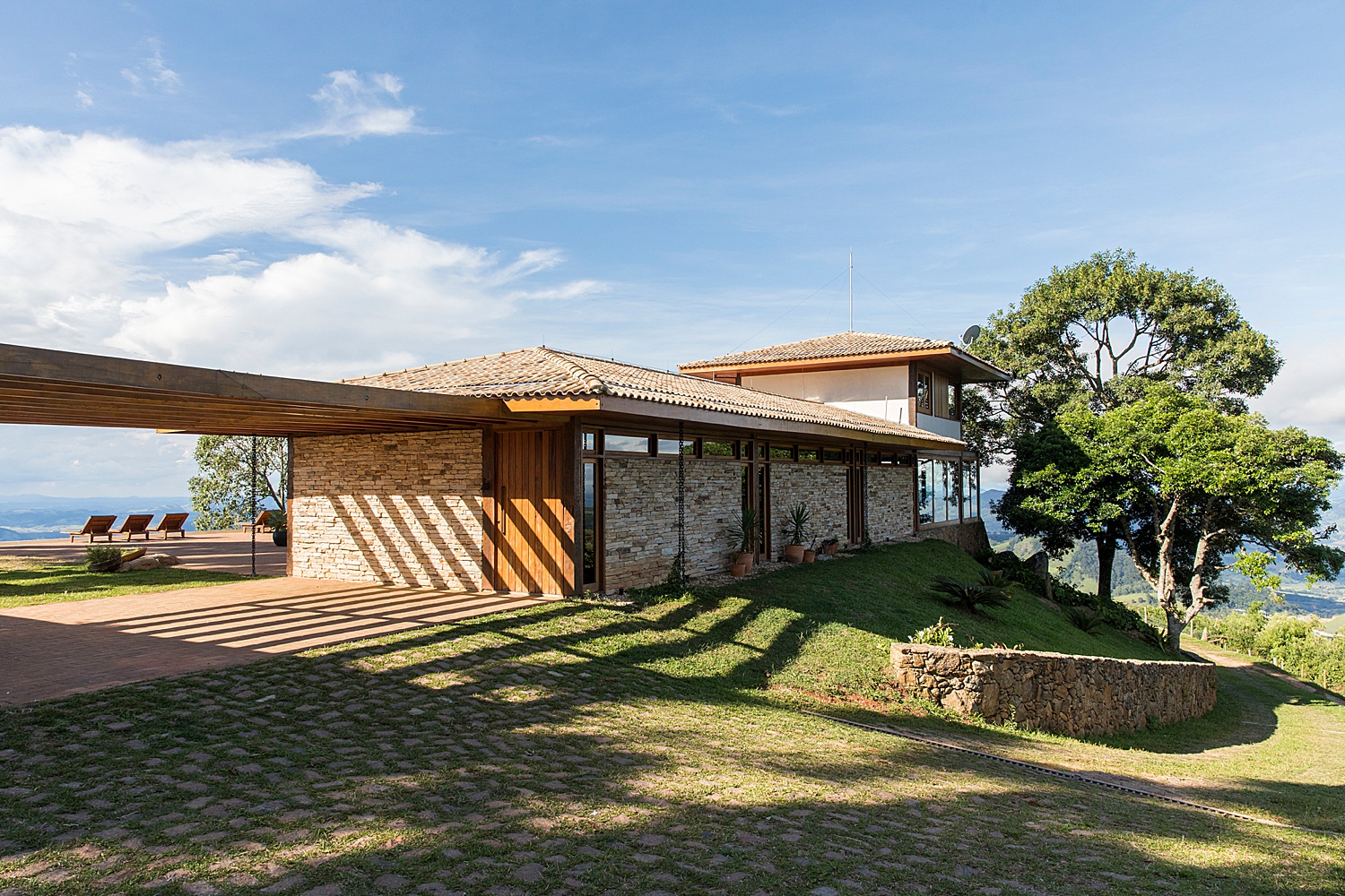
The next image gives us more context about the house itself. There are so many materials used in this structure, and we get a good feel for them here. The roof tiles are relatively light, and I appreciate Maíra’s effort to preserve them, all while retaining the shadow detail. This is done tastefully and she doesn’t stretch it so far that the image looks flat. There is a lot of great technical work being done here.
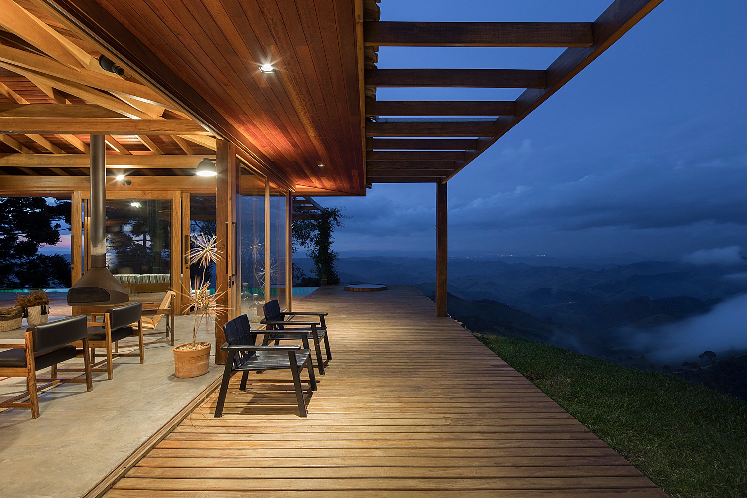
This project is riddled with great linear elements that Maíra takes advantage of. In this picture, she sets up a strong one point perspective. The lines from the pergola, flooring, pool ledges, and the house itself pulls us through the scene and out to the view.
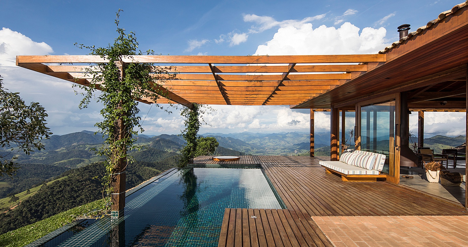
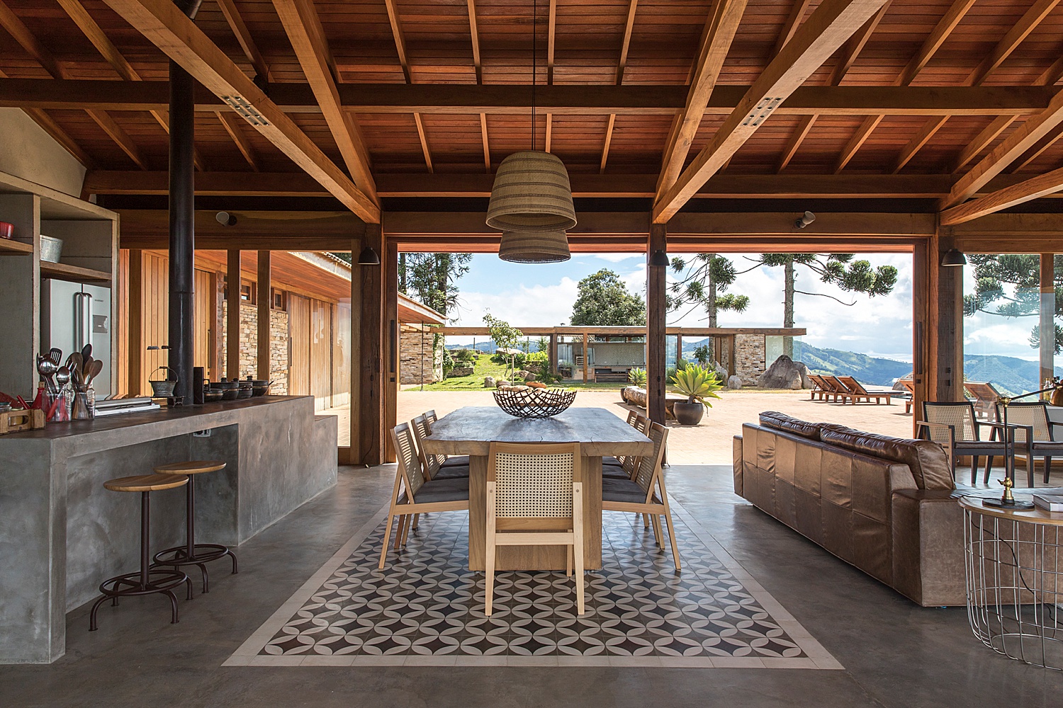
Here’s another image in this series with powerful leading lines. There’s an additional great factor at work though: the tonality. This is a pretty high contrast scene and I can imagine what each bracket of this photo looks like on its own. I love that the view is properly exposed for (since it’s the real moneymaker here) AND the interior is visible. Maíra creates a convincing and true-to-life balance in exposure here.
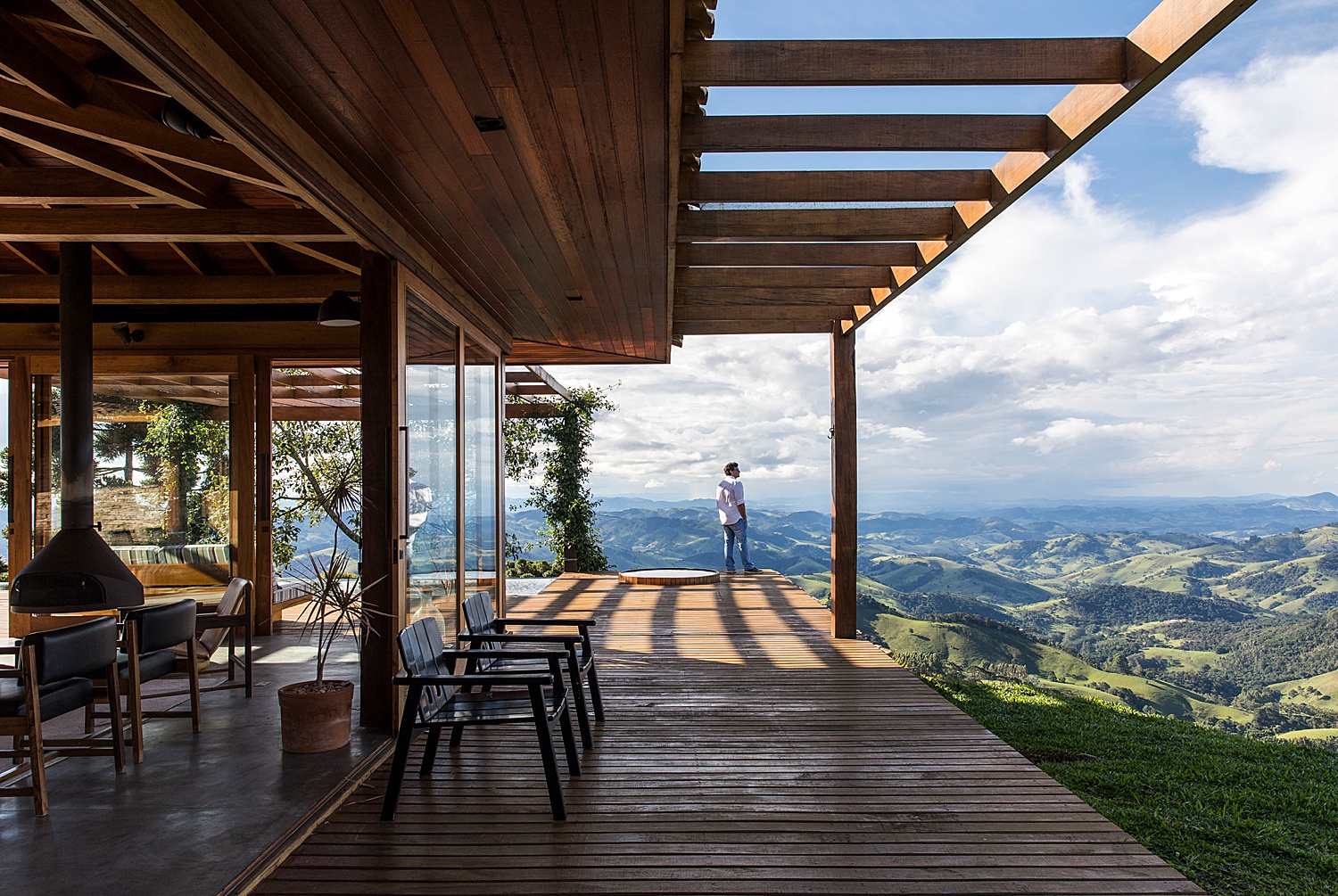
The long shadows throughout this shoot subconsciously give us a hint about the time of day, and that – along with this grand expansive view – gives us a sense of place.
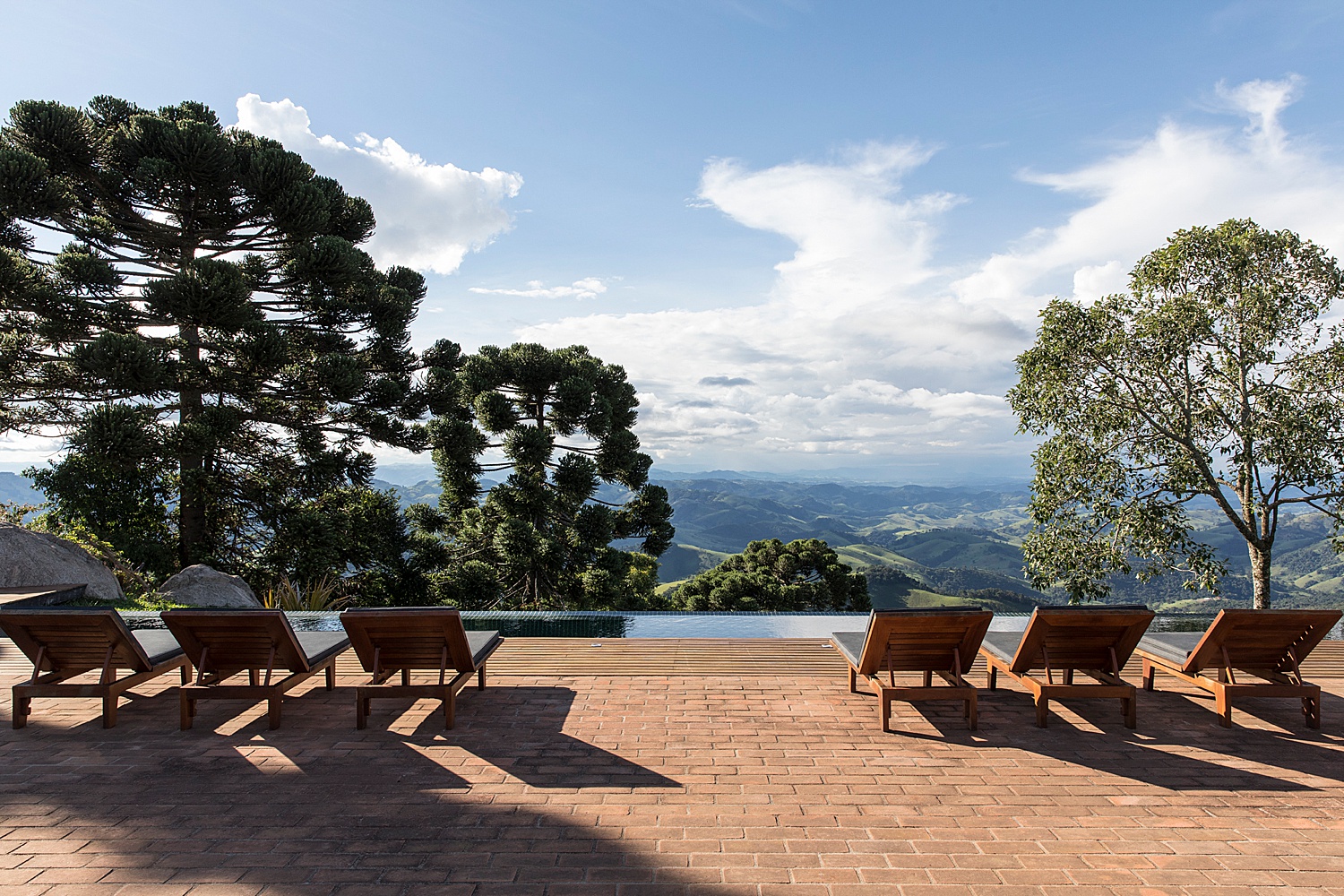
You can’t look at this scene and not feel happy. It’s perfectly exposed. The shadows give us enough depth to provide mood and interest, yet nothing is clipped. The specular highlights on the black cushions evoke a sense of heat. I know exactly what those lounge chairs would feel like just by looking at them. The colors are accurate. All in all, it feels warm and inviting.
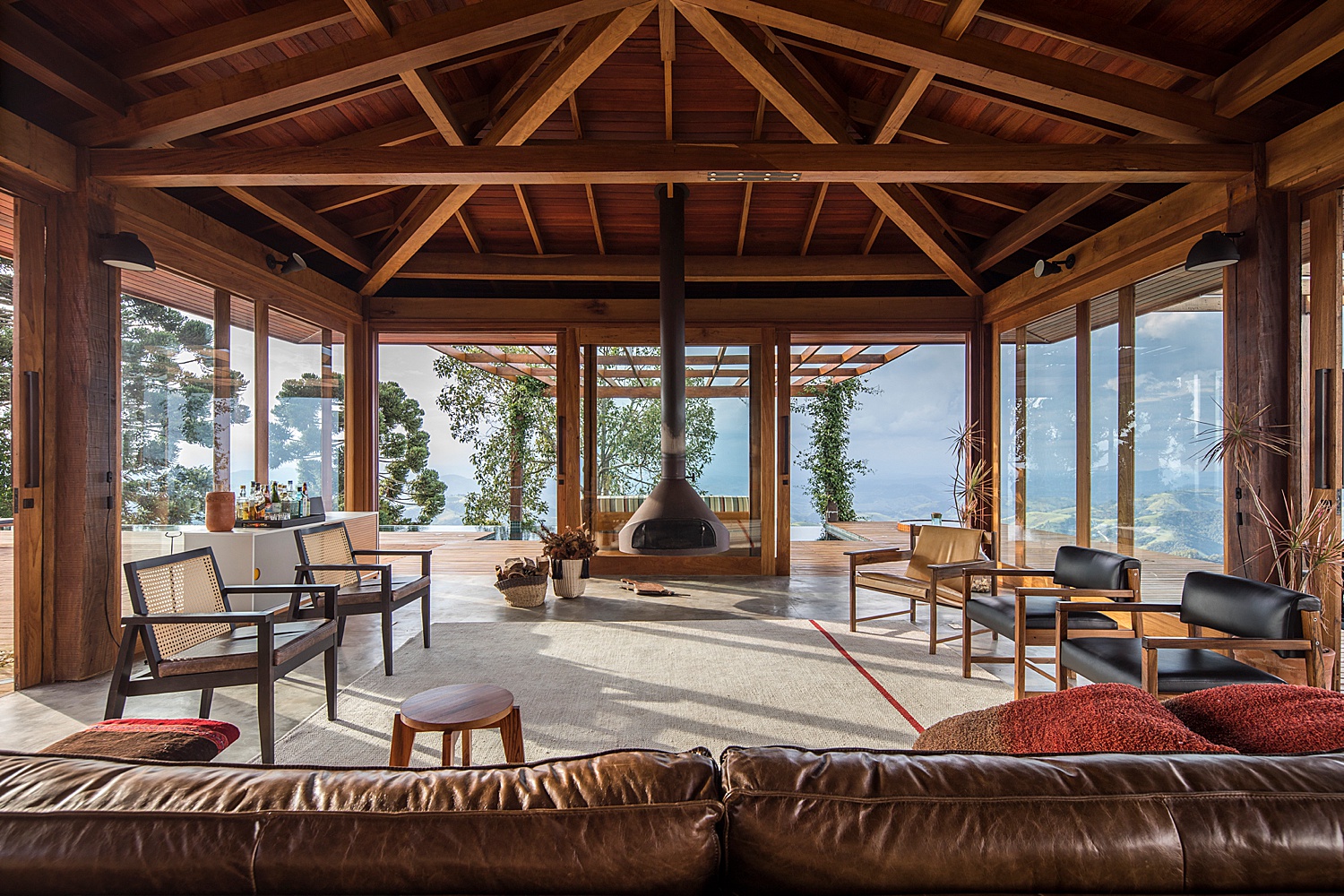
Inside, we find more examples of realistic exposure balance and strong perspective. The indoor to outdoor exposure ratio is spot on. There’s a lot of objects competing for our attention in this open floor plan, so the one point perspectives ground us and guides us through the room with ease.
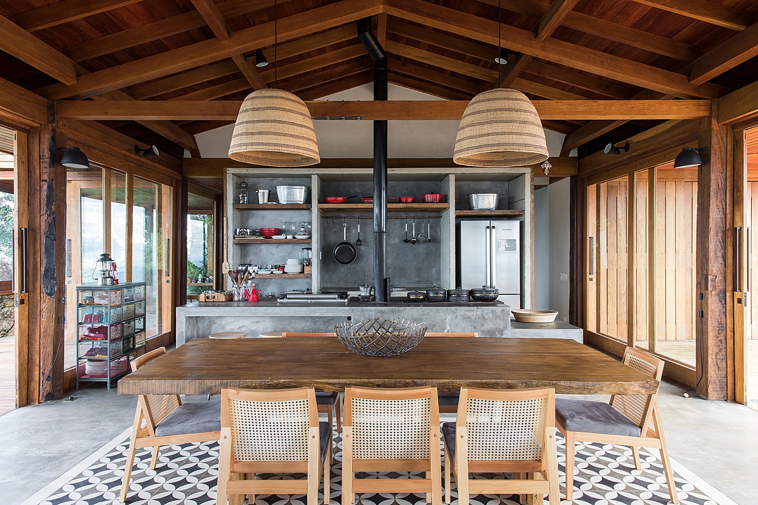
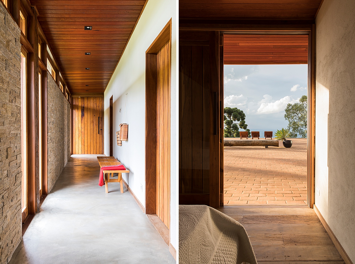
Maíra’s use of vertical frames here creates a sense of intimacy and really hones in on the details throughout Casa Gonçalves. We are now able to see the wooden slats on the ceilings, clerestory windows, and materials we may have missed otherwise. I’ve said it before and I’ll say it again, the tonal range in this series is perfect. In the photograph on the right, there is such a wide gamut of of light in the scene. The shadows, at their darkest point, and the highlights at their brightest, are just at the cusp of losing detail. This helps create dimension and keep the photo from having that gross flat HDR look. However, this photo DOES have an incredible amount of dynamic range present. It’s perfect.
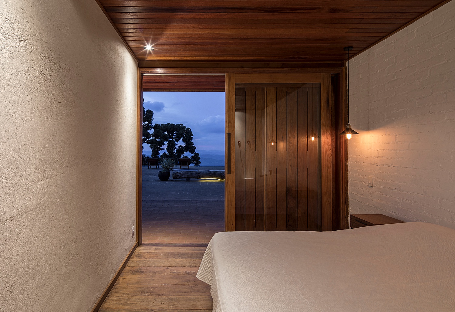
Ahh, Casa Gonçalves with the lights down low. Look at the abundance of texture in this frame. It’s like you could reach through your screen and touch it. The pitted concrete, the painted bricks, the sheen on the glass…it all looks tangible. The most beautiful thing here though is that it’s basically a color wheel at work. The cool blues and purples outside are clearly differentiated from the subtlety orange interior. It’s a great example of contrast through color.
At the end of our journey through Casa Gonçalves, Maíra shows us a familiar scene, this time with the emphasis on the interior. The complementary color scheme makes the indoor area feel inviting while the mountains are calm and cold. Notice the cloud slipping by below. What a proper ending to such an incredible project.
Maíra Acayaba was gracious enough to send over her photos and stories from Casa Gonçalves despite her busy work season. We’re thankful that she shared this project with us, and would highly recommend scouting out the rest of her work on her website and Instagram.
If you have a project you’d like to be considered for Project of the Week, you can submit it here.