Photographing the Dark and Moody Green Massage with Cai Yunpu
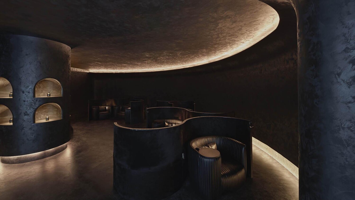
Many moons ago when I started writing Project of the Week, I fell in love with Ivar Kvaal’s photographs of Under because they were so dark and fascinating. I’ve finally found another project that gives me that same feeling. Meet Shanghai-based architectural photographer Cai Yunpu. Cai’s work has a wonderful textural quality about it. This project in particular though is quite curious. How can something so dark and moody make us feel as if we could reach into our screens and touch it?
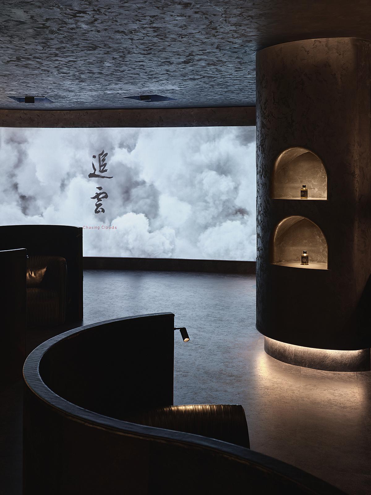
Let’s take a look at Cai’s photographs of Green Massage in Lujiazui for Vermilion Zhou Design Group. Cai’s photo brings us into Green Massage where we are instantly enveloped in the black color palate. The digital art on the walls reflects in a basin of water. Do you, like me, feel like you could just reach and dip your hand in?
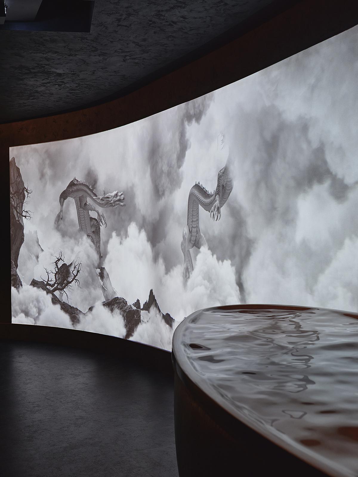
The light of the digital art streams toward the camera, bringing out the texture of the ceiling and floors. The cool blue tones are contrasted by the warm pools of light coming from the display volume.
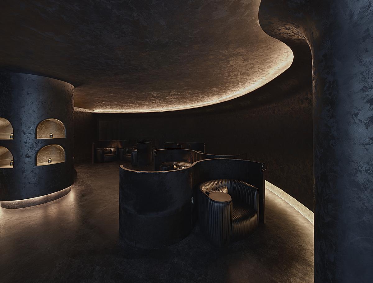
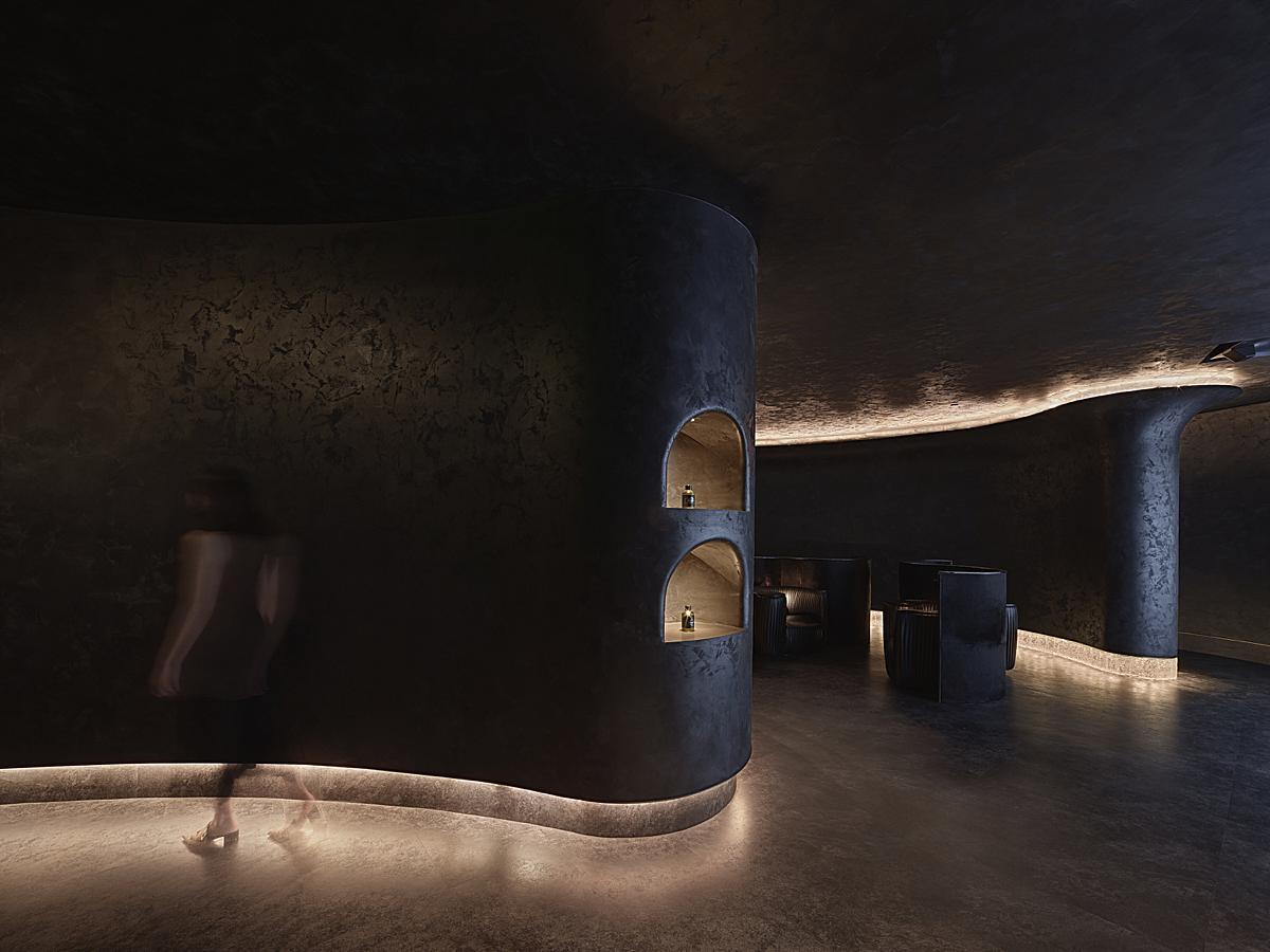
I love the way Cai places us in this scene to bring out the curving arcs in the design. Our eyes are swept through the image, and our attention rests on each little illuminated detail.
I appreciate that Cai isn’t afraid to let these images fall dark, because they are dark. There is a deep sense of contrast and while his blacks are silky and bold, we are still able to see a bit of texture on the walls.
While Green Massage is dark, it is not stark. Cai translates this perfectly. He gives us a sense of place, and make it feel as if we are walking through the scene, ready to plop down in one of the armchairs.
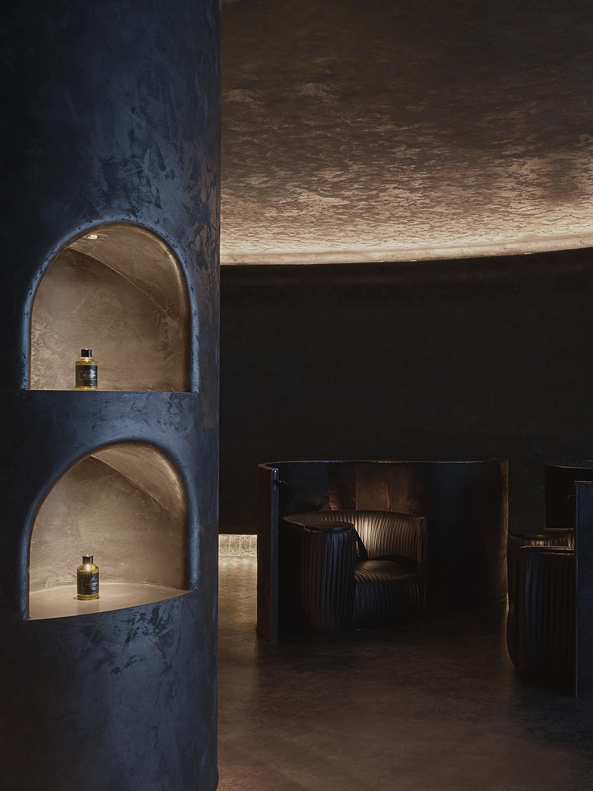
The use of a figure gives purpose and movement to the room. It creates curiosity, and we are left wondering what is down that hall.
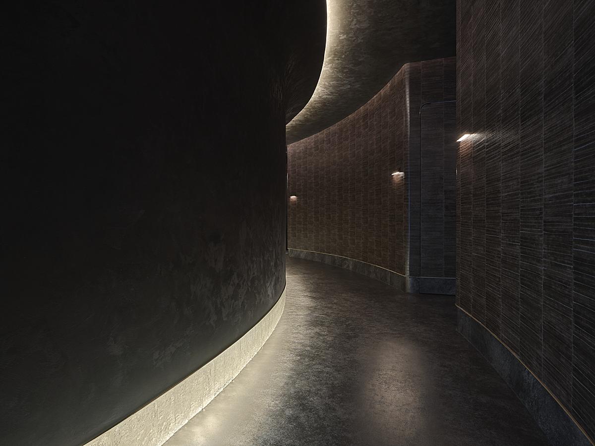
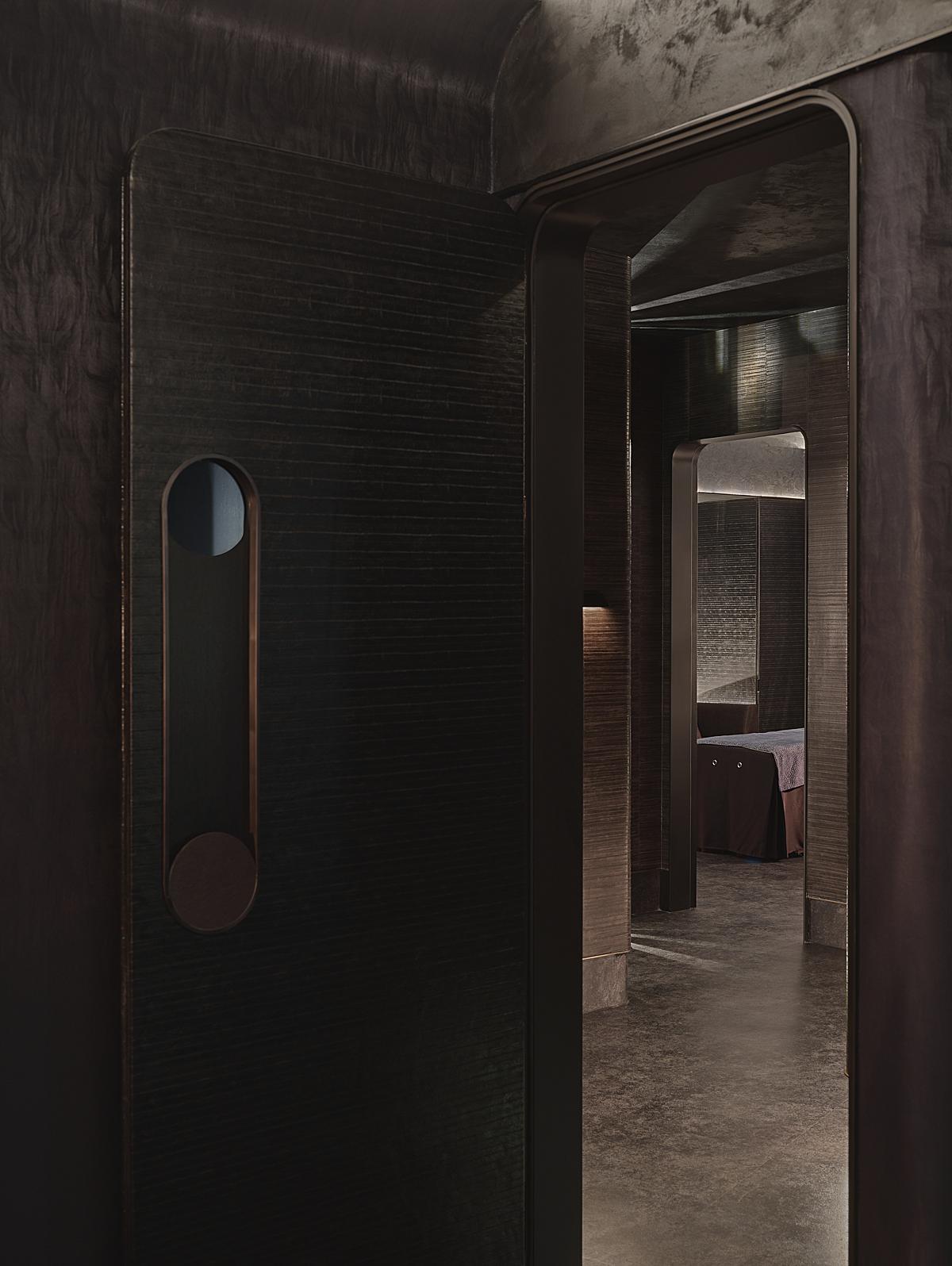
Here we are greeted by more dark tones and soft curves of light that pull our eyes down the frame. We are able to pick up on the textured walls and make out the outline of doorways… piquing our curiosity even more!
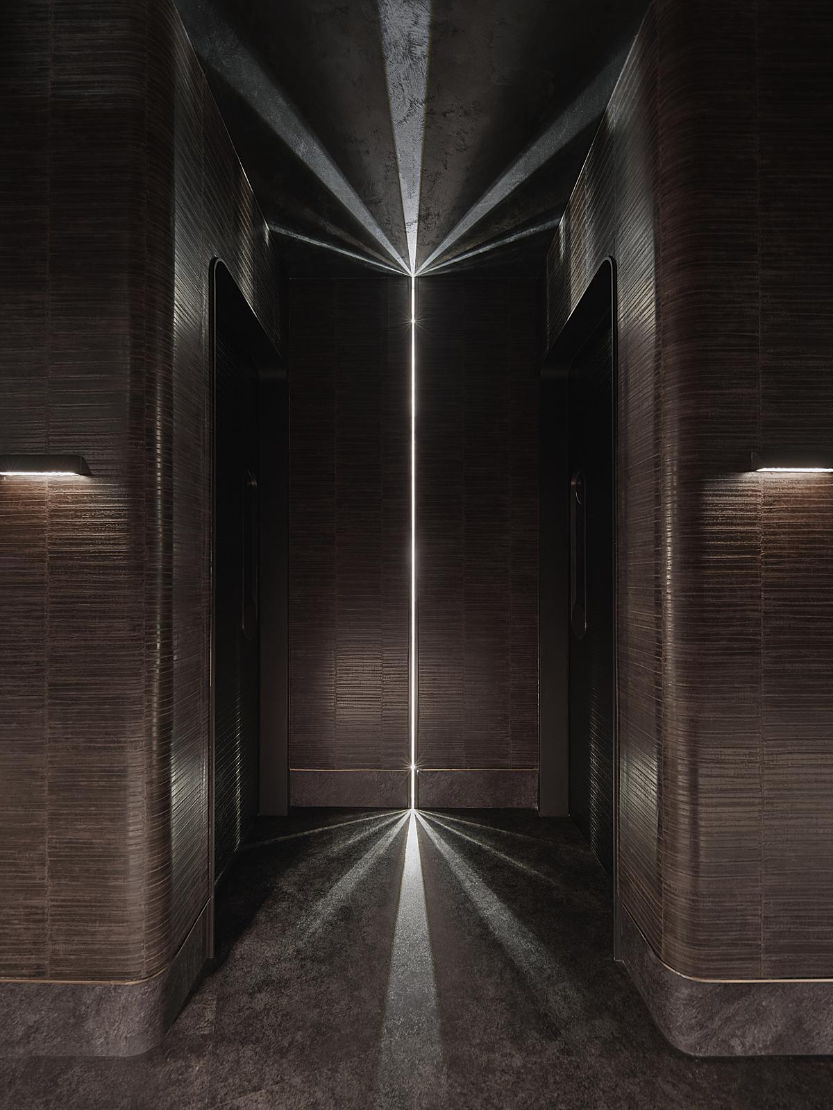
Ah, my favorite image. The symmetry begs for this to be a one-point perspective, and Cai knocks it out of the park. The lighting design creates an other-worldly feeling, and we are left wanting to know more.
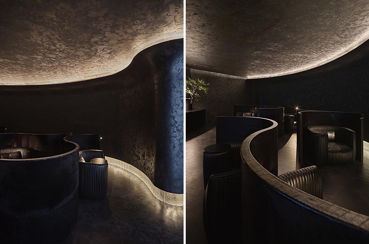
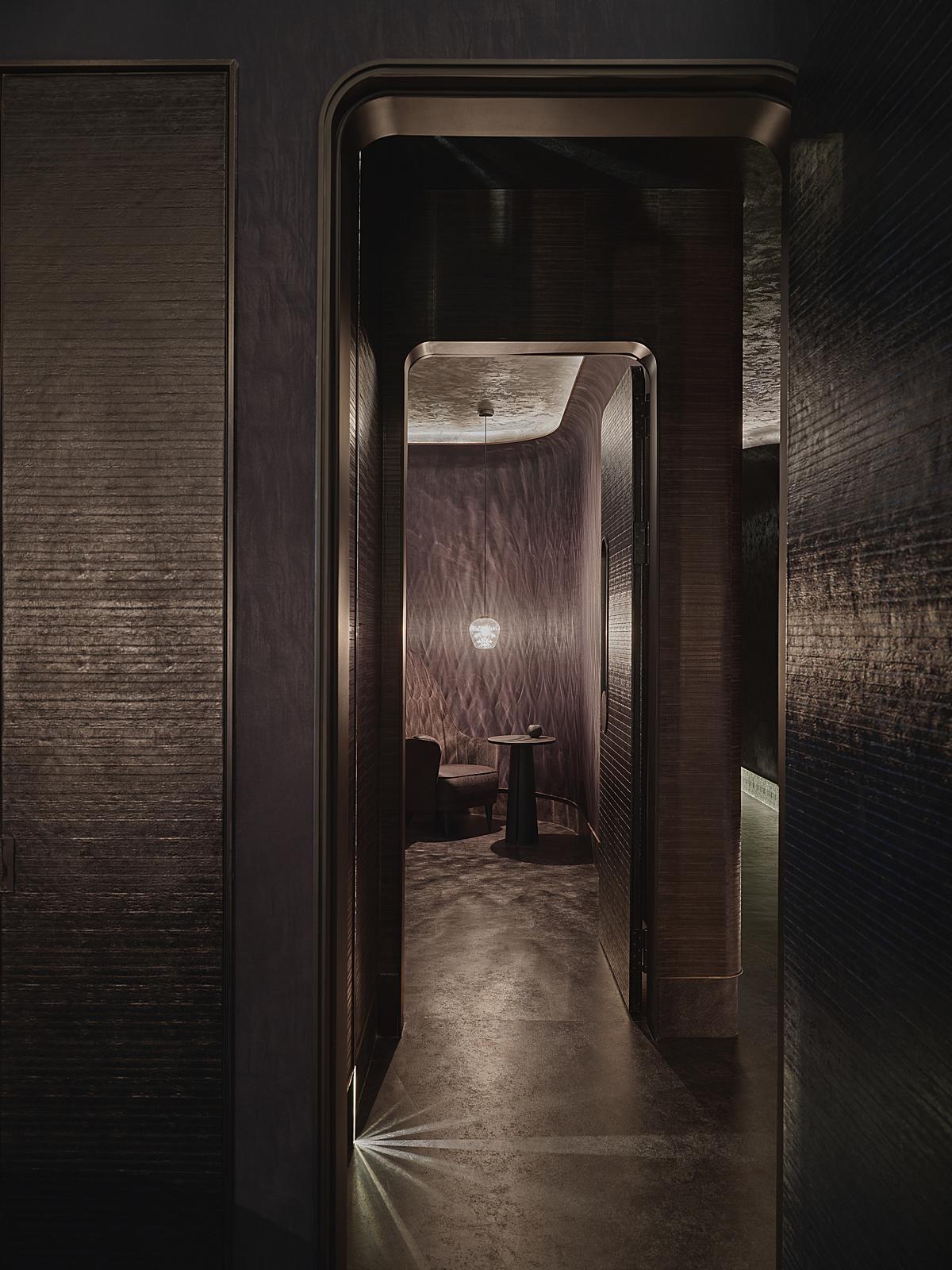
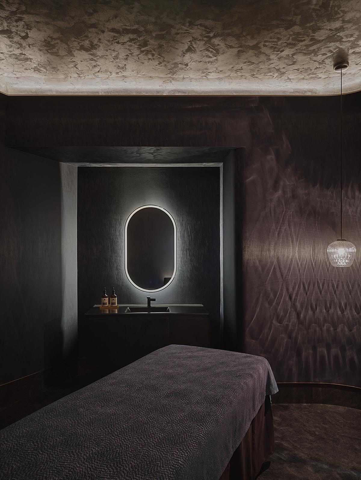
Inside the massage rooms, there is still the same black design scheme, but a warmer and more relaxing feeling about it. Cai translates the inky colors, subtle sheen, and textures that are reminiscent of water. The whole scene feels very soothing.
Green Massage is designed to be a deep immersive experience. With a peculiar yet beautiful space such as this, Cai’s photographs spike our curiosity and walk us through the bold design. Many thanks to Cai and his team for sharing these incredible photographs with us!
See more of Cai’s work via his website caiyunpu.com!
If you have a project you’d like to be considered for Project of the Week, you can submit it here.
