Quiet Scandinavian Interiors Photographed by Marcus Stork
I came across Marcus Stork on Instagram and was immediately drawn in by the quality of light and depth of his compositions. Marcus’ photographs have a delicate and quiet air about them and include that effortless Scandinavian styling that is just so beautiful to look at. One particular series that I love is this week’s featured project designed by Stylingbolaget.
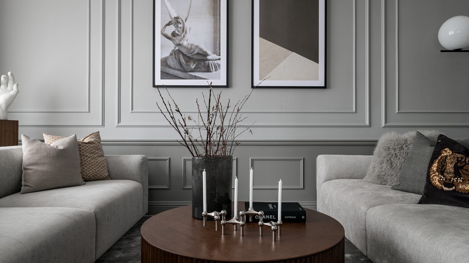
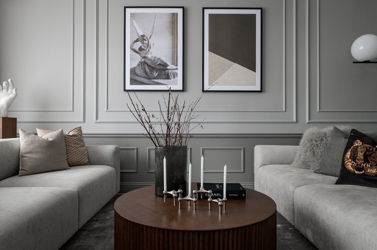
Starting out in the living room, Marcus shoots with the windows backlighting the scene. That lovely light streams over the furniture, emphasizing the shape of each piece, while giving the photograph some nice contrast.
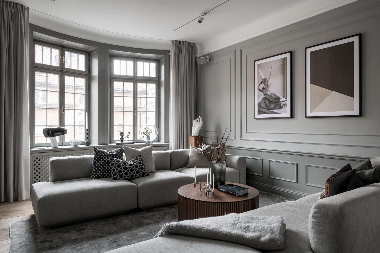
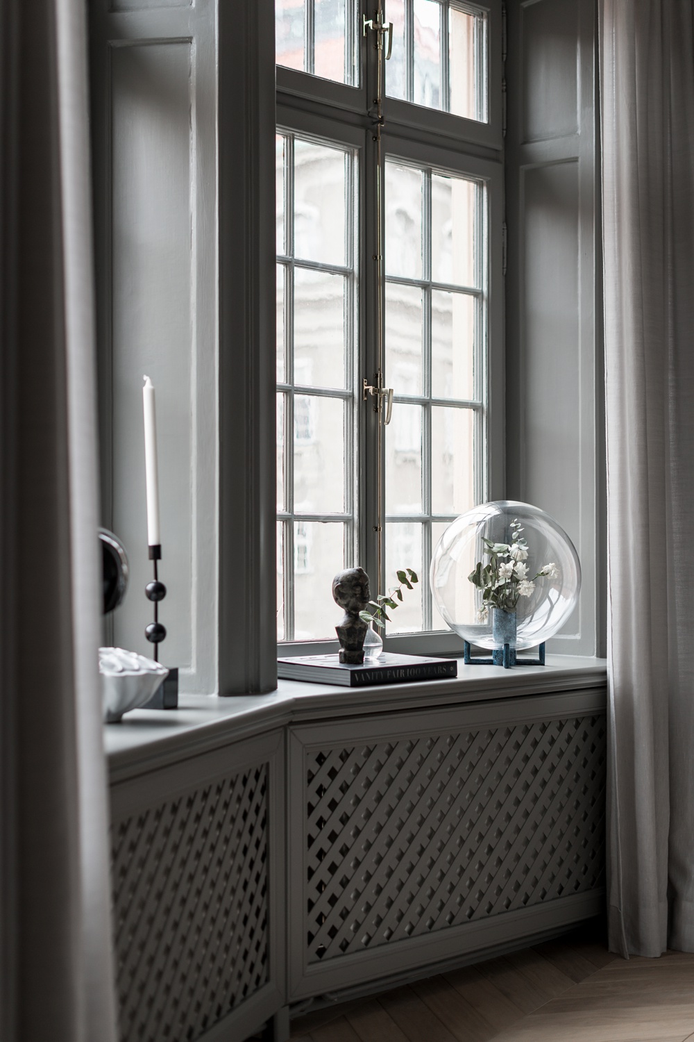
A one-point perspective hones in on the design details of this room. We can see the sculptures and lighting fixtures creeping into the frame, while a gradient of light washes in and draws our attention to the molding and millwork on the walls.
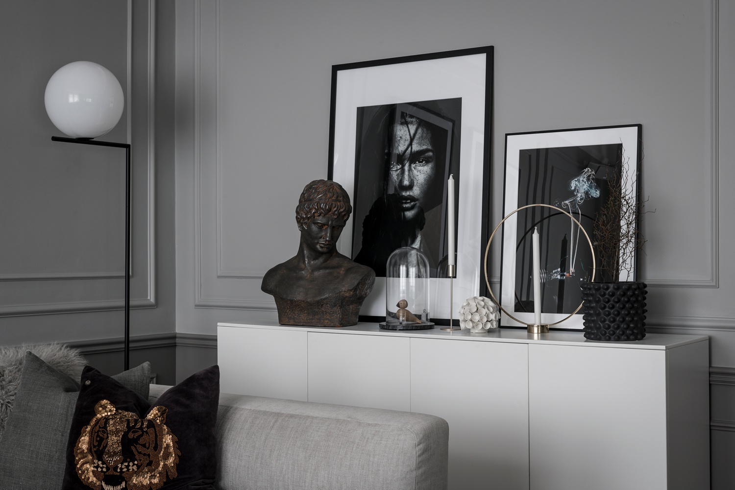
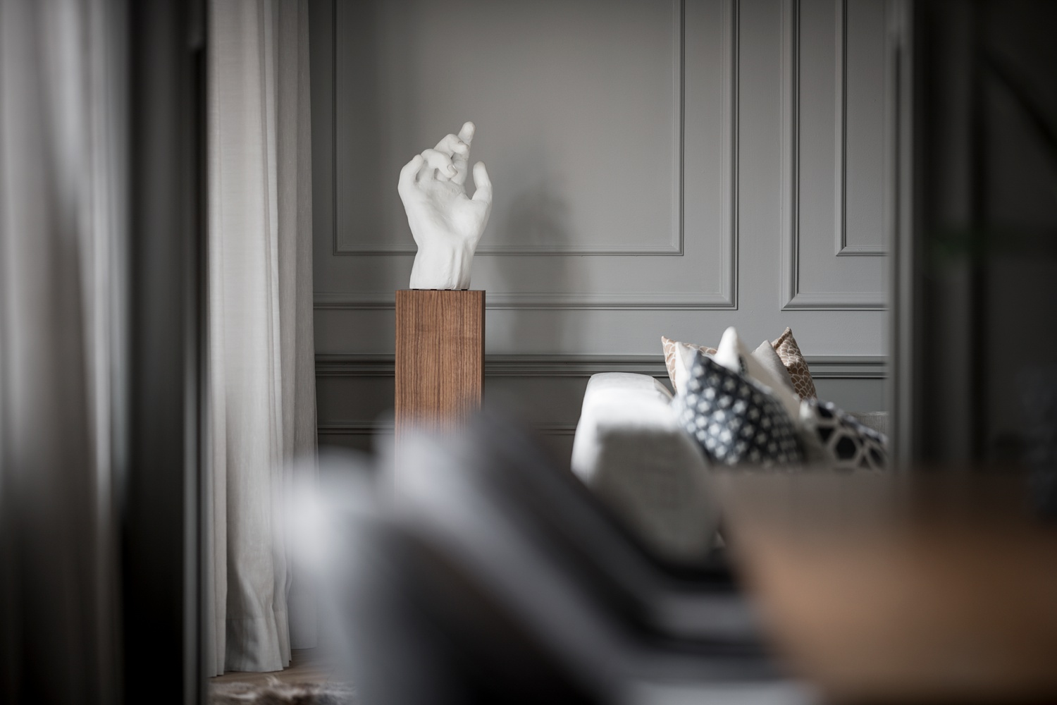
With his client being a designer, Marcus included many tight crops and vignettes featuring styling details in this project. Each one was just as lovely as the next! His careful compositions and that same gentle light flowing through the rooms, indicates that he poured the same amount of care into all of his accessory shots as he did each of the main “hero” images.
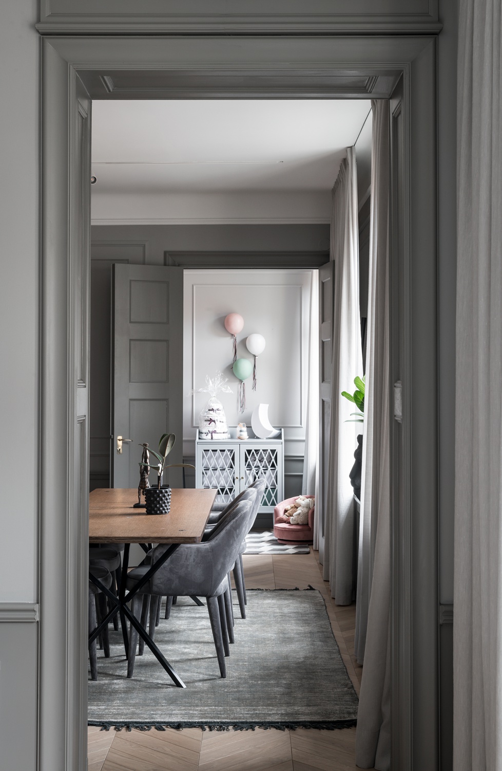
Orienting his camera vertically, Marcus uses the door frames to pull our eyes all the way from the living room, through the dining area, and into the child’s room on the other side of the home. This composition gives us a good sense of place and displays the length of the size and layout of the flat.
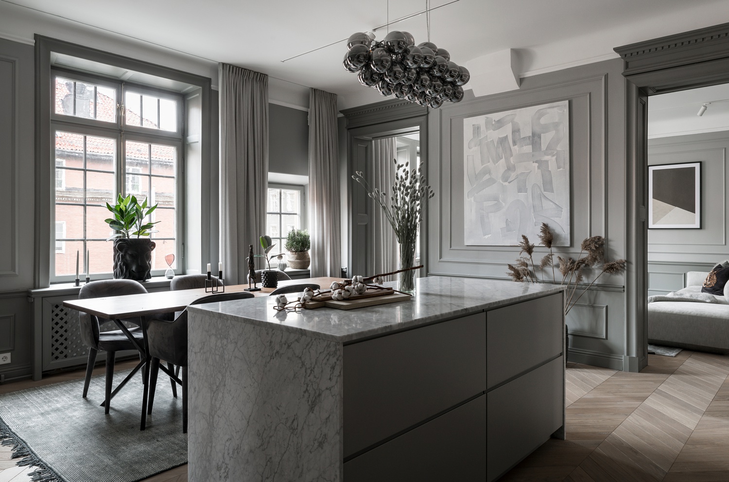
In the kitchen, a sublimely lit one point perspective draws our attention to the repetition in the rectilinear shapes present in this design. With a monochromatic color palette, all of the contrast and depth in this image comes from the range in the highlights and shadows. The light emphasizes the square shapes of the larger and more obvious elements like the island and cabinetry, while chiseling out those created by the trim and paneling.
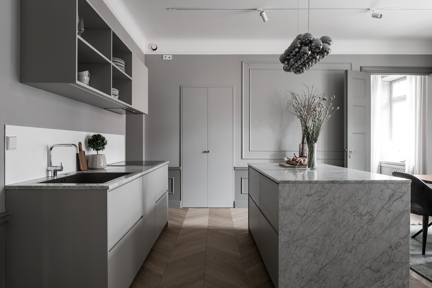
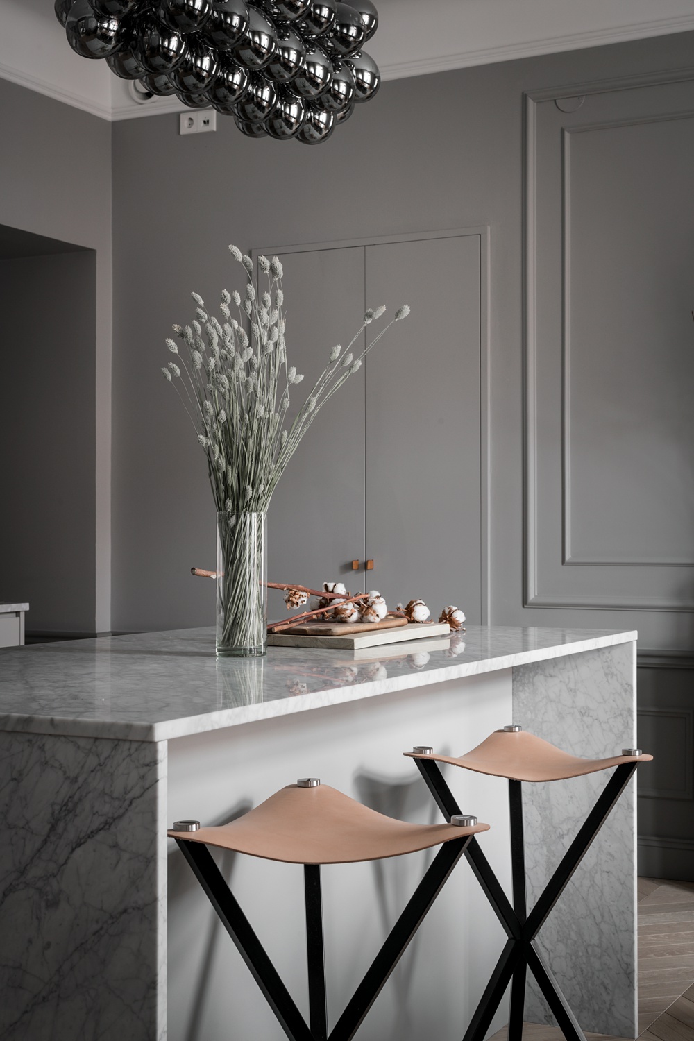
There are a lot of straight lines and hard shapes in this project, especially the kitchen. By propping this scene with greenery and the cotton stalks, Marcus subtly adds a dash of color and organic shape that helps soften this image.
From the other side of the room, backlighting the photograph gives us a dark foreground, which allows our eyes to travel past into the dining space and back into the living room beyond. I also love the light streaming across the floor, highlighting the herringbone shape and the faint differences in color that each plank has.
I appreciate Marcus’ dedication to photographing the details of this project, which show the thoughtful styling and design of the home. By mixing in vignettes with shallow depths of field in with the wider views of each room, Marcus is able to tell the full story of this house.
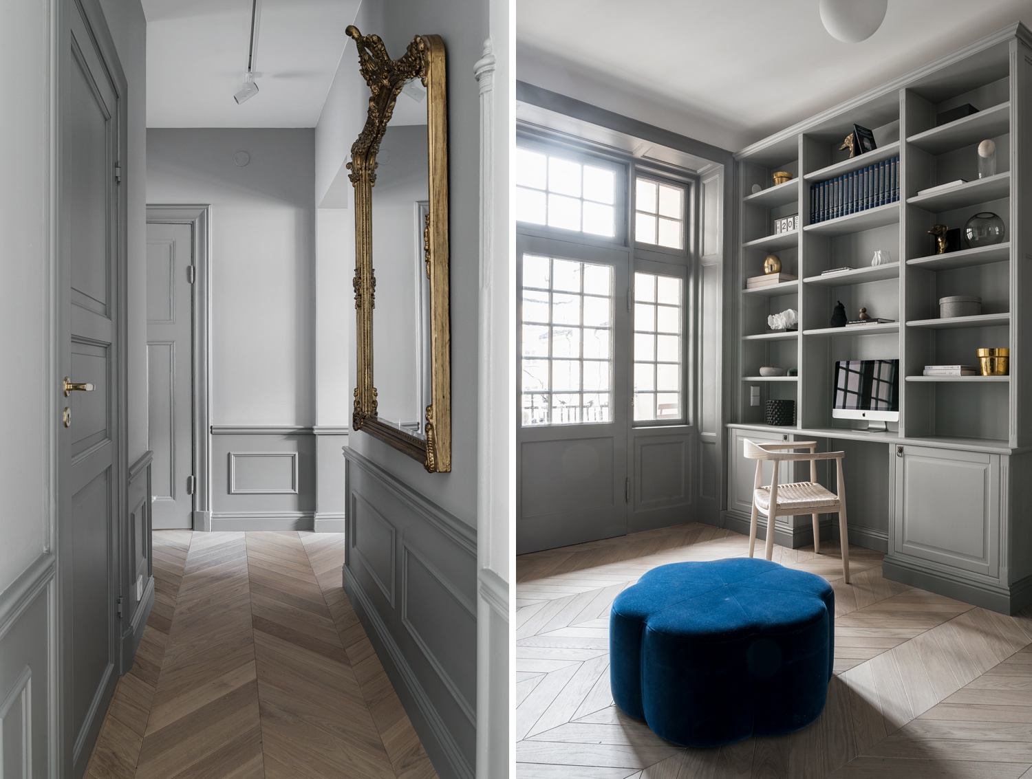
As we travel through the hallways and other rooms, the same minimal color scheme is present, contrasted by gold accents and the occasional pop of color like the ottoman here. These two particular images give off a great sense of space to me. Both transport me into the scene. Maybe it’s the light pouring into the intersecting hallway, or the sun streaming through the windows. It gives off a long-shadowed, sleepy later afternoon vibe that just teleports me there.
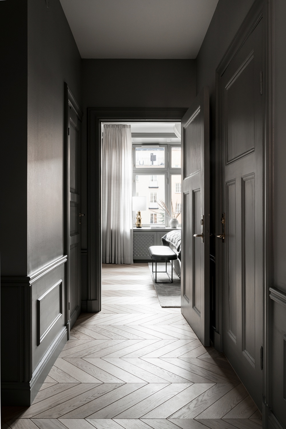
Much like the image composed through the doorway earlier in this project, this one too draws our eyes through the frame, past the dark foreground and into the bright room beyond. This image in particular though has a rich sense of contrast, pushing the dynamic range at each end of the spectrum. It still feels completely natural though, and the difference in exposure between the window view and the dark walls immediately in front of the camera feels very real and true to life.
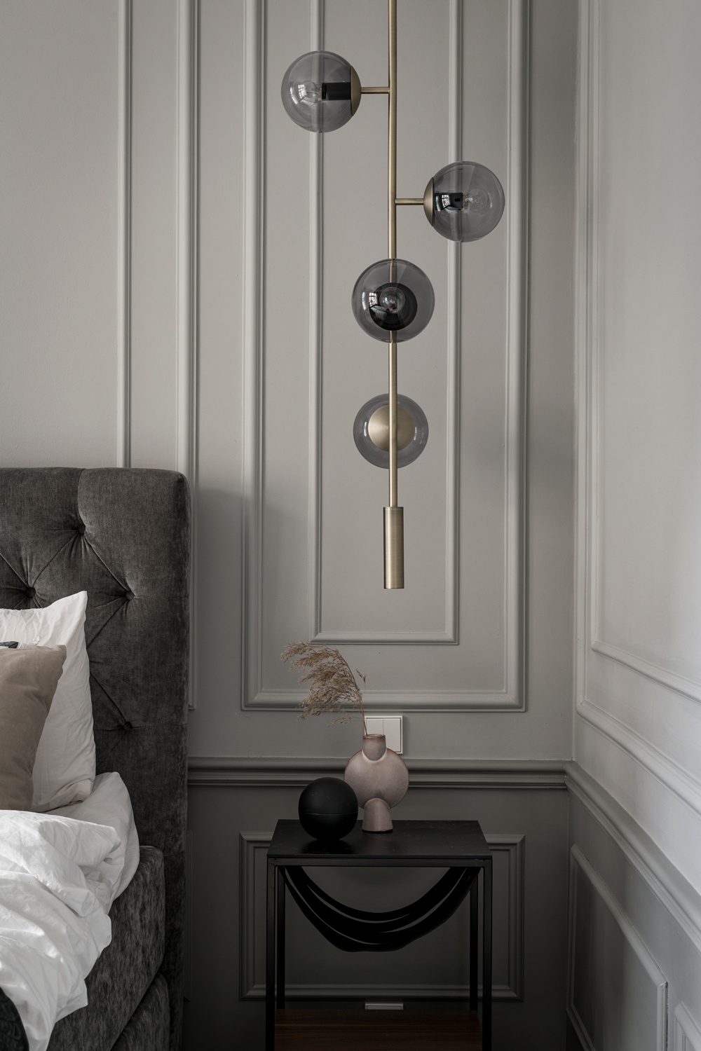
In the bedroom, a vignette shows off the details of the millwork on the walls, and that gorgeous lighting fixture. The sliver of the bed implies which room we are in, without taking over the image. A gorgeous fall off of light from the top of the frame to the bottom draws our eyes down through the scene, but doesn’t let them linger on the base of the nightstand or the bottom of the bed. It keeps our attention right on the main subject, the lighting fixture.
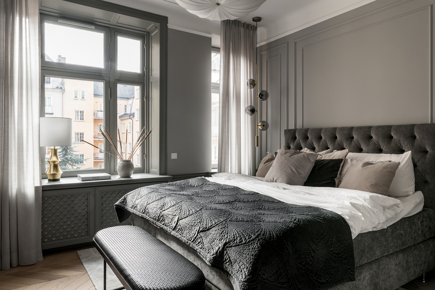
Our last view of this project — a wide and encompassing view of the master bedroom — is riddled with intermixing textures. The light raking across the scene picks up the velvet of the headboard and bedside, the tactile quality of the bedspread, and even the delicateness of the overhead lighting fixture. The whole scene is palpable, like you could reach out and touch each object, and is a proper sendoff to this beautifully designed and photographed project.
Many thanks to the wonderful Marcus Stork. You can check out more of Marcus’ work on his website marcusstork.se or follow along on Instagram @storkholmphotography.
If you have a project you’d like to be considered for Project of the Week, you can submit it here.