Photographing Bespoke Cabinetry and Millwork With Tony Colangelo
Today we’re checking out an absolutely beautiful project by the wonderful photographer, Tony Colangelo!
Tony was hired by his long-time client South Shore Cabinetry (SSC) to photograph a stunning cabinetry/millwork installation in their recent project. Tony knew that the images will eventually be submitted to a regional building awards program on Vancouver Island, so his primary goal was to focus on displaying the kitchen.
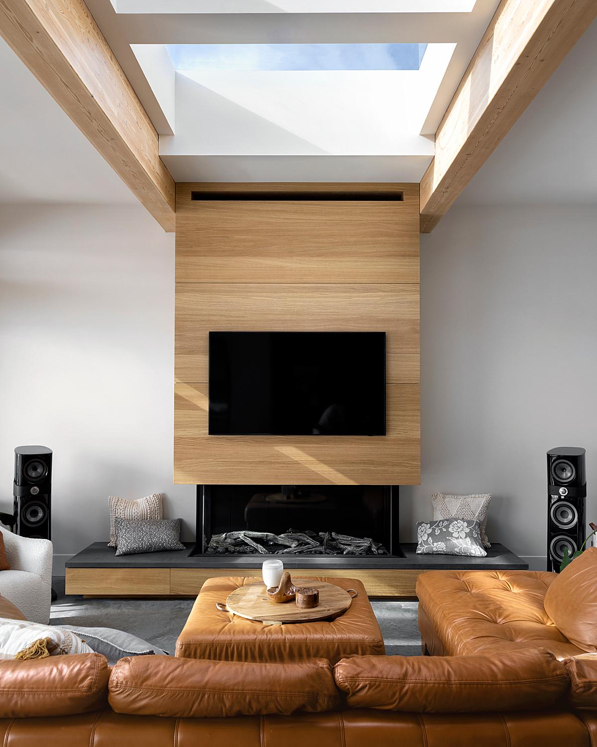
“The type of wood used for the project was one that I’d never seen before: European ‘scratched’ white oak. Korey Sandsmark from SSC, who was there to do a walk-through with me, shared that he loved using this wood. When I asked him why, he said that he liked its random veneer pattern because it gives more of a custom look versus buying a book-matched veneer,” Tony notes.
“On top of that, he noted that the bandsaw marks that create the scratches on the wood, give it more of a rustic, natural pattern that gives the material added character. Beyond its natural warmth and beauty, the wood complies with guidelines set by the Forest Stewardship Council, aimed at responsible management of the world’s forests.”
After a 30-minute scouting session where Tony and his client discussed all the specifics and noted where the light would be most advantageous thanks to the ‘Sun Seeker’ App, the actual shoot ended up taking Tony about 9 hours. His biggest challenge while shooting this space was the ever-changing weather, constantly vacillating between overcast skies and powerful sun breaking through. He also mentioned that he was in-between assistants at the time, so he performed this job totally solo.
I would be remiss if I didn’t mention that Tony is well known in the architectural photography community for his compositional approach – so much so that he offers a dedicated course on it. He shares a bit about his methodology, explaining “Philosophically when it comes to composition, I believe that the overarching purpose of our photos is to create a feeling of ‘relief’ in the viewer’s brain.
That is, we try to organize the scene in such a way that the viewer doesn’t have to exert lots of mental energy to process what it’s seeing because things just make sense/feel right. While this might seem like an ethereal concept, there’s a branch of study in the field of cognitive neuroscience called, ‘processing fluency’ that’s rooted in this principle. Years of research in this area has found that the human brain prefers to think about things that are easy to think about. As such, it tends to prefer tidy over untidy, balanced over unbalanced, tack-sharp over blurry, and so on.
Ultimately, I think this principle is at the heart of good composition. That is, we’re trying to organize the info within a scene so that it’s easy for our clients to process. So, we use composition techniques like the rule-of-thirds or leading lines to organize the overall scene and then we spend a lot of time refining the photo through effective staging and trying to remove distractions, such as tangents. I think that melding such concrete practices with our own creative instincts, is what leads to compelling photos.”
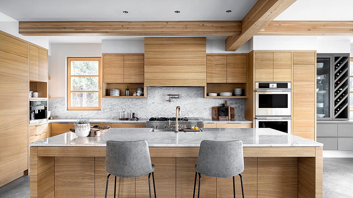
He continues, “Operationally, like many in our community, my default is to throw a tilt-shift lens onto the camera for most scenes. This is usually my 24mm TSE, which is often paired with a 1.4x extender. I also use a CamRanger and 10” tablet to help in composing the shot. In this photoshoot, my years of experience in working with this client gave me knowledge of their preference for receiving a good number of vignette-type shots in portrait orientation. Consequently, I decided to use my 24-105mm zoom lens for many of the photos. It just made sense to me that zooming in to a tighter composition would be the best way to capture the beautiful warmth and grain of the white oak. I also thought that there’d be some benefit in using the additional focal length to bring a bit more perspective compression into play.”
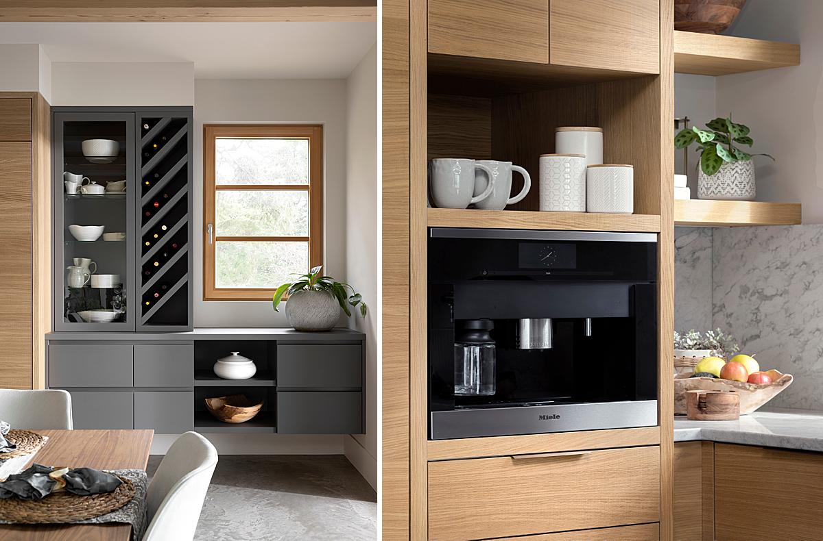
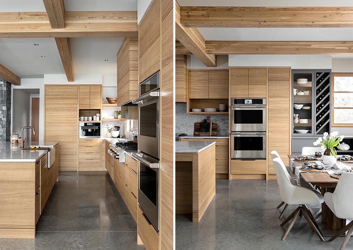
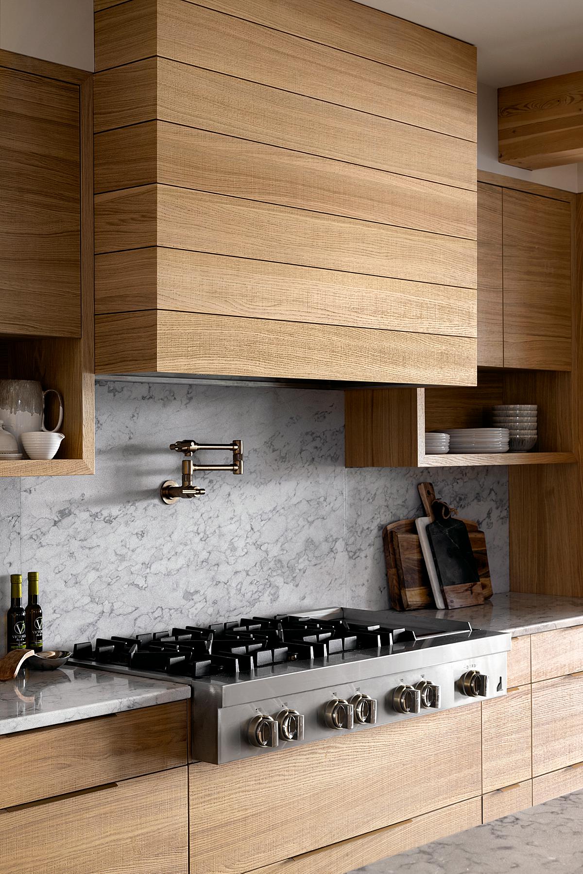
We can see that gorgeous compression in the photograph above of the coffee area, as well as the photo of the range below. The built-in coffee maker was shot at 96mm, producing lovely compression and creating a tight crop that allows our attention to rest on the textures, gradients, and craftsmanship in the image. In the photograph of the range, Tony is at 55mm. We can see every groove and pattern on the cabinetry. It’s stunning.
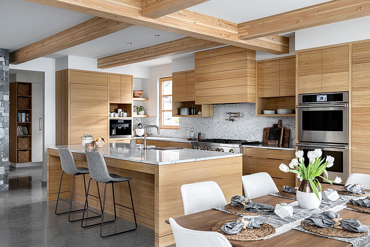
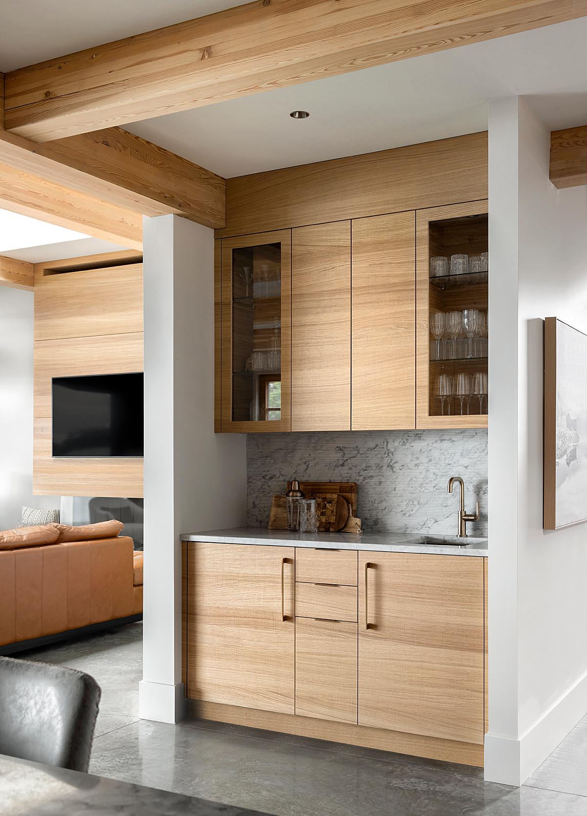
“Another important factor in finding compositions at this shoot was the awards submission requirement that, for any of the kitchen-related award categories, there has to be at least one photo showing a connection between the kitchen and an adjoining space(s),” he explains, as evident in the photo below. Through layering, Tony helps us understand where we are in the house. A slice of the island countertop in the foreground helps place us in the scene. The subject is the bar area, but we are able to see into the living area and hallway on either side, piquing our interest in those rooms.
“From an editing perspective, my over-arching approach is to take advantage of soft, natural light, as much as I can. In fact, significantly more often than not, I deliver all-ambient images to my clients; and such was the case here. Indeed, if memory serves, there were only a handful of photos where I used a flash frame in the editing process. I tend to shoot a four or five-shot ambient bracket for each scene. I also capture a flash frame or two, just to give me options/additional info in post. The use of luminosity masks allows me to pull out the best elements of each selected ambient frame.“
“My editing workflow is done entirely in Camera RAW and Photoshop, with DxO Nik Software plug-ins used on every photo, to make either enhancements to luminance, contrast, detail and color (either selectively or globally). I’m a huge fan of Nik tools and have been using them forever!,” Tony shares.
Tony tells “As you can see, I landed on one-point perspective compositions for most of the photos. Aside from the intrinsic sense of balance found within most one-points, I thought that using this approach would allow me to better leverage the exposed ceiling beams to frame the top these vignette-type shots.”
Tony closes out by telling us all about his – and my – favorite photograph from this series. He says;
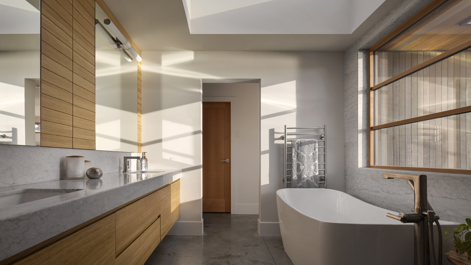
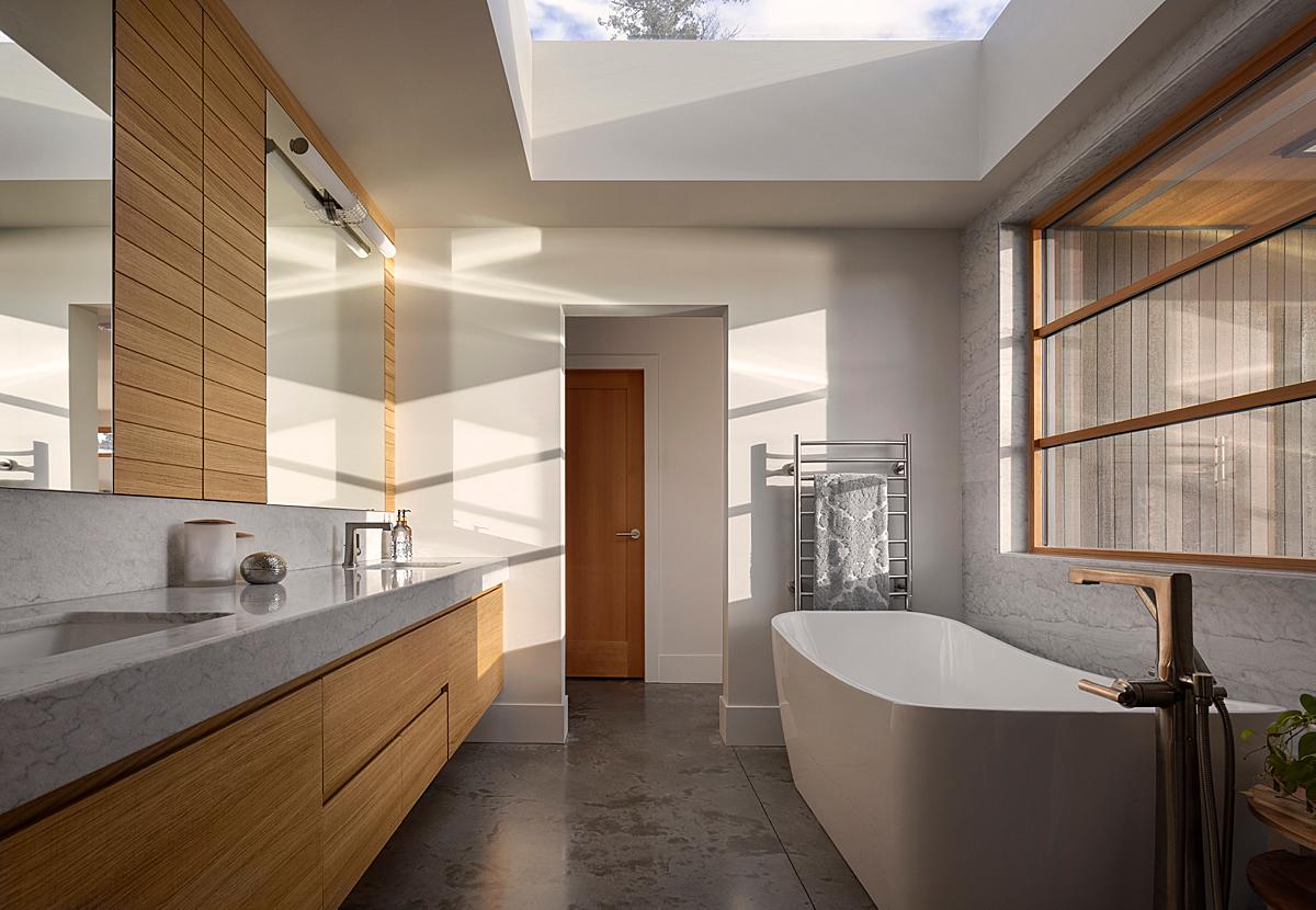
“Despite the high number of kitchen shots from this photoshoot, I think that my favorite photo in the set ended up being the one-point perspective composition of the ensuite. By the late afternoon that day, much of the cloud cover had blown away, allowing gorgeous, golden-hour light to stream into the space.
In sussing out the composition, it was clear to me that this camera position was the best one to capture both the directionality of the light and how that lovely, warm light affected the white oak cabinetry. Another reason why I like this shot is that, aside from capturing the warm glow coming off the cabinetry, it also captures what I think are some very interesting architectural choices (e.g., the size of the skylight; the concrete floors; etc.)
In closing, I can honestly say that I had a blast shooting this project. My only regret is that I didn’t have a second day to capture the many images that I know were left behind!”
Many thanks to our friend Tony Colangelo for sharing this dreamy project with us!
Visit Tony’s website tcphotography.ca to see more of his work, or give him a follow on Instagram @tcphotography99.
If you have a project you’d like to be considered for Project of the Week, you can submit it here.