Photographing a Tidy Interior Design Project with Jack Lovel
Here on Architectural Photography Almanac, we tend to focus on — well — architecture. Not to be overlooked though, is photography with an emphasis on the design of a space. This Project of the Week by Melbourne based Jack Lovel is great study on clean edits, simplicity, and the “less is more” aspect that shines when working with interior designers.
Let’s jump right into Jack’s work of balance designed by Studio 103:
I’m immediately grabbed by the beautiful quality of light that Jack is harnessing here. It’s soft nature meshes perfectly with the wellness studio’s overall feel. There are just enough shadows present to provide visual interest, but all in all, it’s a very gentle scene. Jack familiarizes us with the space by showcasing its different design elements — the wooden room divider, the branding, and the play between the industrial and chic materials that are present.
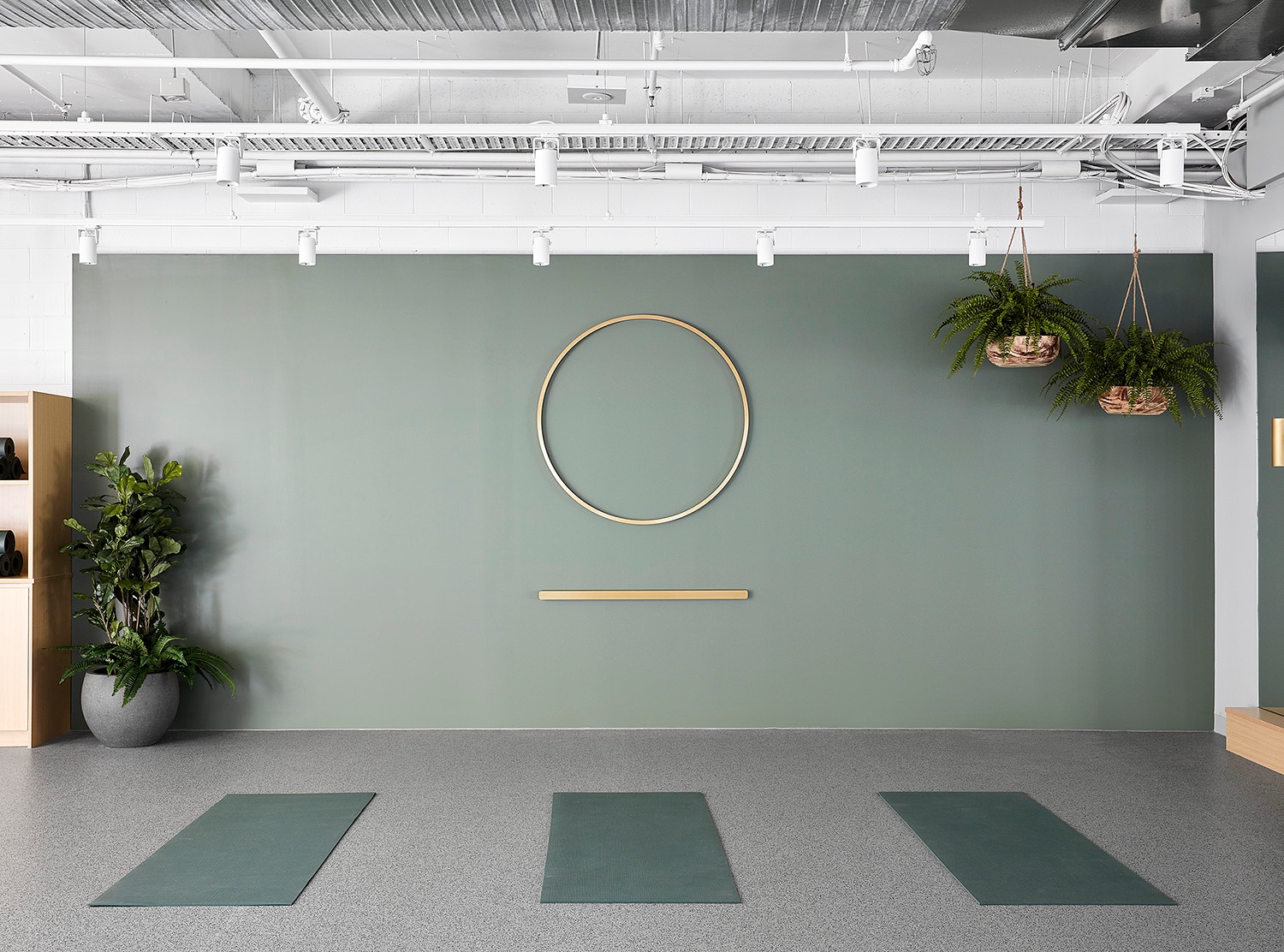
Lovel sneaks in a shelf and what looks to be a doorway at the edges of this next frame. These imply a sense of roominess in the building, but a strong one-point perspective grounds us in this room. There is beautifully soft yet directional light raking across the wall, bringing life to the plants the logo on the wall. This image gives off a great sense of place, and I truly feel like Jack is transporting me to the second row of a yoga studio.
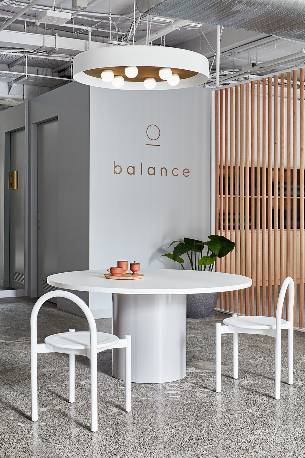
This is a pretty busy yet well-executed image that shows off the room divider. It works because of the dim foreground and the use of the arch to peek on out into the entryway. While there is a lot to look at, our eyes are moved by the rhythmic wooden dividers and settle on the plant and coat rack. I also think it’s great that Jack yoga mats to remind us that the divider separates the two rooms.
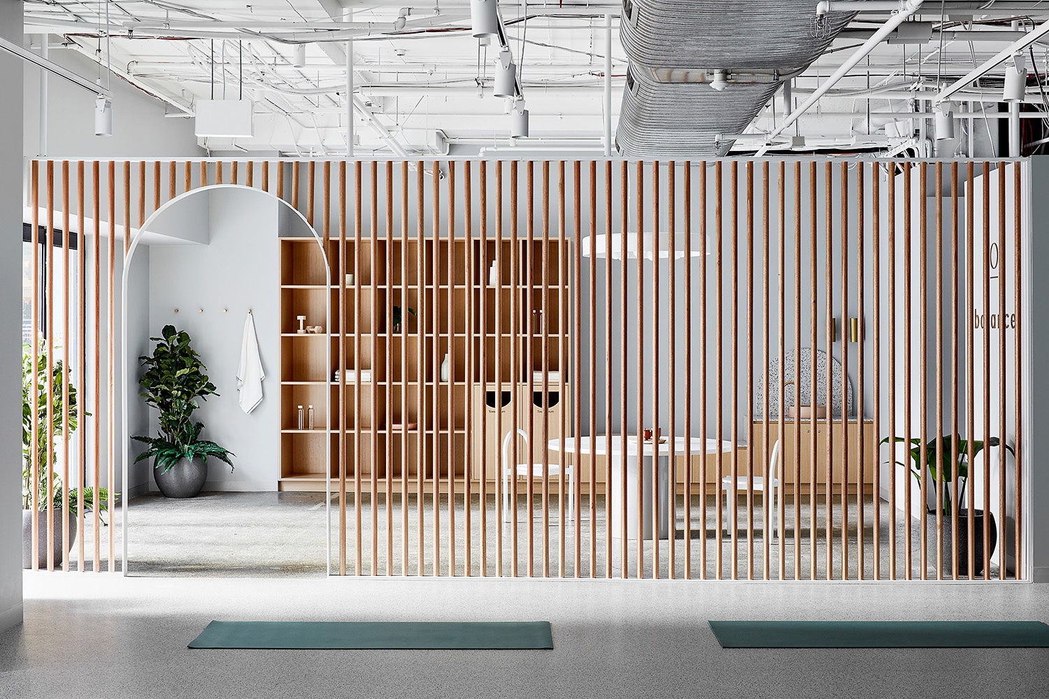
The wooden room divider is really the show stopper of Studio 103’s design for this studio. It’s definitely not a design element that you see every day, so I’m glad that Jack documented it well. This next image isn’t quite as busy, and gives the archway and the dowels room to shine. The plant is perfectly framed in the archway, bringing a nice organic feel to the space. Check out that beautiful streaming in on the floor of the studio!

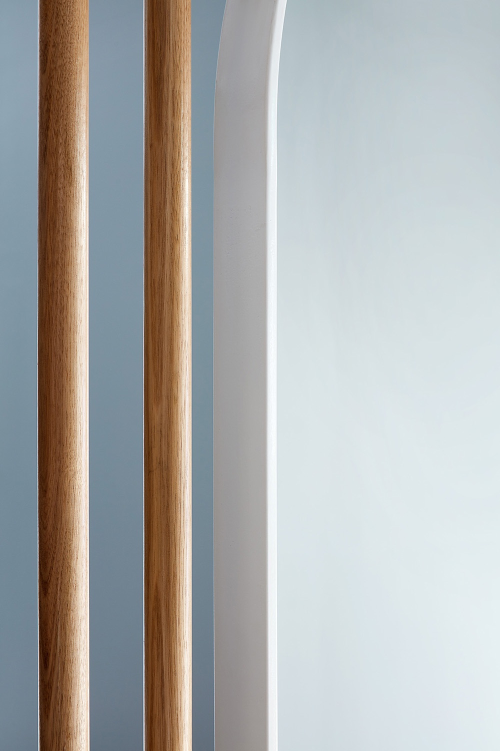
Getting nice and tight here, Jack highlights the wood grain on the dowels and how they contrast the smooth metal. I love the repetition in the linear shapes, the subtle gradiation in light and color, and how the texture of the wood is exemplified against the blue wall. This is a great example of showcasing the details within a space while sticking with the overall mood of the project.
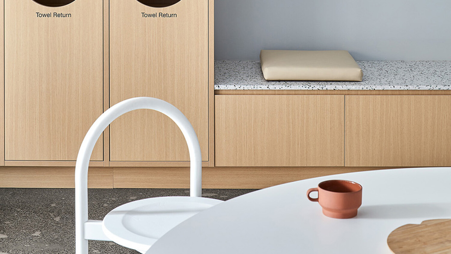
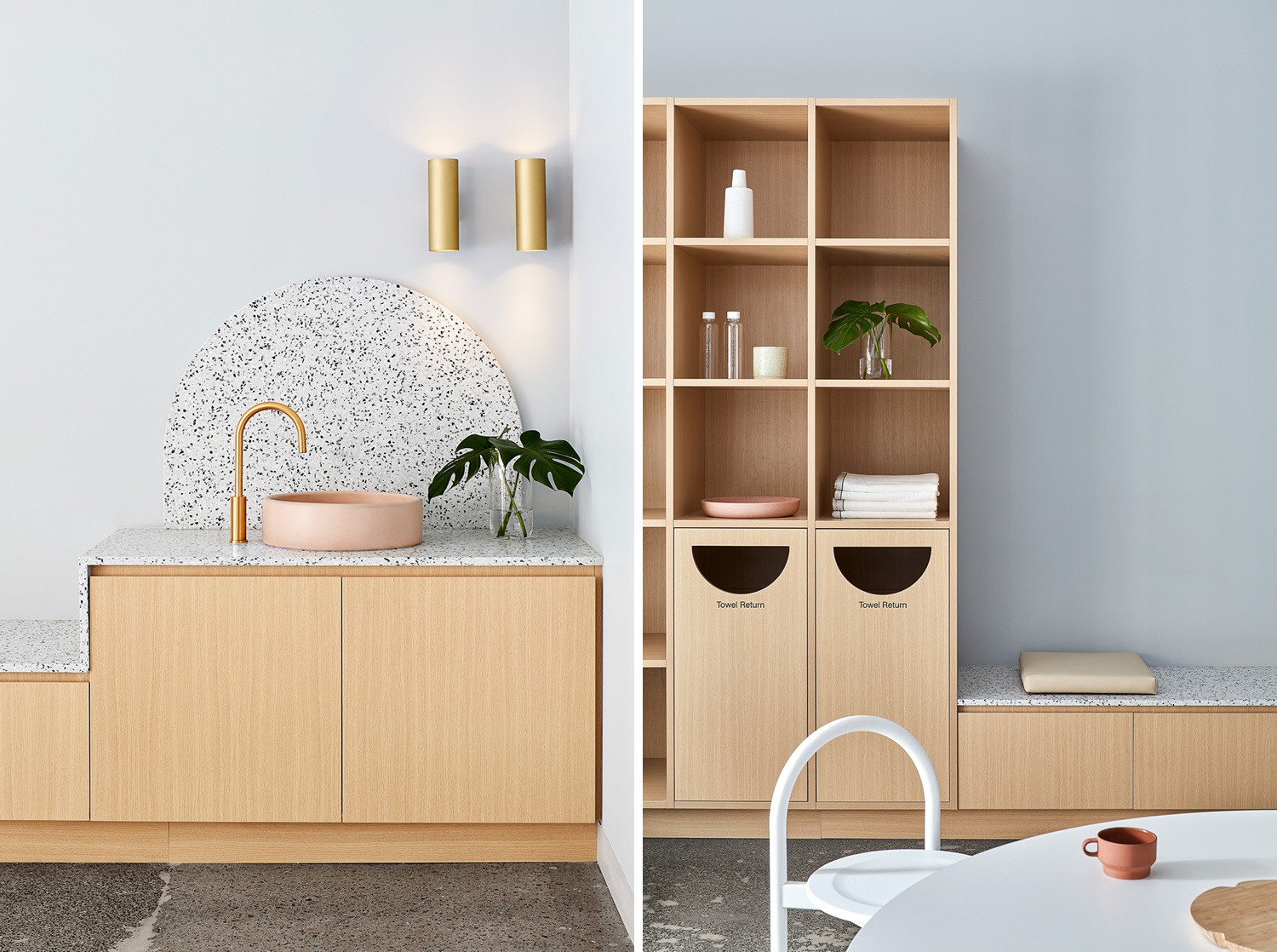
On the other side of the divider, Jack gives us two great vignettes. Again, ever so soft directional light adds a bit of dimension without being distracting. What is most masterful here is the tidiness in styling. On the left, Jack faintly paints in the lighting without getting ugly color casts all over the place. On the right, look at how perfectly everything sits in the frame. We are able to see a faint extension of the shelving. The chair has a little sliver of spacing between it and the base of the built ins. Check out how the edge of the table curves perfectly into the edge of the bench! Whew! These subtle details really push this project into a class of its own!
Many thanks to Jack Lovel for sharing his beautiful and ever tidy work with us this week. You can see more great examples on his website jacklovel.com or his Instagram @jack.lovel.
If you have a project you’d like to be considered for Project of the Week, you can submit it here.