“Patient, Observant, and Ever Ready,” Bien Alvarez Photographs The Viewpoint House In The Philippines
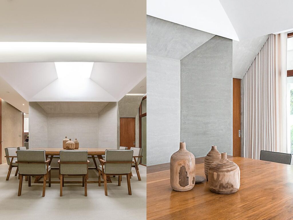
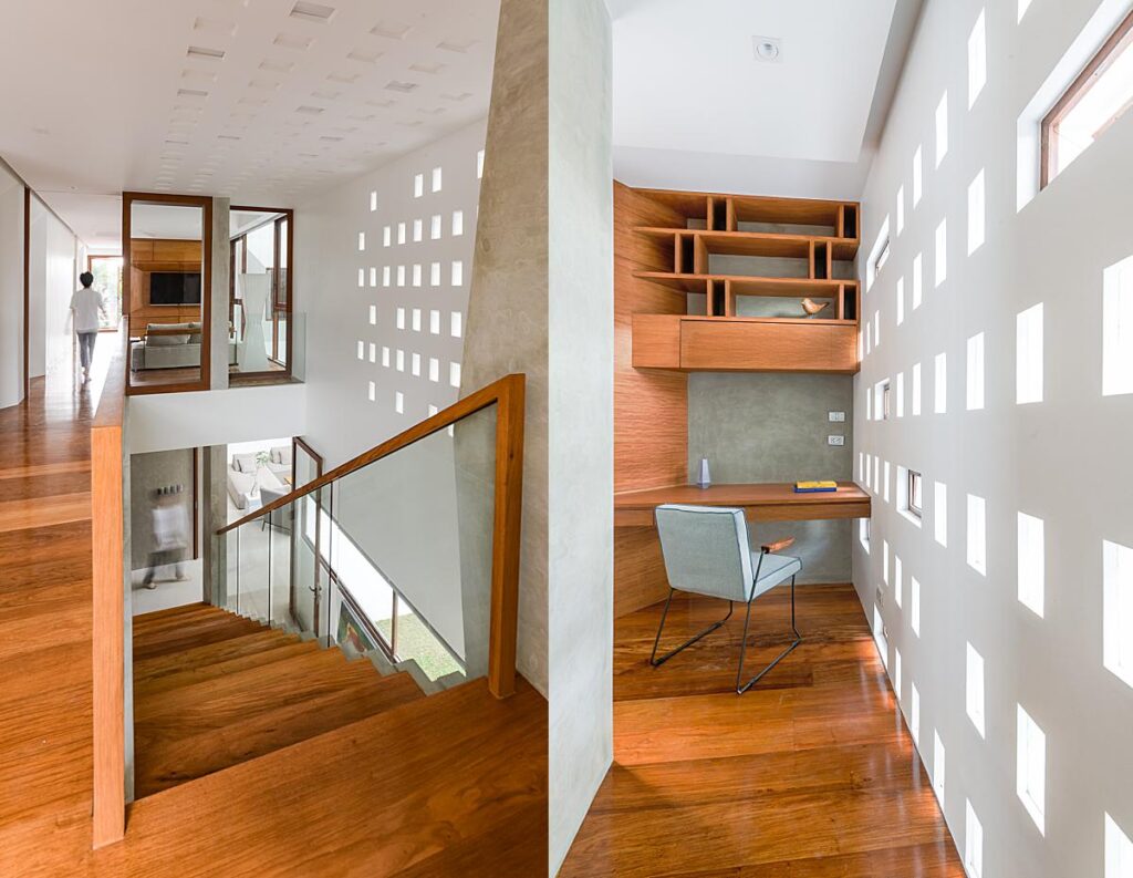
Today’s featured project takes us to Quezon City, Philippines where we’ll be checking out a home named Viewpoint House, designed by Jim Caumeron Design. This contemporary beauty was documented by Manila, Philippines based architectural photographer Bien Alvarez. I think you’ll agree that Bien’s photographs highlight the shapely design of this home while showing off the intricacies found within this space. Bien has many insightful things to say about his time spent photographing this project, as well as some good mantras to shoot by, so let’s hop right in and hear what he has to say!
Bien kicks things off by sharing “The project is a residential house situated in Quezon City, Philippines and is designed by Jim Caumeron Design. The main goal was to show the intent of the designer through the images, to highlight the creative and spatial attention that was given to the various rooms, places, and views around the house. Due to the pandemic and the then strict implementation of quarantine, difficulties in the scheduling of construction and other works arose. Documentation of the project had to be done in three days, each a week apart. While most of the photography was done in a single day, the other two days served as ocular visits and visits done for the documentation of specific spaces within and around the house while it was being finished.”
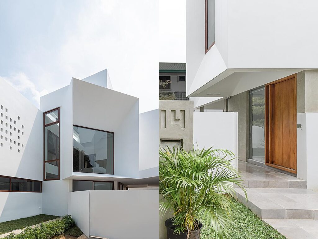
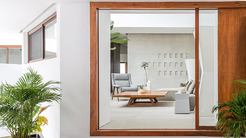
Look at how gorgeous and tidy this photograph is. There are a lot of great things happening here. Overall, I love how Bien shows the connection between the indoor and outdoor spaces here. The doorway creates a perfect frame looking into the living room. I love the bit of plant he leaves peeking in, which helps soften the very linear feeling interior elements.
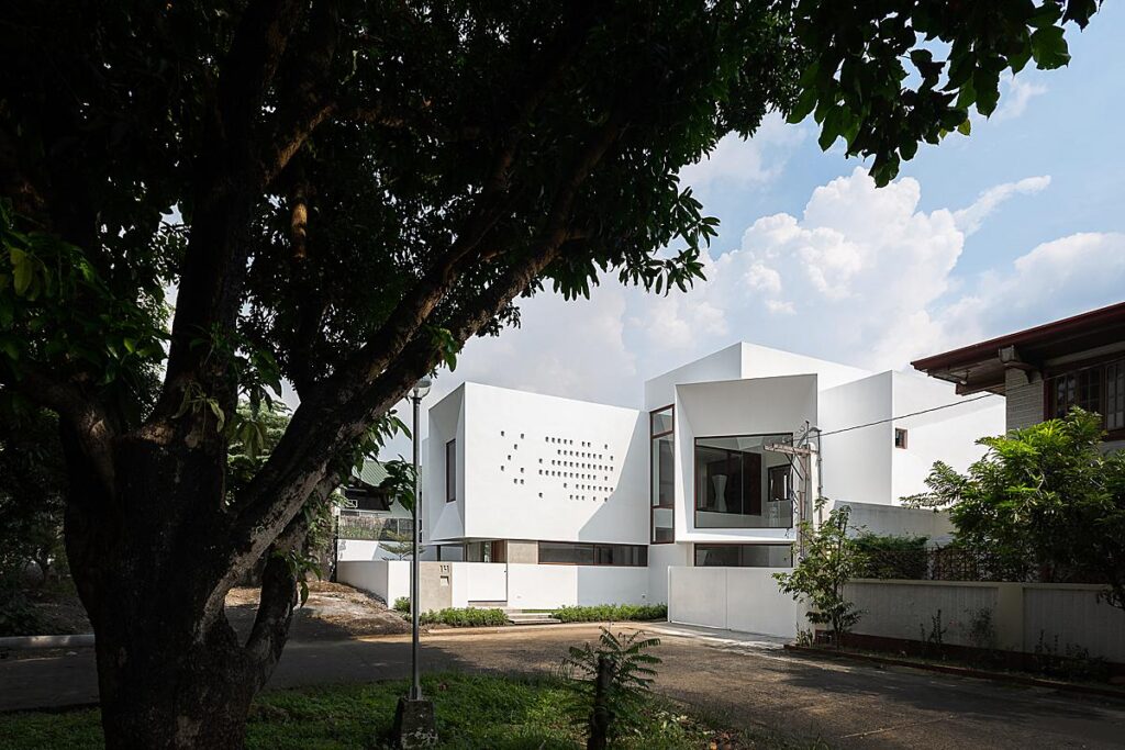
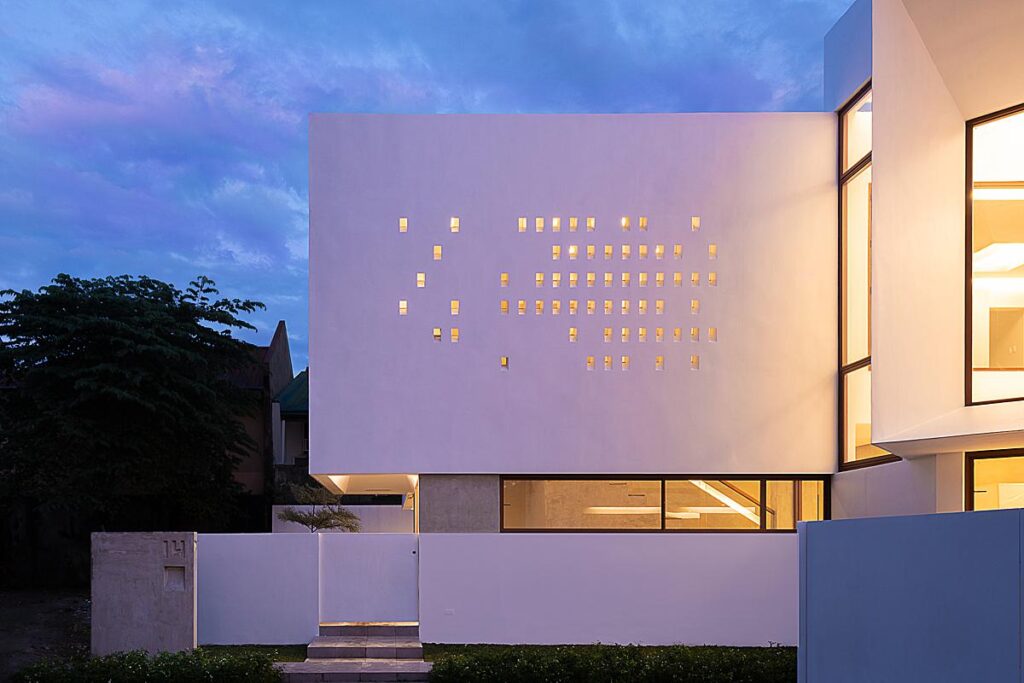
“In all of photography nothing beats good light, composition and technique. That said, there are times that specifically light and its natural characteristics in a specific composition can be damaging to the final image. For example, in a lot of the images, there were very strong reflections of light carrying the hues of the various objects around. These casts were quite evident on the white walls of the structure, some from the trees across the lot, or the houses beside the structure and even from the parked and passing cars on the road.
What helped me deal with this was the precise control on colors using the HSL Panel as well as local adjustments using color range masks in Lightroom. The effort was made to show what was actually experienced on-site, often the camera and its sensor are too discerning that it shows colors far different from what the eye sees and what the mind perceives. We see a swatch of white, we know it is white yet the hex code we get from color-picking that swatch from a digital image is far from white, it often is too warm or too cool with tints thrown in as well. The precise control of color in specific areas of an image to show how the structure looked as it did on the day was integral in building the images that are shared with you” Bien explains.
“I have been working as a photographer for about 5 years now, shooting almost twice as long, under various mentors in different ‘fields’ of photography. My affinity for architectural photography is due to my background as someone studying architecture and design, yet I find I myself enjoying and returning to landscape photography most often” Bien explains. “In architectural photography a lot of the same rules and truths apply. Rules in composition are to some degree universal, shared through all kinds of photography as well as most forms of art.
Then there are the truths of shooting out in the field: One cannot light an entire mountain, nor ask the moon or sun to slow its march up into the sky. One cannot will the tide to rush farther inland or further out. One cannot beg the skies to part and let beams of light through to the scene.
These truths that I have encountered in shooting landscapes have taught me to be patient, observant, and ever ready for each scene.”
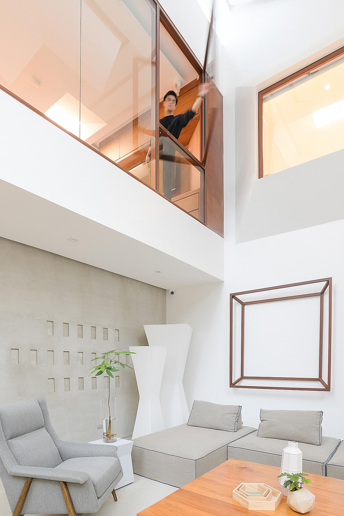
I appreciate how Bien incorporates a bit of humanity to show off the function of each space. This is a great example. He could have just popped open that window, but having someone actually do it creates some beautiful movement and gives life to the scene.
Besides the delays in construction and the spaced out shoot days, Bien ran into some trials and tribulations with the weather. He describes, “The biggest challenge was timing, specifically timing with the weather and timing with the construction. Aside from the difficulties in documentation due to the pandemic and its effects on the schedule, the fickle and ever-changing weather also affected the documentation. It is something all photographers fear and wish for luck with, but something we all duly face.
The weather was uncooperative—overcast clouds, intermittent midday showers, and a host of others made it difficult. The sun seemingly came out whenever the shadows it cast on the structure were at its most unflattering and hid almost as soon as the composition was about to materialize. In between those changes, there were moments that the light was just right. The difficult part was having the camera framed and ready to take the exposure as it happened, not to mention inside or outside of the house before the changes occurred. I believe I was able to catch enough of them to convey the at times subtle interplay of light and color in and around the structure.”
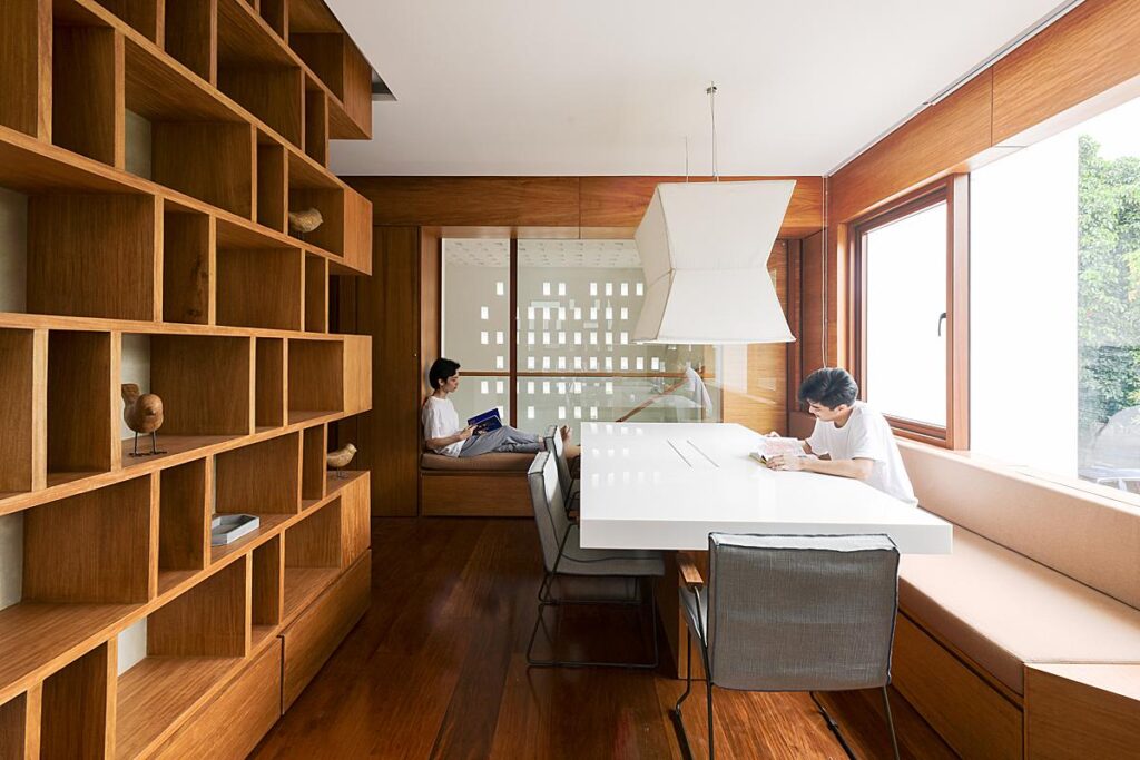
There is great directional light streaming in here, and again Bien adds in some figures to show the functionality of the space, such as the built in reading nook in the back of the image.
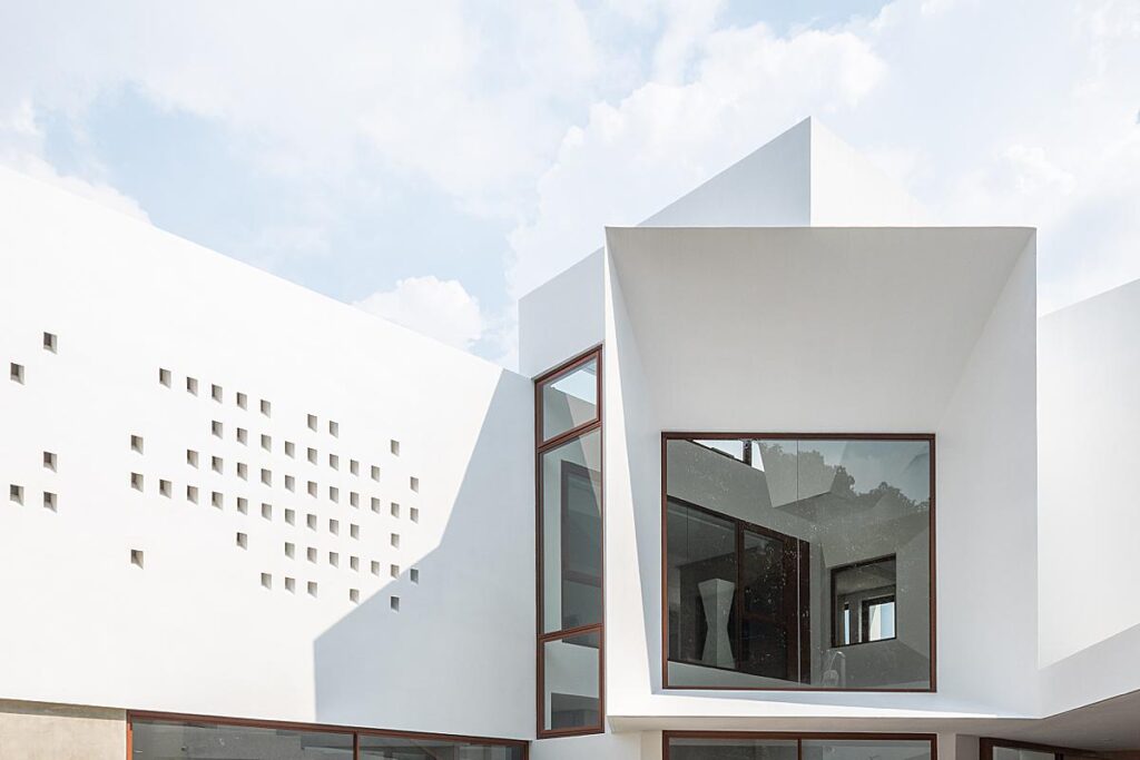
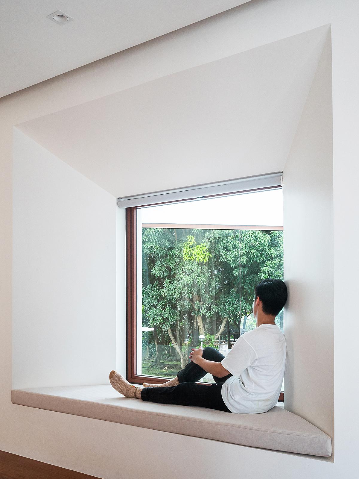
Bien goes on to describe this particular photograph — “The single image that stands out to me is the image that shows what the house is named after, a viewpoint. The view is of the park across the lot as seen from the master bedroom. It pierces through the facade that frames both the park and the vantage point.
I believe that every single time we press the shutter to take an image, we impart ourselves to that which we create. At times it can be a battle to remove the photographer from the images he or she takes and that of the subject from which the images are taken from, and vice versa. In architectural photography I believe in documenting the work, hence the work needing to be the focus. In that specific image, I believe I was able to remove enough of myself to show the house and the view as they were. It was also intentionally a reference to one of the oldest photographs that exists, which a lot considered to be architectural photography, of a simple view through a window in France (View from the window at Le Gras by Niépce from 1827).
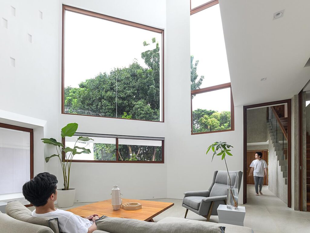
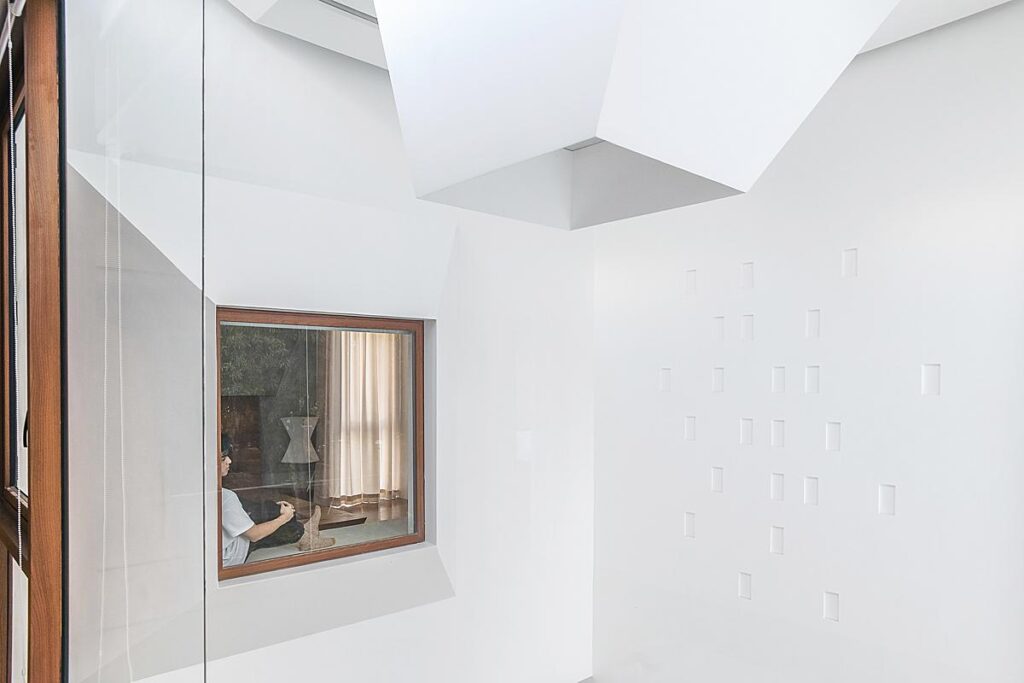
The inverse of that image — a view from the opposite direction — creates a scene with almost a painterly feel. I love the light and airy feel of the architecture mixed in with the quiet feeling of the person in the window seat.
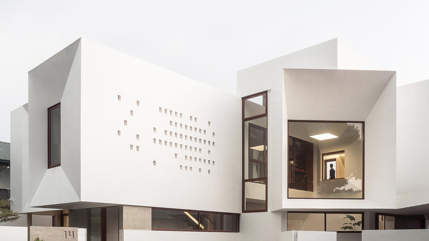
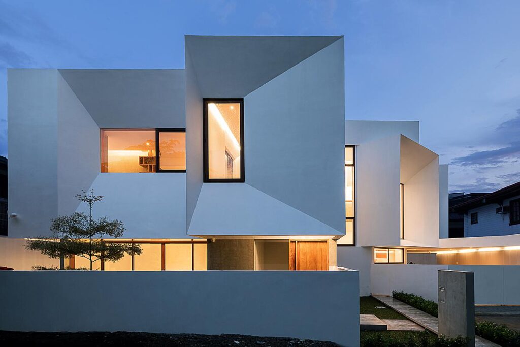
This photograph in particular is my favorite from this series. Not only do we get a good look at the massing of this structure, but by Bien placing a figure infront of the furthest window, he translates the scale and depth of the house. Our eyes are pulled in through multiple rooms, noting the intricacies of the design.
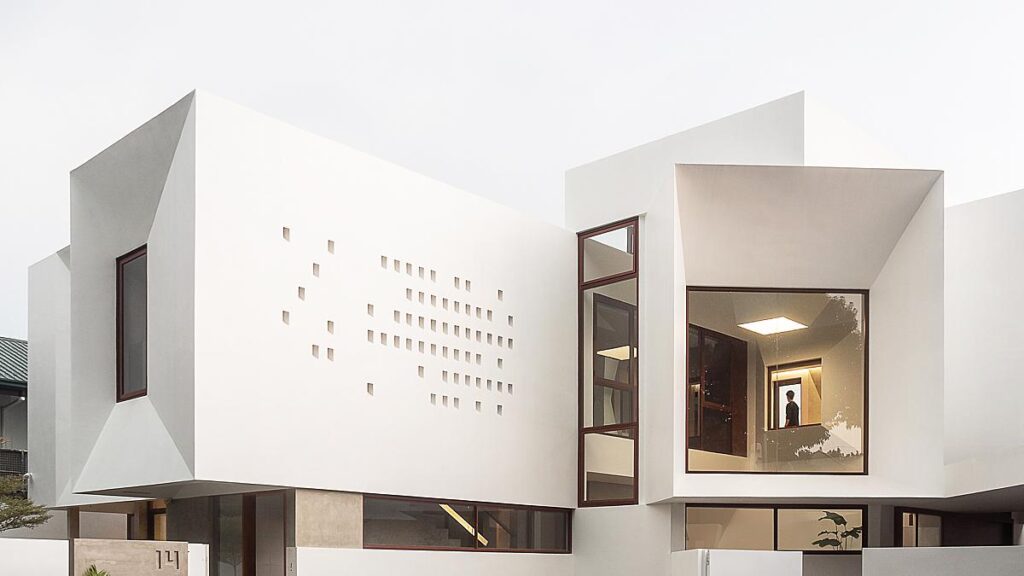
In terms of gear, Bien works with a Nikon D850 and Nikon F3 with various Nikkor lenses. It’s always a refreshing treat to me to see someone shooting architecture on Nikon!
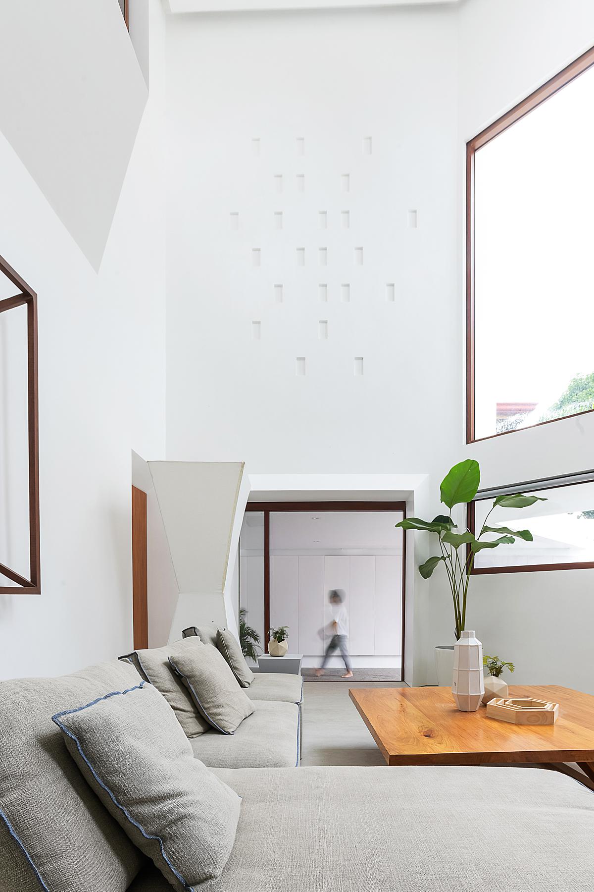
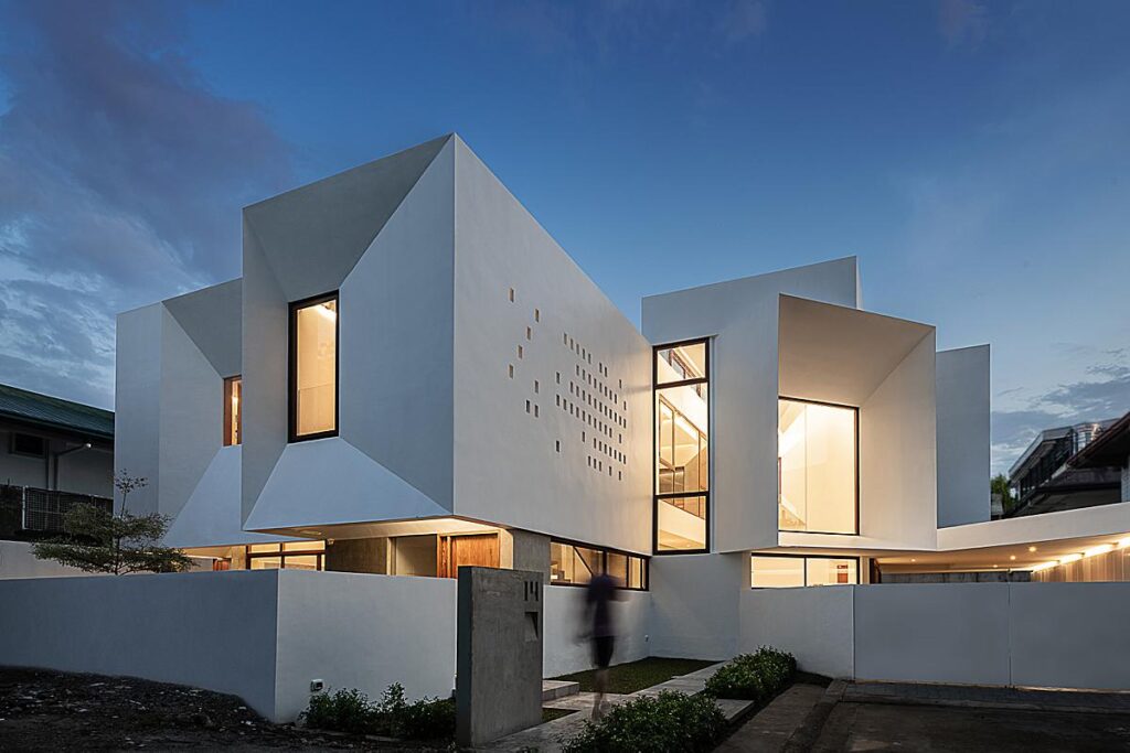
As gratifying as a one-point perspective is, the variation in Viewpoint House’s depth and subtle angles really shine here. This photograph gives us a good sense of the shape and complexity of Viewpoint House’s design, and I’d say it makes a lovely hero shot for this project.
A warm Thank You to Bien for sharing his work with us here at APALMANAC. You can view more of Bien’s work on his website bienalvarez.com or by following him on Instagram @bien_alvarez.
If you have a project you’d like to be considered for Project of the Week, you can submit it here.
