Nate Sheets Breaks Down How He Made Each Photo of the MMH Experience
Nate Sheets is back at it again with another doozy of a project! If you love contrast, texture, and dramatic light, you’re going to love his photographs of the MMH Experience. “MMH stands for Madi Mali Homes and is run by Troy Moore. They are a design-build company located here in Kansas City. This was the first time I’ve worked with them but when they reached out I was fully aware of this project. MMH Experience Center is a project built as a show-house and an opportunity for Troy to show his creativity,” Nate explained.
We’re going to shake things up a bit this week, as Nate has graciously agreed to break down each photograph here, in addition to giving us an overall rundown of this shoot. Nate is a wealth of information, and I’m so excited to have him walk us through this project.
MMH was photographed by Nate in one long 12-hour day, and was a smooth process thanks to the team on set. He says “My teammate JC worked really hard on the back end stuff and deserves recognition. This whole shoot was a very collaborative effort between me, JC, Troy (MMH owner), and Brent Thompson (Interior Designer). This shoot was also cost-shared with Gillpatrick Woodworks, as Bob handled all of the cabinetry throughout this house.”
Nate continues, “These images all varied in how they were handled. Some were almost a perfect balance of light and required one, maybe two exposures. I had other shots where I used a heavy dose of lighting to control bloom and balance out the extreme dynamic range. I have a tendency to make a space really dark and only allow a window or two to be exposed and scrim the others with black plastic. Anyone who has seen my Instagram stories knows I hang black plastic all over the place haha. Sometimes it makes the shot a bit more difficult with how dark it can get but I find the movement of light and deep shadows to be worth it. Post-processing is similar as mentioned above – some photos were a nightmare to retouch, and others were a breeze. Controlling the windows in darker spaces can be a task. I use a mix of ambient/flash blend and luminosity masks to balance it out.”
Let’s jump right into the photo breakdowns:
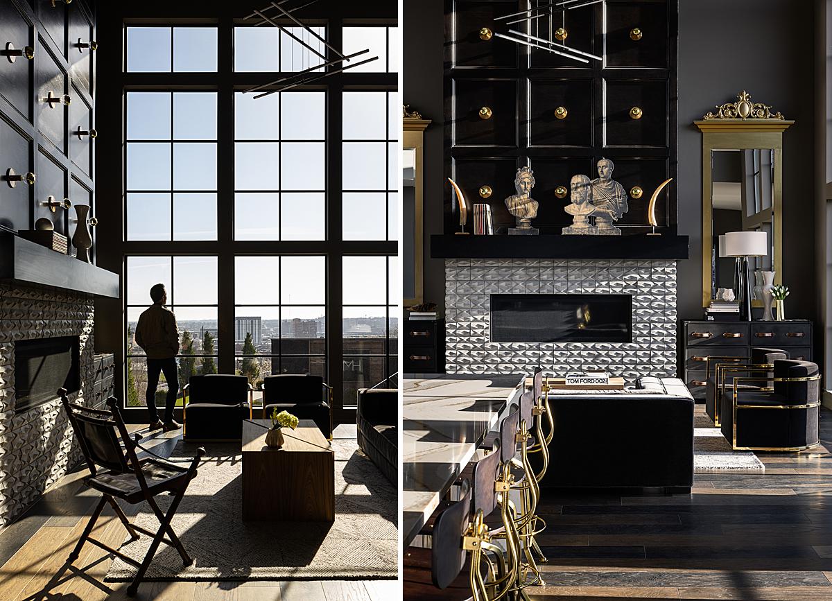
For the photo on the left, Nate shares “The idea of this shot was to show the scale of the windows and still feature details of the fireplace. I scheduled the shoot for this early morning light for this shot and the previous fireplace shot (102). I decided to add a person looking at the view to add a bit more drama to the scale of the fireplace and windows. This was an all ambient bracket, exposing more for the highlights and letting the shadows go darker keeps the scene pretty dramatic in my opinion.”
To make the photo on the right he explains “There has been a lot of people come through this project for events, a lot of people of taken their own photos of the fireplace and posted them. I was challenged to find a shot of the fireplace that he hasn’t seen before. I decided to compress the scene with a 50mm lens instead of shooting wider to show the scale. This was an all ambient bracket and processed with luminosity masks to tame the highlights.”
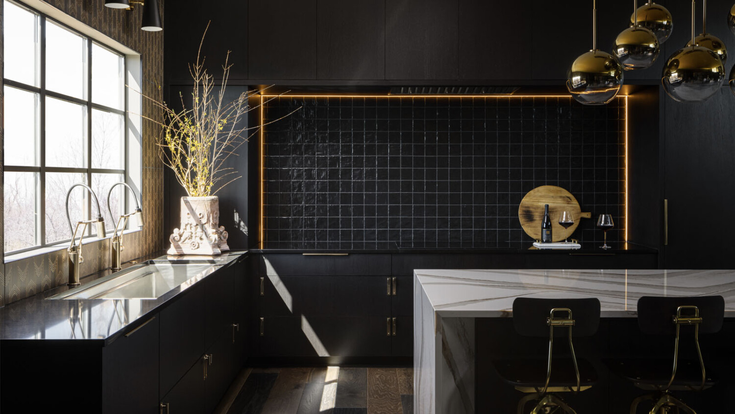
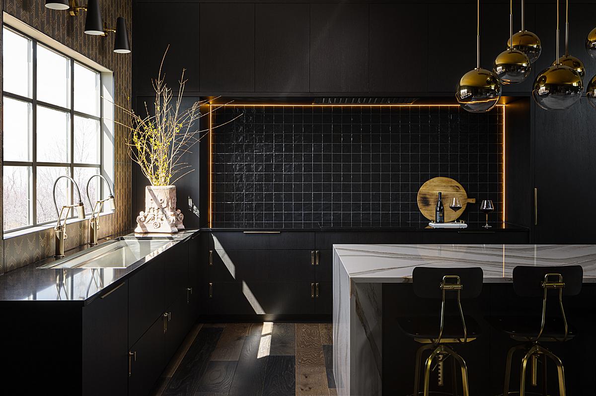
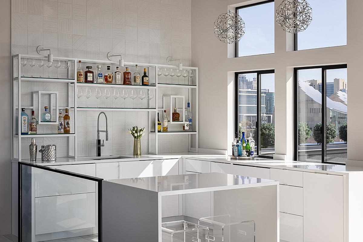
“When I noticed this pin stripe like light coming into the kitchen we rushed over to try and capture it,” Nate tells. “I really liked that the light landed right in between the cabinets and island. The highlights on the vessel and countertops were pretty extreme. I held a strobe above the countertop for me to brush in over the windows and countertop, the rest is ambient. I like the drama of the accent lighting along the backsplash, so I decided to shoot a frame with those on and added that in post. I also hung black scrims on the windows behind me to give me shadows on the face of the island and stools.”
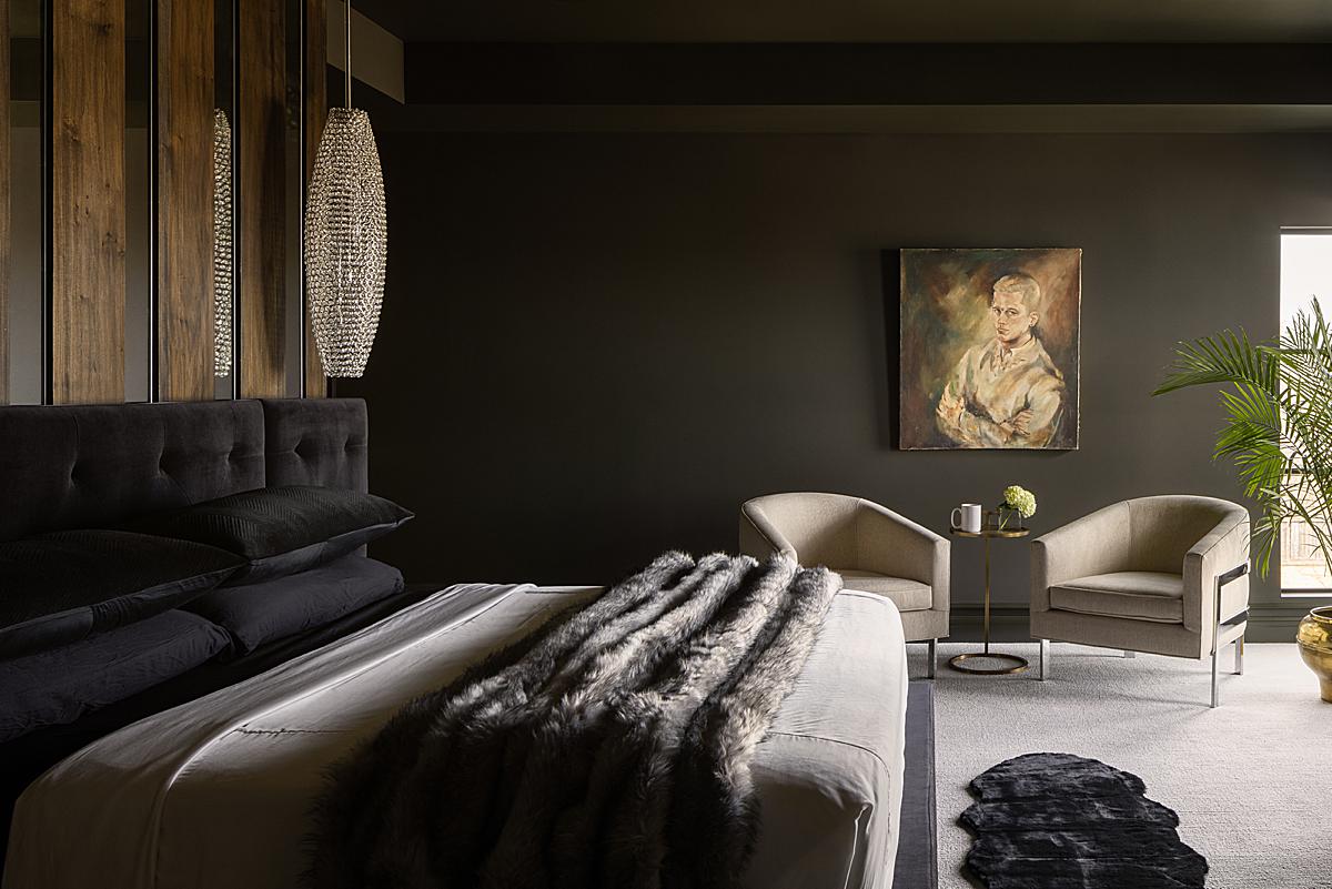
For this shot of the bedroom, he explains, “This shot was tough. I blocked two windows to my right and only allowed light to filter through the window seen in the shot and a glass door next to it. The dynamic range between the window and room was extreme. How I combatted that was to step outside the door (directly right of the window) and used a strobe and bounce umbrella to get detail back around the window frame. The rest of the scene is ambient light.”
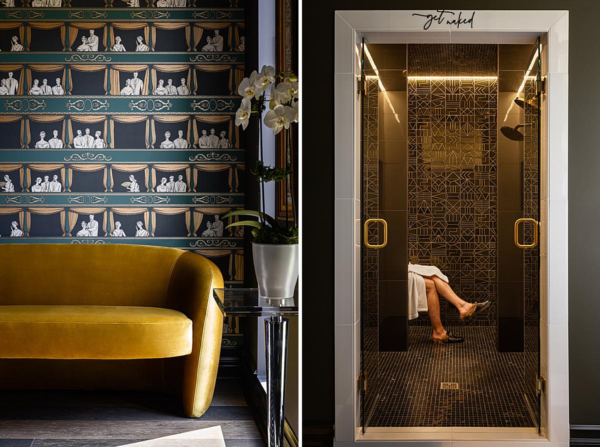
For the left photo, Nate said “This shot is all ambient. I put a black scrim over the window directly right, I then slowly opened it to get a nice backlit feel on the orchid and table. I used a luminosity mask to target the highlight on the floor to bring back detail.”
On the right is one of Nate’s favorites from the shoot. He breaks it down, “Because this project is so unique I wanted to be unique with the photography. I scouted this project about a week or two ahead of the shoot date to brainstorm some ideas, compositions, and check the light. When I got to the primary bathroom and saw the dramatic shower I had a good feeling about sticking a person in there. Troy and Brent the interior designer found a robe and some slippers for Troy to put on and step in for the shot. This is currently one of my favorite photographs. For this shot, I set up a strobe with a 7 ft bounce umbrella outside to the right. I then bracketed ambient light for inside the shower and added Troy last.”
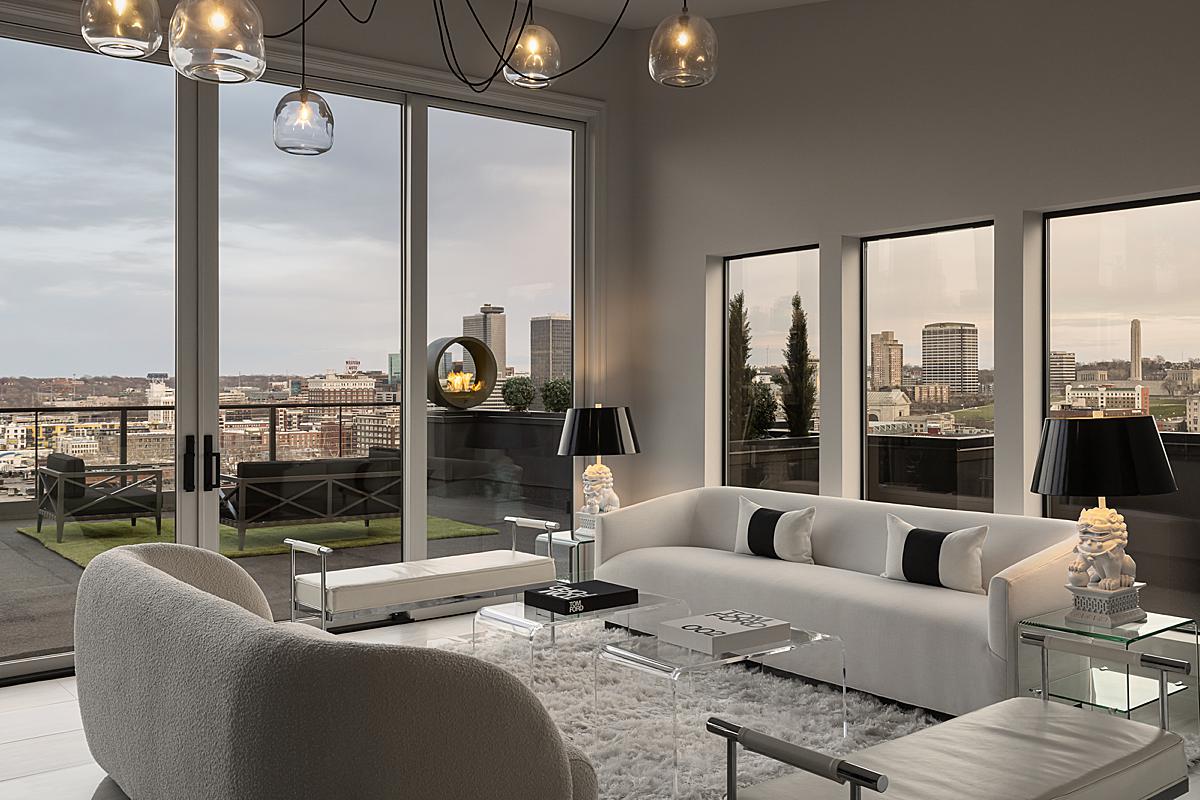
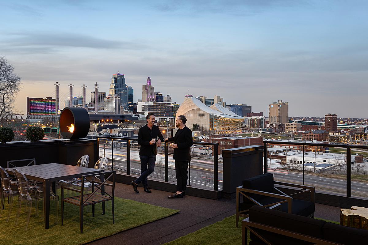
For this light and bright(er) photo, Nate says, “This sky bar shot was based on the view. Right outside the windows is the Kauffman Center for the Performing Arts, which is a staple of Kansas City’s skyline. I used a 50mm lens for this shot to compress the view and sky bar. I had to get pretty far back and move a large and heavy credenza out of the way to get the camera in the right spot for that focal length. I added a strobe to the right to expose for the bright highlights and keep the windows looking crisp. I then bracketed ambient light and blended that over the flash frames – I’d say it’s about 80% ambient on this shot.”
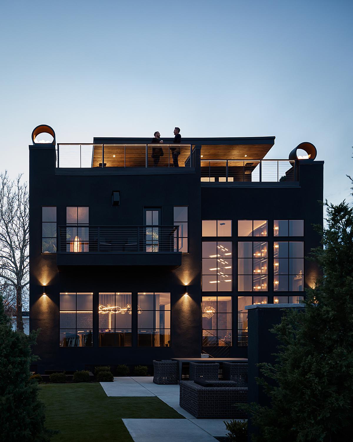
As we step outside at dusk, Nate shares his thought process behind this photo including Troy and Brent. “My favorite part of this shot is the blurred traffic in the background. I felt it would add a good amount of motion and drama to the image. I also think having people in this shot gives the image life and allows you to enjoy the rooftop as if you are there. Without them felt bare to me, I liked using them to fill the void of negative space.”
“The biggest challenge I faced on this photo was construction,” he shares. “Directly to the left was a foundation with tall orange construction netting wrapped around it and to the right was a house with siding wrap, pretty big eye sores. So, I had to get the camera farther back and used the trees to strategically block those and add some depth. This was an all ambient shot, I took several brackets over 30-45 minutes. My teammate was running this camera after it was set and I was up top shooting [the photo above] at the same time. We were on FaceTime with each other so we could direct Troy and Brent where to go for each photo. I thought it would be nice to have their heads break the house line into the sky, this is what determined model placement for me.”
A giant thanks to Nate for giving us so many details into his process and a behind-the-scenes look at this shoot. See more of his work on Nate’s website natesheetsphoto.com and give him a follow on Instagram @natesheetsphoto to see more beautiful photos and BTS stories!
If you have a project you’d like to be considered for Project of the Week, you can submit it here.