Murray Fredericks Photographs A One-Of-A-Kind Residence in North Bondi
Australian architecture is such an interesting mix of modern and tropical design. Built to contend with the harsh temperatures and elements, these homes are never boring and almost always beautiful. Enter Murray Fredericks and his series on Bondi House by the architects at CplusC.
When I reached out to Murray about his Bondi House photographs, I received an auto-responder email saying he was on an expedition and could only be reached by satellite phone. Paging Walter Mitty, earth to Walter Mitty… I knew I had to learn a bit more about him.
Murray’s work has an undeniably exciting and graphic feel to it. I suspect this comes from his commercial advertising and cinematographer background. His work – and this project in particular – is riddled with texture, color, and movement.
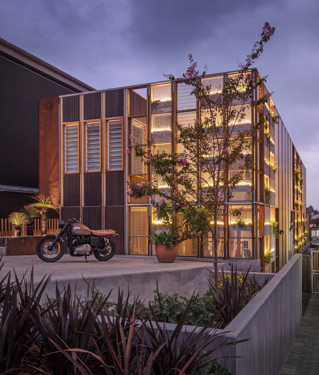
We’ll start with an exterior of Bondi House. This nicely executed one point perspective sets the stage: hot (hard shadows and that one specular highlight on the window), eclectic (the rhythmic facade, plants galore!), and masculine (thanks to the rad vintage motorcycle). We are given a hint of what’s to come inside, with the wooden slats and orange-hued rusted steel facade.
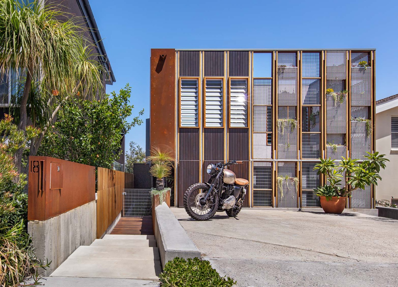
Bondi House, it would appear, is designed around the square. It is a shape that repeats over and over again throughout the design and Murray positions himself to showcase these blocky patterns and angular lines that result and that give the house its character.
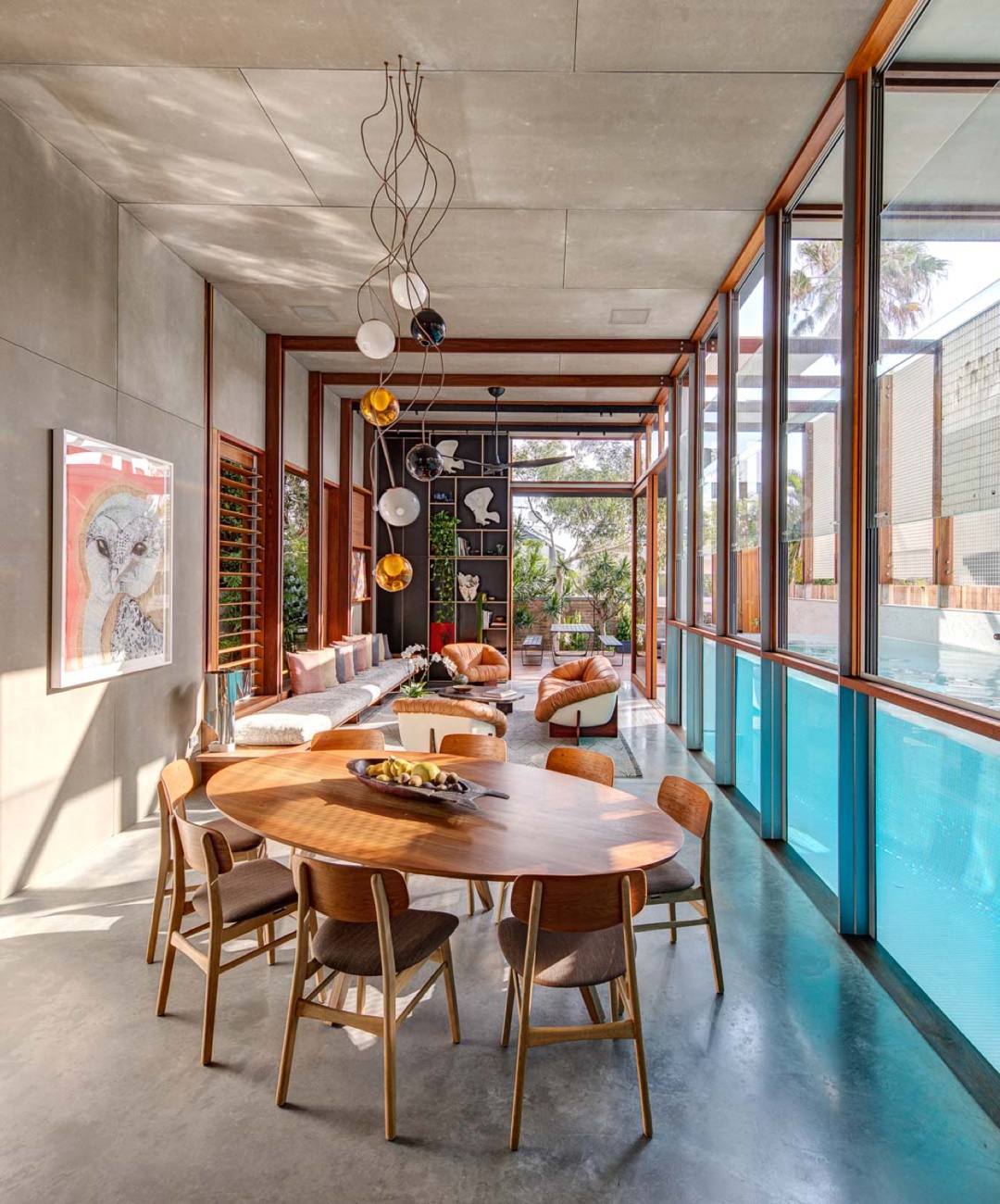
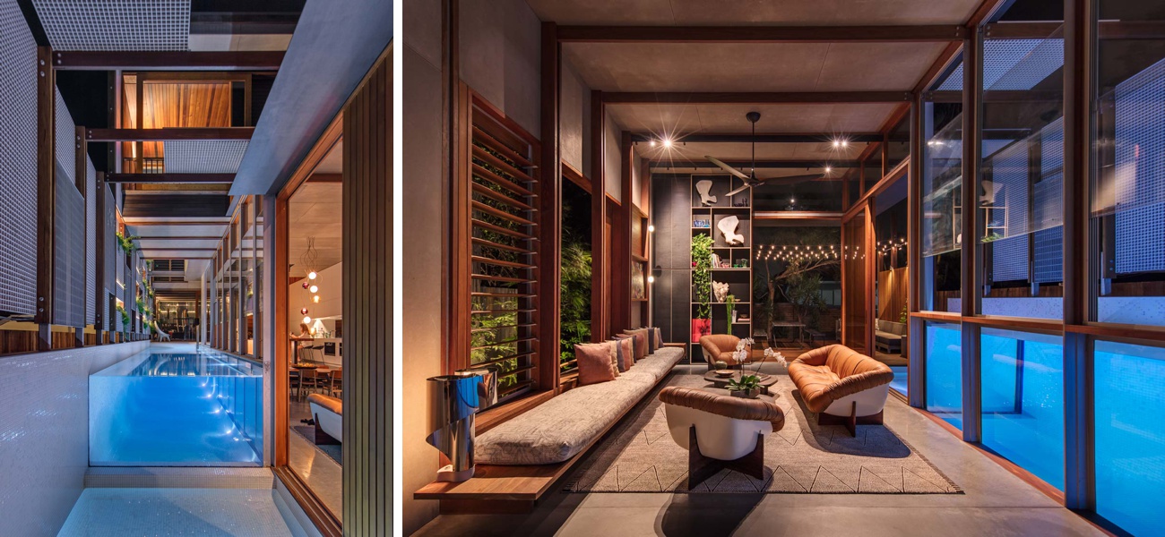
The color harmony throughout this series is brilliant. A double split complementary color palette (two complementary sets that are directly next to each other on the color wheel) creates excitement and color contrast while still feeling congruent. The oranges in the wood trusses, table, and chairs are pulled out by the bright blue pool water. The reds in the art and decorations contrast with the green foliage. This creates motion and contrast in the image that draws our eyes through the room. I also love the lighting here which adds plenty of warmth to the scene and as a result makes me want to hop right into that pool!
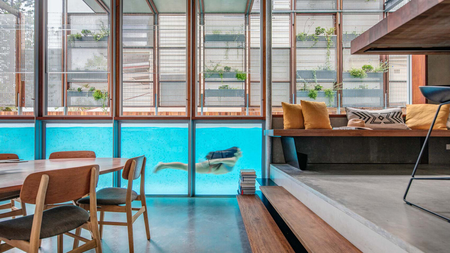
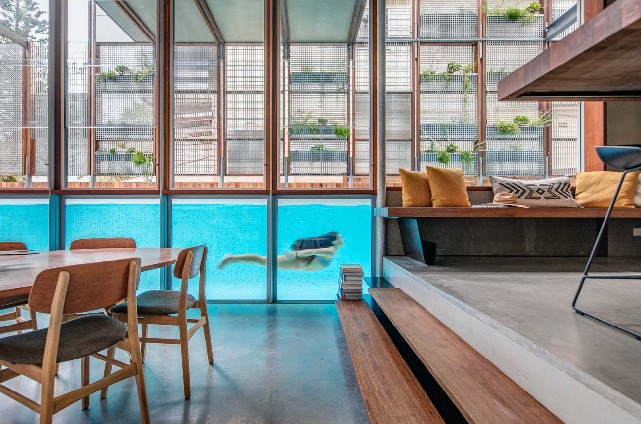
I originally thought that the pool was indoors – a sort of giant tank within the living room – but these images explain its placement in the vestibule outside. Here you can see that the pool is partially covered by the cantilevered second story, while the rest is open. Both of these one-point perspectives are full of repetition created by the trusses. These rhythmically drive our eyes right on back through the images.
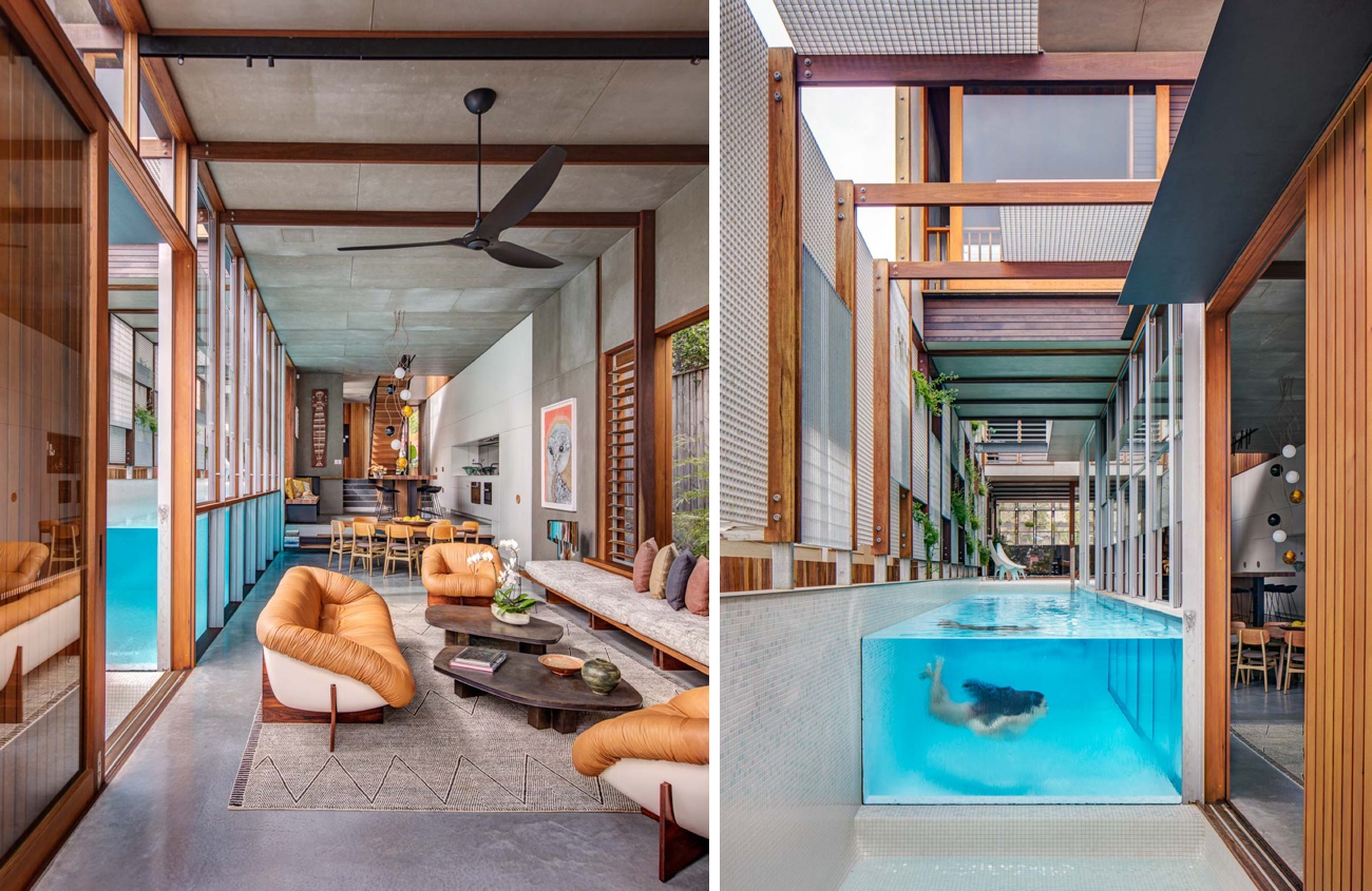
Here’s the money shot, the image seen ’round the world, the photo saved on countless “Dream House” Pinterest boards. While shot from a low perspective, it works perfectly here. The steps and both sets of tables give context to the room and flow of the floor plan. The orange/blue color scheme gives us a subtle contrast through color. Our eyes are obviously pulled right to the pool. Look at the proper spacing between the swimmer and the objects in the room. It’s perfectly balanced and a joy to look at.
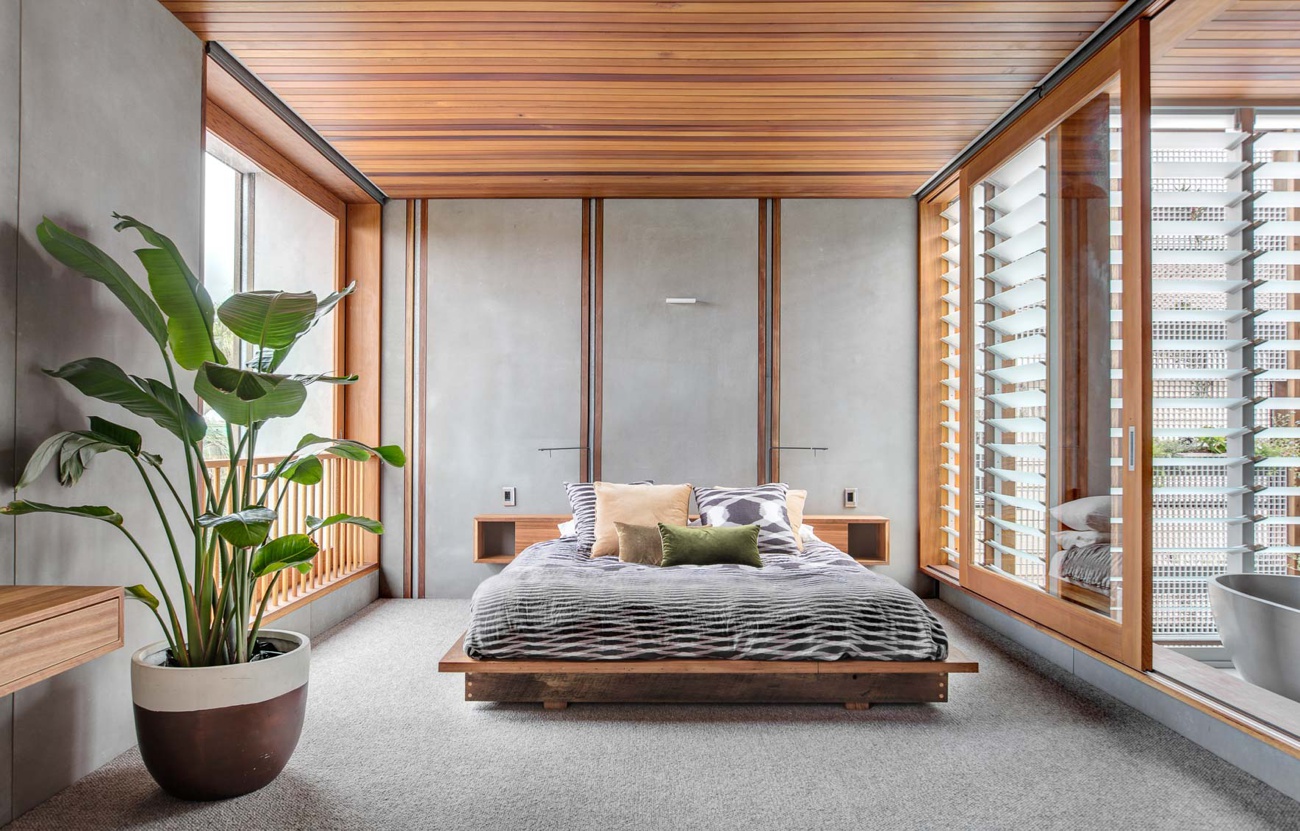
Up in the bedroom, Murray uses soft light for a serene and meditative feel. The quiet simplicity of this shot says it all.
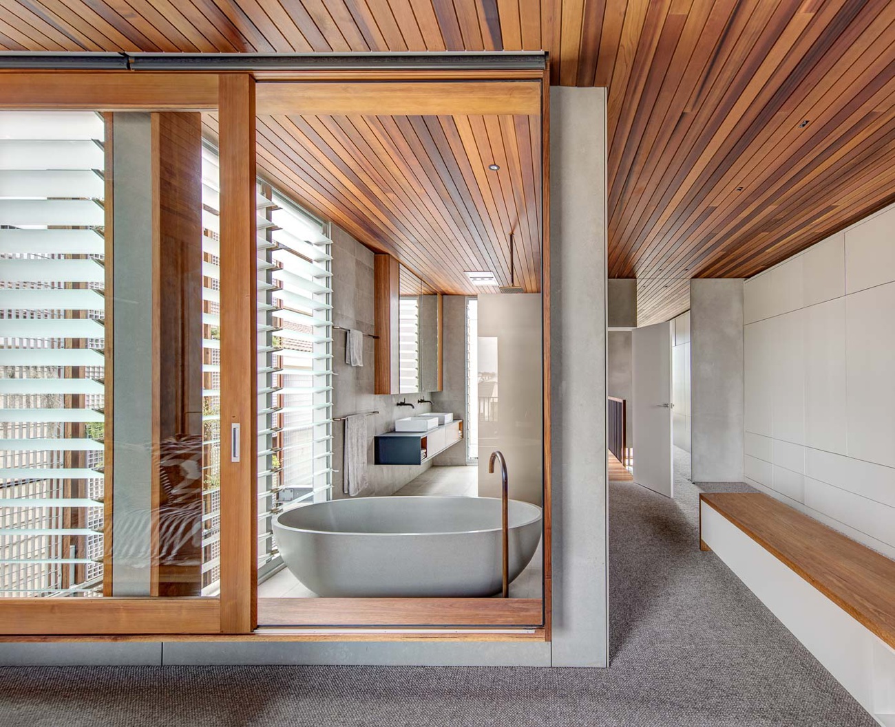
In this scene, the mix of horizontal and vertical lines create plenty of motion and frame the subject beautifully. The movement created by the paneled ceiling is exciting and lends a lot of life to this view of the master bath.
Switching gears to twilight (motorcycle pun intended), Murray gives the house a rich and sexy feel. Look how crisp that illuminated pool is. The depth in the color tonality here is exciting but not overdone, and I appreciate that he kept a slight view of the foliage outside, not letting it fall totally to black.
Our departing shot of CPlusC’s Bondi House is a tasteful send-off. Murray’s perspective here gives dimensionality to the house despite its relatively flat street-facing facade. We are able to see that the house stretches back through the narrow lot, and we understand the size of the house as a result – something that is helped along by the lighting within the vertical garden. The framing of the ornamental grasses in the foreground gives an organic feel that contrasts the metallic elements on the exterior.
A big thank you to Murray Fredericks for sharing his series with us for Project of the Week. Murray has many, many, more examples of his top-notch work on his website.
If you have a project you’d like to be considered for Project of the Week, you can submit it here.