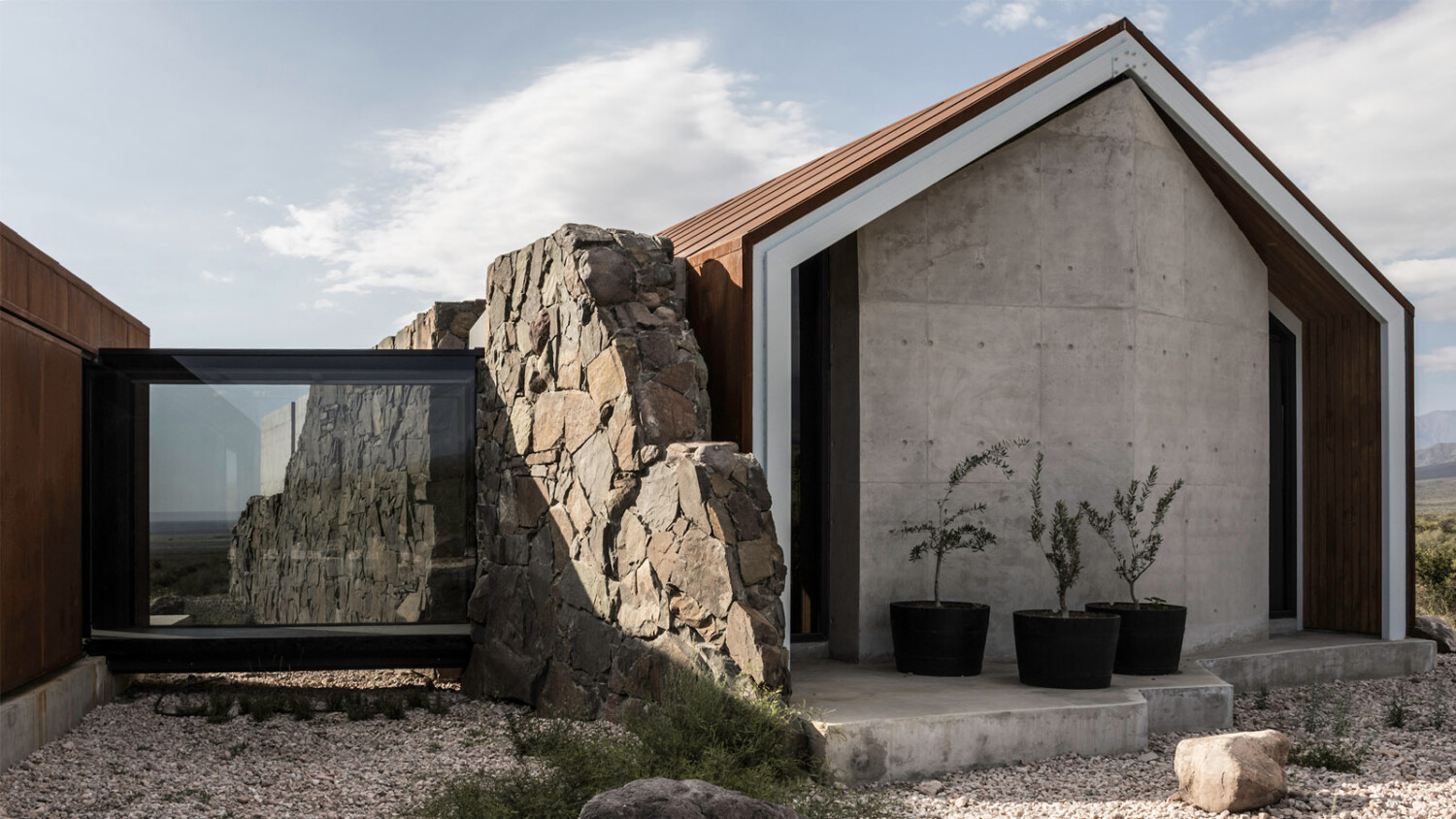
Luis Abba Transports Us to a Beautiful Home Outside the Foothills of the Andes
This week’s featured project is absolutely stunning.
This curious and charming piece of residential architecture has been masterfully photographed by Luis Abba, an architectural photographer working in Mendoza, Argentina. Luis has documented Alberto Tonconogy & Asociados‘ Casa de Piedra in a way that infuses the photographs with a sense of place and time. The architecture is shown in relation to its surroundings – both flora and fauna. Luis includes a human element in many of the scenes he creates, showcasing the home’s design being used as intended.
I’m so excited to share this lovely project of Luis’ with you!
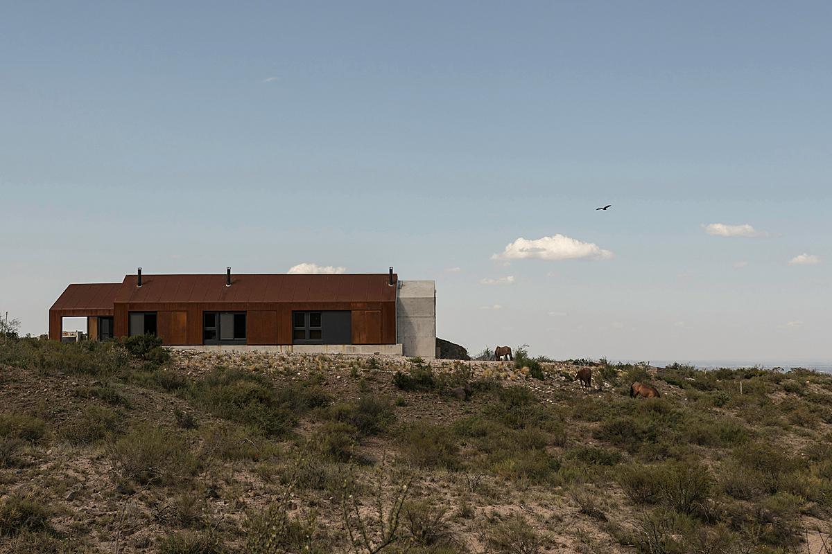
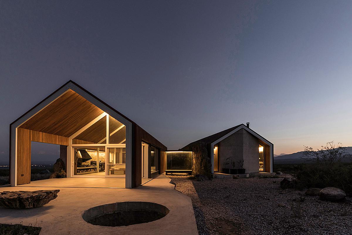
Casa de Piedra is a barn-like shelter that sits in the arid area leading up to the Andes. It is a mix of stone and oxidized corten steel. The home is comprised of two volumes connected by a glass bridge.
Luis shares “It was a very long day, after studying the site my goal was to start taking pictures from the moment before dawn and stay at the site until nightfall, so I had to start the trip to the site at 4am to be arriving before the first rays of the sun appeared, my friend Pablo Porta who was the Drone operator accompanied me to that record.
At approximately 6:20 am I took the first picture, and at 11:30 pm I have the record of having taken the last picture, we were practically taking pictures all day long!
During the registration, we had no problems, but we did encounter a very dangerous spider in the area – the black widow. So after that, we continued the photo session very cautiously.“
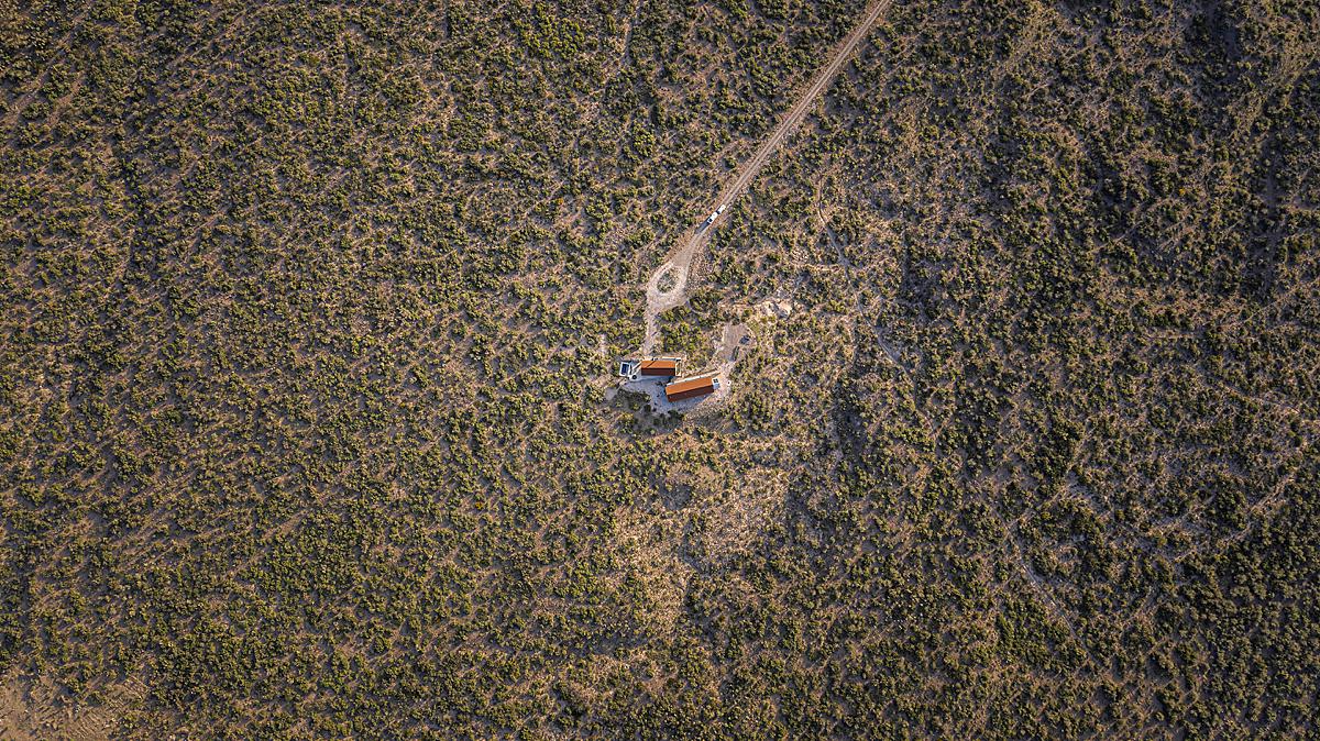
I love the way that Luis shows Casa de Piedra in context with its surroundings. The sweeping drone image conveys the way this home sits in a swath of isolation. The ground-level view below communicates the vastness even further, placing the rust-colored shell against a wide blue sky. The distant mountains mirror the shape of stone cladding and wall. We can see how this home fits in with the landscape, echoing the color palette, shapes, and materials we find around it.
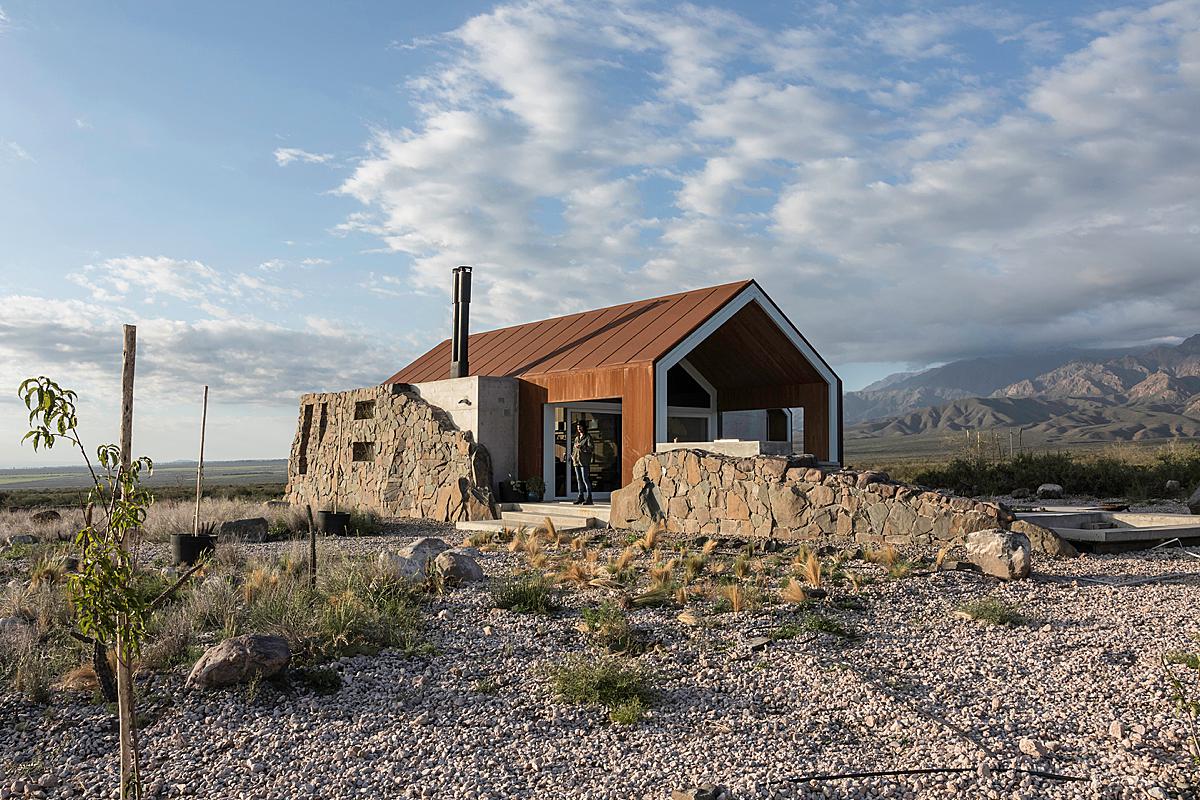
Another thing I find wonderful about Luis’ work is its lived-in quality. There is no render-ish confusion here. He leaves in the coiled hose, the imperfections in the cement, the divots in the landscaping. It’s real, and it’s lovely.
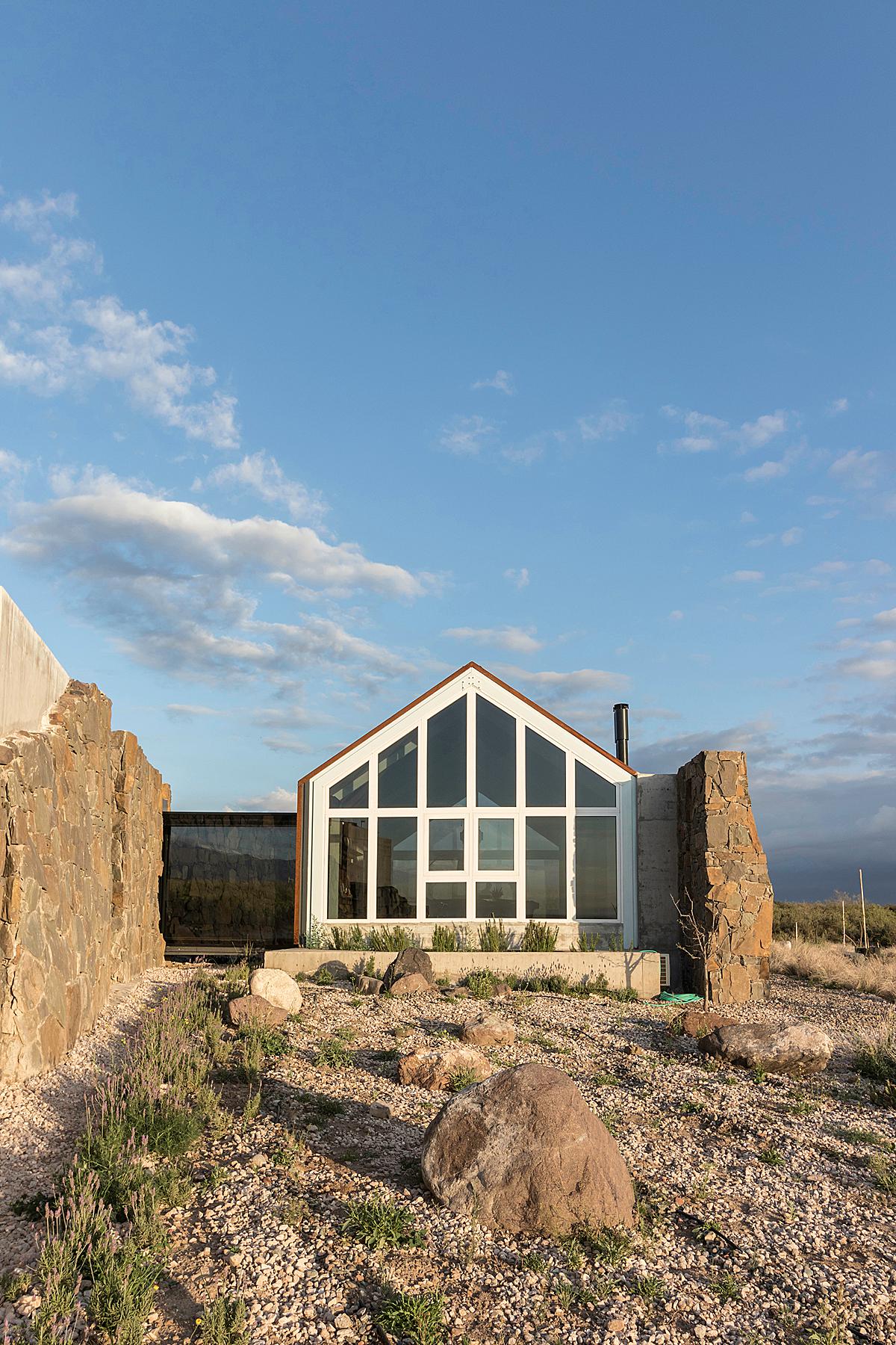
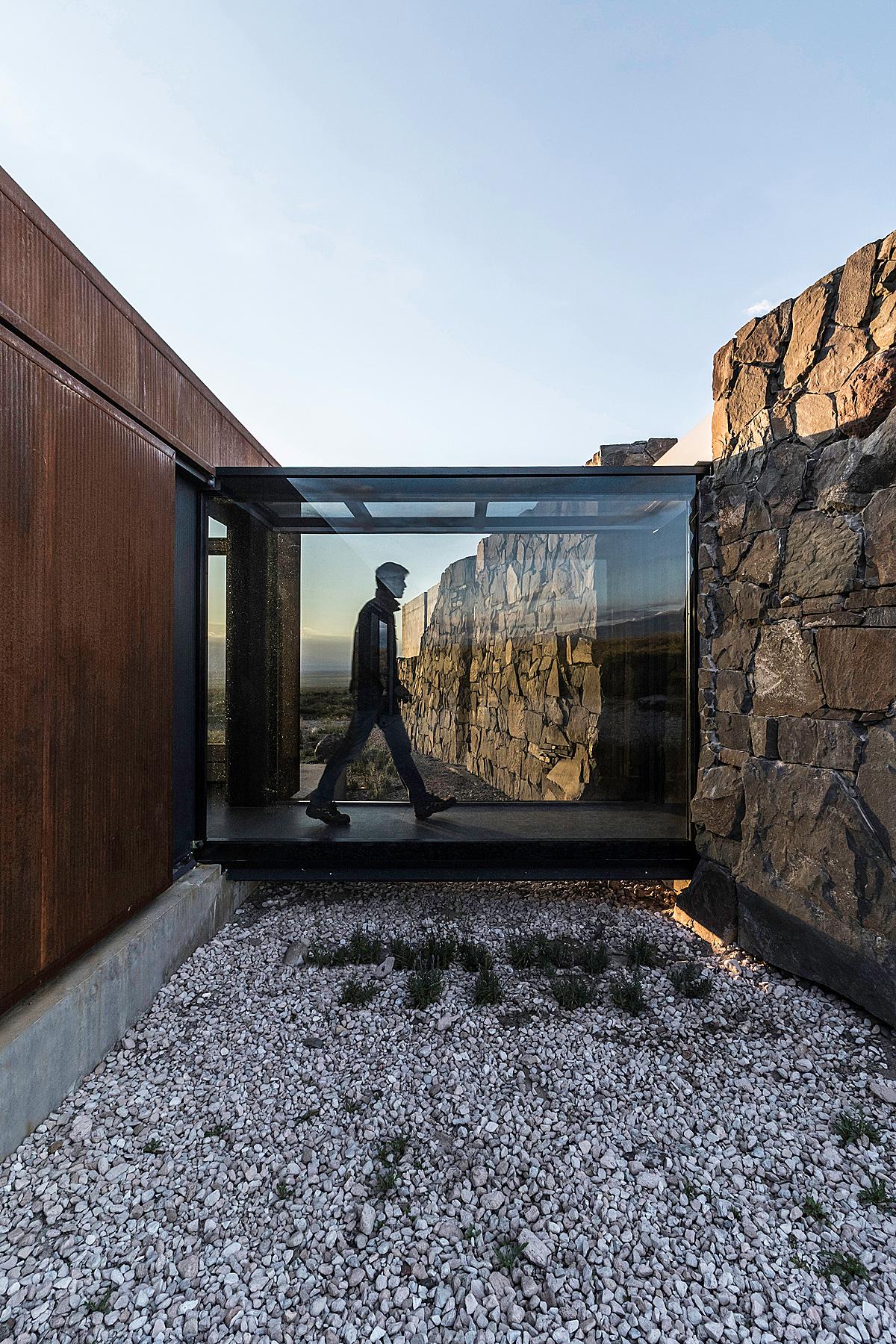
One of Casa de Piedra’s defining features is the glass bridge that joins the living area and the bedroom quarters of the home. Luis shows us both sides in a very similar fashion, helping us to make sense of this space and form a layout of the architecture in our heads. We see similarities, like the hard angular shadows cast by the structure, in both images, further tying them together. An interplay of highlights, shadows, and reflections, creates a sense of complexity that is interesting to see.

Here we see the pass-through in use, communicating a sense of scale and purpose. I personally love that the figure is silhouetted instead of blurred. It feels refreshing and appropriate for this scene, adding just enough motion and shape without being distracting.
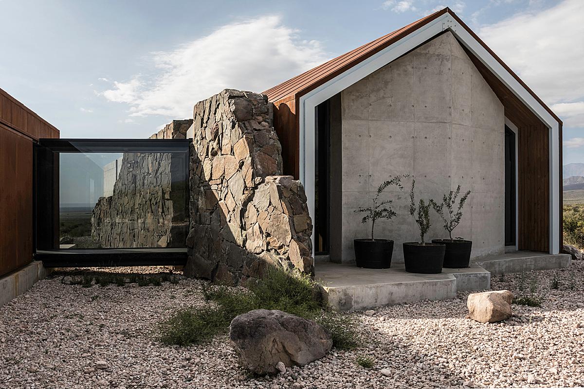
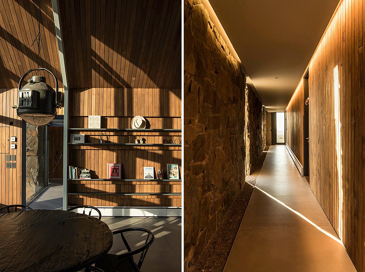
Luis takes a step back, and now we are able to flesh out even more of the home’s layout in our heads. I enjoy the directional lighting and the highlights and shadows that the warm, angular pools of light that the sun makes in this scene. There is a great deal of dimensionality and texture here.
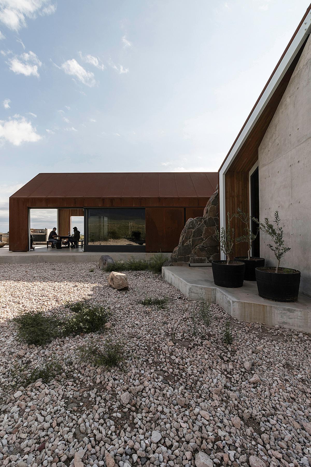
This next image makes it easy to feel as if we are standing in the scene ourselves. It seems as if we are walking up to Casa de Piedra, heading through the layers of the image, preparing to sit at the table and enjoy a meal. All of Luis’ images share this sense of place, and it is a quality I really admire about his work.
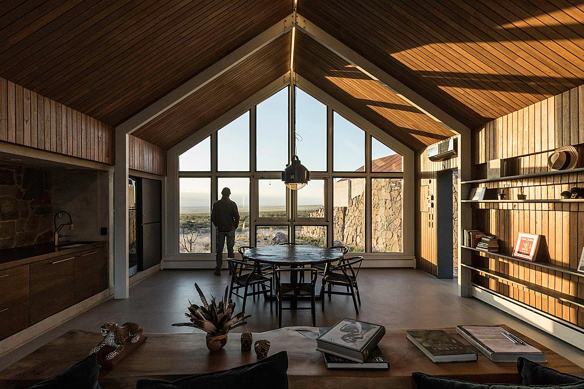
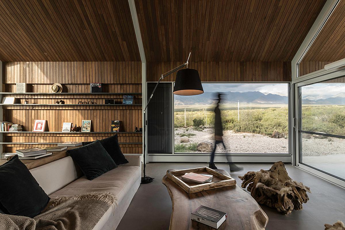
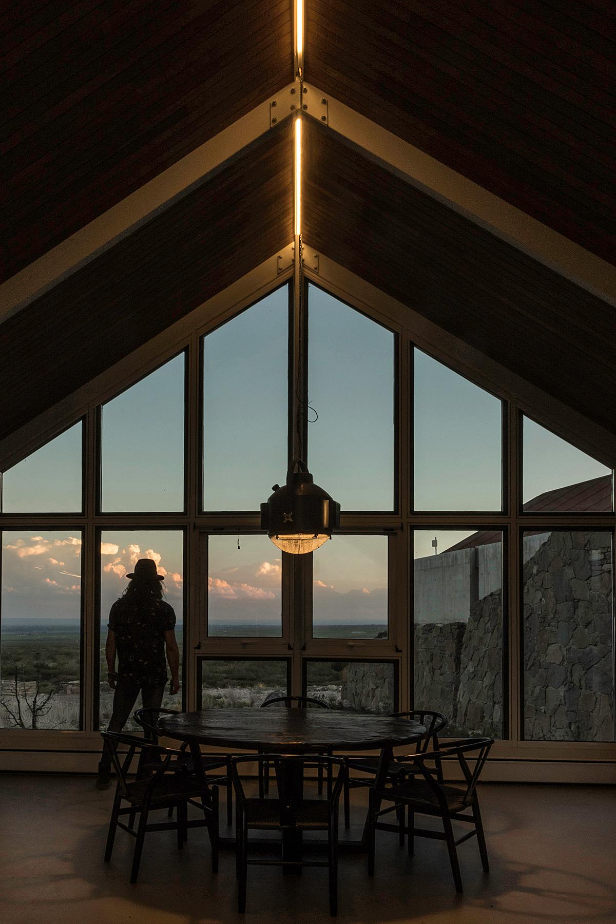
Inside Casa de Piedra, Luis’ images continue to radiate this feeling. I think it’s the moodiness of the images that make them so alluring to me. He isn’t afraid to produce a contrasty image. The right side of the frame and the foreground are dark. It takes a moment to notice what is happening in them. Our eyes are pulled immediately to the warm glowing highlights, and out the bank of windows. I imagine this is what it would look like if we were actually there.
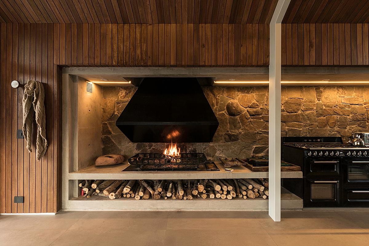
The warmth in the kitchen is lovely. The styling is simple. We see the fireplace on, which shows functionality and adds a layer of coziness. We feel at home here.
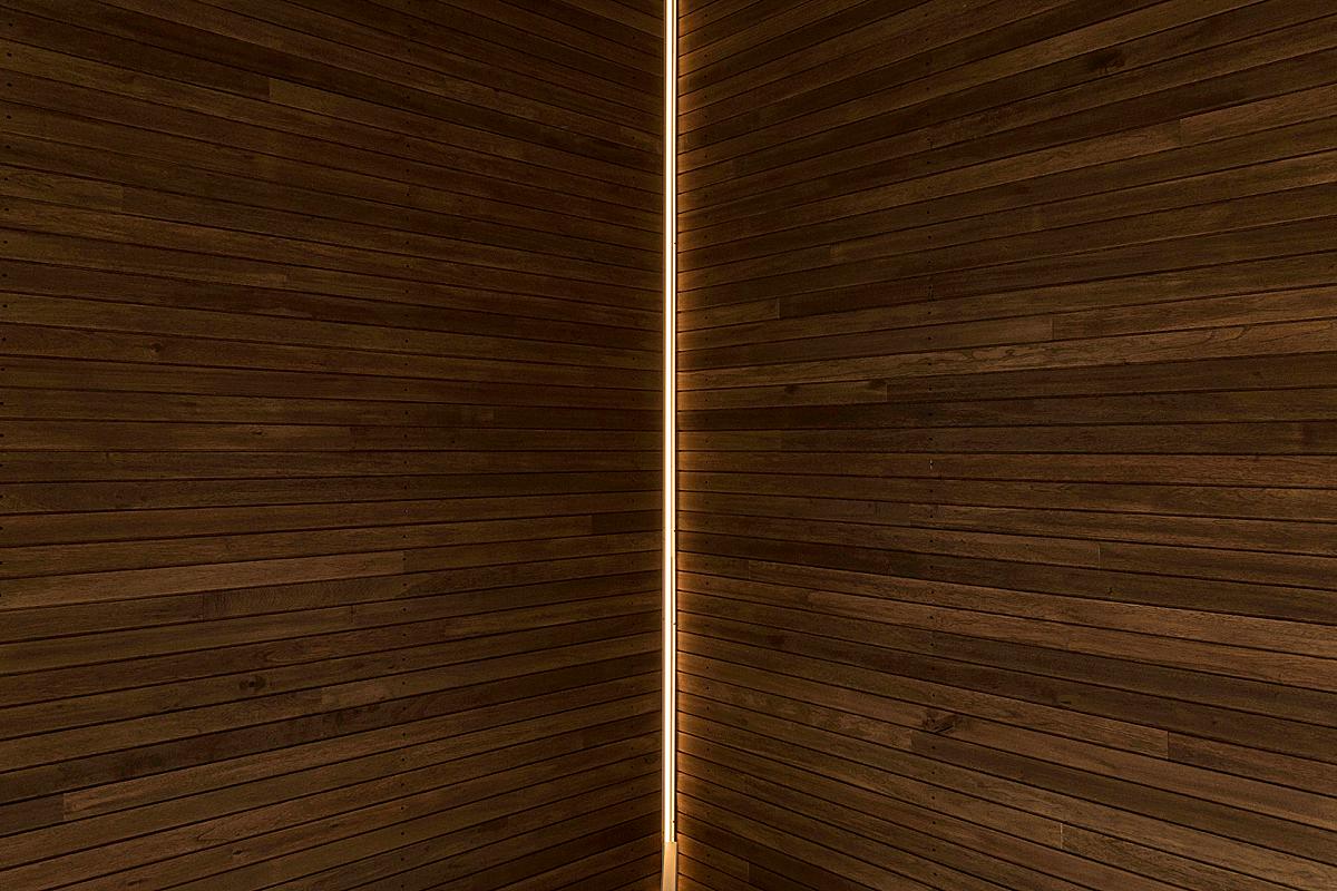
I appreciate that Luis isn’t afraid to let an image go dark. It is refreshing in a world of bright white interiors. Here, the subject is the practical lighting and the beautiful view through the glazing. He lets the extraneous information fall into shadow.
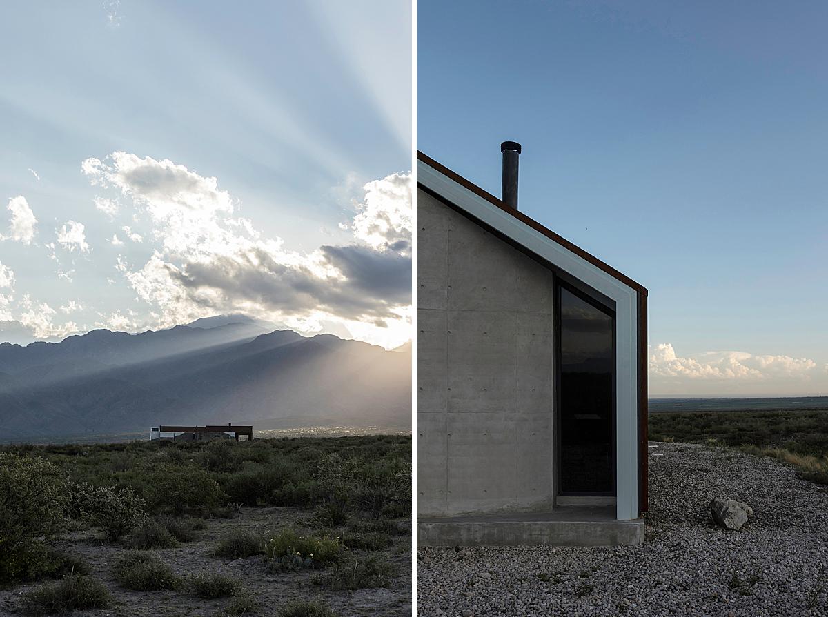
Back outside, Luis crafts more images that tell the story of Casa de Piedra and where it rests. His photographs make it easy to fall in love with this piece of architecture. Look at the rays of sun spilling out over the mountains as the home balances in the middle of the frame. On the right, a chunked-down view feels rich with leading lines and simple geometric shapes.
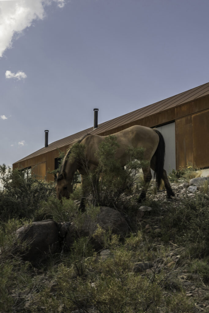
With the clouds overhead and the horse’s mane and tail blowing in the breeze, we can feel the weather, and a moment of shade in this scrubby landscape.
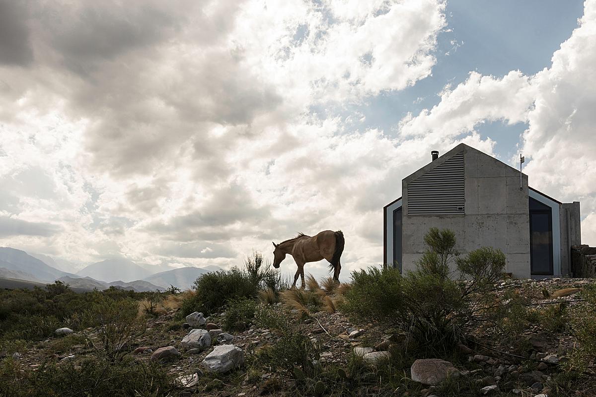
Luis notes “In my work, I try not to focus solely on architecture, although I strive to make a complete record that allows me to understand the totality of the work I like to have a broader view, to also photograph common aspects of everyday life, the context and different events that are usually outside of what should be strictly recorded in architectural photography. That is why my favorite photograph of this series is one where the building is in the background, being as some say “the scenery of life” and in the foreground appears a horse that is feeding.
To take this photograph I had to be very patient and very careful with my movements to get closer, as these horses are native and not being used to the presence of people they tend to escape quickly when they feel threatened.
This picture was taken with the Sigma 18-35mm F1.8 Art Dc Hsm lens, so I had to get very close to take the shot.”
Casa de Piedra at twilight is a beautiful sight. We can see each volume illuminated with warm orange light that contrasts beautifully from the blue night sky. I appreciate Luis’ restraint in his post processing. Throughout this entire series, there is a muted quality about the colors in his images. They feel true to life and are not distracting. There is a sense of warmth here, and we can appreciate it, along with the beauty of the passing sunset without being hit over the head with it.
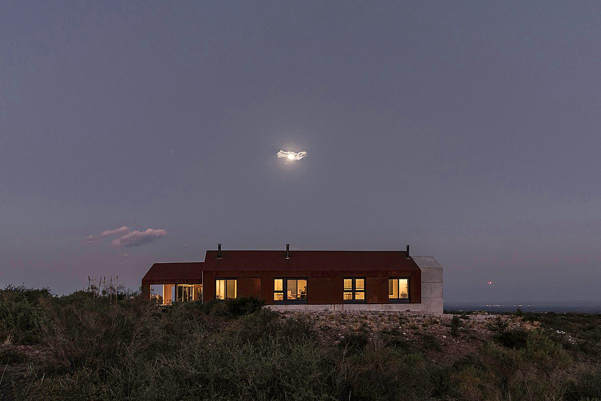
We’ll end this Project of the Week with a whimsical tiny cloud obscuring the moon over Casa de Piedra. Many thanks to Luis for sharing this wonderful project with us. It was a joy to look through!
Luis attended the University of Congreso, where graduated with a Diploma of Honor promotion XX in his studies to be an architect. He teaches at the “Taller de Arquitectura 1” of architecture at the same university. Luis also worked as a researcher and participated as a speaker at national and international congresses sharing his results about the history of the Tren Trasandino (Trans-Andean Train). He served as a collaborator in the studio “A4estudio” from 2016 to 2020. He is the founder of “Luis Abba Estudio” where he works as an architect and architectural photographer.
Luis is currently developing projects in Mendoza and Rio Negro (Argentina) and in the city of Santiago (Chile). Among his many awards is the Third Prize in the national competition of master plan and morphological ideas and preliminary project district tenth section hills (Mendoza, Argentina).
See more of Luis’ work via his Instagram @luisabbaestudio
If you have a project you’d like to be considered for Project of the Week, you can submit it here.
