Joe Fletcher photographs an ‘Act of Congress’ build at Grand Staircase-Escalante
When you’re hired to photograph a resort, your end goal is to sell the experience. If there’s one guy who can pull this off, it’s architectural photographer Joe Fletcher. Three photographs into his collection on Amangiri Resort, and I was trying to justify spending my F-You Fund on a vacation.
The Amangiri Resort is in Canyon Point, Utah. Residing among Grand Staircase-Escalante, the resort boasts that it required an act of congress to be built. Crafted by I-10 studio, comprised of renowned architects Rick Joy, Marwan Al-Sayed, and Wendell Burnette, this Project of the Week is a butte (ba dum tss)!
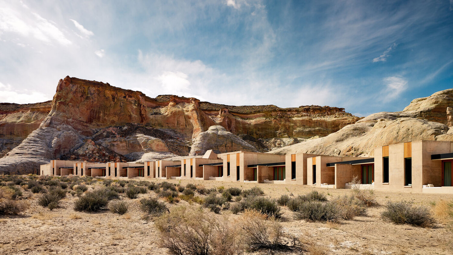
Let’s kick off this week’s project with Joe’s all-encompassing view of Amangiri and the surrounding landscape. Right off the bat, we are able to become familiar with the resort’s layout, amenities, and overall mood. The building materials echo the tones found in the desert beyond. Tonally, it blends seamlessly, however, Joe shows us how that the blocky massing contrasts the organic shapes found in the landforms. I love this particular view because it gives scale to both the resort and those beautiful mesas.

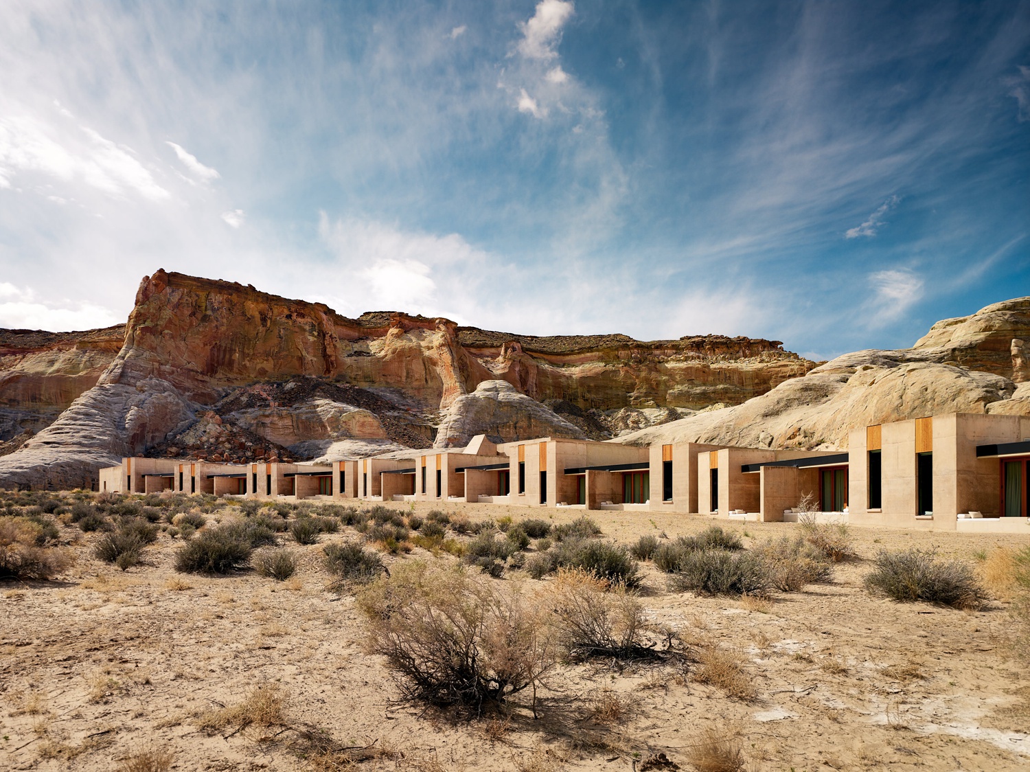
Viewing the resort on from the ground level is a bit more natural feeling to us. We are able to see how the resort stretches out over the desert, and acertain more of the building’s details. There’s a nice rhythm created by the staggered window heights and the repetition of the wooden details. The quality of light is excellent. I think, what is most beautiful about this image is how Joe post-processed it. American desert landscapes tend to trend orange and saturated. Joe keeps things neutral and tasteful. His restraint in color grading here is masterful. Now that we’ve got our sense of place, let’s carry on!
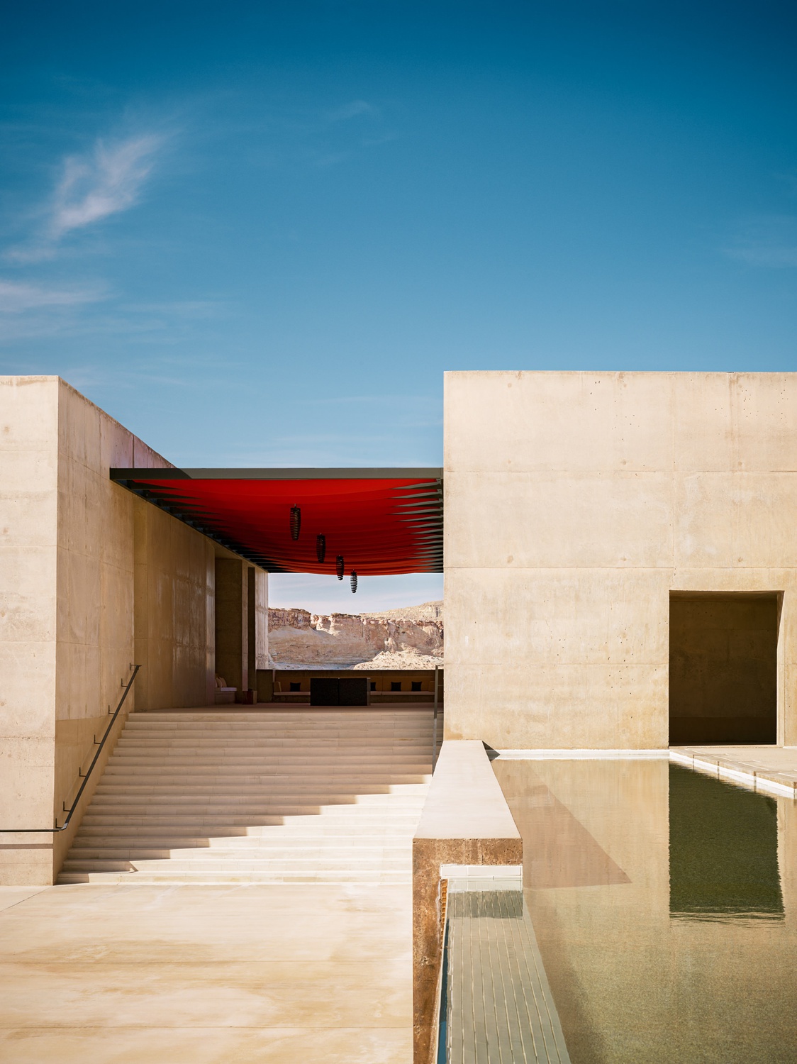
I can definitely envision this next shot as a magazine cover. The bold yet simple shapes and colors in this scene give off a powerful graphic feel. It’s a beautiful example of color theory. Notice how the red canopy pulls out the green in the pool. Meanwhile, that deep blue sky contrasts the pale concrete aggregate, making it pop off your screen. The powerful use of one-point perspective fits right at home here with the rectilinear shapes — and most importantly — creates a frame that displays the surrounding canyons.
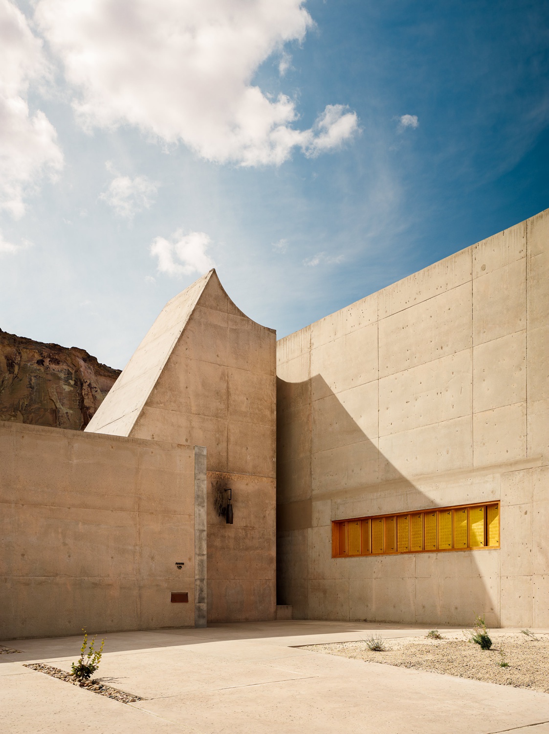
Joe uses hard light to emphasize the angular and slab-like massing, which echoes the shapes found throughout the landscape. This harsh (yet beautiful) light conveys a sense of heat to the viewer. This transports us to the scene and gives the image a great textural, gritty quality as well.
There are so many great aspects to this next shot. Joe employs some top-notch framing to ground us in the scene. The hard highlight leads us to the pool stairs, like a giant “ENTER HERE” sign. The dappled reflections on the concrete add a little je ne sais quoi that just feels so darn happy. I love the little slice of blue sky and how it’s mirrored by the pool. There are a lot of elements to look at here, but Joe gives each its own space to be viewed.
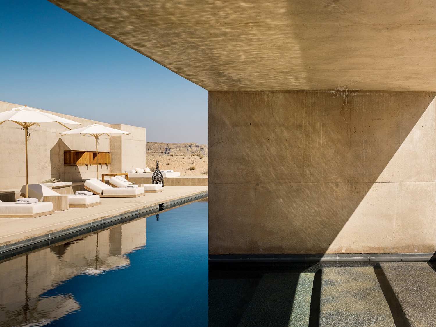
On the flip side, this serene view of the pool feels a bit different. While there are hard shadows jutting in, there is a softer feel to this image than the previous photographs. By crafting a darker, cooler, softer image, Joe conveys that this particular pool is an oasis away from the desert heat.

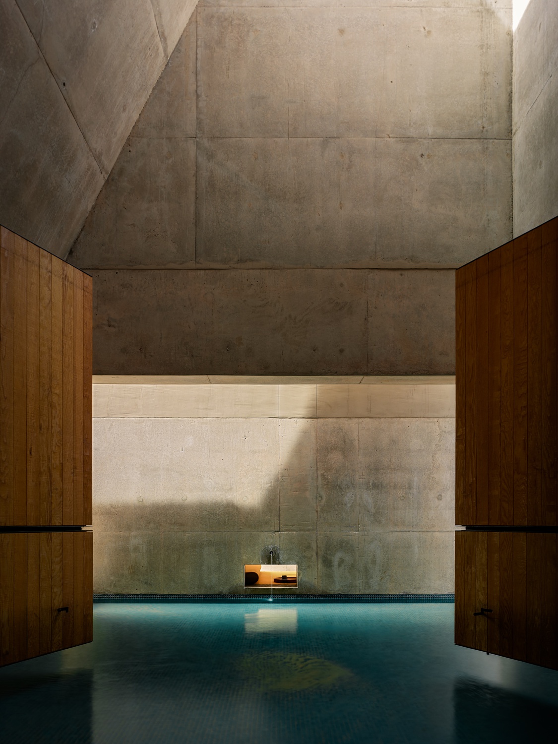
Here, a vertical perspective is used to show an indoor spa being lit by a massive skylight. The camera height gives us a good feel for how huge and epic this room is. It also gives scale to the Jurassic Park-esque doors. Again, there’s an interesting mix of both soft and hard light — providing visual interest and showing off the beautiful textures in the concrete work.
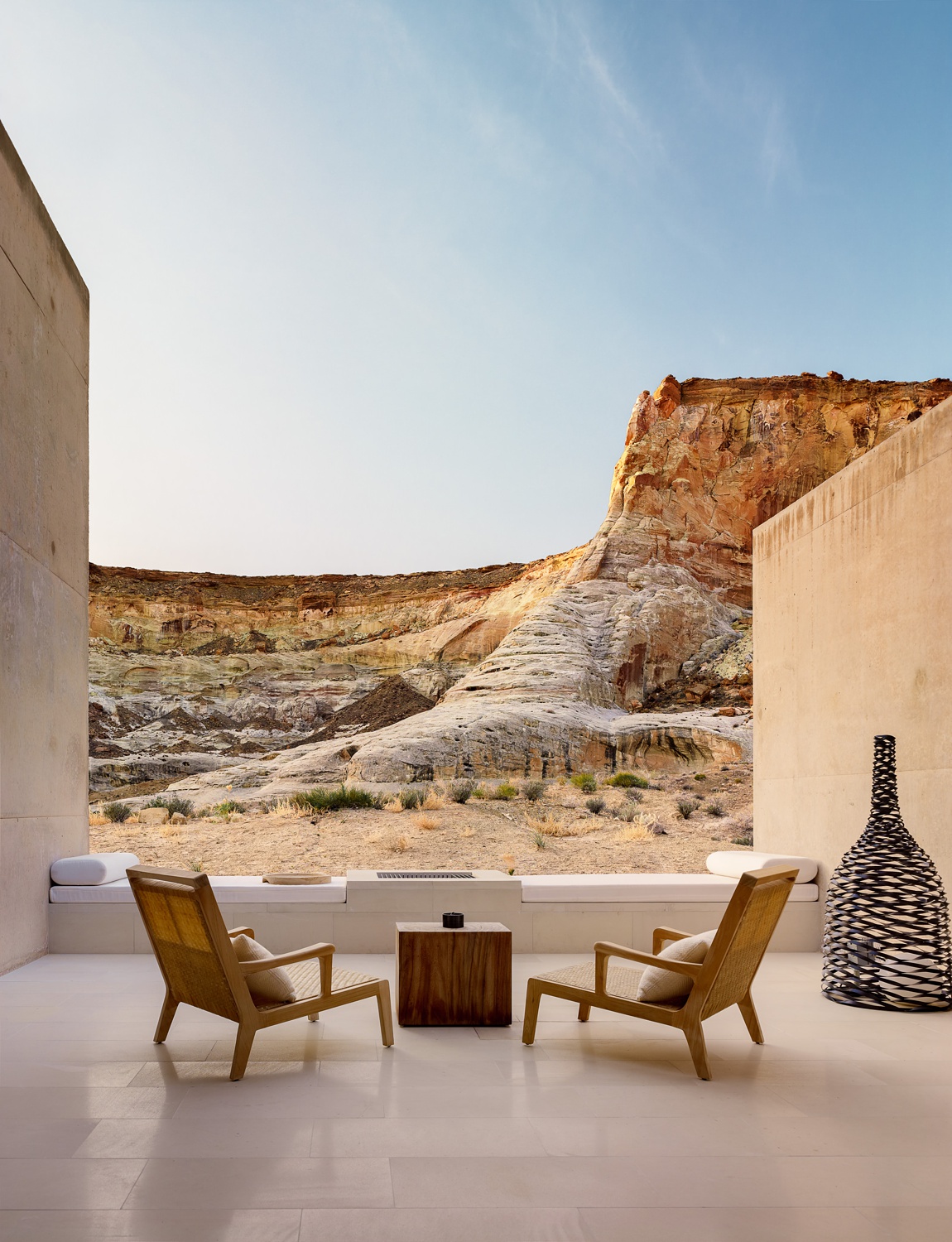
Joe sets up a nice inviting little vignette of an exterior courtyard. If any image sells this resort, it’s this one. Our photographer displays how pockets of the building frame the surrounding landscape. At this time of day, Joe properly balances his exposure to display the seating area a bit darker than the landscape (side note: in the psychology of photography, usually objects that are further away are brighter and have less contrast than those up close, especially mountain ranges). The tight crop lends itself to the warm and tranquil scene here.
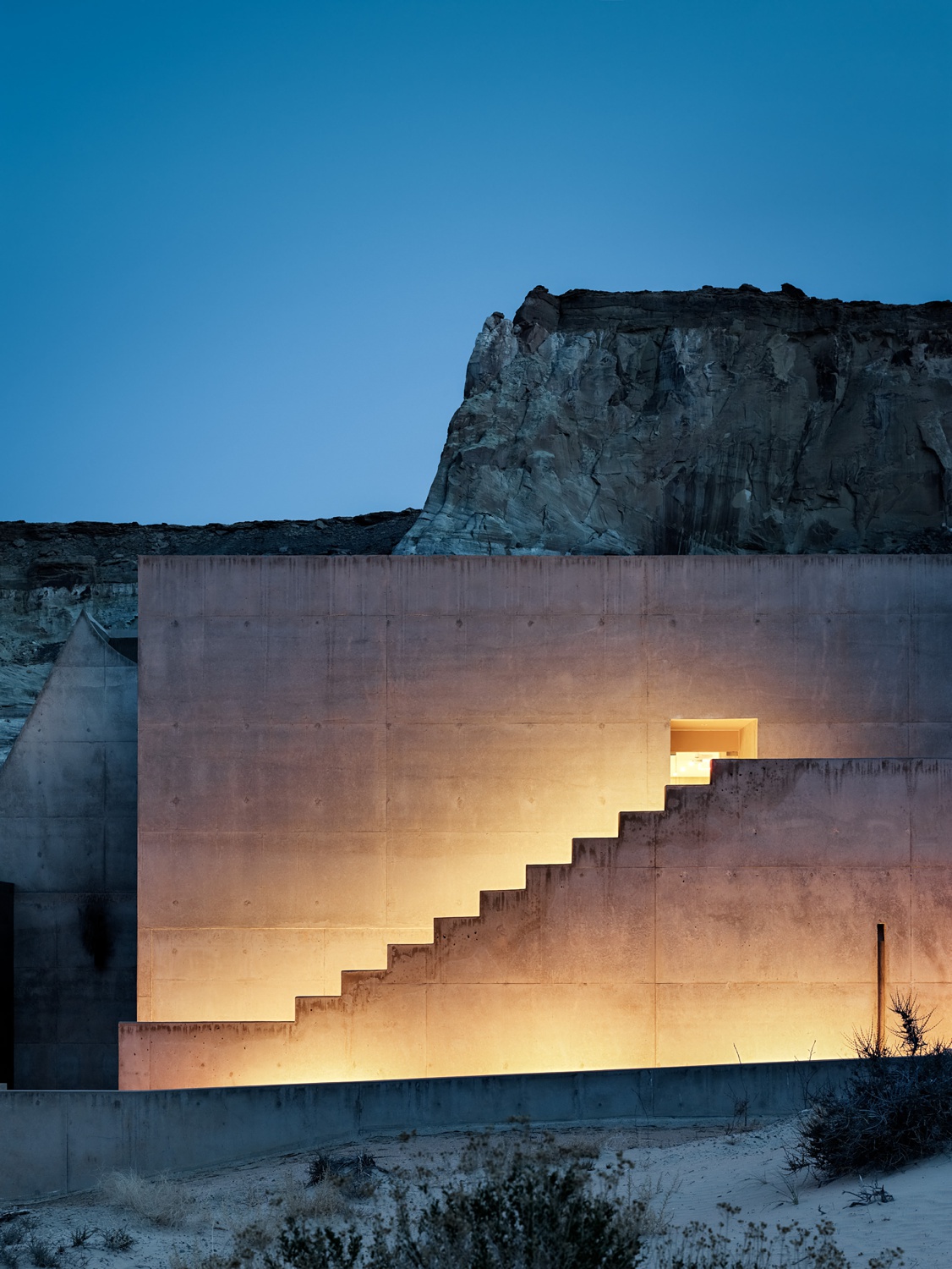
Joe’s departing shot of Amangiri is a textbook example of color theory and chiaroscuro. While a seemingly simple photograph, it’s hard to ignore. The oranges and blues play off of each other beautifully. The illuminated stairwell sucks our eyes into the main focal point of the image. The crisp rectangular shape of the facade contrasts the jagged mesa, making it stand out from the landscape. What a beautiful end to a beautiful project!
A huge thanks to Joe Fletcher for sharing his photos of Amangiri resort with us. Joe’s portfolio is thick with mind-blowing projects and is well worth a visit. If you’re looking for more inspiration on powerful framing and tasty lighting, check out his website joefletcher.com or his Instagram @joefletcherphoto.
If you have a project you’d like to be considered for Project of the Week, you can submit it here.
