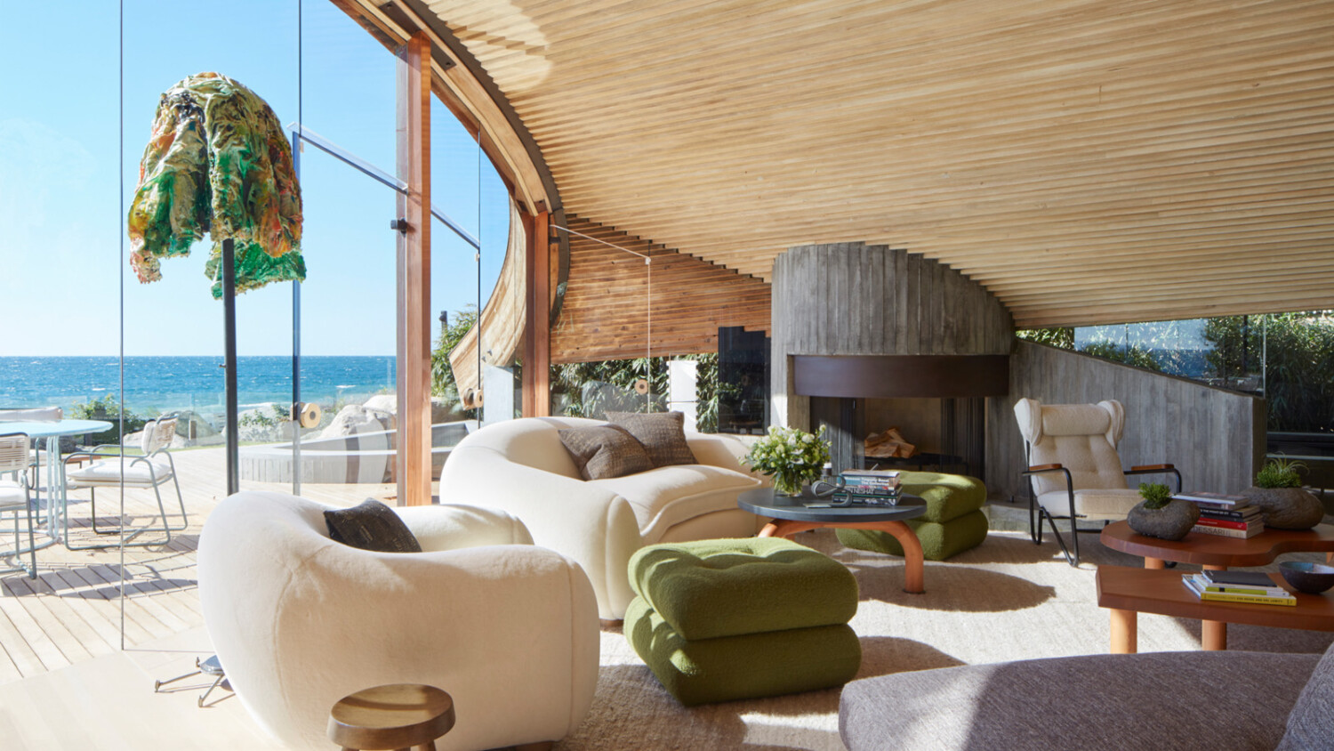
Inside An Iconic Malibu Architectural Masterpiece with Roger Davies
There is a special place in Californian architecture marked by the renowned work of architect John Lautner. Kicking off his career as Frank Lloyd Wright’s apprentice, Lautner fell into his own iconic style and took over the West Coast mid-century scene. Spanning from mod Palm Springs residences in Bond films to Coachella hotels (before it was cool, might I add), then passing through the hands of endless celebrities and L.A. socialites, his work is undeniably special.
One particularly beautiful design crafted up by Lautner is a home on Malibu’s “Carbon Beach.” This is the star of Project of the Week. Photographed originally for Architectural Digest by the incredible Roger Davies, we’re in for a truly special and gorgeous treat this week. Let’s do this thing.
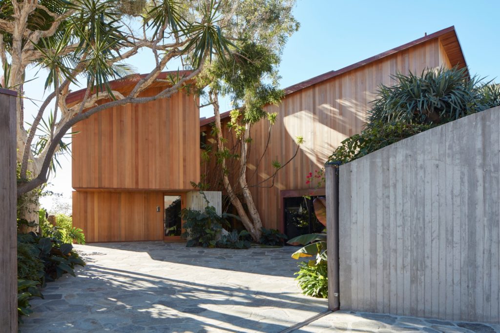
The opening shot of the Carbon Beach house sets the scene nicely for us. Framed by beautiful foliage and the privacy wall, there is a bit of mystery and a private oasis vibe at this property. I love the contrast in the warm tones of the wooden facade with the cool sky. The light streaming across the front of the house and the hardscaping adds some shape and definition, chiseling out simple shapes and textures.
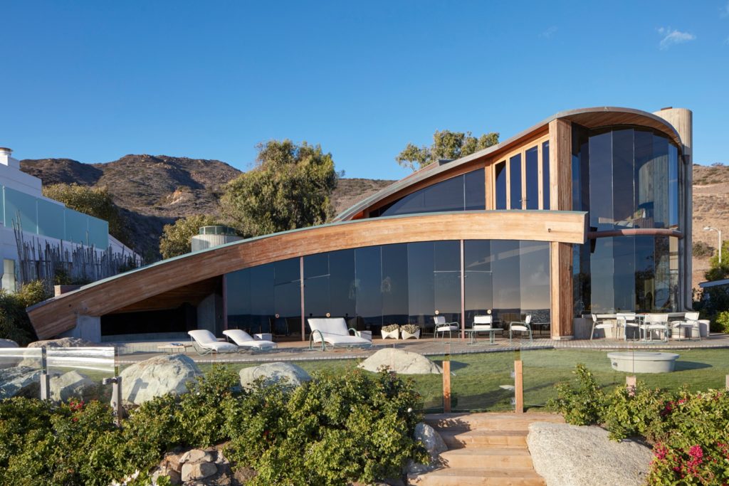
Out back, relatively hard light creates a nice depth in the shadows, defining the massing of the house and accentuating those curves! Roger skillfully uses the time of day and quality of light to help shape this great piece of architecture throughout the entire project.
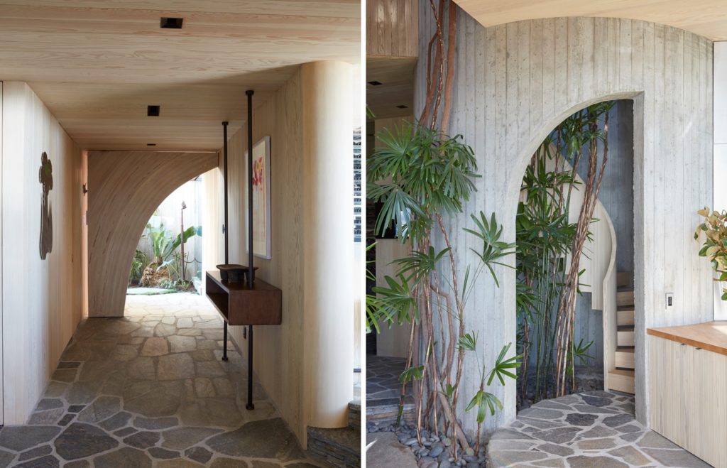
Inside, soft light gives a delicate and organic feel to the images despite the hard lines and geometric shapes found throughout. Careful framing showcases the design elements and details that set the home apart.
Rife with oversized furniture, which is notoriously hard to photograph, I appreciate that Roger was able to compose this image to show off the textured ceiling, those massive windows, and the expansiveness of the space, without distorting anything or overstuffing the image – it still breathes. From this perspective, we are able to see the way the wood ceiling interacts with the fireplace and the tops of the walls, which is a very, very cool design detail.
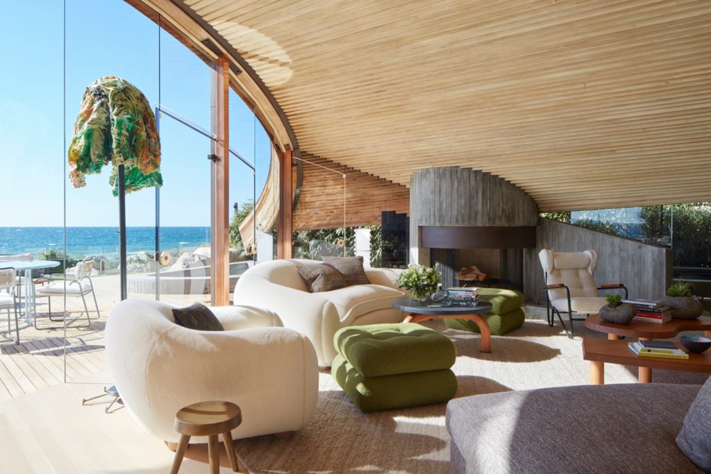
From a slightly different angle, Roger allows that incredible ceiling to fill up a huge portion of the frame and let it really shine. The leading lines created by this composition are impossible to ignore, and they carry your eye through the frame, creating movement and repetition. This is aided along by the view – the eye naturally goes to the brightest part of the frame, and everything leads us right there.
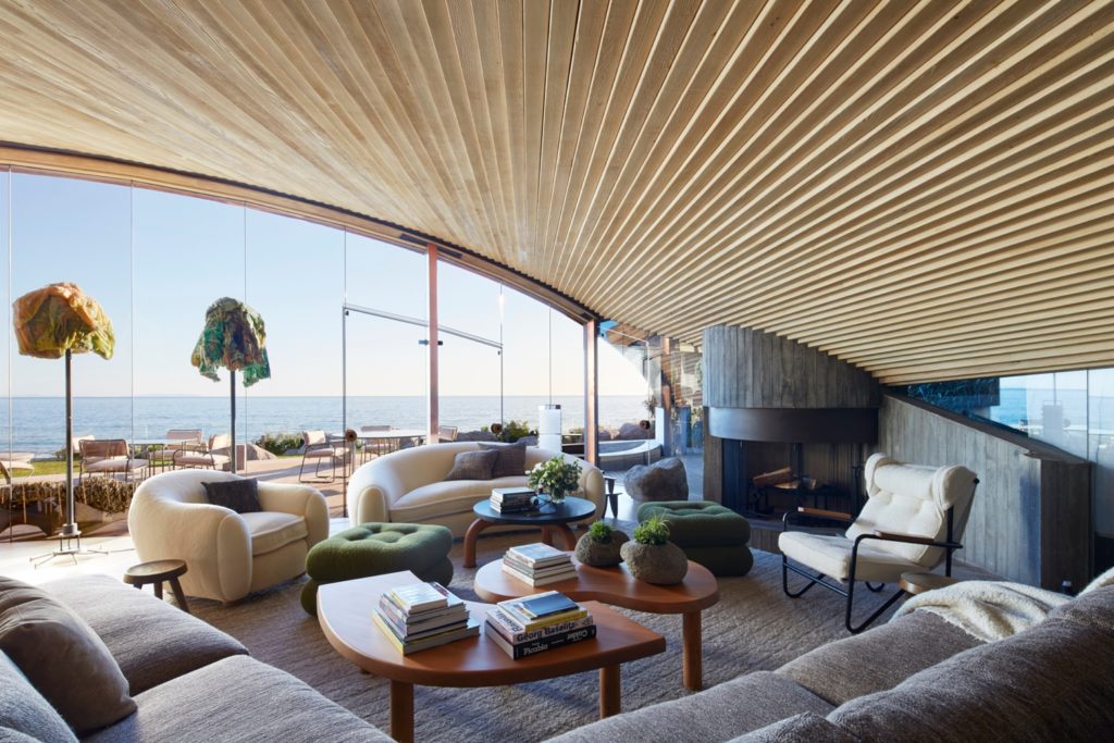
Another strong composition informs us on the mixture of curves and hard lines throughout this home. There are so many shapes and textures present, but Roger grounds us in each image and lets our eyes move throughout each scene. Never going too wide or so tight as to leave us lost.
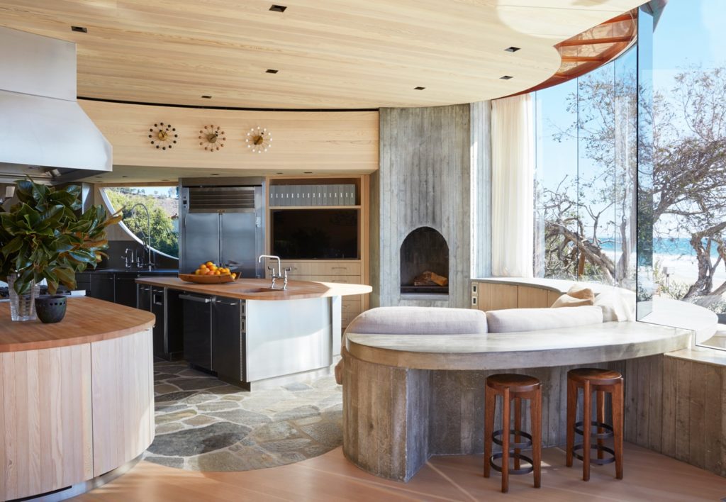
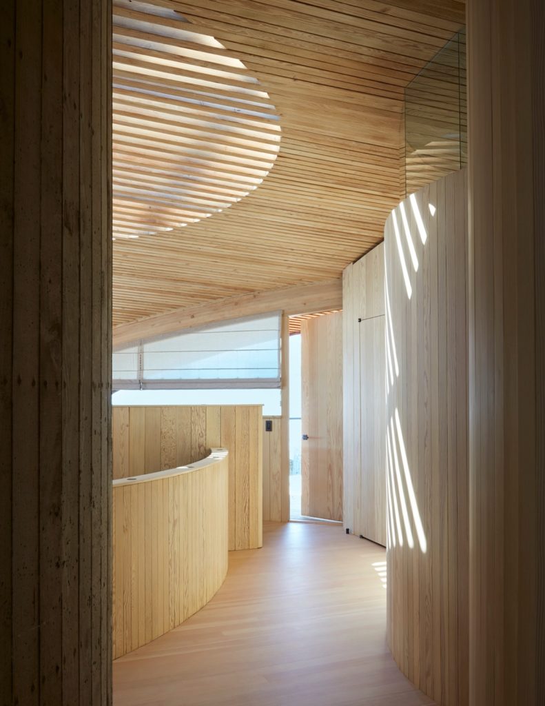
One of my favorite photographs from this series, look at the juxtaposition of horizontal and vertical lines, and the rectiliniar shapes mixed with broad arcs. To add to the movement of this scene, Roger chooses to shoot this space at a time of day when the light streams through the ceiling, throwing those highlights on the wall. It’s a lot to look at, but by framing us up with a darker foreground, we are able to drive our eyes through this image and out that little slice of the doorway. By keeping the styling simple, we get a purely architectural shot that shows the wonderful color and material palette of the home.
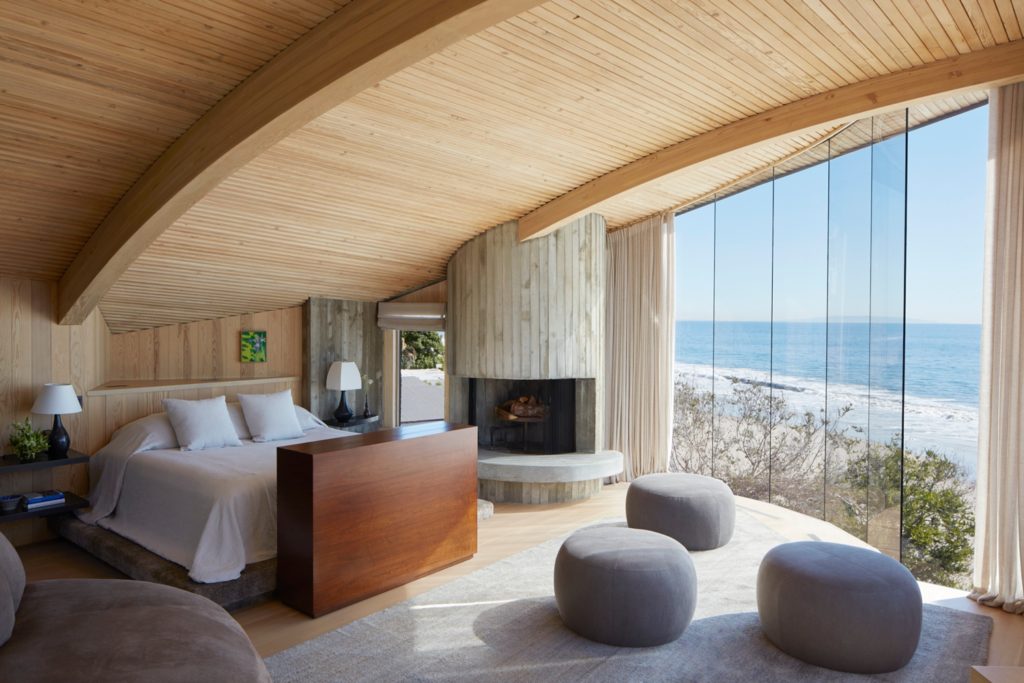
There is such a serene feel to this image of the Carbon Beach House’s bedroom. Even though a relatively wide focal length, it still feels cozy while featuring plenty of ceiling and the wall of windows. The sunlight pouring in to the room is tastefully exposed for and gives the sense of a warm and bright day without overdoing it or distracting from the architecture itself. Beautiful shadows transition to perfect highlights from left to right, framed by the glulam beams – movement galore.
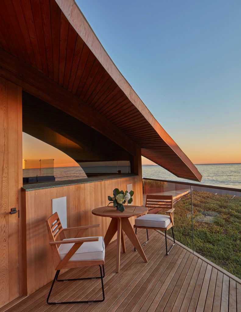
This parting shot is a masterclass in color theory. The orange wood contrasts the beautiful Malibu sunset and dark Pacific ocean blue. It feels warm and inviting against the bold blues in the sky and ocean, exactly how you’d want your sitting area to feel. I love the reflection in the glass and the way the roofline intersects the horizon in the distance. Simple styling keeps the shot quiet and serene – I can almost hear the waves lapping below.
A million thank yous to Roger Davies for sharing his project of this beautiful and iconic Lautner home with us. Roger is a master at framing and using light, and has photographed plenty of other projects that are just out of this world!
You can keep your eye on Roger Davies’ beautiful work on his website rogerdaviesphotography.com or his Instagram @rogerdaviesphotography
If you have a project you’d like to be considered for Project of the Week, you can submit it here.
