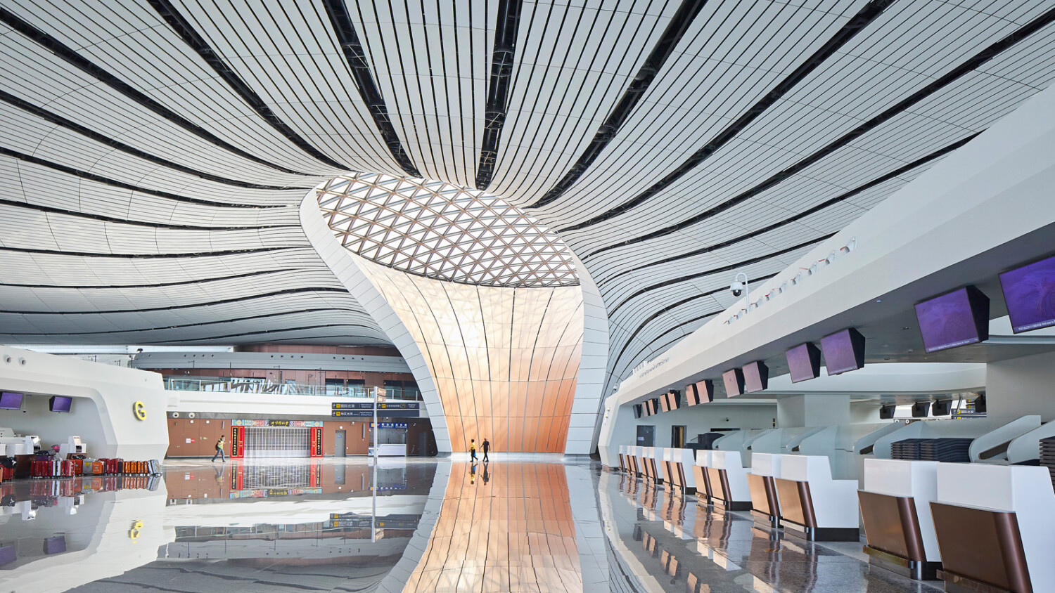
Hufton & Crow Tell Us About Photographing the World’s Largest Airport
A headliner on CNN, Curbed, Dezeen, and Architectural Digest, this week’s featured project has been widely talked about in the press and has made waves across the architecture community. A truly incredible undertaking, Zaha Hadid Architects‘ Bejing Daxing International Airport is a 12.9 billion dollar, 700,000 square meter masterpiece.
While the news outlets are preoccupied by tedious things like how many people and flights it can support, we’re here to look at the truly important stuff — the photographs.
Enter the rockstars at Hufton + Crow. If you watch the opening image carousel on Hufton + Crow’s website, you’ll quickly realize that they are no strangers to photographing massive architectural landmark projects. Their body of work features endless beautiful displays of geometry, light, and wrangled chaos. They are the perfect team to document Beijing’s international airport and were gracious enough to sit down with us for a brief interview to discuss the process of photographing this massive project.
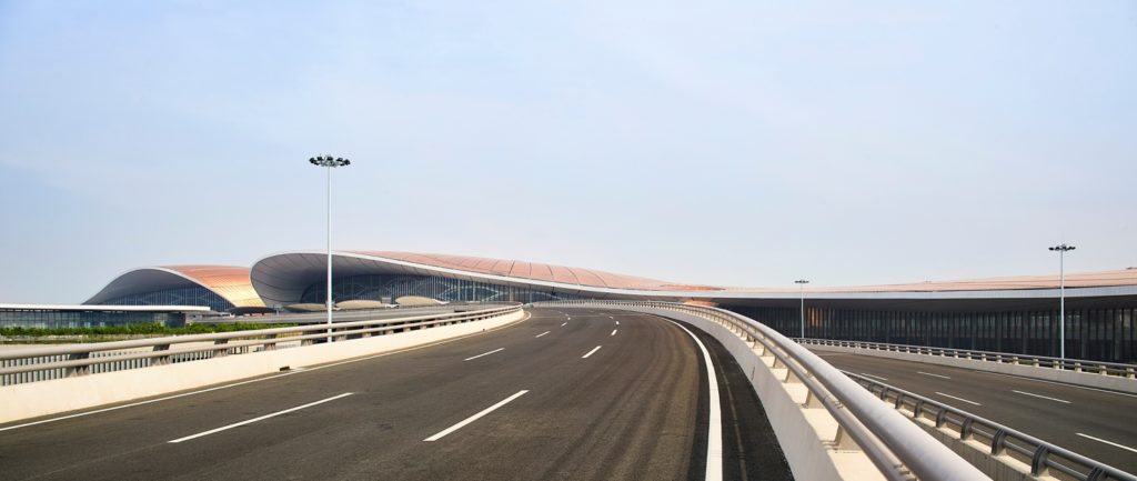
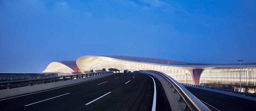
In our opening image, Allan Crow sets the scene for us by showing Daxing from the road — a familiar sight for travelers. The curved road leads our eyes to Daxing itself, which mirrors the swooping arcs found on the road. Notice the serene feeling this photograph gives off. There’s soft warm light, a clean uncrowded road, and a gentle air around this mammoth structure. It gives an inviting quality to the airport and is a nice juxtaposition of what we’ll see inside.
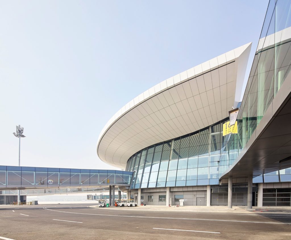
“I traveled to Beijing and was on site for three days. It [Daxing] is huge! The shoot was back in August. The temperature was around 40°C (104°F), so I certainly had my work cut out for me” Allan explained. Despite the scorching heat, he continued to photograph the exterior elements of the airport like these beautiful jet bridges extending from the terminal. I love Allan’s framing here, and how the lines pull our eyes throughout the image.
“Like many projects we shoot, we visited before practical completion. There was still quite a lot of work happening. One challenge of this shoot was to try and communicate the aesthetic qualities of a finished project before it was actually finished.” If there were any hardships in that arena, Allan did an awesome job of overcoming them. All we see is a perfectly finished space. This image shows us the central courtyard which the rest of the airport radiates out from. Reminiscent of traditional Chinese architecture, this is the heart of Daxing.
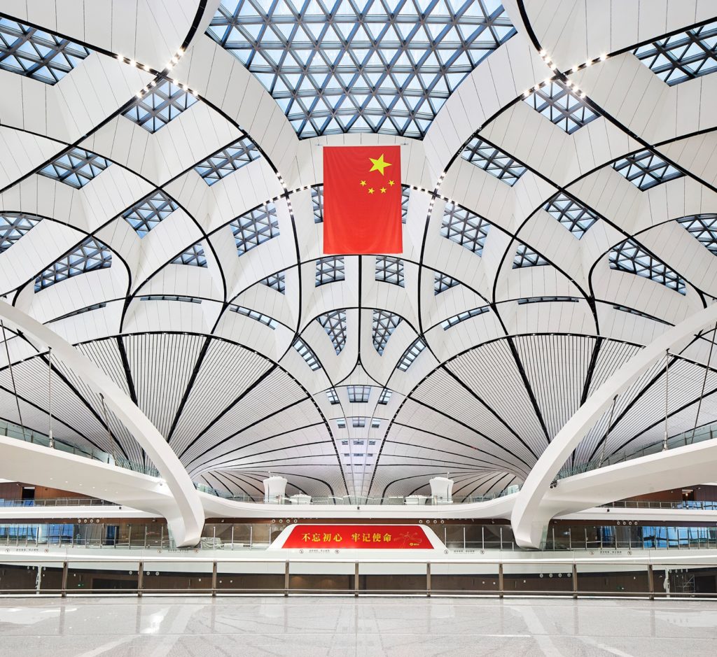
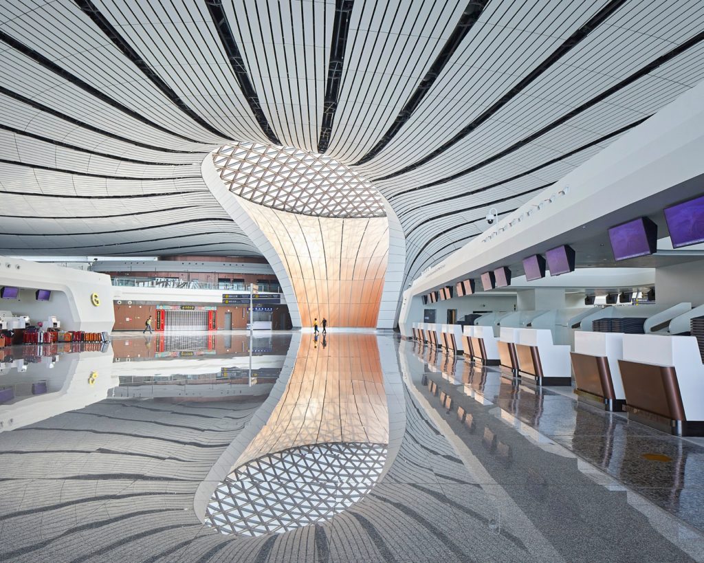
There isn’t one inch of any frame that doesn’t have something interesting happening, which in many cases may lead to overstuffed photographs. Yet here, the perfectly balanced and considered compositions do a great job of simplifying a cavernous space. The airport becomes quite easily digestible as a result.
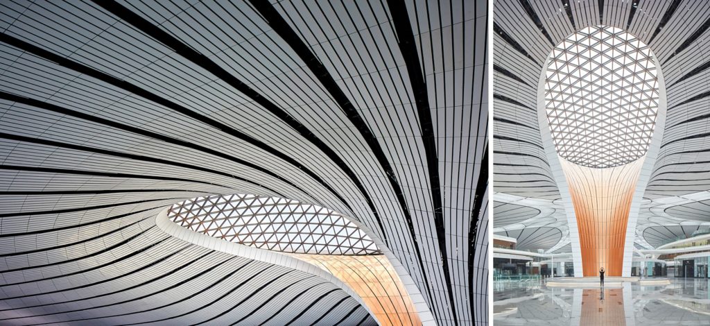
Allan Crow noted that “like with all Zaha Hadid Architects projects, it was a joy to shoot and actually, you have to be quite selective with your compositions and really consider them, as it looks pretty good where ever you point the camera!”
This is hands down my favorite set of images from this project, because they show the scale of the main courtyard, how the project flows together, and gives a good overview of the design elements.
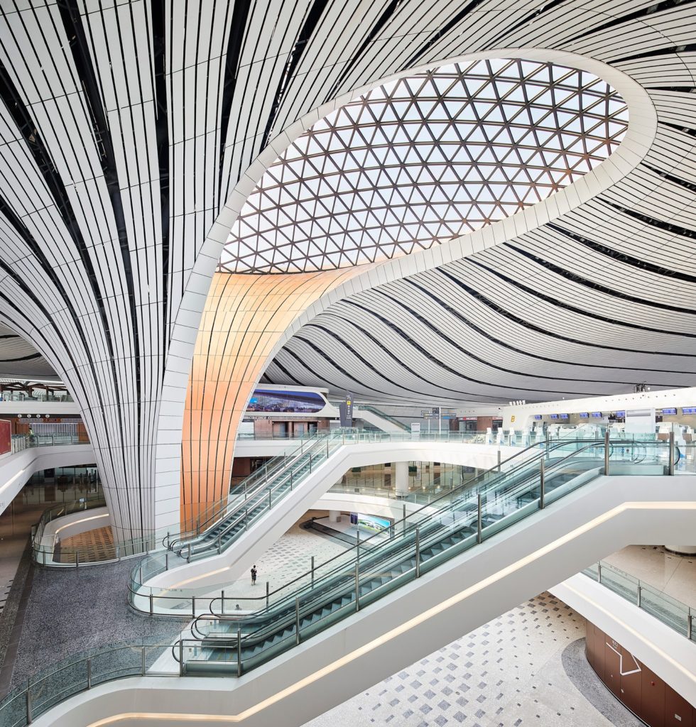
Despite the fact that the airport wasn’t open yet, Allen adds in a human element to some of the frames. It shows not only the outrageous scale of the place, but more importantly, shows the functionality of the space, as the architects intended it to be used.
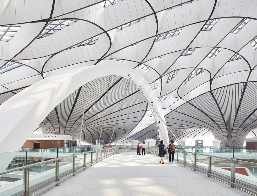
Hufton and Crow have a superpower where they can take an area that has A LOT to look at, and display it in a way that makes sense to our eyes. Careful framing drives us through both of these images, showing off the depth and labyrinthine quality of the airport, while still anchoring us in the scene.
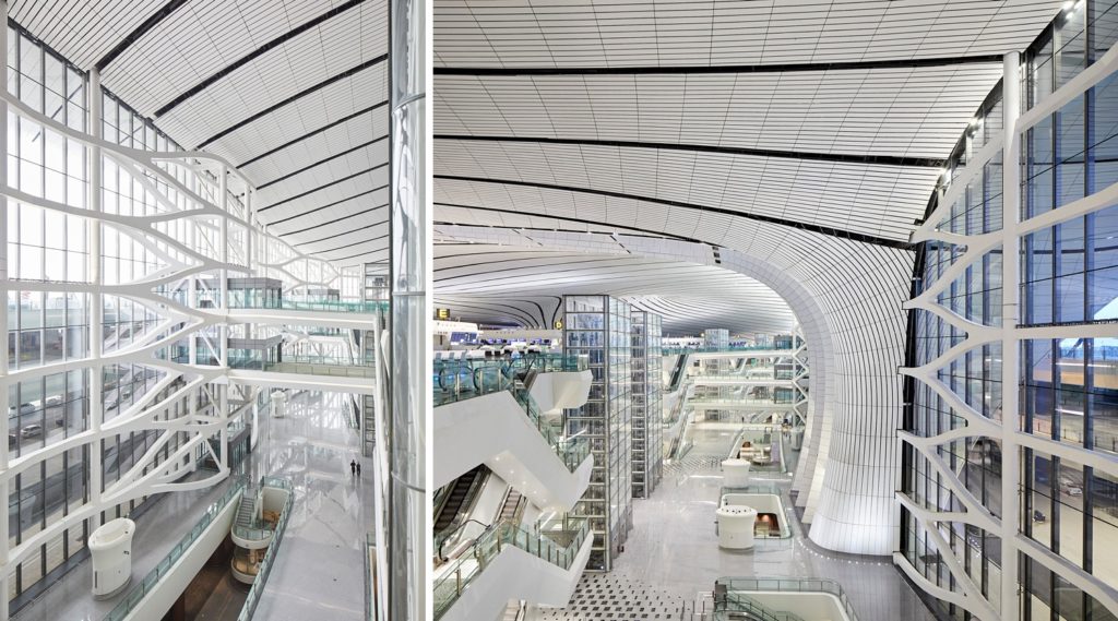
The next three images are beautiful examples of using one point perspectives to heighten the appearance of symmetry and leading lines. The curvature of the linear design elements creates a gentle movement throughout each of the first two images. In the last photograph, sharp straight rectilinear elements create total symmetry and one converging focal point. It almost has a kaleidoscope feel thanks to the reflections on the floor.
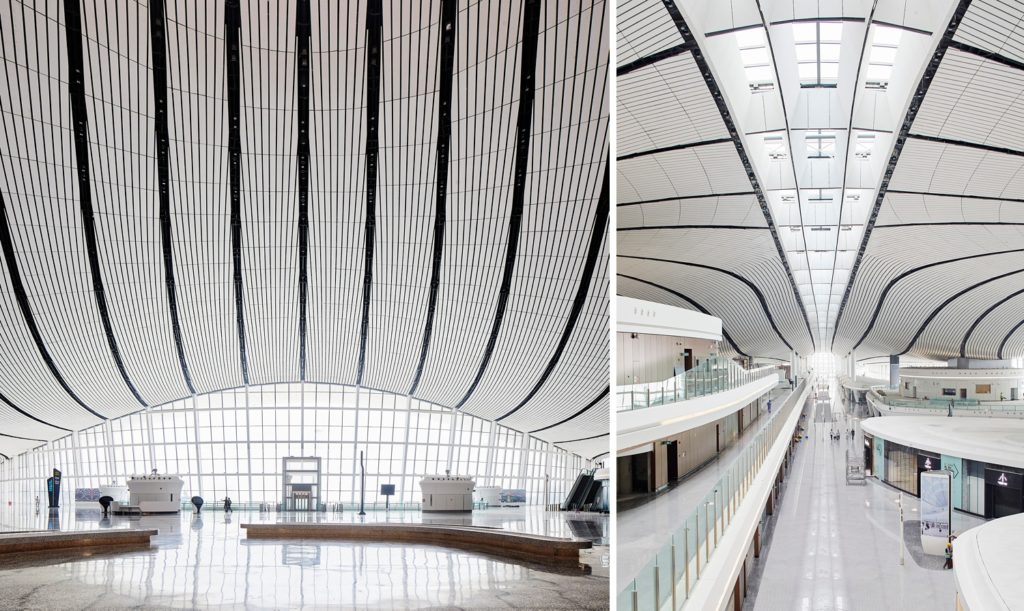
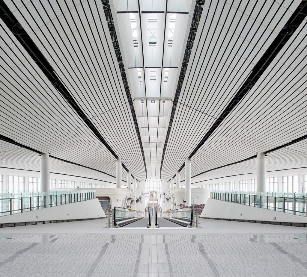
Back outside, we get a look of Daxing in the twilight. Again, there’s a lot of great movement and repetitive shapes here which create a sense of rhythm — a theme present throughout the entire project.
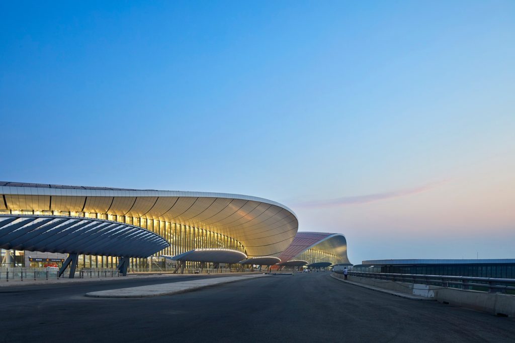
Ending where we began, this time we see the airport from the entry road in soft, quiet evening light – the somewhat organic design, evoking a creature taking flight, is perfectly captured in this subtle image. A moment of quiet beauty at an otherwise chaotic place.
“I’m hoping to revisit the airport on my next trip to Beijing in November, and hopefully it can be organized for me to take some more images now that it is fully finished and operational. This is a space to watch” Allan Crow told me. A huge thank you to Hufton and Crow for sharing this project with us. We’re all eager to see more of this incredible piece of aviation architecture. Keep your eyes on their site huftonandcrow.com as well as their Instagram @huftonandcrowto follow their work.
If you have a project you’d like to be considered for Project of the Week, you can submit it here.
