Harnessing Australia’s Beautiful Light With Timothy Kaye
Here at APALMANAC, photographs with plenty of mood are our kryptonite. Photographed by Timothy Kaye, this week’s featured project is one overflowing with dark tones, incredible lighting, and punchy modern shapes. Without further ado, here are Tim’s dreamy photographs of Heyington Place by Carr.
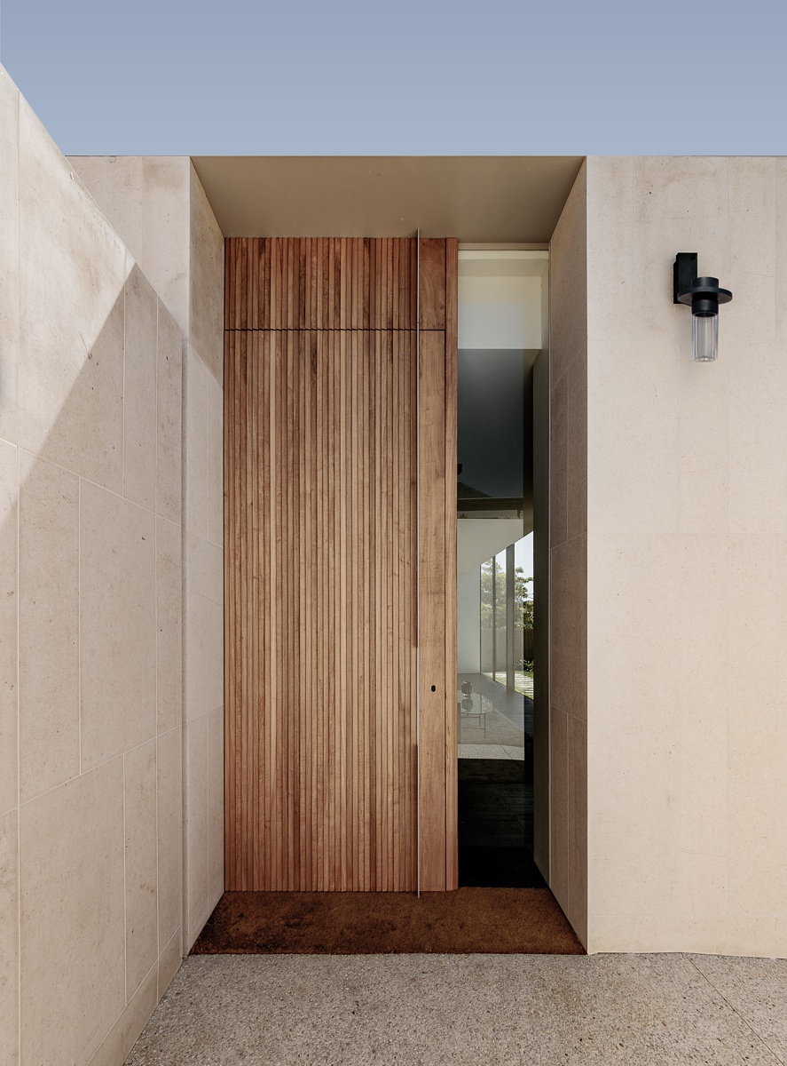
To kick things off, Timothy shows us the entryway into Heyington Place. I love the crisp simplicity of this photograph. The hard light casting angular shadows gives some depth to the scene but isn’t too overwhelming. We aren’t distracted by the sky. Our eyes are able to hone in on that beautiful custom door and then the interior beyond.
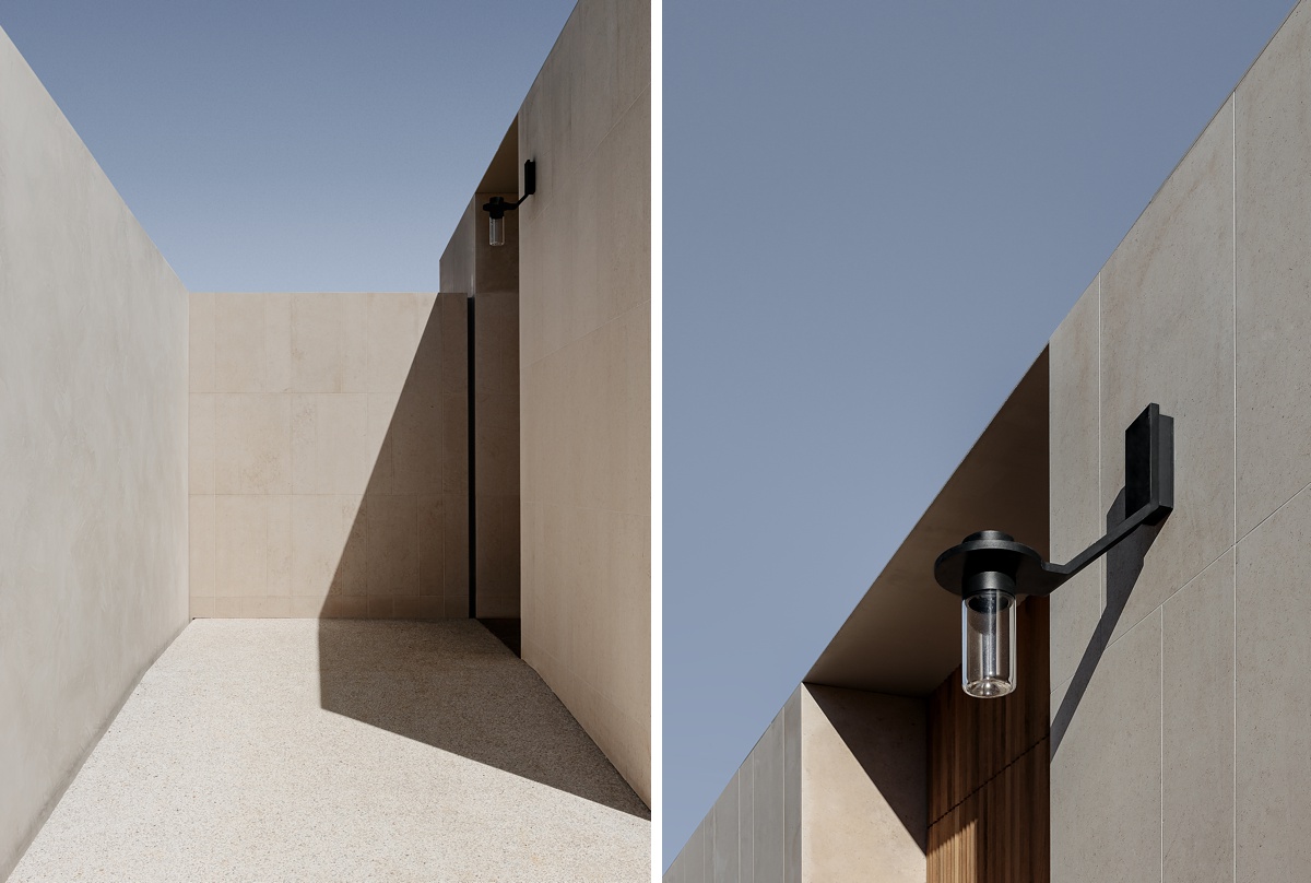
Backing out of the entryway for these shots, Tim harnesses the harsh light to make gorgeous and graphic vignettes. The rich quality of light is just off the charts here, and mixed with the subtle color palette and sharp lines, this scene feels very bold, clean, and modern; a taste of things to come within this home.
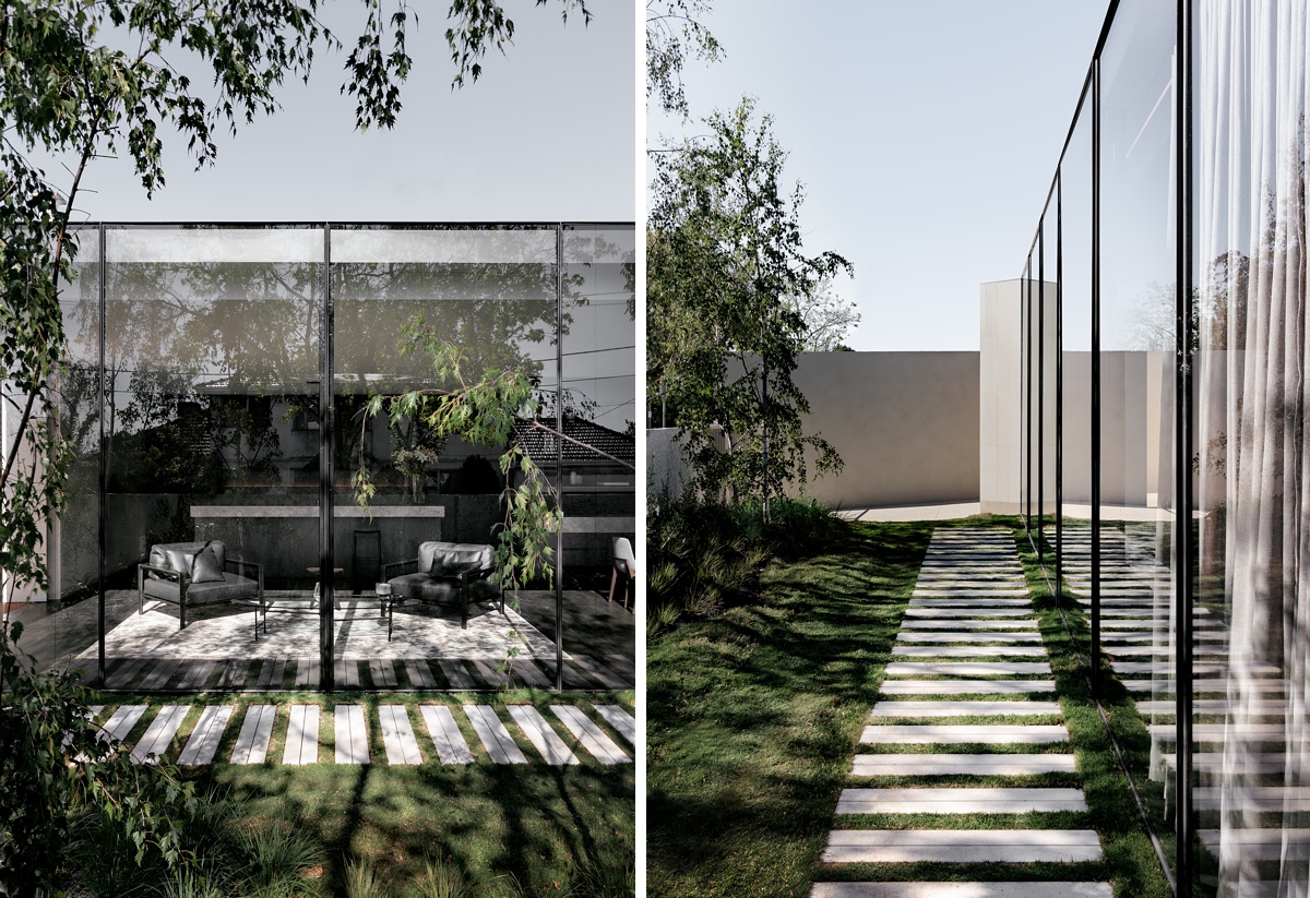
Contrasting the minimal aesthetic of the home’s entryway, we are able to see the lush landscaping and vegetation in the yard. I love Tim’s uses of framing, shooting through the trees to draw our eye into the living space, while showing off the landscape design. The dappled light streaming over the pavers and onto the rug in the sitting area gives off a nice cheerful mood and adds some life into the scene. On the right, by shooting directly down the path, we are able to see how the yard connects to the entryway. The pavers drive our eyes right to that privacy wall where we see hard light casting shadows onto the ground. What I love most about this photograph is how Tim uses the reflective qualities of the window to mirror the scene and add in repetition and movement.
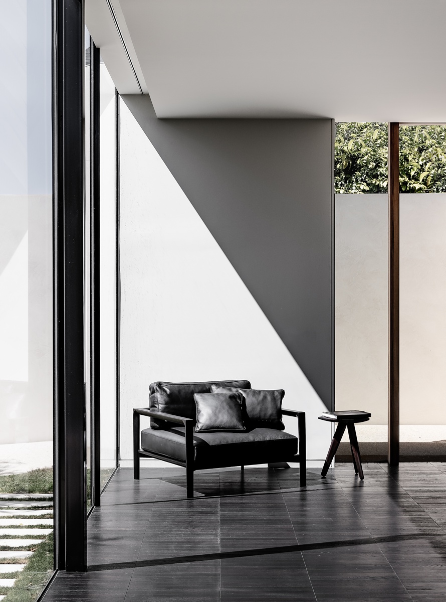
Inside the sitting room we were introduced to above, Tim is able to show off the great design of the space. That same hard sunlight pouring into the room creates a beautiful and crisp triangle of light that pulls our eyes right in like a tractor beam. Tim repositions the chair to sit within that pocket of light. I love how he angled it away from the window, as to replicate the shape we see in the cast shadow, and to minimize the size of that massive chair. Our attention is allowed to drift elsewhere in the frame — like to the squares of foliage on the right and the beautiful texture of the flooring.
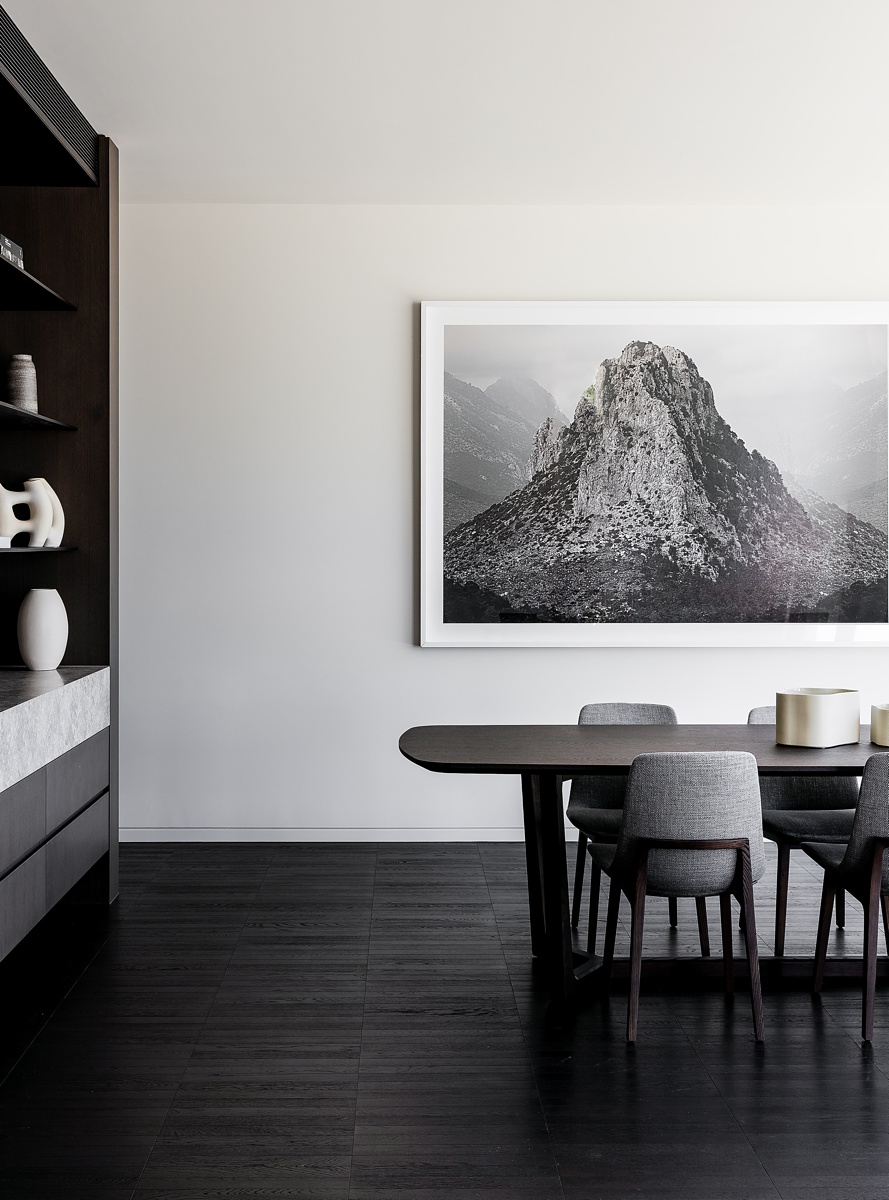
In the dining room, Tim crafts a perfectly weighted image. The dark built-ins and cabinetry on the left are visually heavy. The portion of dining table, chairs, and large wall art that we are able to see, balances that visual weight out while implying that there is more to the room that is left unseen.
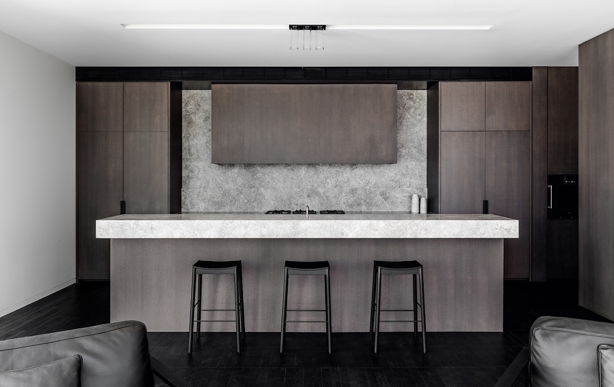
Now for Heyington Place’s piece de resistance; the kitchen. Tim gives us the lay of the land here, introducing the blocky, almost monolithic design, by way of a great one-point perspective. This helps accentuate the rectangular shapes and leading lines in the scene. I love how the island is framed by the two leather chairs from the sitting room, helping give some context to the space and how it relates to the rest of the house. Their neutral color keeps them from being distracting, and gives some extra oomph to the photograph while letting our eyes focus on the island.
Holy wow. Would ya just look at that dynamic and velvety light?! By standing off-axis from the light streaming in through the windows, Tim is able to create a beautiful and dynamic image. The shadows on the sides of the cabinetry, range hood, and island create depth and heighten the shapeliness of each element in the kitchen. Speaking of great shapes, check out the way the table and built-ins from the dining room in the foreground help frame up the scene, familiarize us with Heyington Place’s layout, and provide some visual interest through layering. This is absolutely my favorite frame from this series. There are so many great things happening here!
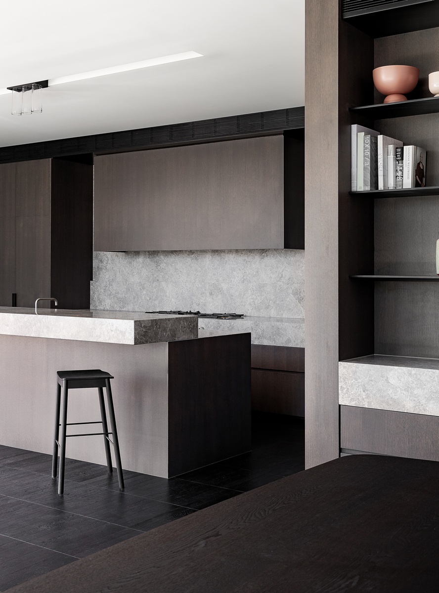
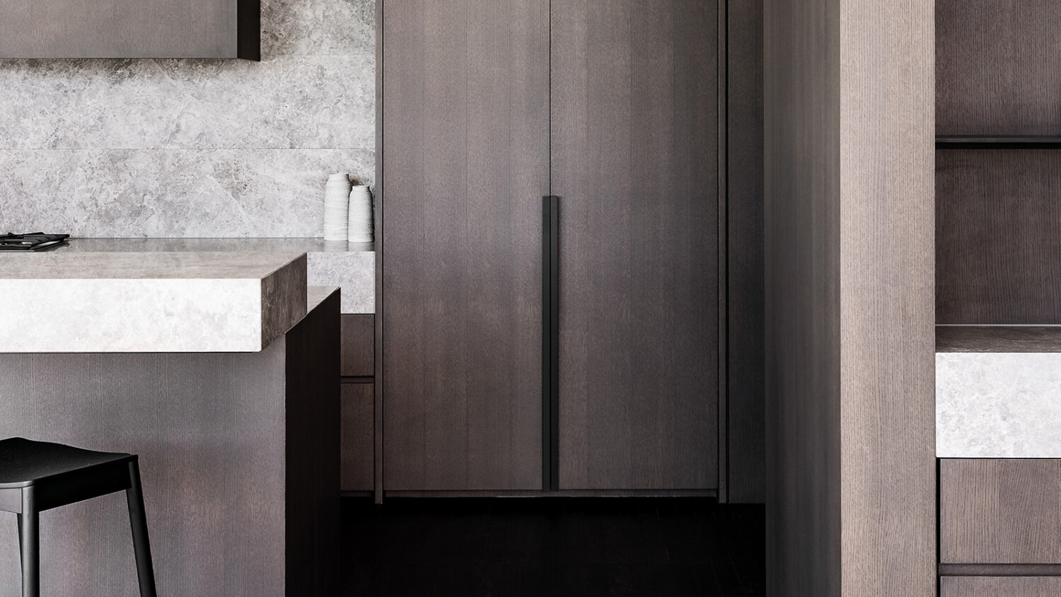
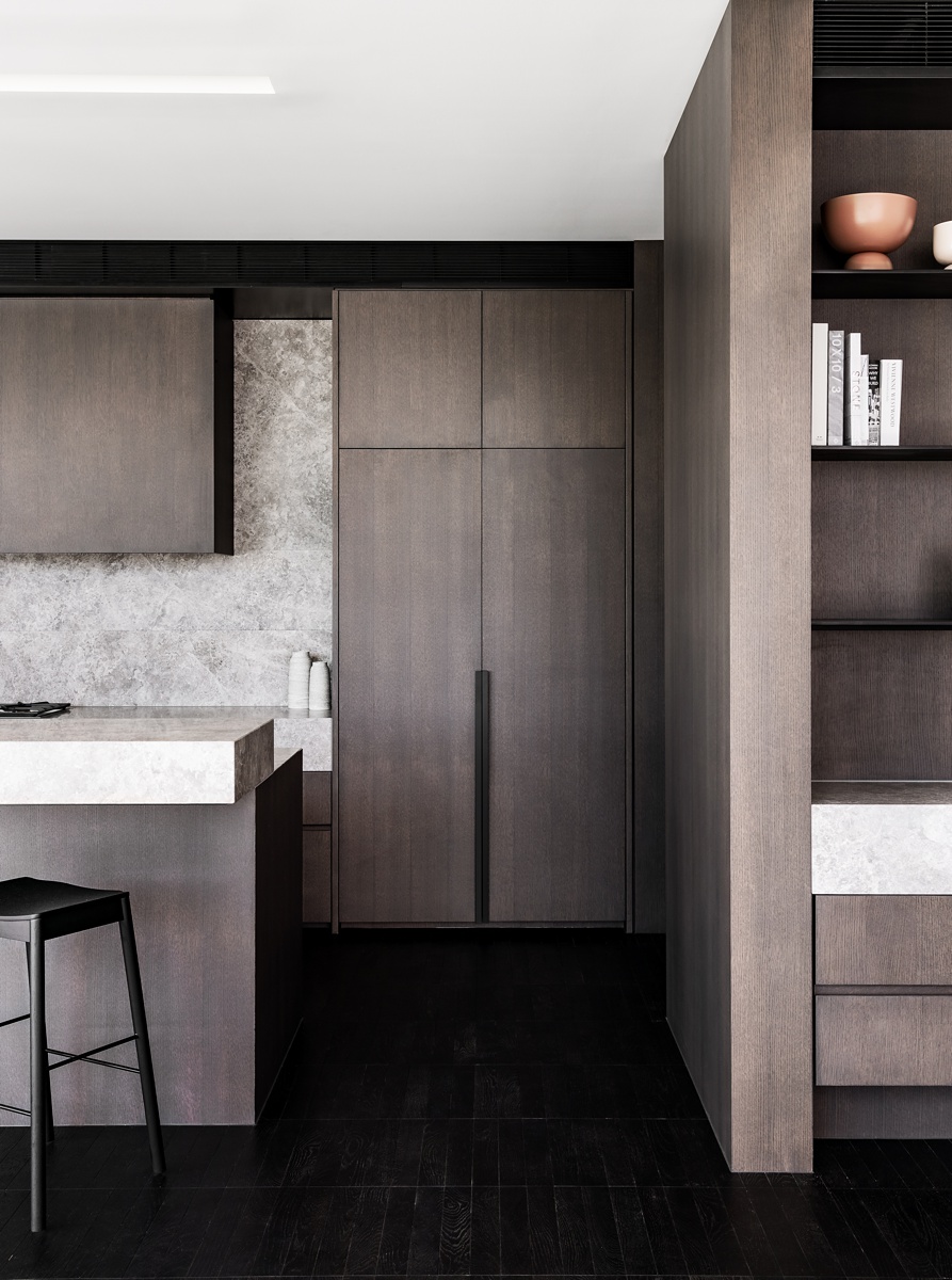
A similar view, but shot head-on, provides an intimate feeling in this relatively hard feeling room. The minimal styling is brilliant and really plays to the strengths of this design. The books echo the rectilinear shapes, while the bowls and vessels on the countertop help subtly soften the scene. The angled bar stool helps break up the blockiness of this room, and gives a little dimension. What a great photograph.
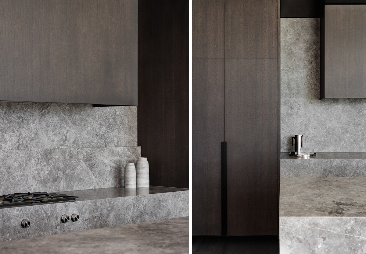
Shooting over the island countertop, Tim creates depth in these two vignettes. I love how he isn’t afraid to let the cabinetry fall dark on the edges of the frame. This creates great contrast with the light backsplash and countertops.
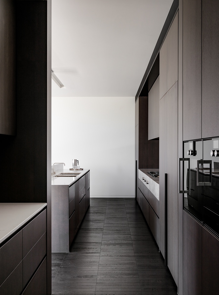
We’ll finish up this week’s featured project with another stunning kitchen image. By keeping the foreground dark and the background light, our eyes are pulled through the length of the scene. On the way, we are able to pick up on details like the built-in appliances, texture in the floor, delicate faucet, and recessed lighting in the ceiling. I love this project because of its simplicity in design and styling, yet how rich and dynamic it feels. Tim is absolutely the master of creating jaw-dropping images through thoughtful light and composition, and this project has been a textbook example of those skills!
Many thanks to Timothy Kaye for sharing this freshly edited project with us. Tim is in the midst of rebranding his website, so for the time being, you can (and should) oogle his work on Instagram @timothykaye!
If you have a project you’d like to be considered for Project of the Week, you can submit it here.