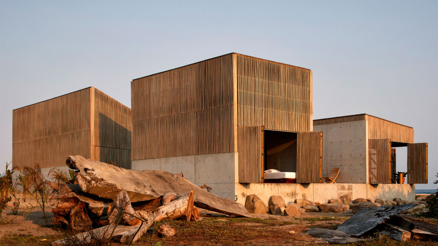
Edmund Sumner Shares the Story Behind Photographing a Beautiful Mexican Beach House
Edmund Sumner is an architectural photographer based in London who has been working in the field since 1998. A wealth of experience and talent, Edmund shoots worldwide, bringing his thoughtful compositions and recognizable style to all projects spanning from hospitality to cultural installations and everything in between.
I was very excited when Edmund submitted his photographs of Casa Naila by architect Alfonso Quiñones of BAAQ’ in to APA for Project of the Week! Today we’re taking a deep dive with Edmund into his gorgeous photographs of Casa Naila. Edmund has delightfully shared the story of this shoot of the Mexican beach house, so I’ll let him take the mic here!
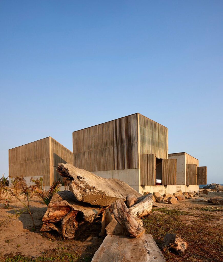
Edmund: This is the story of shooting “Casa Naila” back in 2018, a fantastic house and what I consider to be one of my best shoots. Casa Naila is named after “Naila” by Mexican singer Lila Downs and is near Puerto Escondido Mexico.
In 2015 I’d been commissioned by the Japanese architect Tadao Ando to shoot Casa Wabi where I met Alfonso Quiñones of BAAQ’ who was the project architect as well as having his own studio. Alfonso and I stayed in touch and worked together on several projects in 2016 / 2017 and Casa Naila in 2018.
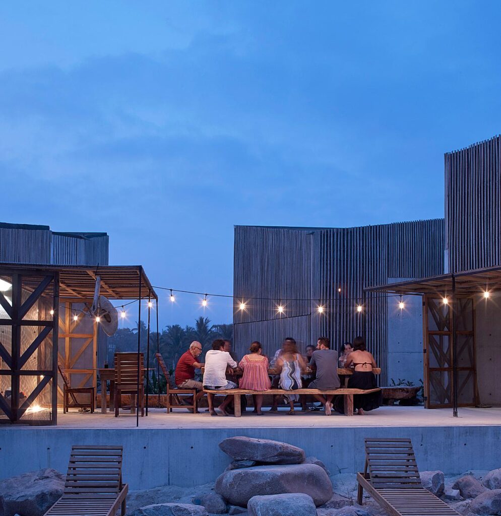
The proposed date for the shoot coincided with Alfonso’s birthday when there were to be maybe 20+ people or so staying over for a long weekend… perfect I thought.
I’m a fan of shoots both with and without people, ‘Gonzo’ to formal, all have a place but I like to mix the two together…
As an architectural photographer, I see my role as both to record and interpret a space, and if we can’t communicate the mood and the feeling of being there, then we are not doing our job right.
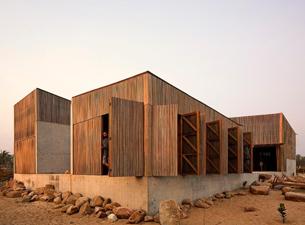
Having 25 people staying for a party obviously posed challenges for the shoot so I suggested we start a day early to shoot the house empty and then carry on shooting the rest during the party.
For me, one of the most important aspects of a successful shoot is time — the more the better. When I shoot I like to “zone out” and immerse myself in the present and stop the clock. If a shoot needs a little extra time or effort to coax out the magic I’m fine with that.
I’m comfortable with large-scale commercial projects but find the magic is often found in smaller ones. Casa Naila is situated near Puerto Escondido in Mexico, an area that is now a modern-day architectural catwalk.
The scheme to the untrained eye is a simple one, a series of 4 triangular cabins around a west-facing pool — a pool I correctly suspected referenced Louis Khan’s Salk Institute.
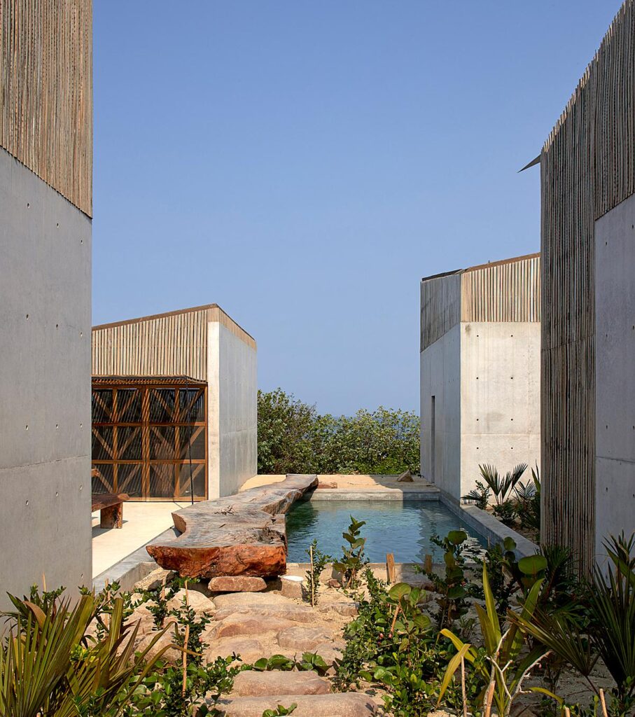
The material palette is calm and un-fussy — a concrete slab and a wooden envelope. The structure is light simple and cool, a thin mesh is concealed and lets the building breathe but keeps out mosquitoes.
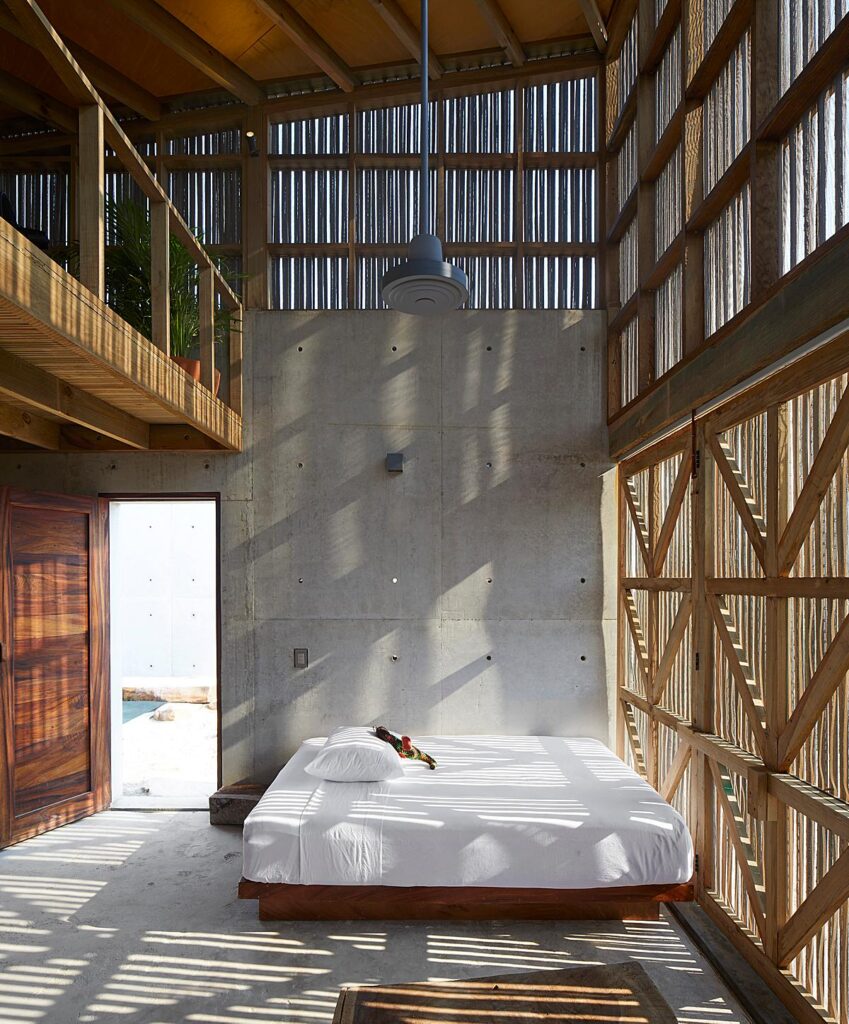
The brief from Alfonso was along the lines of “do your thing” which is my favourite sort. When I first visit a project I spend a long-time scoping, trying to get under the skin of the building’s DNA. Certain aspects immediately struck me: the location, materials, and craft combined with high tech.
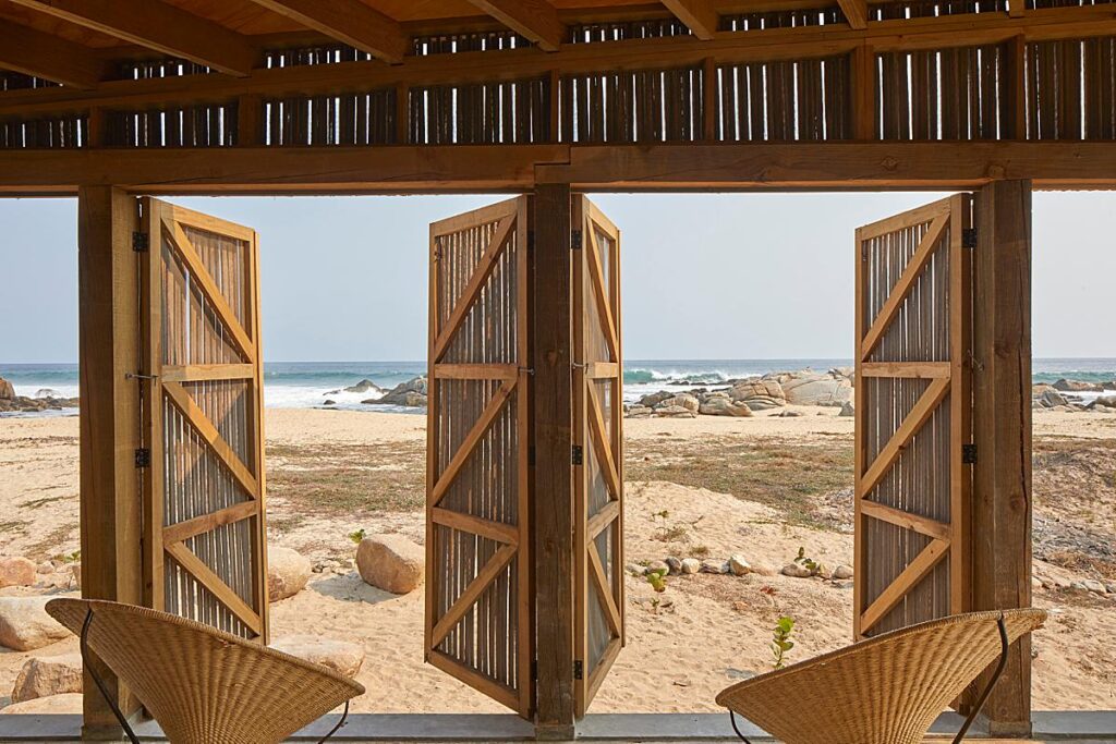
It’s a Wabi-sabi masterpiece.
Architectural photography for me is about signs: signals and visual clues that help explain/interpret the scheme through the images.
I’m always looking for ways the visually unlock a project. For me, it’s not just enough to record a project, one needs to interpret it, present it in a way that reveals the design intent, the mood, its ‘Raison d’être’ …reason for being
I find in architectural photography the most difficult shots are the ones that look simplest.
The big shot — the images that show the building in its entirety in its context, tell the whole story, explains the whole story in one image, and images that a magazine can run DPS — are the tricky ones.
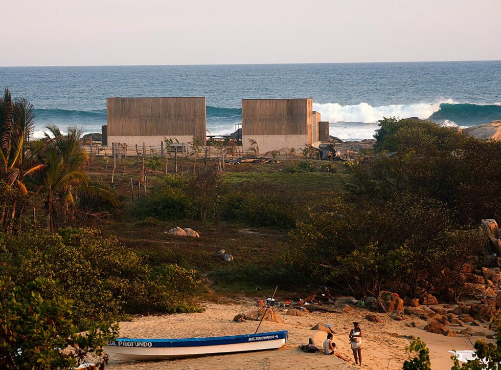
As a young photographer, I remember I’d run around catching details of this and that but at the end of the day would have a series of ‘zingy’ detail shots that, although decent enough, would not really explain the project in any meaningful way. Now, with young photographers, I explain architectural photography using the analogy of playing snooker or pool. Essentially you need to be thinking 3 or 4 shots ahead and you need to have a logical road map to capture the whole project. Without a logical approach, your client is left with a series of details/fragments that on their own won’t stand up, and don’t make sense to a broader audience.
On the first day of the shoot, we had the whole place to ourselves so we worked through the gears capturing views and examining spaces. Technically my current kit isn’t anything special, at the time I was using a simple Canon setup with the standard pc lenses, 17/24/45/90.
My route into photography was an old-school one: I was an assistant (terrible) for just over a year in the late 90s working on 10/8 and 5/4. A photographer I worked with lent me a camera for a small commission, a retail project, where I made 7 images over 2 long days. But the architect was a rising star, and the project got widely published and the rest is history.
From 1998-2009 I worked on 5/4 and grew a vast collection of lenses. I had 14 lenses from 72-480, colour temp meters, endless boxes of filters… the whole 9 yards.
I loved this way of working and still miss its complicated simplicity.
I’ve always been rather slow to adapt to changing tech but in 2008 after a misguided entry into 6/7 film with a scanner, I got approached by Leaf Aptus who made the best digital back at that time and wanted to sponsor me. I was starting a book on Japan so accepted their kind offer. Reluctantly I entered the digital world but initially found a little of the chemistry… the magic had gone. I worked with an Arca Swiss Digi back setup for many years but eventually found it all too much of a hassle and moved onto a very simple Canon setup. Surprisingly I found a lot of the magic came back: it was light, forgiving, built like a tank, very good with colour, and could be carried hand luggage on planes.
Shooting Naila There were two areas in particular that I was interested in that both offered visual signals to the project.
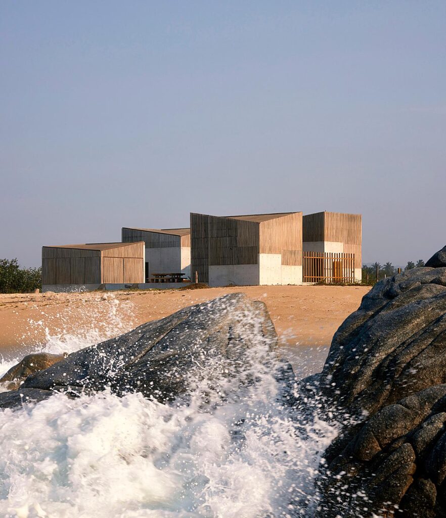
The distant jagged rock on the beach caught my eye and seemed to mirror Nailla’s form. I had a feeling there might be interesting views from there. I’m not a big dawn man photo wise but made an exception on day 2 wading out past the breakers and finding a spot that framed the building between the rocks perfectly. On finding this spot I was then after the perfect wave that would explode under the distant Naila.
The second spot I was interested in was the rear by tree trunks. Visually the tree trunks felt like a metaphor for the organic wabi-sabi nature of Naila.
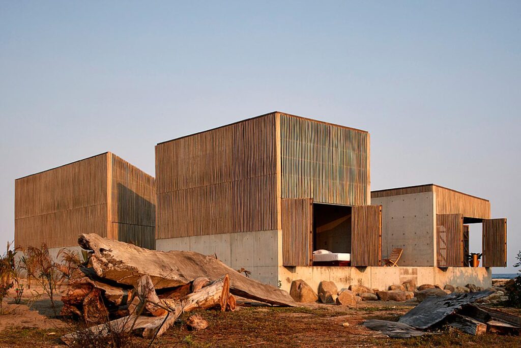
The dusk shot took this further showing the house as almost a Japanese lantern, something hard to illustrate in the day.
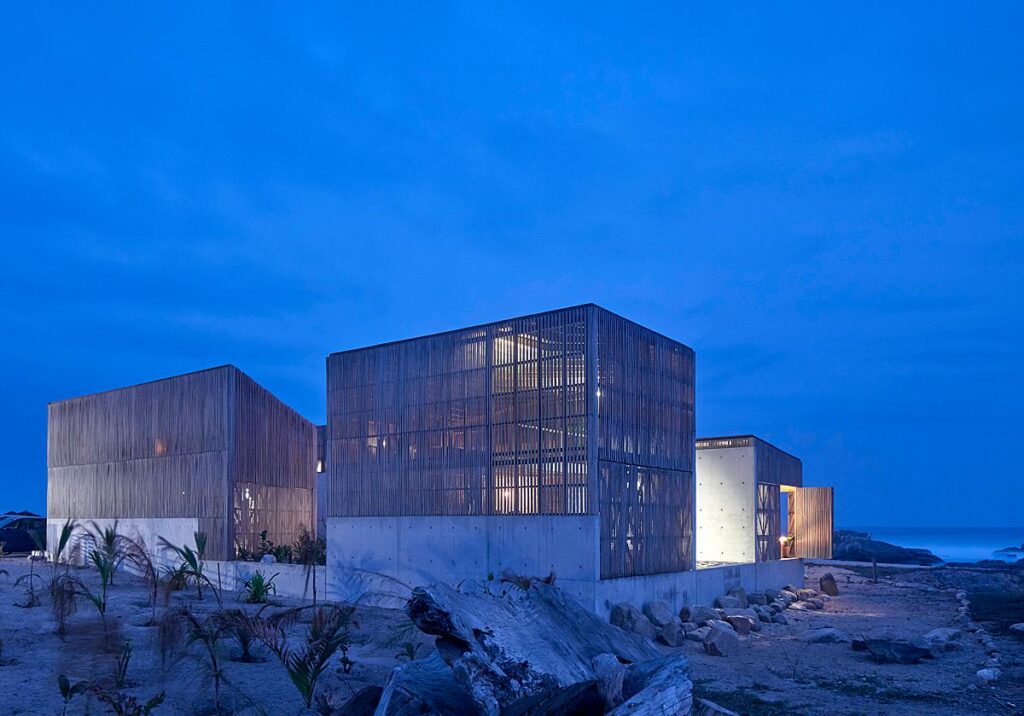
I think this visual analogy worked well. Dusk photography is a wonderful thing, but best used to illustrate something where lighting is key. Otherwise, its use is simply “sugar cherry on a cake” — effective of course but overused in my opinion.
Later on day 2, more and more people arrived and it became a major party. This suited me just fine! Visually I changed into Gonzo mode and mixed details with cocktails.
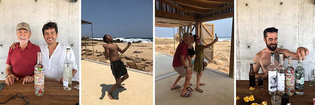
Having worked through the gears the day before, most of our bases were covered. I was able to be relaxed and free to roam and capture the less obvious aspects. The late afternoon and last light provided the best images and I knew roughly where I wanted to be at certain times.
The trick to architectural photography is patience. Find a vantage point and wait for something to happen — it always does. Architecture, after all, doesn’t move.
I’ve returned to Casa Naila a few times since. Usually, when I return to a project I’ve shot previously, I find a vantage point or angle that I maybe missed before. With Naila, this isn’t the case. It was, for me, the near-perfect shoot. At the time I was quite new to Instagram but I put a few images up and was genuinely shocked at the reaction — thousands of likes and numerous offers from paying magazines. AD (Mexico) were first and subsequently won their house of the year. Casa Bella followed with 12 pages, then Wallpaper, Abitare, Arch Record, Dzeen, etc. In short, it went nuts — I think it’s won BAAQ’ over a dozen awards. Instagram is still spinning it and the requests still keep coming. It led to a lot of future commissions for me in Mexico, which makes me rather happy.
I’m delighted of course, but mainly for my client. After all, this is why we shot it.
Drop by Edmund’s Instagram @edmundsumner or visit his website edmundsumner.co.uk to become more familiar with his work!
Thanks again for submitting this project to us Edmund, and for all of your insight into its making!
If you have a project you’d like to be considered for Project of the Week, you can submit it here.
