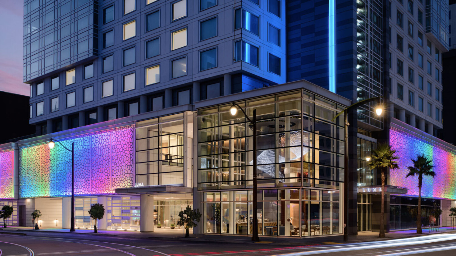
Check Out LUMA Hotel SF With Hospitality Photographer Dylan Patrick
Today’s featured project by architectural photographer Dylan Patrick is a brilliant rendition of hospitality photography. As Dylan shows off the LUMA Hotel in San Francisco by architect Hornberger + Worstell, you’ll notice his striking compositions, each one easy to read and hero-esque in its own way.
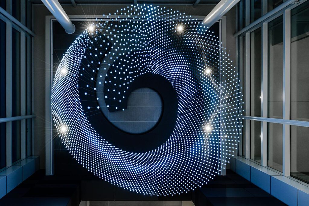
A reoccurring theme throughout this project is excellent lighting design. Dylan photographs each space at the optimal time of day to translate the mood and details for us observers. Hornberger + Worstell’s well-thought-out design harnesses San Francisco’s dreamy West Coast sunlight. The project sports lighting design throughout by Jackie Hui, which Dylan showcases again and again. Not to mention his emphasis on a genuinely stunning custom-made LED light fixture by artist Jim Cambell.
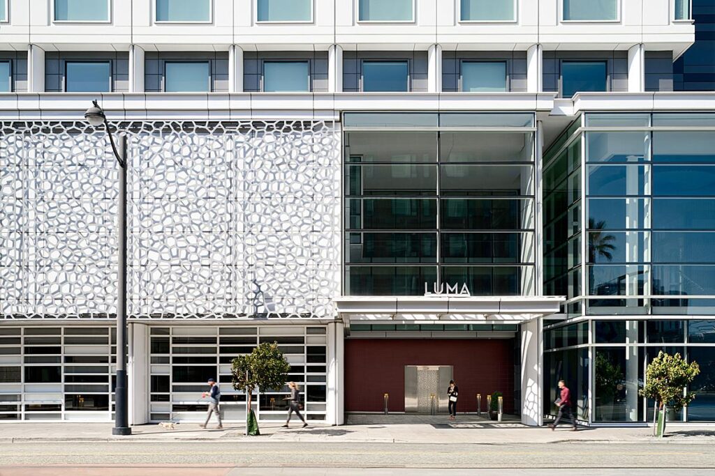
Dylan kicks things off by sharing “I spent a week shooting stills and video for the newly opened LUMA Hotel in San Francisco. The corporation that owns this property is one of my oldest clients and I was lucky to have shot the first LUMA in NYC when it opened back in 2018. They are based in San Francisco so this is very much a flagship property. It is also their own brand which is fun as it means I don’t have to be bound by some of the constraints of typical brand photography standards.”
He continues “One of the most challenging things about shoots like these for hotels are always the location and occupancy of the property. LUMA SF is located in a basically entirely new neighborhood section of San Francisco they call SOMA (South of Market). The location is killer, right by the bay and the hotel is literally a 5 minute walk to Giants Stadium. The entire building is new construction as is the entire neighborhood, so lots of stuff going on and lots of new residents and guests to work around. This particular week was high occupancy.”
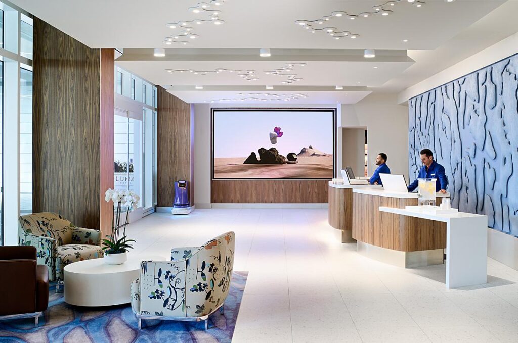
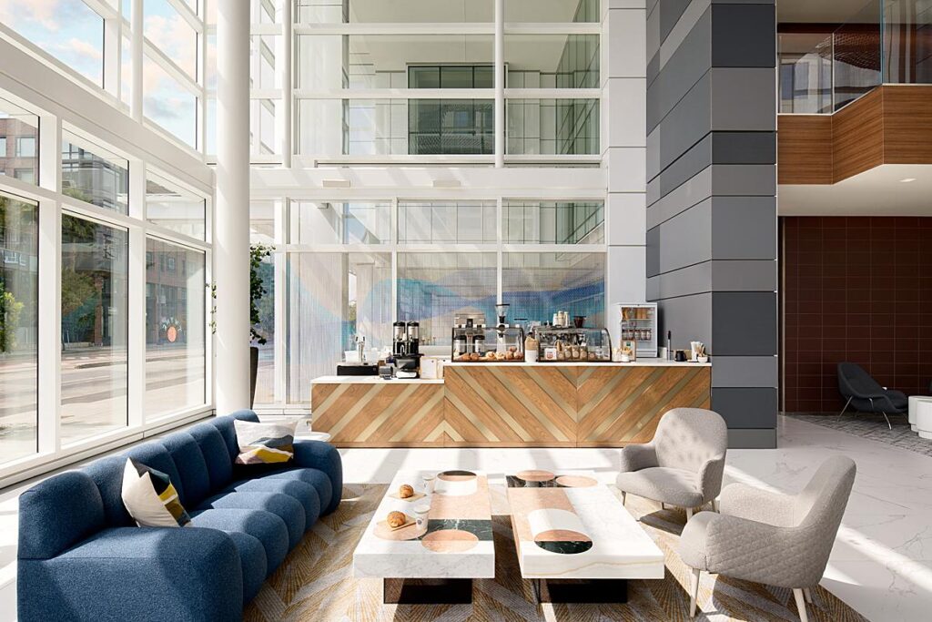
My personal favorite set of images from Dylan’s LUMA Hotel project are in the Twine coffee bar. He makes it outrageously easy to love this series – the sky, the leading lines, the silky colors, and the warm directional light all plays into the cheery morning mood – just the sort of vibe you want when portraying this kind of space.
He breaks down the process for us, telling “While there is always wiggle room in a schedule to move things around for light or people movement, sometimes you just hit weather wrong, or timing wrong and have to work through it. For the morning shots of Twine, their in-house coffee bar, I basically needed to be shooting when everyone wants coffee. So we had to close it for a short amount of time to capture that.
The morning light, when not cloudy, is quite beautiful and as the hotel’s name is LUMA, I really wanted to play a lot more with using more harsh directional light (something not always welcomed with brands) to let that be a theme throughout the images. However that morning there were extremely fast-moving thick clouds that would literally change the light in the middle of the exposure, and for this shot we decided we didn’t want people outside. So I needed a few shots to work out the exterior and the interior and catch it all with some direct sun. Ultimately I ended up settling for a bit softer light which I ended up really liking for one angle. You get the sense the light is just starting to peak through the clouds, you still get the shadow contrast but it’s a bit more subdued and soft.”
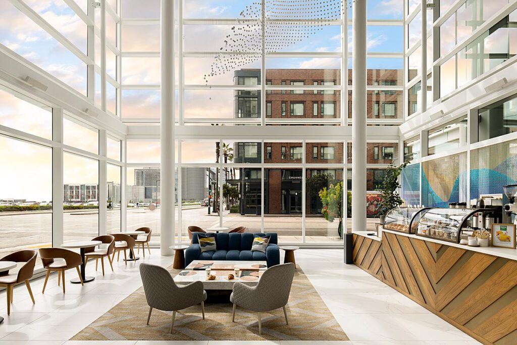
Dylan continues “For the second angle I waited a couple of hours to see what would happen with the light and managed to get that with some more directional light that coincidently aligns pretty nicely with the front counter design.”
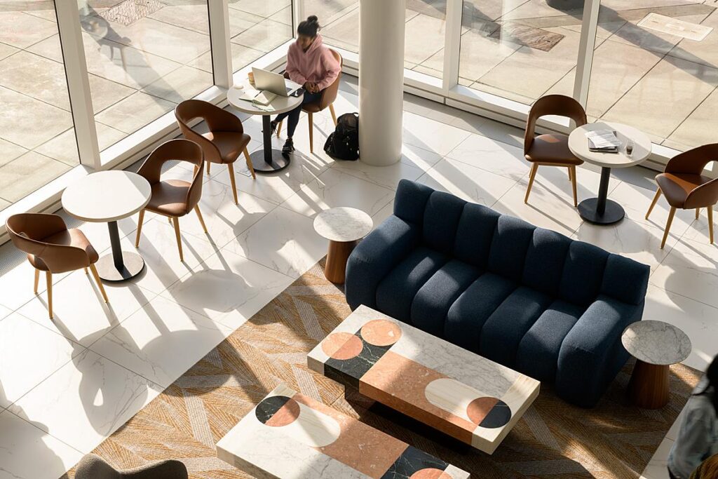
“A few days later I caught an overhead detail from a balcony of the morning light that I think ties all three together nicely with some people for context, blurred to be unrecognizable for use,” he says.
This overhead perspective is my absolute favorite. The people add scale and life to the scene. The long shadows and warm highlights are really apparent here. This image rounds out the set and is definitely the cherry on top for me!
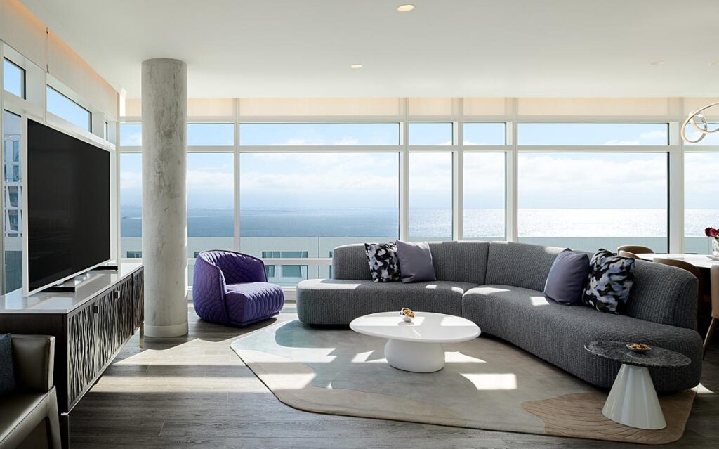
As we move into LUMA Hotel’s guest rooms, we’ll start with the penthouse. Dylan sets up a brilliant composition that showcases the massive glazing that looks out across the water. I love the linear repetition here. The crisp line of the ceiling is echoed by the lines of the window casings. As our eye moves down, the horizon out on the water creates its own line. Then we meet the line of the glass railing out on the balcony. The whole way down the frame, as our eyes scan, they meet line after line. The rhythm of this scene is just lovely.
Another great aspect that Dylan includes is, of course, the light. Bright, specular highlights off the water add a sense of heat and help us get an idea of the time of day. Sharp patches of light on the floor and furniture communicate this same feeling.
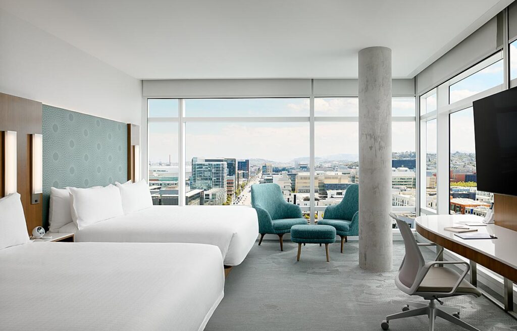
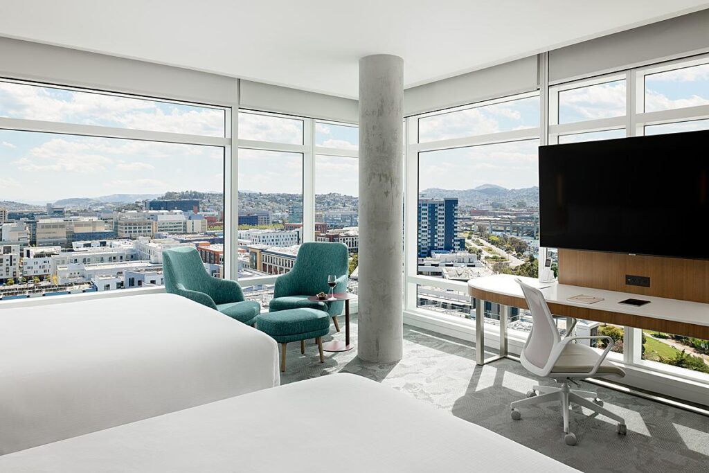
“The guest rooms are bright, clean, and stunning with some simple but effective pops of color. A recent trend with this company is putting in massive guest room windows, which is amazing for me. Even in the standard rooms, they are 4-5ft square windows so most require very little flash, maybe only a pop or two,” Dylan explains.
“I leaned into shooting into the morning and afternoon light a lot, not shying much away if direct sun was coming in a room. I had to deal with losing some construction out of the windows in most of the east-facing rooms in post, but it ultimately came together very nicely. I go back again in the spring and the buildings will be finished so I’ll reshoot some of those views and replace them later. Most of the room shots are dominant natural light with some flash here and there blended in for a refined feel, but well hidden and blended I think,” he shares.
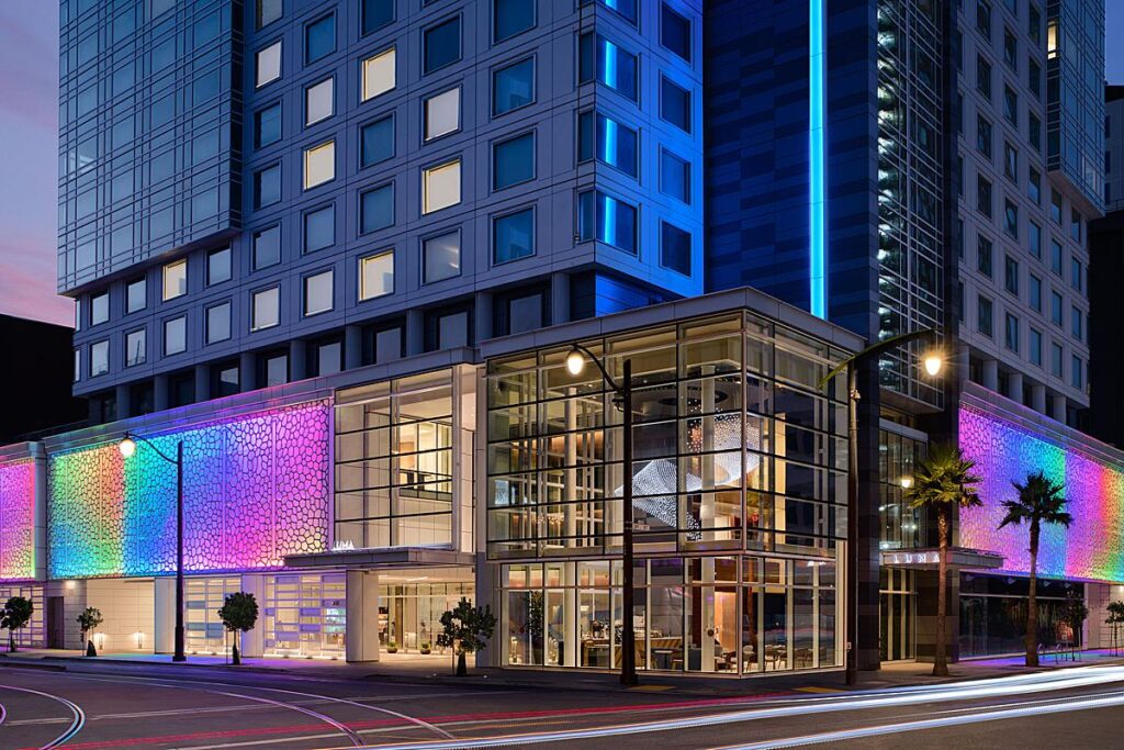
As dusk falls, that’s when LUMA really starts to – ahem – shine. The lighting design of this place is just incredible. Dylan gives us some insight, recounting “The dusk exterior was quite a challenge because due to the size of the front room, getting an exposure that you could see the Jim Cambell piece meant shooting that section at a much later time than I usually shoot exteriors.
There is a street car that runs right in front of the hotel so all those cables and wires had to be removed in post, but overall I’m very happy with how it came out. The lighting on the sides of the building and up the front are designed by Jackie and really add to the LUMA brand and vibe.”
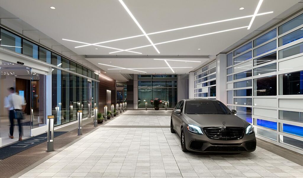
He goes on, “The completely covered and hidden valet entrance is also super cool and very handy for exteriors as sometimes those areas can be a challenge to keep clear and keep cars moving.”
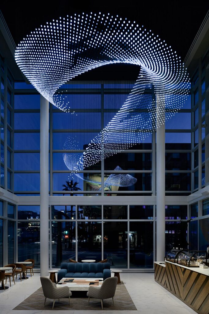
Now it’s time for the pièce de résistance – Jim Campbell’s waterfall light fixture.
Dylan says, “The Jim Cambell-designed LED light art fixture in Twyne was easily one of my favorite shots. I intentionally let the outside go darker and cooler to let the fixture pop more, I then lit the space with flash and blended it with some ambient frames. The fixture moves like a waterfall and features a video of people climbing up it… it’s pretty amazing.
Every bulb is individually hung and programmed for the sequence. Jackie Hui the lighting designer for the hotel corporation was also on hand throughout the shoot to dim sections and brighten sections as needed which is always helpful and time-saving.”
What an awesome project! Many, many thanks to Dylan Patrick for submitting this to us here at APA. It’s always a blast to see what you all are creating, and hearing what goes on behind the scenes of making these gorgeous images. Dylan would also like to acknowledge his retoucher who he couldn’t say enough great things about! Dylan collaborates in his post-production process with Jamie Gragg of Semblance Retouching.
Check out more of Dylan’s brilliant work at www.dylanpatrickhospitality.com and on Instagram @dylanpatrickphoto.
If you have a project you’d like to be considered for Project of the Week, you can submit it here.
