Andy Macpherson Walks Us Through Photographing The Magnificent Prospect Terrace In Brisbane
I can’t think of a better way to kick off a new year of Project of the Weeks than with our friend, the great Andy Macpherson. Today, we’re traveling to sunny Brisbane, Australia to check out Andy’s photographs of Prospect Terrace. Prospect Terrace is a gorgeous project worked on by architect The Artificial, developer Zephyr Industries, and landscape architect LARC Collective. Here you’ll find an abundance of contrast, texture, and interesting patterns of light. As always, you can expect to see Andy’s work sporting a clean and natural look, with a little je ne sais quoi that makes it uniquely the product of his hand.
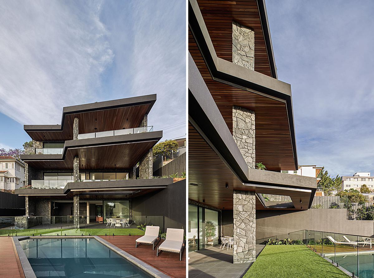
Andy introduces us to Prospect Terrace by sharing “Prospect Terrace was designed by Salvador Farrajota aka The Artificial and built/developed by a young developer Zephyr Industries. There was also a fantastic contribution from the landscape architects LARC Collective. It’s a pretty ground-breaking development for the area. It is built into the side of a big, very steep site looking to the Brisbane CBD. Going into the shoot I had a call from Brayden at Zephyr saying I might need to factor in extra days for the shoot because of the size of the house, which is rare, but I was super busy so I decided I would need to be focused and shoot it all in one day.
My overarching goals were mainly about capturing the big ideas of the architecture — the scale, location, orientation materials, etc. — but also factoring in the time to photograph selective vignettes that communicate some of the more quiet moments to offset the scale of the overall project and make it more digestible. I also wanted Sal to have a mix of deliverables so it could be marketed for development but also have images that would suit both architecture and interiors publishers to give him more options for publicity. Working with Sal is always great, he’s the most relaxed person but still has a really strong, considered point of view. I highly respect him. Sal has been an architect for about 15 years (the first 10 he worked at a prominent local firm) so he is up & coming in the sense that his work is only really starting to be known which is crazy considering how talented he is.”
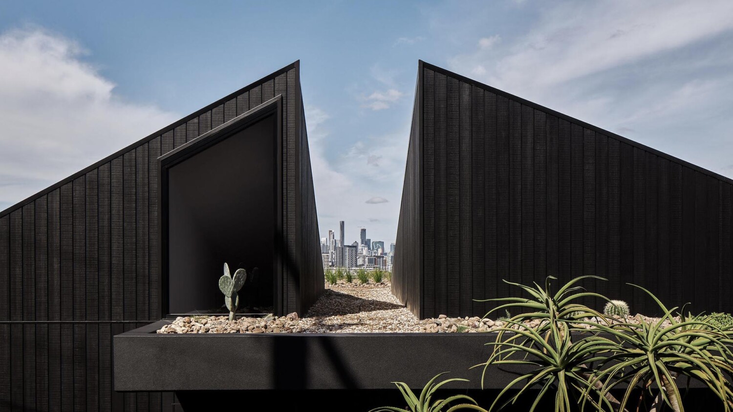
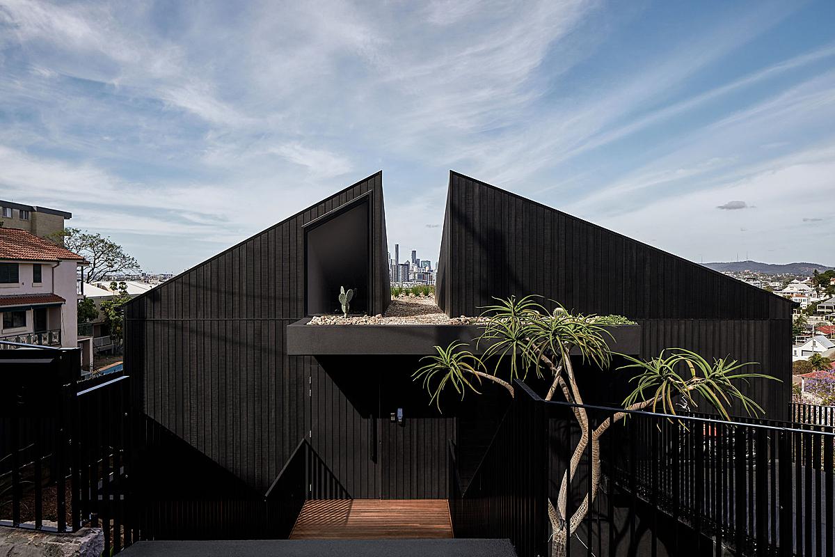
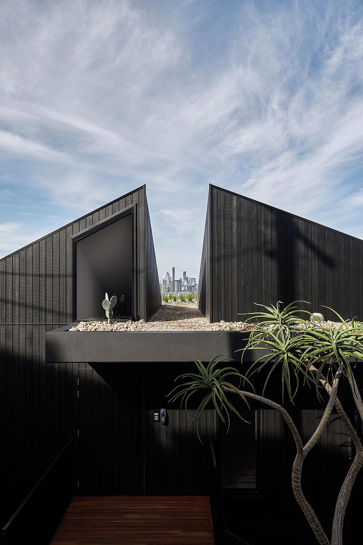
Andy and I share a similar favorite image from this set. I for one, love the highlights on the facade, bringing out the texture of the charred wood and accentuating the lines in the planks. I love the analogus color harmony, with the blue of the sky picking up the green foliage. Most importantly to me though, is the way the house frames up the skyline in the background of the photo. It’s like a bonus surprise that just elevates this shot to the next level of awesome!
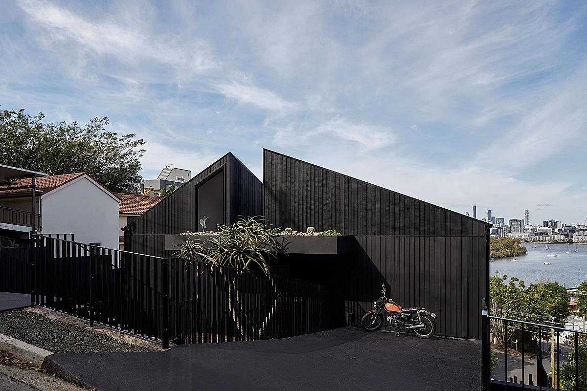
Andy shares these sentiments. He explains, “I think it is how the shot communicates the way Sal designed the house to have an aperture perfectly framing the city at the front entry, the shots give the house context too. I also like how there are the shadows of the power poles and power lines on the front facade, Sal and I discussed this and chose to intentionally leave them in – it subtly gives reference to the streetscape. And, also shows that the house, as grand as it is, still engages with the street and isn’t hidden in a compound or behind a huge fence.”
An interesting tidbit that I forgot about Andy is that he shoots untethered. Gasp! He also didn’t bring a formal, hired assistant on this shoot, but had Sal the architect lend a hand.
“Sal assisted me (thanks Sal!),” relays Andy. “We worked pretty collaboratively on this one so there was no hired assistant. We covered a lot of ground in a very short period of time. We followed the sun up and down floors as the angle was right. It was intense and it also reminded me why I don’t tether — you’re uninhibited by extra gear and can capture so much more over that critical time when the light is right.”
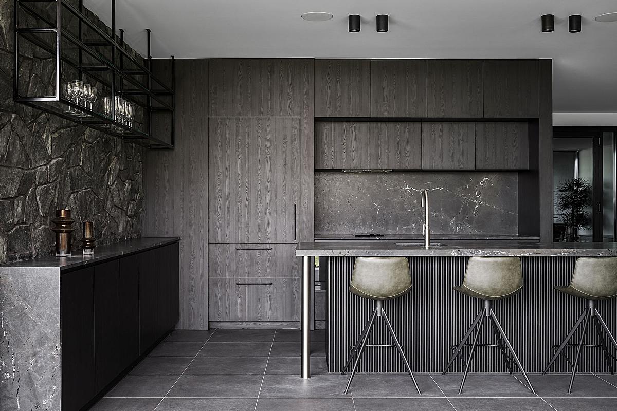
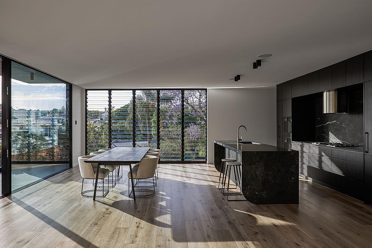
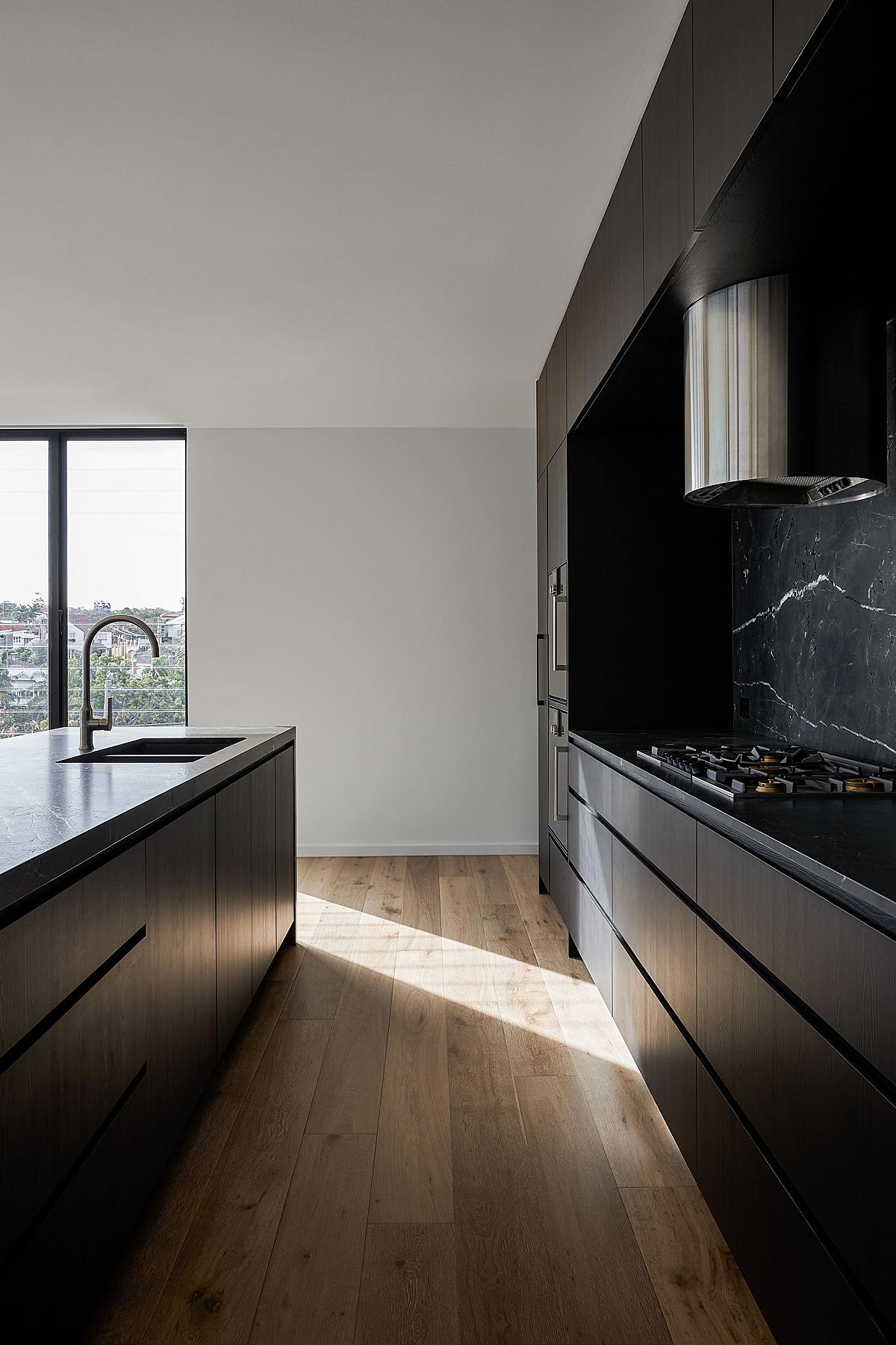
Comparative to the majority of Aussie projects I see, this house strays from the light and bright color and design schemes that demand…well…light and bright photos. There are so many dark materials, which makes it a real beauty to look at. I do appreciate though that Andy let the house trend dark as a whole, not being tempted to get those white walls ultra bright. That is one of the things that makes Andy’s work so refreshing to me. In this establishing shot of the kitchen, he keeps things moody. Harnessing nice long shadows and pockets of highlights keeps this shot interesting and feeling far from a bland and typical “wide” view.
Also a fan of the opportunity to photograph Prospect Terrace’s dark side, Andy shared a bit about his process of working with the sun in such a light-thirsty space. He explains “Like all of my shoots, I am pretty strategic around timing and where I want the sun to be so it wasn’t too different to a normal shoot. One caveat would be that with such dark materials that really absorb the sun I chose to work in harder, more direct light — so shooting later in the morning when the sun is more broad for certain exterior shots was a different choice for me as opposed to capturing at first light and sunrise when I normally shoot. A lot of the coastal architecture I photograph is normally lighter in colour, right on the beachfront, and really requires special attention to not let it be hit with too much direct light so this one was a little different for me considering that.”
That gorgeous slice of light adds a heap of visual interest and gives us a good sense of place. It just evokes that late morning feeling that transports us to the scene, and you can envision yourself standing behind the island in Prospect Terrace making a cup of coffee in this incredible kitchen.
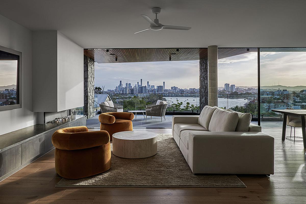
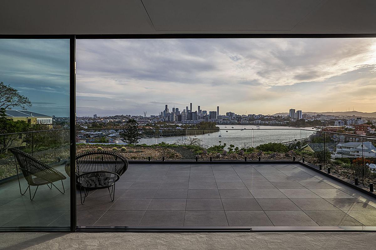
Again, Andy does a phenomenal job of letting the scene trend dark, which drives our attention to the view of Brisbane’s business district and the river below. The kiss of highlights on the floor, walls, and furniture carves out a subtle shapeliness and adds a bit of warmth to the room.
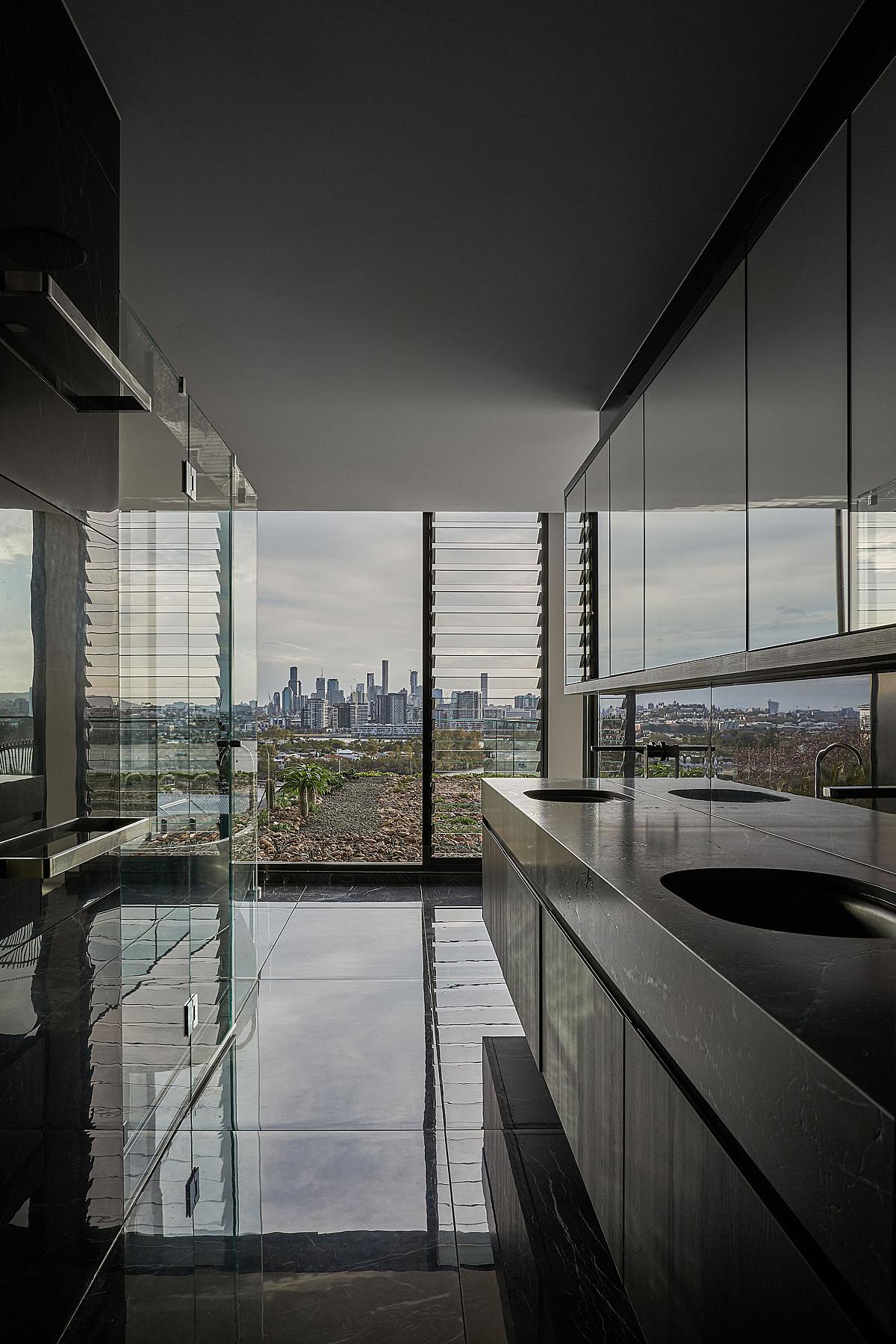
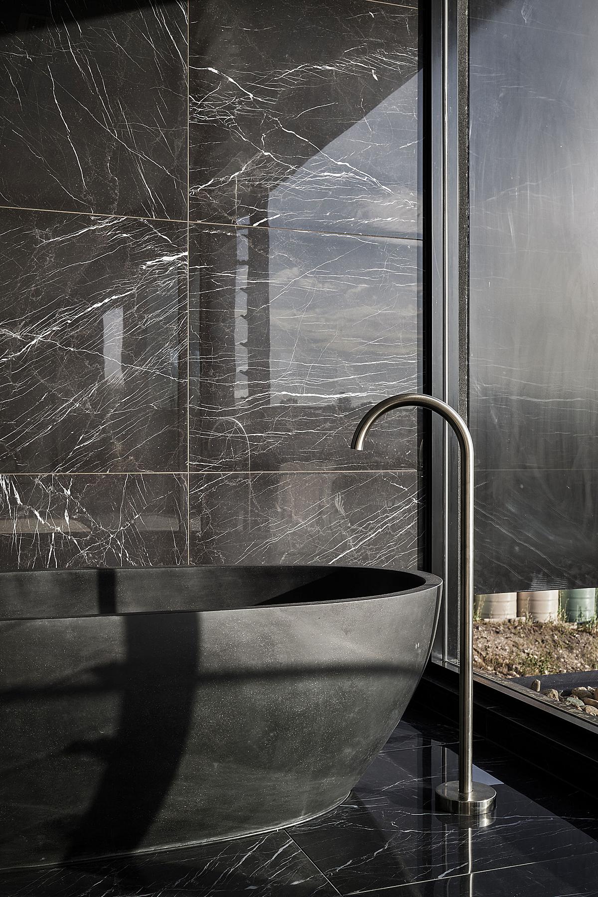
I absolutely love the way Andy was able to translate the reflective nature of the materials making up this bathroom. It reads almost as an optical illusion and really continues on with this home’s sleek and inky feel.
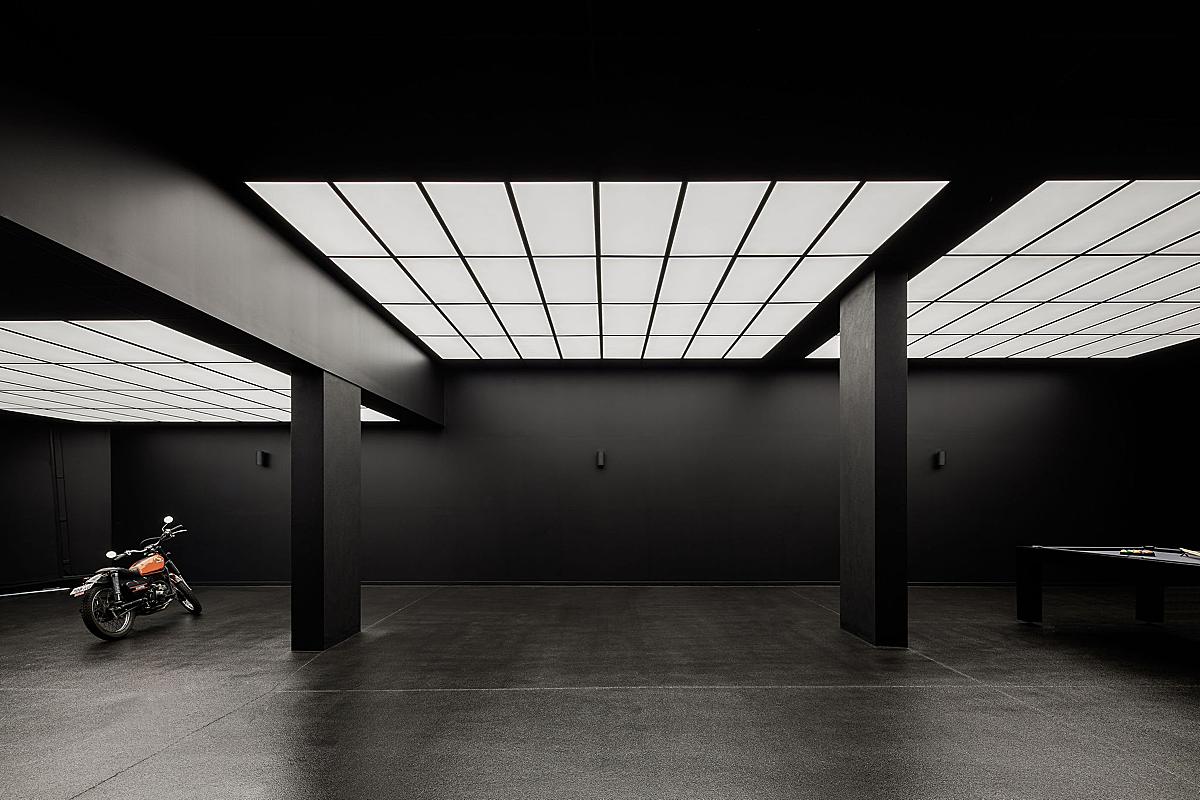
Now we get to delve into my absolute favorite part of this shoot. The day he posted Prospect Terrace to his Instagram, I was scrolling through and had to pick my jaw up from the floor. This had to be a Project of the Week. Check out how stinkin’ dark and deep he lets his shadows go. There is an incredible amount of contrast here that works so perfectly with the geometric nature of this photograph.
Andy shares “it’s probably one of the only photos of a garage I have ever delivered. I love the lighting. I mucked around with the lighting levels to get that right and we also waited for the developer to have moved the millions of dollars worth of luxury cars out of the garage to photograph it. Instead, we used Sal’s humble (but cool) ex-postman’s bike in the shot to give the space context and a sense of scale. We actually put his bike in a key image for every project we photograph as a way to tie them all together which is pretty fun. There’s also something about stripping back any extra sense of opulence when the architecture is already so wild.”
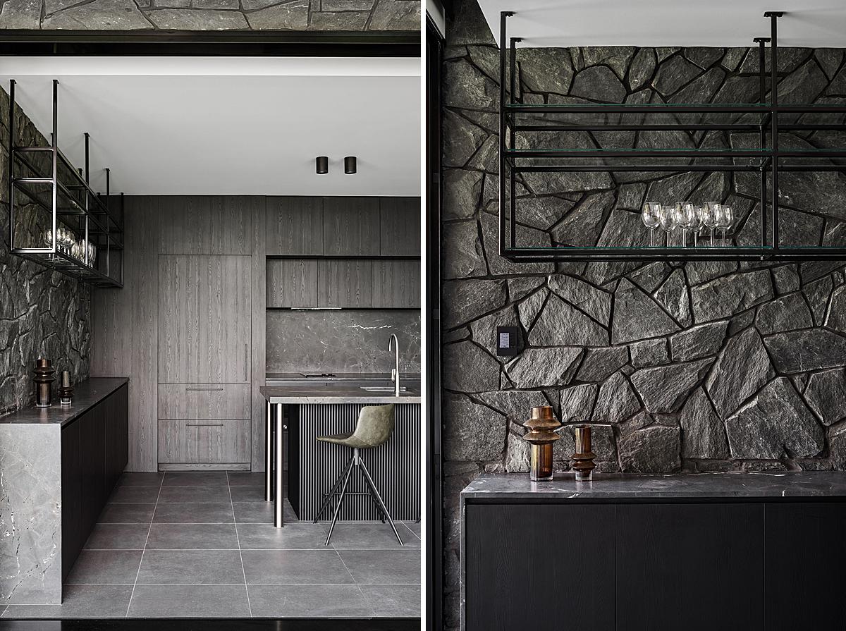
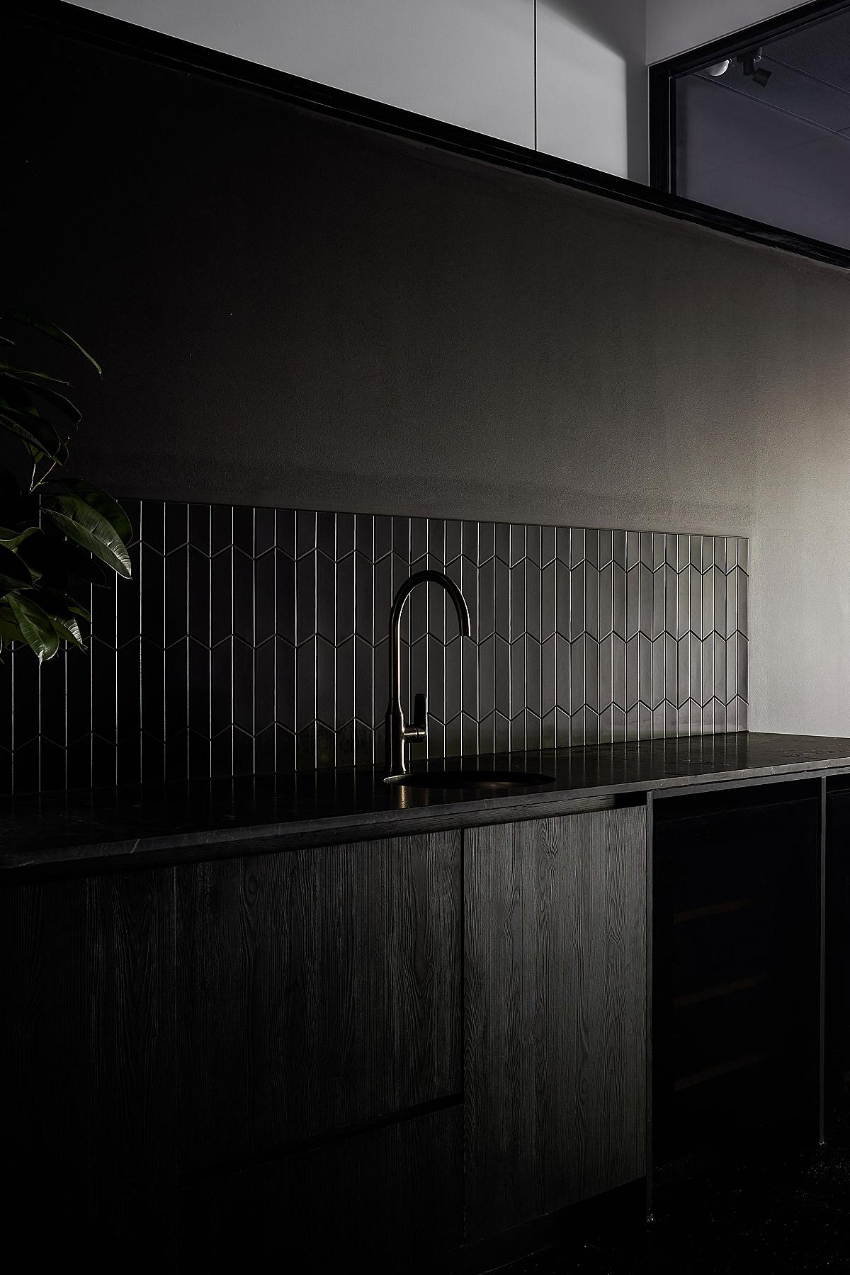
To photograph this sink area in the ultra-dark garage, Andy had to do some problem-solving. He lets us in on the secret that, to achieve this lovely and dramatic directional light that highlights the faucet and black tiles, he opened up the garage door and angled it “to allow just the right amount of light to bounce in.”
Something I have always admired about Andy’s work, and throughout this project, in particular, is that he has definitely developed his own style and look. I feel as if I could pick an Andy Macpherson out anywhere. There is something about the restraint he exercises. Andy’s photos look so balanced and feel true to life, but…better? Andy shares his insight into this by explaining:
“Over time I have worked to refine everything — from being increasingly aware of the balance of light when I shoot, to being really selective in post. Starting with a better-timed capture (or a capture timed to the way you want to represent the architecture) means you will arrive closer to the outcome you’re after in-camera.
For me, this means starting earlier (leaving home at about 4 a.m. for many shoots, ouch) or staying later for the light I am after. But, the trade-off is that I barely blend multiple exposures these days. I would say 95% + of my work is from a single exposure which cuts down my time in post a little.
In terms of my actual post-production, I take a fairly reductive approach. I selectively remove colour contamination to the degree that I judge to feel natural. I often take out distractions and things in the space that weren’t necessarily specified by the architect. My goal is to really get to the essence of what gives a sense of being in the space or what it was like standing there and looking at the building in person. I still use a mixture of Capture One – raw processing, sharpening (although I barely sharpen my files which might contribute to the natural feeling?) and Lightroom/Photoshop where I do a bit of cloning and reducing colour casts. I don’t feel any compulsion to show every detail of a space in a shot these days. I have embraced the darkness — shadows are my friend.” Andy’s reductive approach came in clutch here, not just stylistically, but as a time saver as well. After shooting for 15+ hours, Andy mentioned that he turned around the majority of the images the next day to accommodate the developers’ needs.
There you have it folks! Infinite Thanks to Andy Macpherson for sharing Prospect Terrace with us, as well as taking the time to walk us through his processes. Andy is an incredible guy, one whose work you can see on his website andymacpherson.studio or by giving him a follow on Instagram @andymacpherson.studio. If you’d like to hear more great wisdom from Andy, I deeply suggest you check out the BAAM Podcast which he hosts with the equally epic Barry MacKenzie. Andy has left us with this parting gift to kick off the New Year, some gorgeous drone footage of Prospect Terrace.
As always, If you have a project you’d like to be considered for Project of the Week, you can submit it here.
