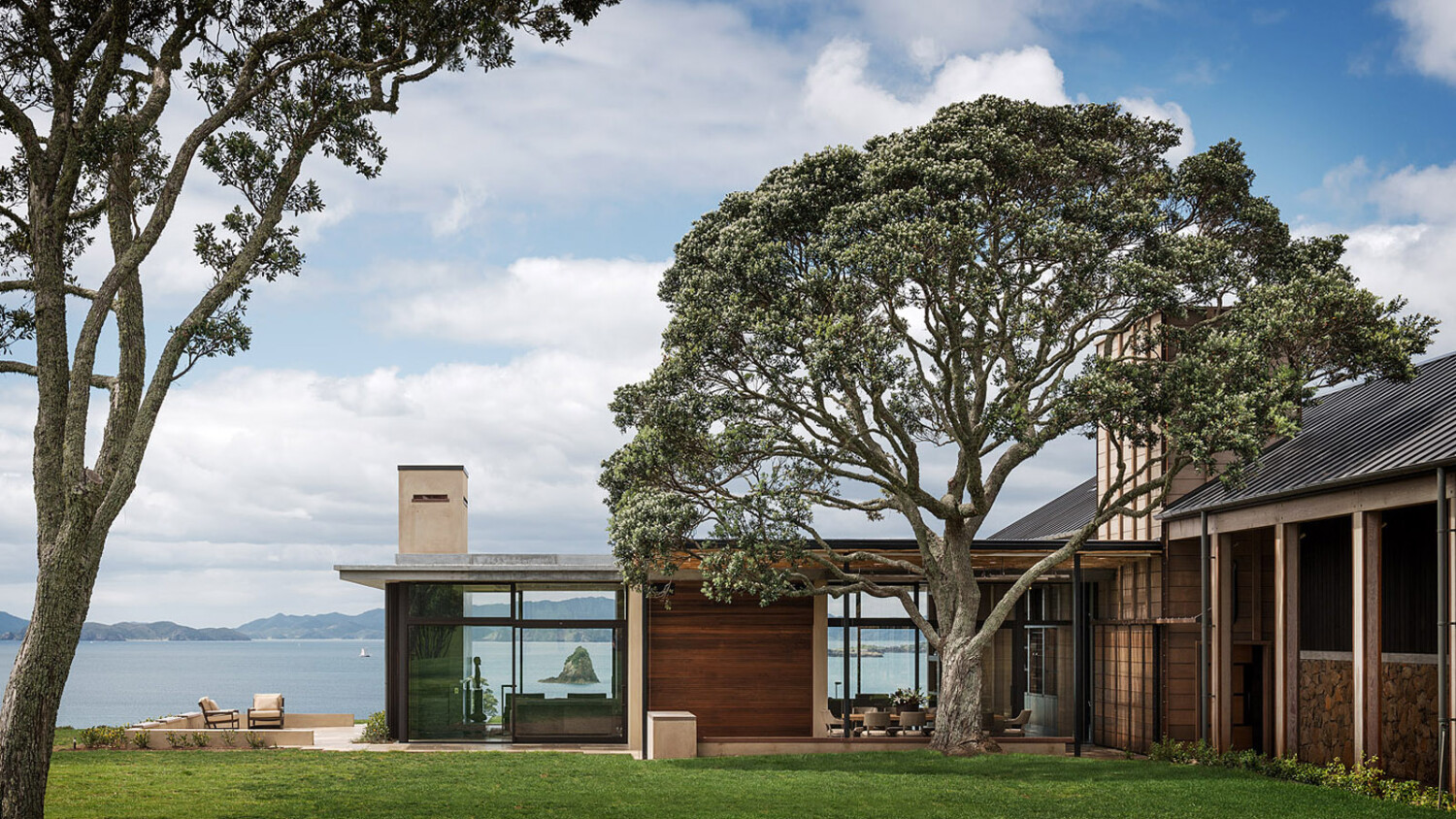
Aaron Leitz Photographs A Reformed New Zealand Cattle Farm
Ahh New Zealand; the magical land where perfect scenery and perfect architecture collide. This week’s shining example is a residential home by Cheshire Architects, with interior design by Terry Hunziker, photographed by Seattle based Aaron Leitz.
Aaron’s architectural photographs cast a strange magic over me this week, and I found myself coming back to his website time and time again. Each and every image looks as if it could be the cover shot on the cover of your favorite architectural or design magazine. Full to the gills with delicate color palates, thoughtful compositions, and gorgeous light, this Project of the Week is no exception. I mean, just look at this opening image of Hilltop House!

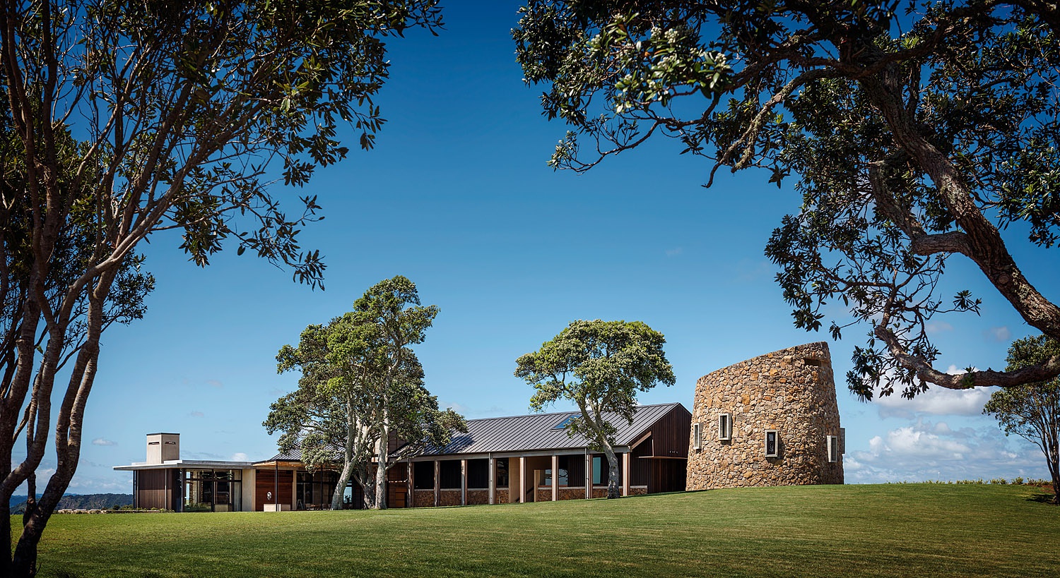
Let’s kick off with wide view of Hilltop House. Aaron frames the building perfectly between the two trees in the foreground. Look how there is no overlap even by the smallest leaves. This careful spacing and attention to detail give the house some breathing room, all while funneling our eyes right to the center of the frame. The beautiful light spilling across the lawn illuminates the home and shows off its massing.
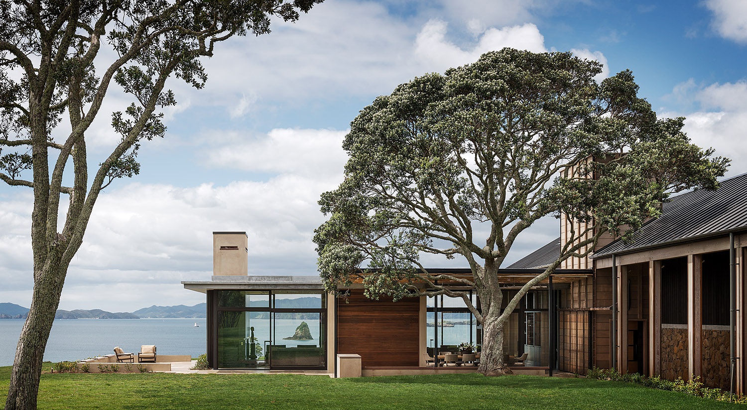
I love three key things about this next frame. The first is that this is a beautiful one-point perspective that focuses on the living area of the house, while still eluding to the rest of the structure as well as the lawn and million-dollar view (well…presumably multi-million dollar view). The second great thing is Aaron’s post-processing style. This photograph maintains a punchy and well-colored feel while actually being quite neutral. The greens in the grass and the trees are actually quite cool and desaturated, yet they look lifelike. This contributes to the images crisp yet gentle feel. Above all else, I love that Aaron framed up that tiny island in the living room window. It pulls our eyes right through the home and gives great depth to the image.
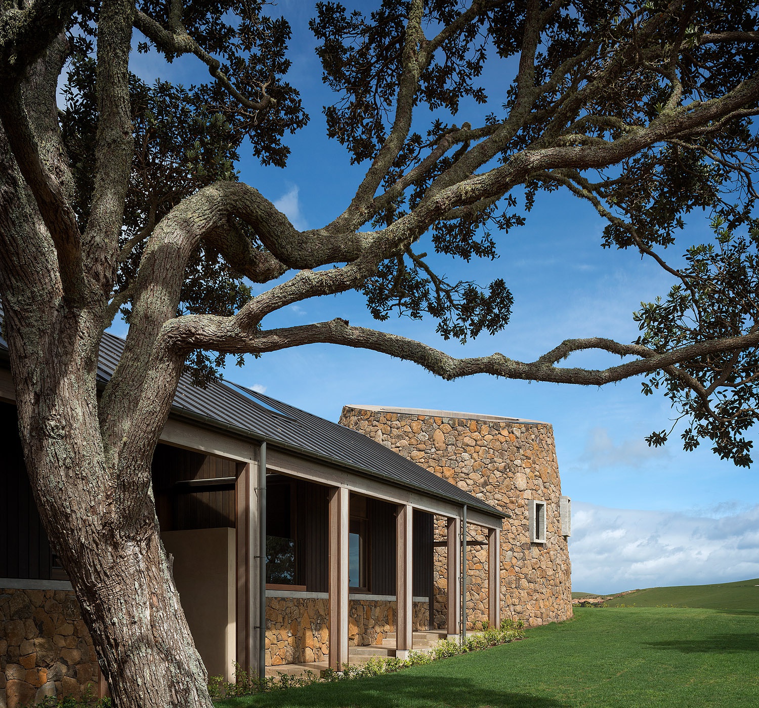
Despite the tree filling up a good chunk of the frame, a subtle gradient (as well as the framing created by that tree) puts our focus on the stone observatory. The rich texture of the stone is brought out by the light washing over it. While the observatory itself is lit pretty brightly, the roofline and structural supports create interesting shadows on the rest of the house. It’s awesome how Aaron can take a relatively busy scene and drive our eyes right where he wants them.
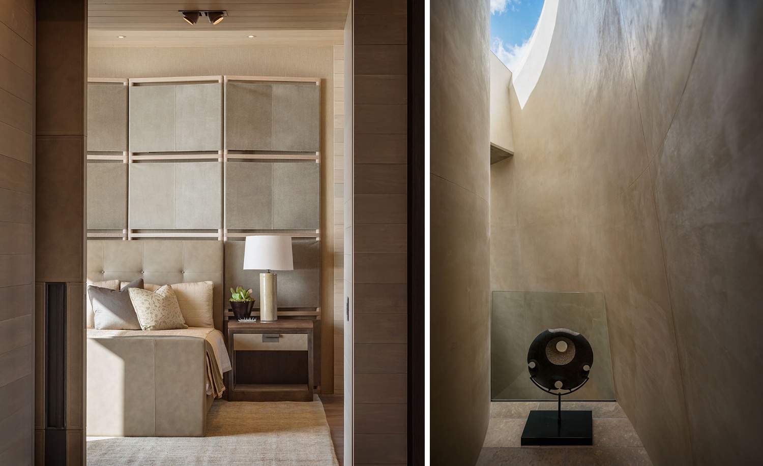
Inside Hilltop House, beautiful light washes through the spaces. Subtle textures are pulled out of the wood grain and furniture. A hard shadow at the foot of the bed gives visual interest, but soft shadows and even light are present in the rest of the frame. Over inside the observatory, a bright blue sky creates contrast against the warm and neutral color of the concrete.
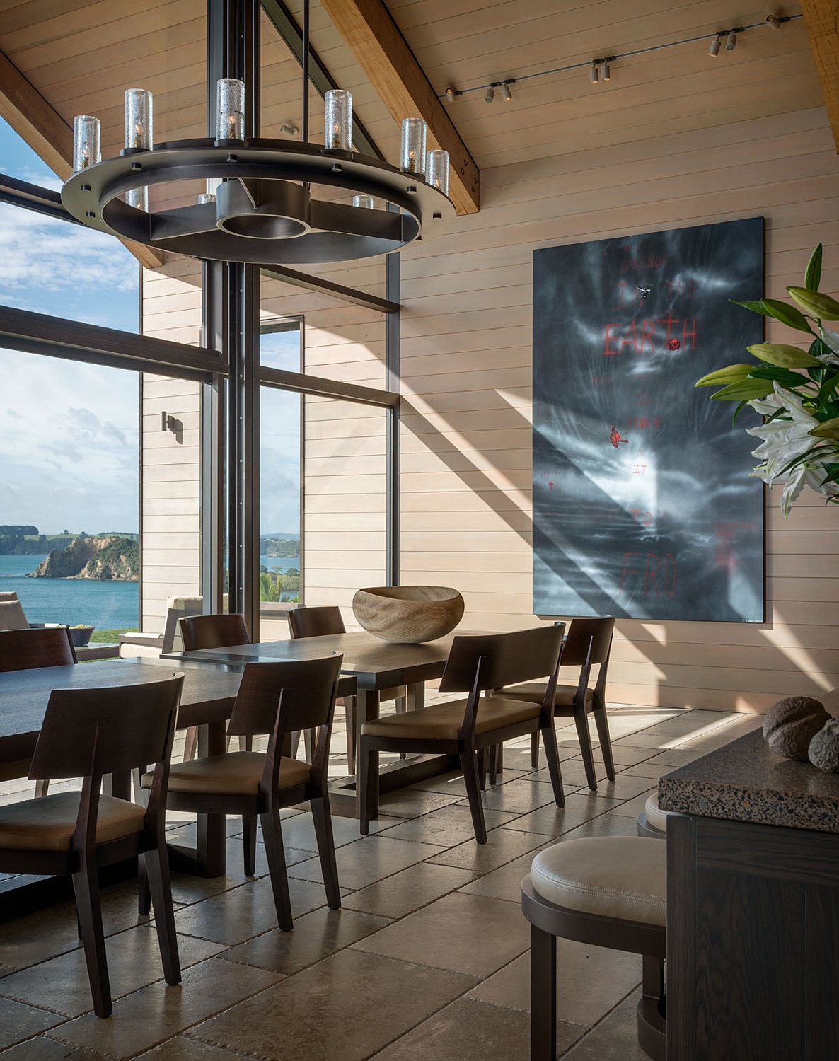
Aaron’s use of framing and foreground elements throughout this whole series is just top-notch. Visual anchors like the corner of the counter — or even the door frame and the tree in the images above — give context to the space and guide us through the home. This is a beautiful low key image with great balance between the interior and the view outside the windows. Both feel a bit on the dark side, but with those hard highlights streaming in, this is exactly how I expect the dining room to look in real life.
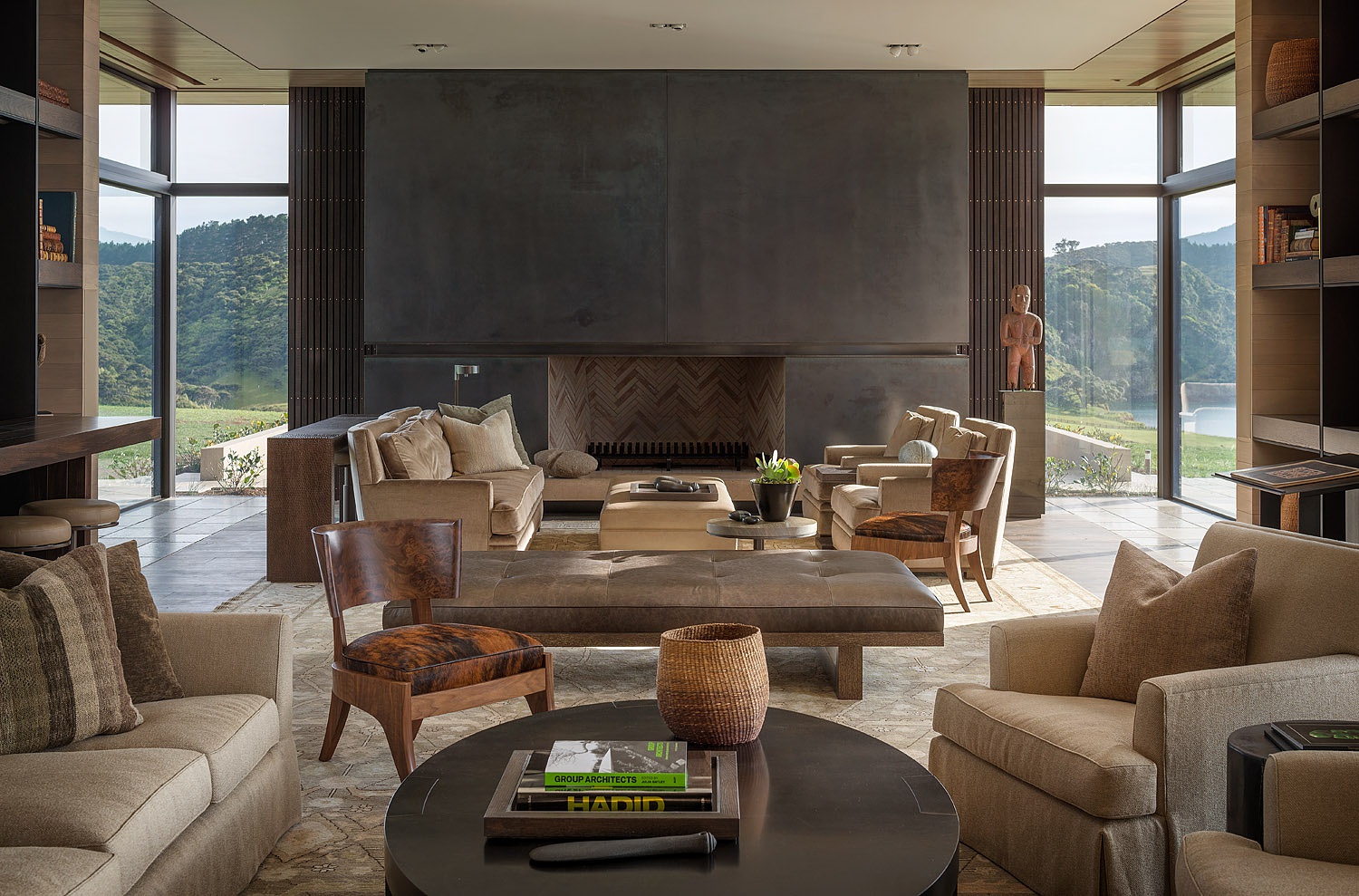
We’ll wrap up Project of the Week with this lovely image. This thoughtful one-point perspective shows the scale of the room by layering furniture and design elements throughout the space. I appreciate the quality of light pouring in through that set of windows on the right-hand side, and how it rakes across the fireplace. Look at the way the texture in the stone is pulled out, and how the room is awash with warm evening light.
Many thanks to Aaron Leitz for sharing his project of Cheshire Architect’s Hilltop House with us. You can view more of Aarons beautiful work on his website: aaronleitz.com or his Instagram @aaronleitz.
If you have a project you’d like to be considered for Project of the Week, you can submit it here.
