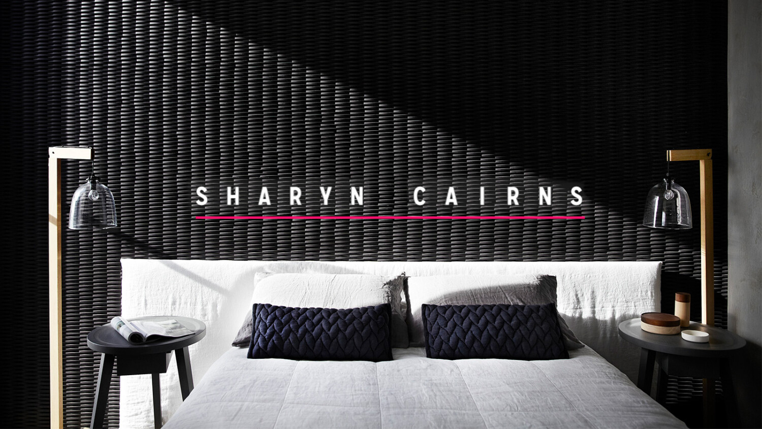
Pushing Boundaries and Creating Career Momentum With Sharyn Cairns
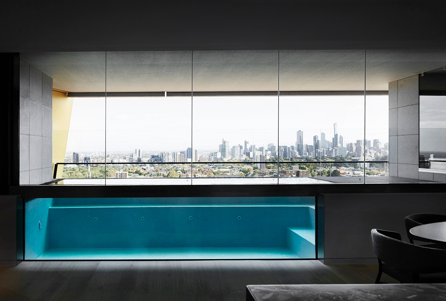
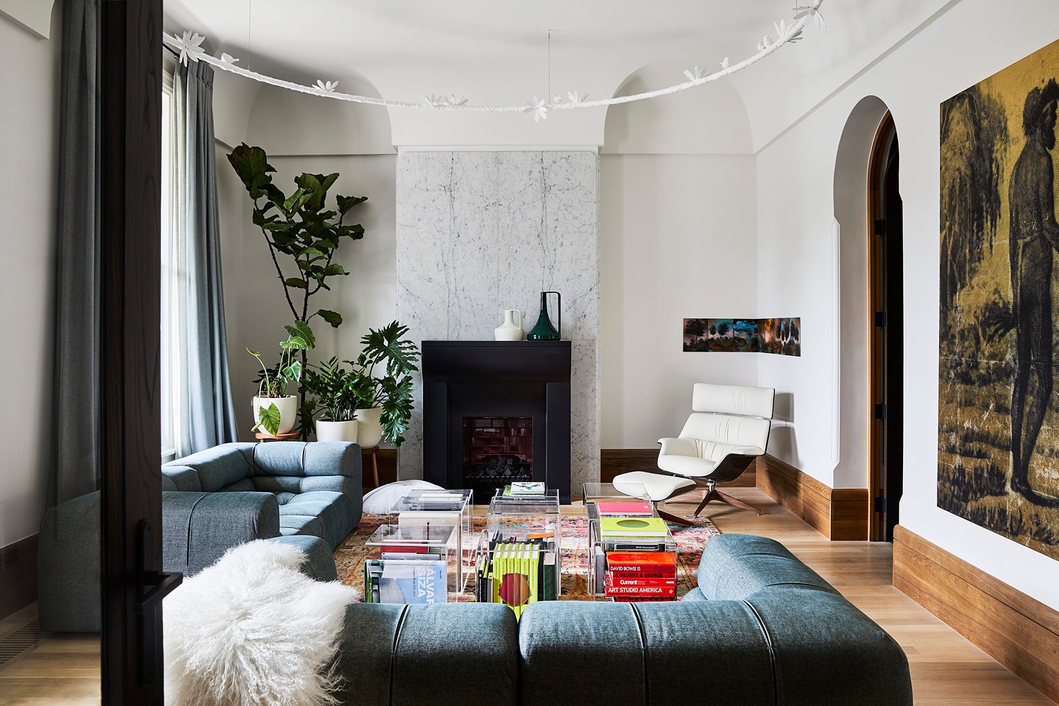
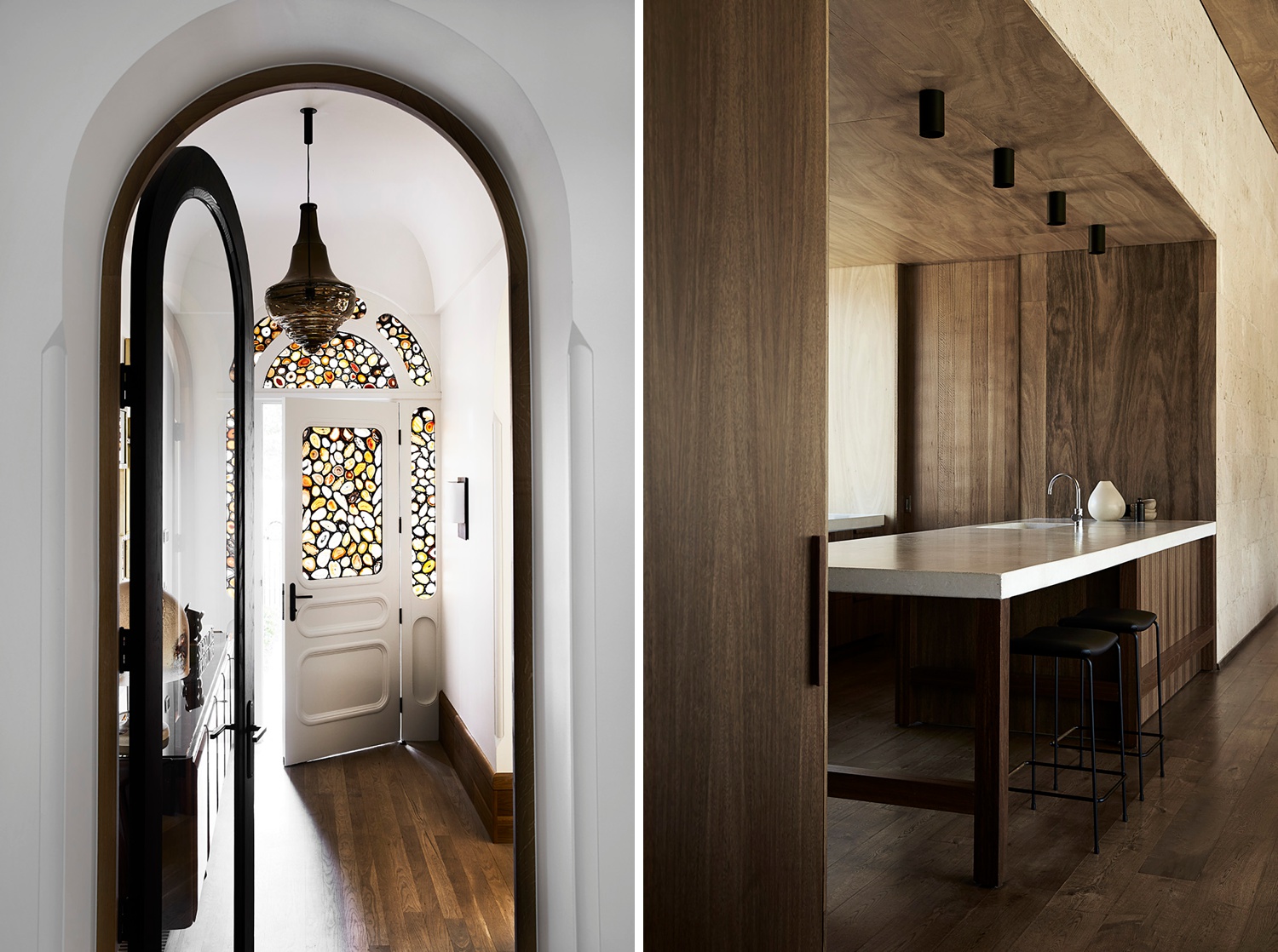
Sharyn Cairns is the Wonder Woman of Australian architectural photography. Her portfolio sports a healthy mix of work – from commercial projects, cuisine, and travel – but the crown jewels are certainly her interiors. She conjures up rich images with interesting light. Her photographs are texture heavy, yet honest and delicate feeling. The rooms she photographs have an anthropologic feel, and somehow she wrangles the chaos into beautiful and compelling images. Let’s pick her brain!
Lexi: Hey Sharyn, it’s an honor to be able to talk with you and learn about your creative process. Thanks for taking the time to share! Could you start by telling us how you began your career as a photographer?
Sharyn: Thank you for having me, I hope this will be insightful!
I began dreaming of interiors and architecture when I was in high school. Back in those days, the choices for subject electives weren’t as extensive as they are now. Graphics was the best of the creative options for me. I grew up in the country, so getting work experience at a large Melbourne interior design firm was a thrill and where I was first headed. I applied for both architecture and interior design courses at Melbourne universities but didn’t get in. It was heartbreaking at the time, but later I realized that the universe definitely gave me what I needed — not what I wanted — at the time. I went on to do a year-long Art & Design Course where I was exposed to so many different creative mediums but photography was what I fell in love with. I then went onto do a Bachelor of Science in Photography at RMIT. After completing that, I spent nearly 6 years assisting a variety of commercial photographers all the while doing little shoots on the side for magazines.
You’ve worked with plenty of publications including Dwell, Kin Folk, and Real Living, but I’ve noticed that a hefty portion of your portfolio is work done with Vogue Living. How did your relationship begin with them? How do you navigate the legalities of working with large publications, licensing, and all of that back end business “stuff”?
I started working in magazines nearly 20 years ago. I put together a folio and gave myself a cut off date to finishing assisting, then went out to show my book around. Thankfully magazines gave me little jobs to start with and it slowly snowballed from there. It was a huge honor and privilege when Vogue Living asked me to shoot a full issue of the magazine last year. Magazine bylines were a great way to get exposure. Over the years it’s been hard to continue to do editorial due to the low rates and the terms & conditions of contracts. I am a big advocate of copyright/licensing for the photographer and many publishers don’t respect that. In a time where digital content is paramount, publishing companies want so much with little or no remuneration. It’s something we’re always trying to navigate. Licensing, in general, is quite time consuming but worth it when you’re not fighting the ‘we don’t have any budget email’ and dealing with clients that respect image usage. These days, most of my magazine work is a submission.
Do you have an “order of operations” when making a photograph? What do you look for first, be that lighting or composition, etc?
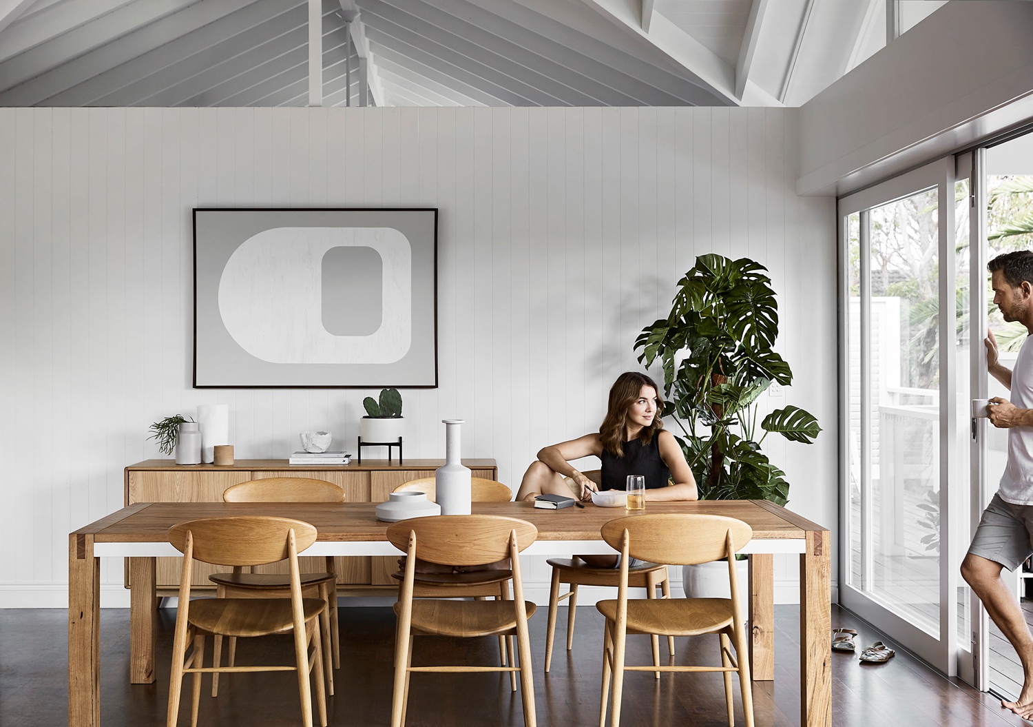
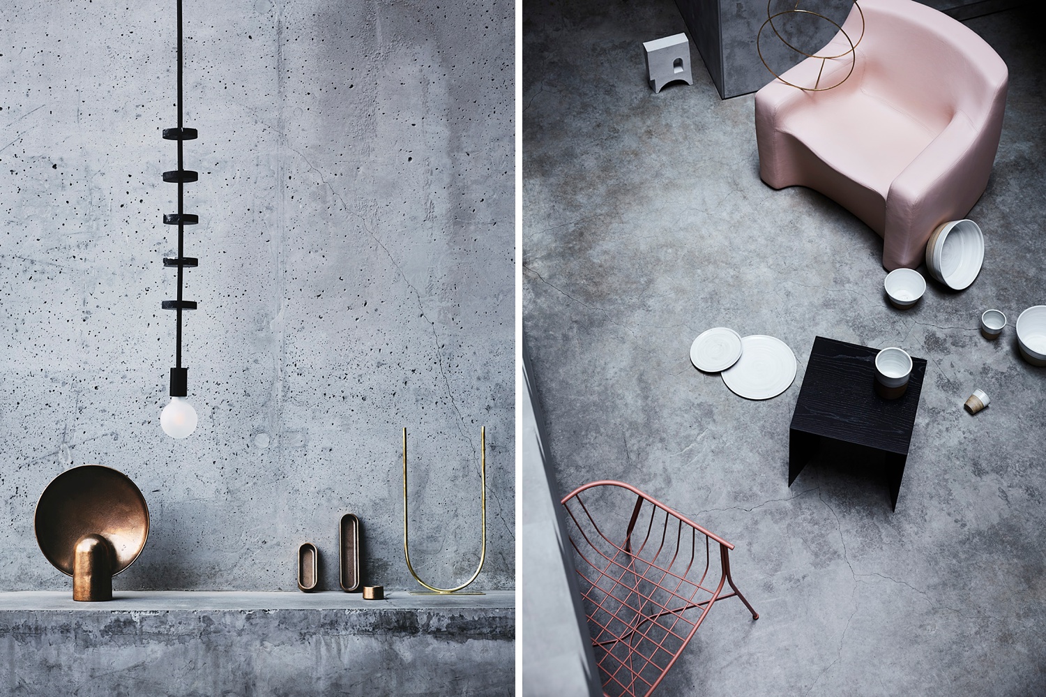
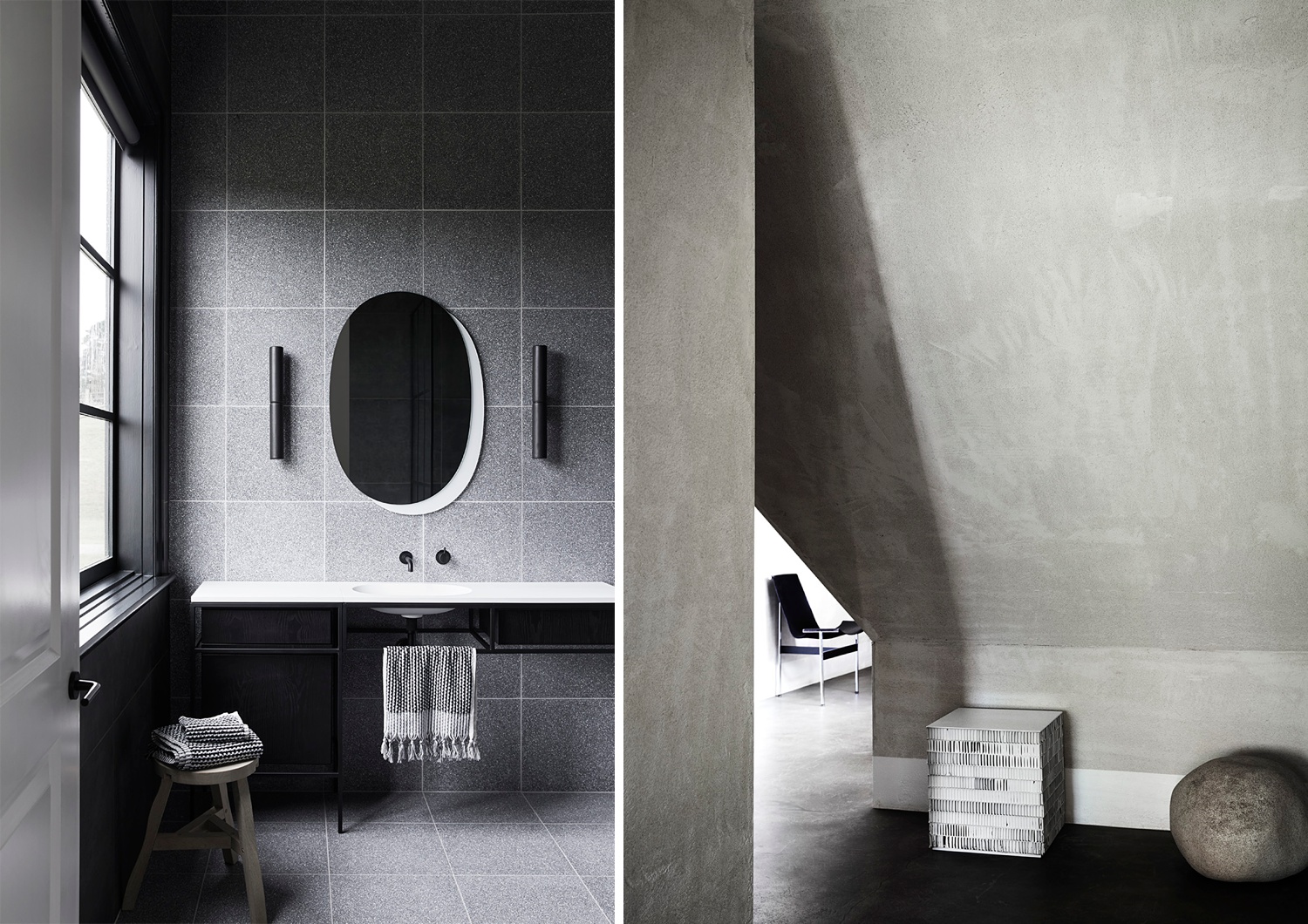
Generally, I’m looking at the light first. If it’s an interior shoot, I’ll do a quick walk through the space with the client, assess the light direction across the rooms, determine what needs to be shot, and work out a rough plan of action in my head. I tend to work quickly as I predominantly use daylight and if the light does something magical I don’t want to miss it. Composition is also key — Deciding what you keep in the shot versus what you leave to imagination or what you’ll shoot as a detail to compliment the wider shots. I like to keep the viewer engaged in an image, so composition is directing the attention to what I want them to look to most. The same process is applied to my lighting and post-production. It goes back to the days of working on images in the darkroom — you dodged and burned areas to lead the eyes to the focus of the image.
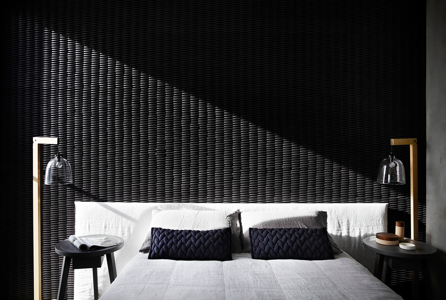
Your work is incredibly beautiful. I think my favorite part is how inky and moody it is! These days, it seems like many clients ask for “light and bright.” That being said, when it comes to your images, how do you tread the line between what you want and what your client wants – your personal style vs the current trends in the industry?
That’s very kind of you to say, thank you. Yes that is a very good question, and it certainly is a fine line. I don’t follow any trends. I just do what feels inherently right to me. Since photography is so subjective, you have to find out your own parameters on what a successful image is to you. I try to be respectful of a client’s brief and hopefully they have chosen me because they like my style. I’ll push the boundaries as far as I can within reason, and generally, we might do a safer option if they are concerned it’s too moody for their audience. Small boutique clients have a bit more flexibility with that, larger clients tend to be quite safe.
While I love dark and moody and tend to showcase that (what you put out is what you attract) sometimes I do miss out on work as I’m not perceived to be in that space.
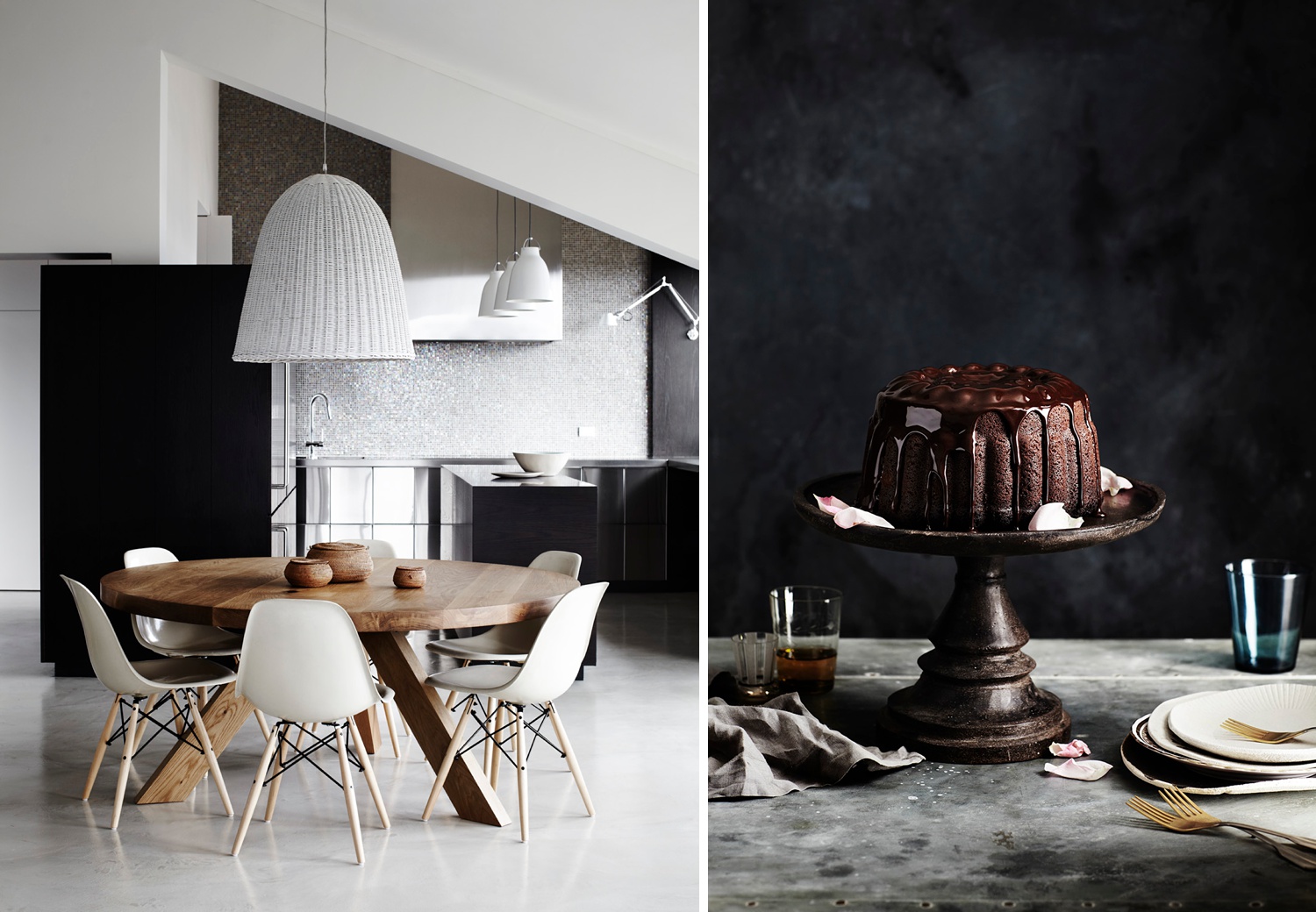
Your body of work is a mixture of food, commercial work, travel, and interiors. Do you think that these all play off each other? How do the techniques and skills you use in one “category” lend themselves to the others?
I definitely love shooting a variety of subjects and while they are all a bit different, the same principle of beautiful lighting is what I’m trying to achieve. Bringing emotion and mood to the images whatever the scale is the main aim!
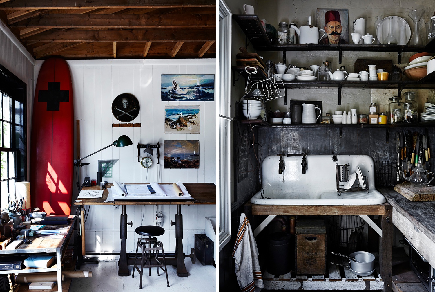
I love your work from the book Perfect Imperfect which explores the principles of Wabi-Sabi. The images have a much more “lived in” look. Do you find that there are challenges that come along with shooting busier images? If so, how do you deal with them?
Thank you! That was such a great project to work on. I love the variety and challenge of shooting a wide mix of interiors, whether clean and chic or busy and mad. With hectic houses you might have to calm them down a little by removing some items, keeping distractions minimal or working a composition that again keeps it simple but still holds the essence of madness. Shooting straight on with clean lines often helps that — as angles add more complexity that isn’t needed.
To wrap up, I’ve got to ask, what’s in your camera bag? Is there any gear you’ve found to be indispensable to you lately?
I like to think I’m not really that gear focused but as I open my cupboards it’s another story! I mostly shoot on Canon and while great gear is really important to give the highest quality of files to your clients, at the end of the day it’s what your eye sees and how you translate that to an image. I’m also loving LED lights at the moment. I prefer constant light sources that I can control color and see what I’m getting!
APA would like to give a huge thank you to Sharyn for sharing her process with us! If you’d like to see more of her gorgeous timeless work, pop over to her website sharyncairns.com.au and give her a follow on Instagram: @sharyncairns
