My No. 1 Business Secret: My Website
In my (free to download) eBook The Value of Architectural Photography, I touched upon instruments our clients can use to increase the value of our work. I asked the following question: “Any time of the day, 24/7, someone who could be your next client can check your website. Your referential projects are always accessible and visible. This is no different for an architect than for the photographer himself. Let me stick to a question of conscience: do you consider your website the best way for you to show off and do you therefore always think about ways to improve the presentation of your work? Or is the website a necessary evil for which (sometimes) time is found between deadlines?”
There we are! The question is as relevant to our clients as it is to us photographers. Really think about it and give yourself an honest answer. I started my photography business six years ago and I make a very decent living making images. But I honestly wouldn’t be able to do so without my website. My website is not just a collection of my work, shown in an attractive way. My website is the pivotal point in my overall communications strategy. I cherish it, I feed it, I am constantly improving it. Let’s dive into it.
Focus on the visitor’s needs
Who are the most important visitors on your website? Focus on their needs! Potential clients are comparing you with a competitor, so don’t let them wander around on your website. Provide them with precisely the information they are looking for, nothing less but certainly nothing more. Time is money, so don’t annoy them with unnecessary information. Don’t make them have to click more than one time to find what they are looking for.
Focus the content
What you show is what you attract. That means that you should show nothing else but the images that make you money. Everything else can distract and detract. Have an honest discussion with yourself about what you want to feature on your website. If you think it can add to attracting clients, then do so. If in doubt, skip it!
It’s also important to remember that you shouldn’t show what you don’t want to shoot! It can be tempting to show everything you can or have photographed, but your website should be an advocate for the work you want to do.
Do you keyword homework
Many books are written about Search Engine Optimalisation. It is quite a different playground than exploring the boundaries of Photoshop and Lightroom. But hey, that SEO-playground enables you to do what you like, so you’d better dive into it. Which search queries should bring your website to the first page, preferably to the top of that page? How are you performing in that respect? What did your competitors invent to be better found? How do you write your content to naturally incorporate your preferred keywords? Time invested in this kind of research is probably your best business investment ever. A list of free keyword research tools is provided in a blog by Ahrefs. I recently performed a competitors analysis using a free trial at SE Ranking. This time, I didn’t find much to be improved, but in the past, I did. Such a research must be done regularly.
Perhaps it’s useful to share an SEO-lesson I have learned over the years. When I started as a photographer, I used a company name “Ruimtes in Beeld” which means “Images of Spaces”. I thought this could help me build my brand. But it didn’t. People had difficulty remembering the name, and much more important: Google didn’t really like it. I really did my best with text, keywords, and everything else, but my site didn’t manage to wrestle itself up in the rankings. An unexpected email changed all this: a guy who was selling the domain name architectuurfotograaf.nl (which is the Dutch translation of architecturalphotographer.com). I did not hesitate to invest in it. From that moment on my Google rankings went crescendo. This last year I didn’t see much growth, but that’s because I am already number one for the keywords I have chosen (-:).
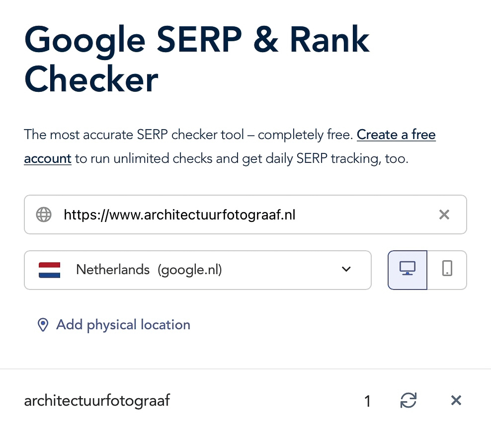
By the way, you cannot check your position in the rankings by just typing the keyword in the search engine in your browser. The results are spoiled with cookies. I am using the free serp-checker of Whatsmyserp.

Speed is king
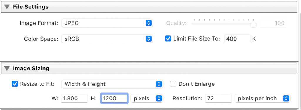
I know, I know, content is king. But speed too! So feed your site with your beautiful, big images, but constrain the weight of them. There are certainly third-party tools for doing so, but Lightroom can do the trick excellently. There’s that small checkbox in the export function to limit the file size of your images, works like a charm!

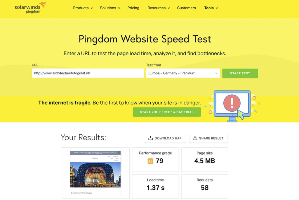
How do you know whether your site is speedy enough? Google has a tool, but that is a complicated one and aimed at developers. Pingdom works great. Be sure that the download speed is under 5 seconds.

Show off on every platform and be safe
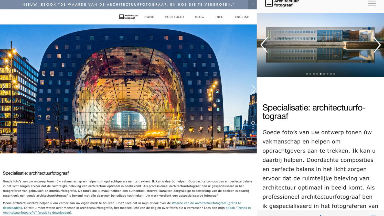
This seems so obvious that I hesitate to say it. Your site must be responsive, which means adapt itself to the platform on which the viewer is watching it — from a 32″ computer screen to a smartphone. Moreover, your site must be a safe haven for your visitors. Invest in an SSL certificate!
Conclusion
You cannot spend too much time investing in your website. It really is the best business instrument available when used in the right way. I hope I have provided you with some useful thoughts but all comments are welcome to build new feature articles upon!
