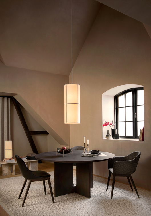
A Discussion With MENU’s Mario Depicolzuane on Art Direction, Concept Creation, and Photographer Selection
Scandinavian brands like MENU have played a huge part in influencing my interior photography especially from styling and compositional perspectives. MENU has been one of my favourite brands not only because of their products but how cohesively they communicate their brand value visually. For a couple of years, I have been following the work of Mario Depicolzuane who is MENU’s Art Director and reached out to him to talk about what he does and the influence of photography in brand communications.
Hi Mario, Thanks for taking the time for this interview. To start with, could you introduce yourself and tell us what led you to study graphic design and then into creative consulting by way of an art director for MENU?
I’m a creative professional working in graphic design, art direction, and creative consulting. Currently, I’m focusing on two initiatives—Studio8585 and CREATIVE.VOYAGE. Studio8585 is my creative practice dedicated to producing elegant and impactful solutions for clients, including brand identities, content, websites, printed matter, and other bespoke communication assets. CREATIVE.VOYAGE is an educational platform with a mission to help creative professionals level up.
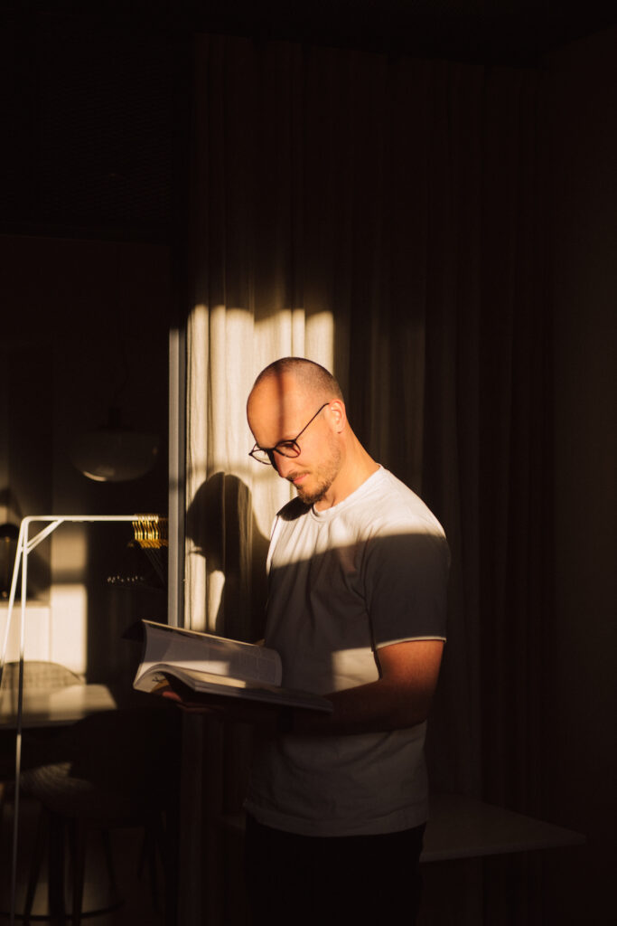
My path to graphic design was determined early in my life. Like most of us, I had the usual fondness for drawing and creation, which got further developed during the computer informatics class in my later elementary school years. Through programming, designing user interfaces, and generous mentorship from my teacher Boris Bolšec, I developed a passion for graphic design. That ultimately brought me to study graphic design at the University of Zagreb.
After working at a design agency and independently, in 2015, I moved to Copenhagen to join Kinfolk. There, I worked as a designer and art director for almost two years, and among other engagements, at the time, I’ve led the redesign of MENU’s brand book. That ended up being a lovely collaboration, so I’ve kept in touch with Joachim Engell-Hansen, Brand and Design Director at MENU. A few years later, I got a call from Joachim, with a wonderful opportunity to work with them as an art director. Currently, I’ve been working with MENU for just over two years. My role is that of an on-going independent part-time consultant. In that sense, I’m heavily involved in most crucial visual communication and, at the same time, maintain a fresh perspective.
For a brand like MENU, different types of marketing collateral are created yearly. Can you walk us through on how you typically come up with the concepts to photograph?
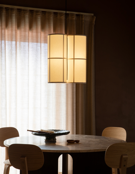
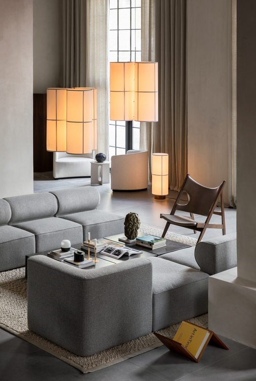
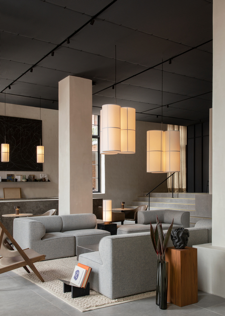
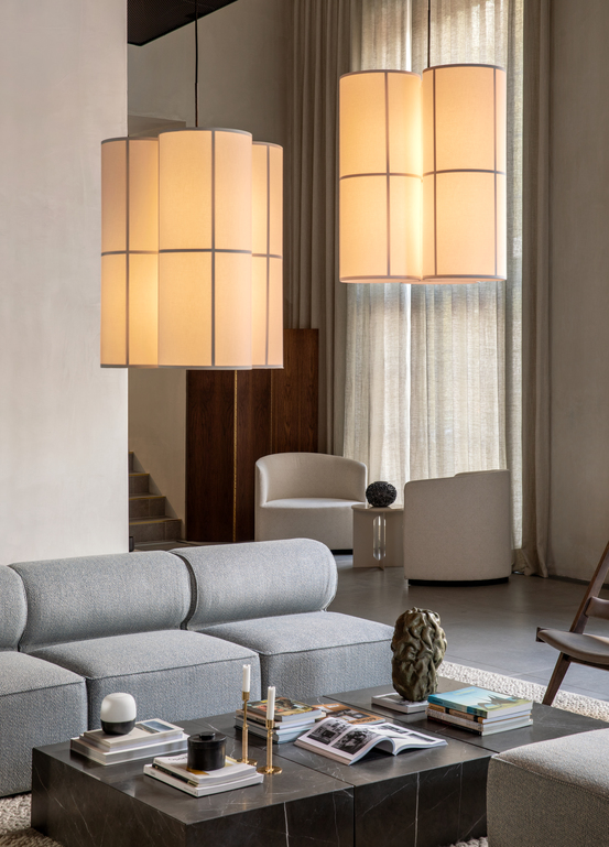
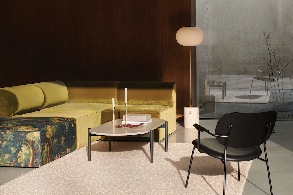
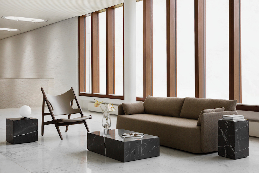
In most cases, our main shoots revolve around new product launches. In that sense, the lifestyle shoots we produce serve as an extension of MENU’s brand experience and tie the latest products with the existing collection. MENU’s ethos is a concept of “Connected Spaces,” meaning spaces that unite our worlds through design and make our transitions from one place to another seamless, engaging, and enjoyable. We aim to utilize each of our shoots in the service of expanding and exploring those ideas and pairing them with the specific concepts unique to each campaign.
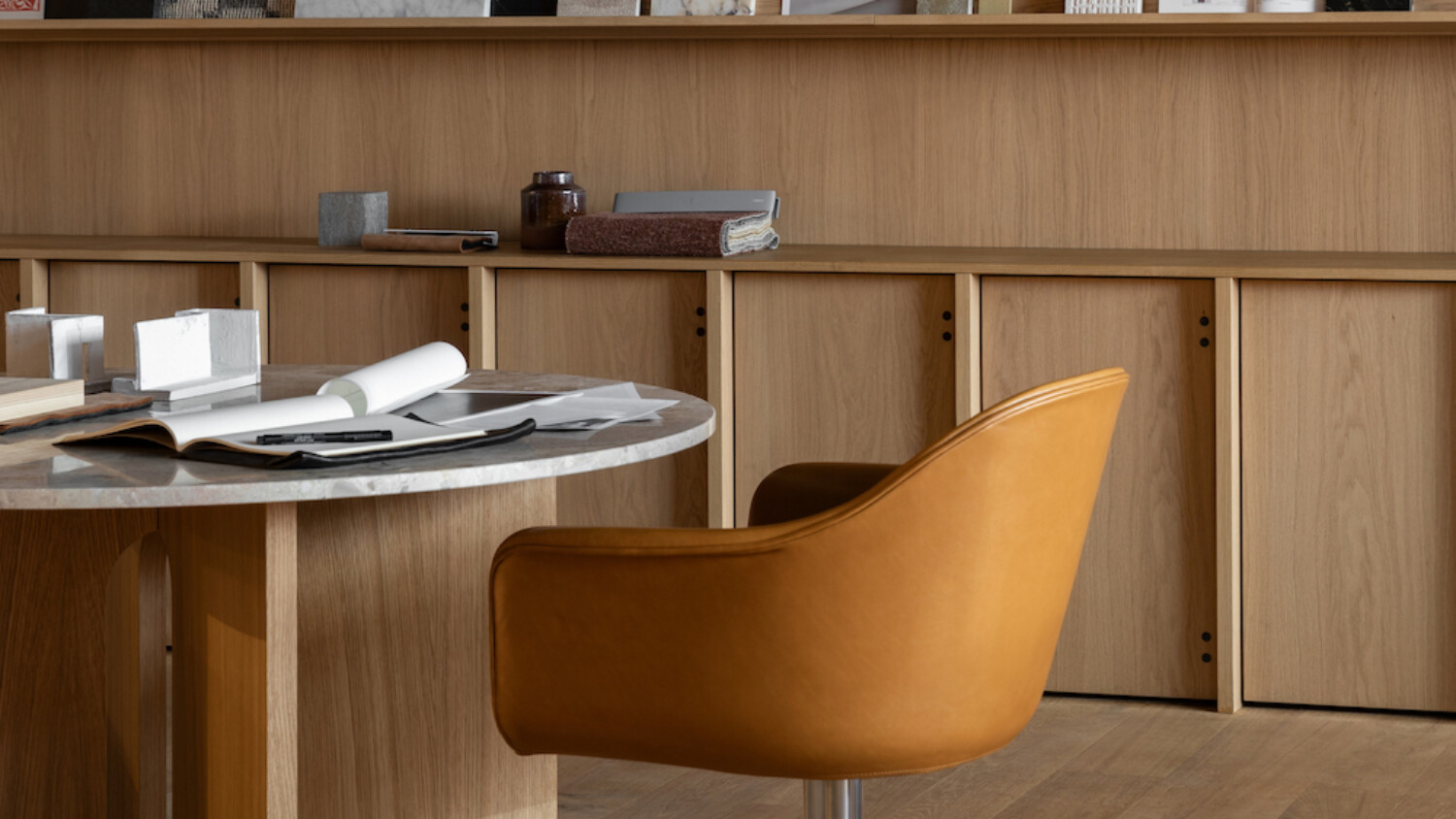
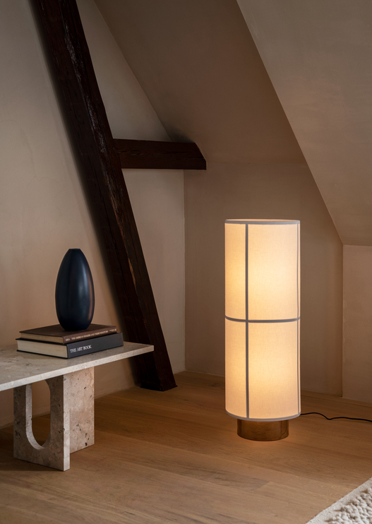
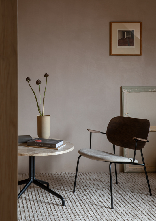
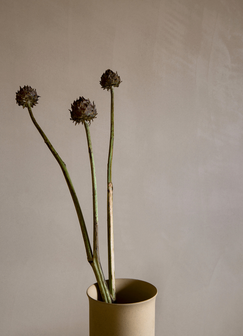
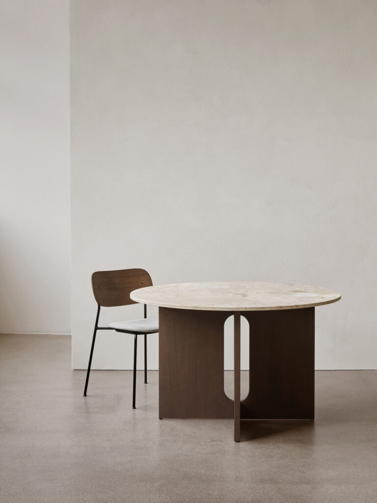
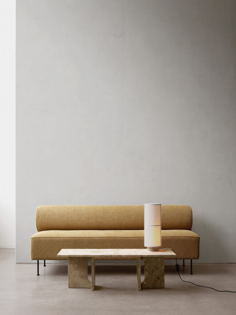
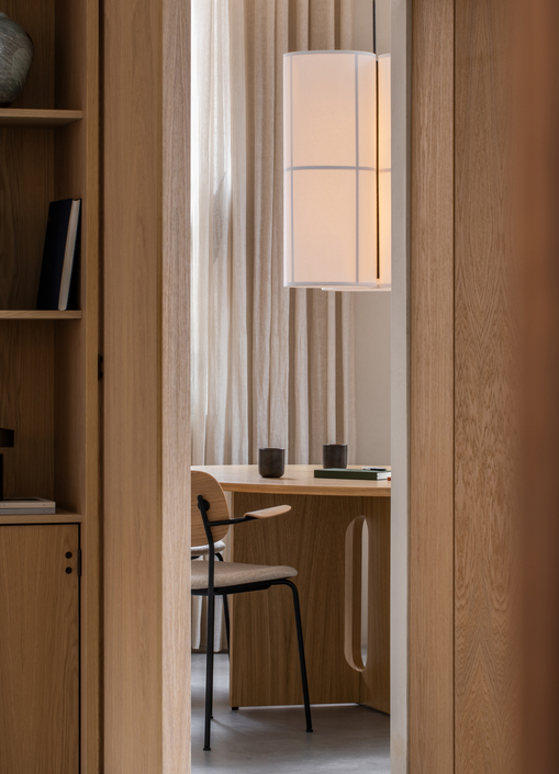
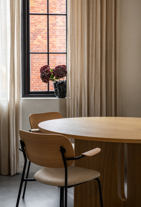
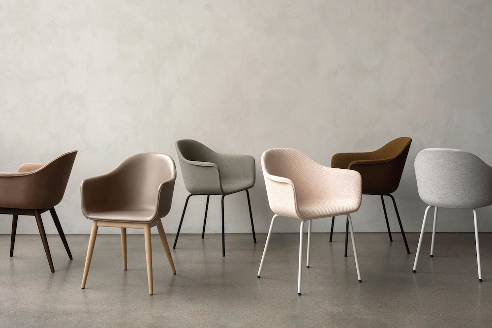
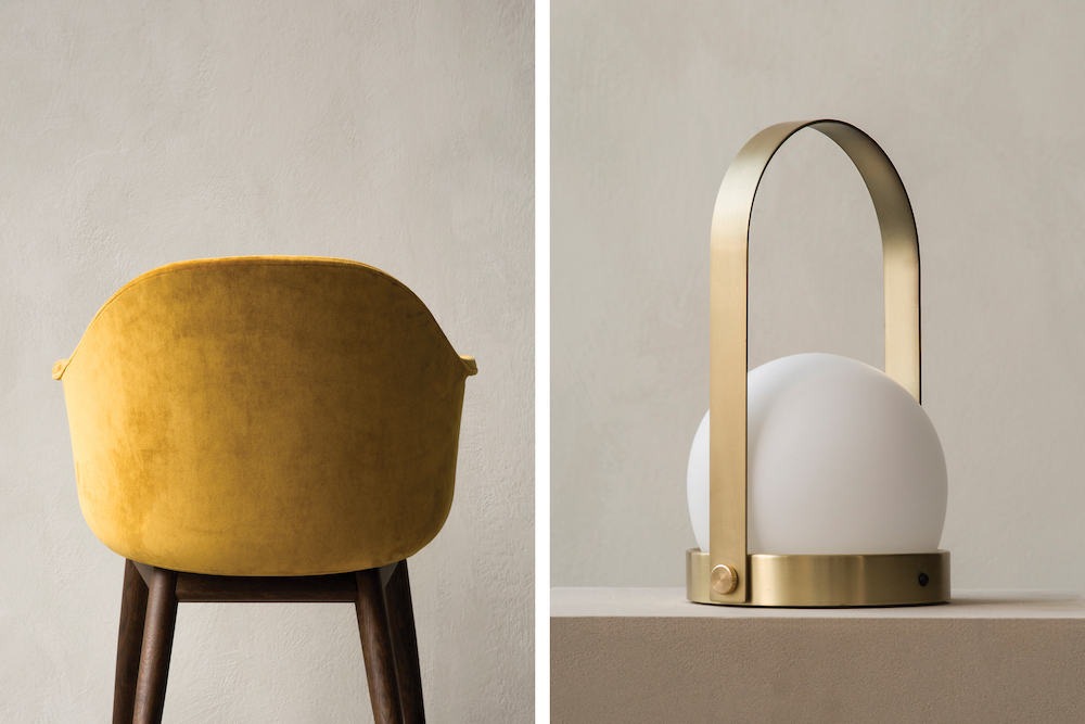
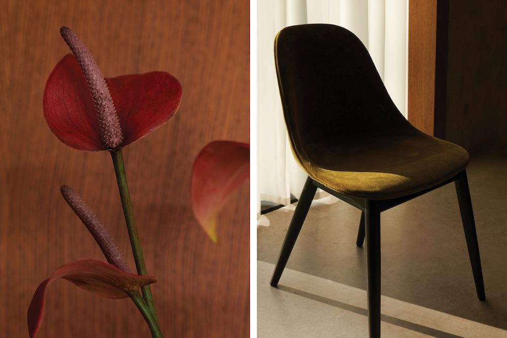
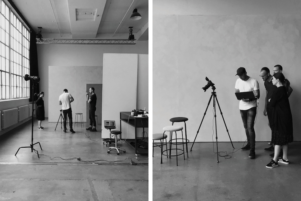
Another common type of shoot is what we call “soft packs.” I see them as fashion look book images, but with furniture. The setup is deliberately simple. It is shot in front of a slightly textured warm grey wall, with natural light, candid compositions, and rich details, giving an honest portrayal of the products, and letting the design, craftsmanship, and materials speak for themselves.
Lastly, we do editorial features of our designers and product production. MENU works with amazing designers, artisans and factories, so we want to communicate that and not only focus on their relationship with MENU, but how they work in general. As you may notice, we don’t use models in the shoots, so this is a natural way for us to tie in people in our communication.
From a high-level perspective, what are some of the things involved in the planning phase of photographing the 2020 Brand Book?
Everything done at MENU is a product of strong collaboration. Most of the company’s roles are agile, meaning that most of the brand and marketing teams will be involved in the production from start to finish. Of course, each of us has it’s own core responsibilities and skills, but the team organically supports each other, which is crucial.
The central vision comes from Joachim Engell-Hansen, Brand and Design Director. His hands-on involvement level depends on the shoot to shoot; however, he always provides initial ideas and assists in developing the concepts and the final brief in all cases.
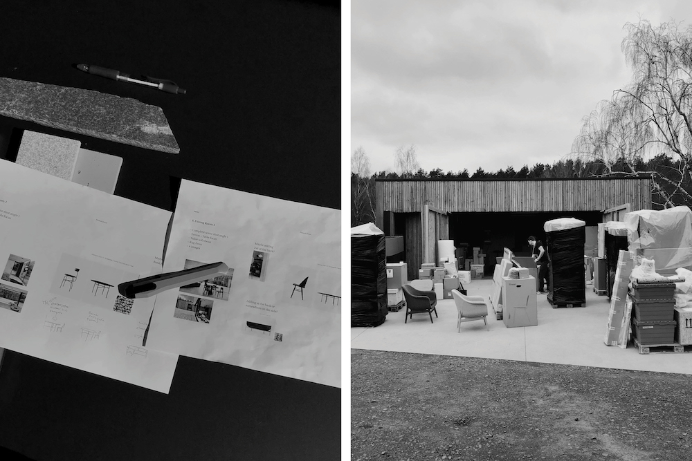
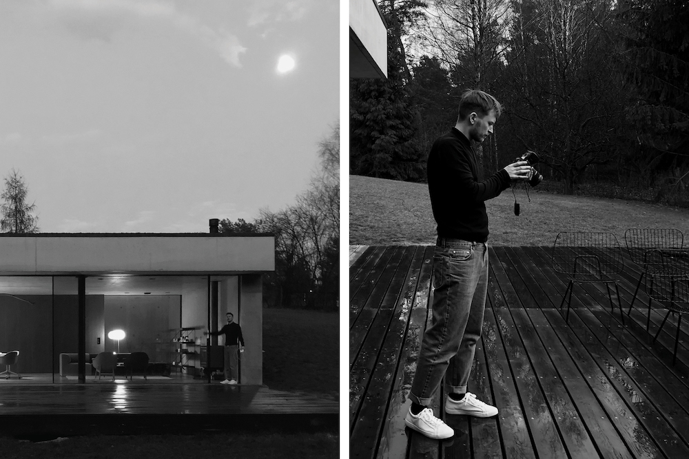
The general concept is often tied to the focused products, so those go hand in hand. As mentioned, it’s a mix of new products and existing products we want to focus on, based on our campaign calendar or other specific needs.
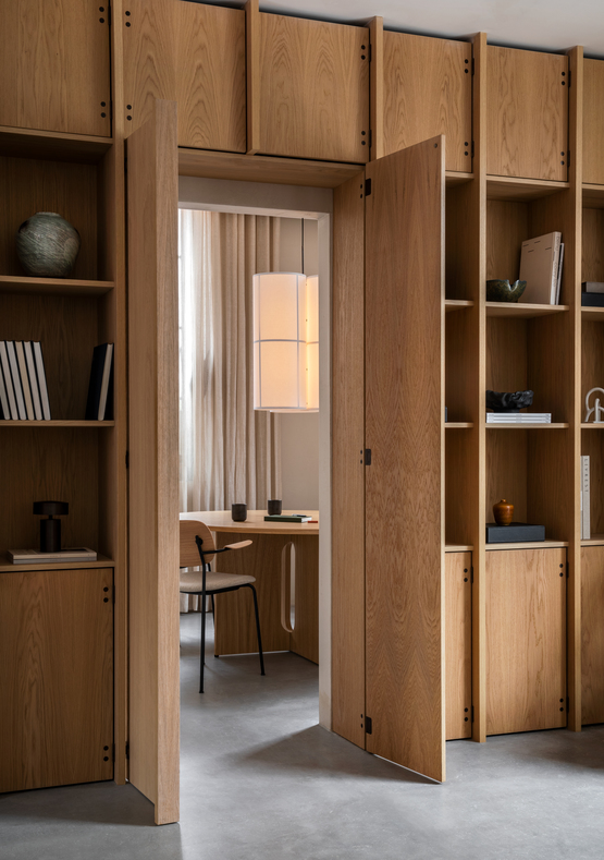
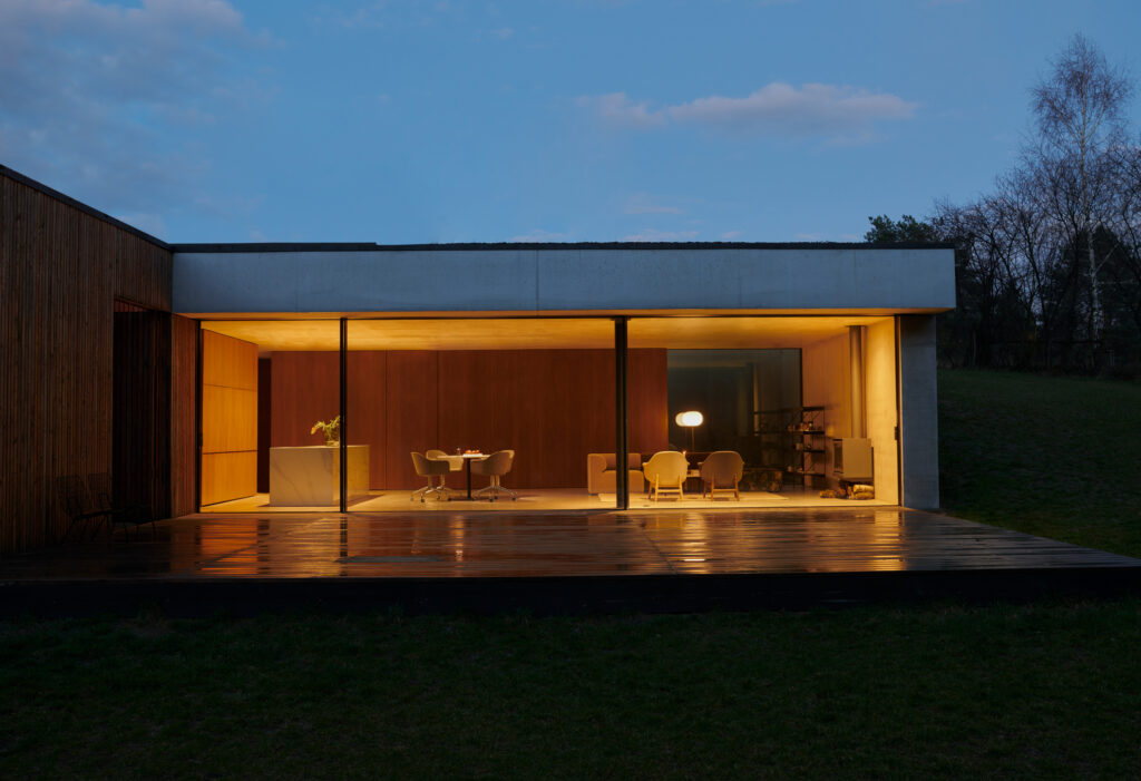
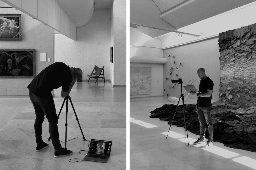
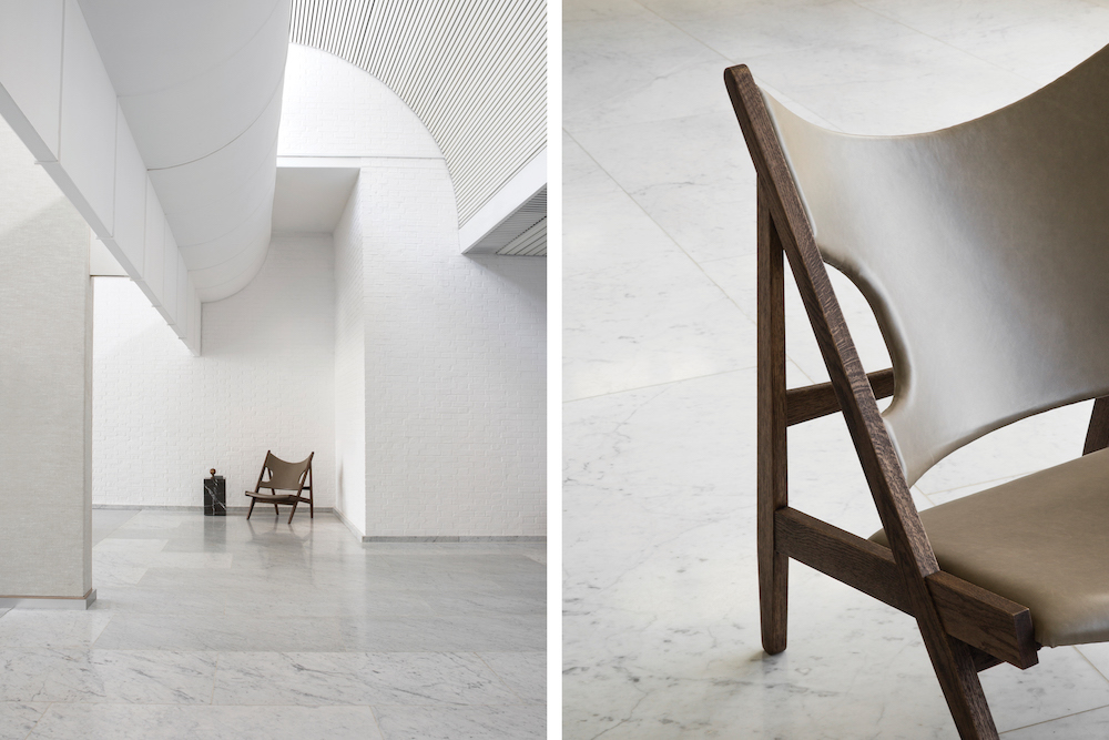
Another crucial step is location. MENU has a nuanced vision for what is the “MENU space.” In our shoots, we are trying to both match and evolve that. More tactical considerations are important too—for example, are we focusing on hospitality or residential spaces. Since last year, we’ve been lucky to be based at the Audo in Copenhagen, where MENU has offices and a showroom. It’s a unique hybrid space done in collaboration with dozens of kindred lifestyle brands, so it reflects the MENU’s spirit wonderfully, and it’s also a space for immediate experimentation. The last few shoots were shot there, including the main lifestyle images for the 2020 brand book.
From experience, we know that we can fit around 5 to 7 different scenes per shoot day. The number of days then depends on how many things we need to capture, and it’s mostly from one to three days, for a lifestyle shoot. On average, that gives us 12 different scenes, and from each of those, we get on average five final images, some full scene shots, and some focusing on the details of featured products.
For a major MENU campaign choosing the right photographer is crucial, what are some of the attributes you look for in a photographer? How do you decide between using an existing photographer over a new photographer?
Choosing a photographer is an on-going, organic process. When considering a photographer to shoot for MENU, we start with the concept and the general look we want to achieve and seek for a photographer who, in some sense, fits that. Through their portfolio, references, and social media presence, I need to recognize the overlapping visual and conceptual interests. Experience in the field is a significant factor too, but not a deal-breaker. Last but not least, it’s about their personality. Often, you need to spend a few long-hour days closely collaborating on a potentially hectic set, so it tremendously benefits if they are friendly, humorous, and calm.
Another essential aspect is an on-going collaboration and relationship development. Working on one or two shoots together can bring insight into the process and expectations, and down the line makes the partnership and the outcome much better. Generally, we haven’t been doing that many shoots per year, so deciding to go with an existing or new photographer is almost like a flip of a coin. There are new photographers we want to work with, and there are photographers we want to continue working with. It comes down to a specific shoot, its concept, and other circumstances (availability, budget, deadlines, etc.).
Additionally, do you allow photographers to give their interpretation of your concept? As well as post-production, is this often done by the photographer, or do you do it internally?
Photographers we work with are chosen because of their “eye”—a specific viewpoint or a style, and I think it’s important to respect that. Of course, there is space for discussion and interpretation from both sides, or, on rare occasions, misinterpretations of the brief. Those instances are then organically addressed during the shoot or in the post-production. In the most successful collaboration, that whole process is a dialog; it goes both ways. Sometimes, my input can improve the image, and sometimes photographers’ solutions can get us further than we expect. On our shoots, styling is crucial as well, and vastly influences the success of the final images.
In most cases, post-production is done by photographers or their retouch collaborators—how the photo is edited a crucial element of photography, and I find it best to have that owned by photographers themselves.
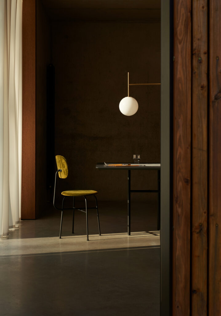
One of your frequent collaborators has been Jonas Bjerre-Poulsen, who is also MENU’s long-time collaborator and consultant. What it is like to work with Jonas and how does his approach to photography differ from other photographers considering that he is an architect?
Jonas Bjerre-Poulsen is one of the most astounding creative professionals I’ve had the pleasure of working with. He’s multifaceted, honest, skillful, and at the same time, friendly and humble. After that intro, it’s needless to say that it’s a pleasure to work with him.
I find his approach somewhat different from working with individuals whose primary focus is solely photography, but it’s hard for me to pinpoint it coherently. However, one thing does come to mind. Many photographers work towards the number of final photos defined in the shoot list. If we are done with one scene and preparing another, there’s usually a time for a break, so they stop shooting. Yet, Jonas often doesn’t stop. During those breaks, it’s not rare to find him take various photos of the location, details, motifs from the shot list, and beyond. He just goes for it, and the results are often useful.
What’s more important is that like any great photographer, Jonas both respects everyone’s role and proposes initiatives. He is detail-oriented in following the brief, from the shoot to the retouch, and always adds that little extra to his output. He thinks about the images and products contextually and conceptually, and by being so close to the brand, he has an in-depth knowledge of what MENU needs and how images are used. That’s the value of successful long term collaboration.
Architectural photography is easier to master because buildings can be accessed publicly; however, interiors are harder. What would be some of your tips or suggestions to photographers who would like to improve how they photograph interiors? i.e., any special Instagram accounts or magazines or design blogs to follow to gain inspiration?
The main starting point should be what needs to be communicated—clarifying that according to the needs of the project is paramount. That defines the look and feel of the final result, including types of angles, crops, lighting choices, styling, etc. It’s easy to put a decent camera on a tripod and take some technically sound photographs. It’s harder to understand why you are even working on the image in the first place.
On a more practical level, taking the time to craft the photograph can make all of the difference. Of course, sometimes, the subject is so beautiful and immediately photo-friendly that an interior photographer can function as a documentarian. However, more often than not, each space needs additional attention, which has to be matched to knowing the why and the messages that need to be communicated.
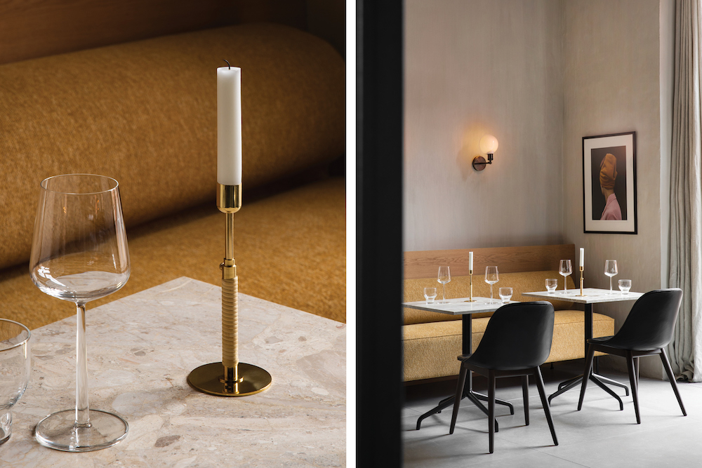
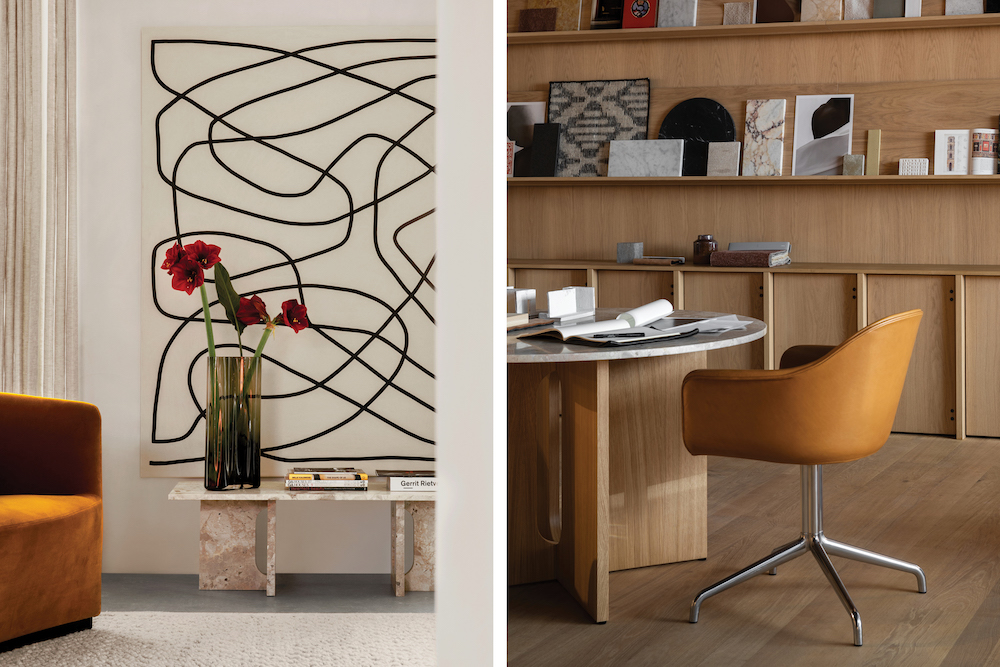
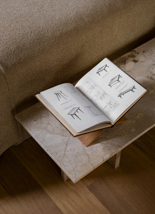
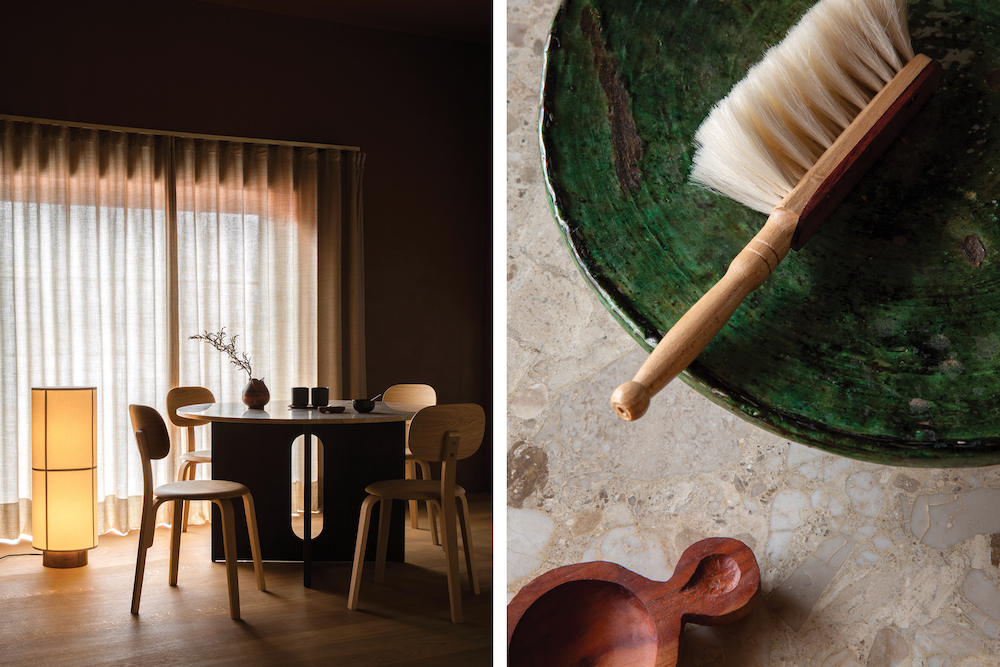
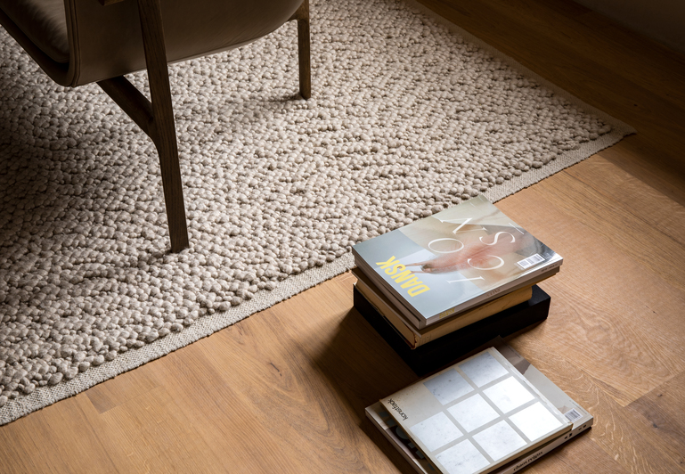
In that sense, interiors can be tricky, because how we see and feel the space with our eyes and bodies translates very differently to the camera. In my experience, to successfully achieve that adaptation, it takes testing out different angles, positions, simplifying the scenes by deliberately cutting out objects or parts of a space. Also, what looks elegant and natural on the photograph can be different from what’s pretty in real life, so adjusting styling for the former can have a profound impact. And a final note – details. Rich, intriguing details of exciting architectural features, materials, and understated objects can, in a series of interior photographs, really convey the spirit of the space.
When it comes to inspiration, I find it hard to highlight specific references because my process is organic and continuous, making this difficult to articulate. Digitally, I do turn to Instagram, Pinterest, and design blogs. It’s mostly individual photographers, designers, and visual artists who drive my inspiration in that domain (the list of people I follow on Instagram is public). The inputs I surround myself as an art director are directly influencing my output, so I’m increasingly mindful of that. More recently, I’ve been trying to mix those digital influences with other sources, mostly books from various fields, different eras, and styles. I’ve been making a conscious effort to explore different sources, contemporary and popular, but also less directly related to my core occupations, obscure and random. Serendipity is essential, and I feel that in that way, it can almost be animated.
For the past couple of years, you have your interview show called The Creative Voyage Podcast. What was the inspiration behind starting this, and do you have any exciting guests planned for your future episodes?
I’ve been trying to figure out solutions to the obstacles I’ve encountered throughout my life, be it personal, relational, or career-related. Through my explorations, I’ve come to experience strategies, tactics, and tools which can help with most creative, business- or life challenges. I’ve become, and still am, obsessed with that. In the Creative Voyage Podcast, I attempt to explore and share those ideas with fellow creatives through honest conversations.
I’m especially pleased about the most recent episode with Tony Brook, creative director at SPIN and Unit Editions, whom I’ve been a fan of for more than a decade. The upcoming episode might be interesting for your readers—it’s featuring Andreas Martin-Löf, one of the most exciting younger-generation architects in Sweden. Also, I recently had a conversation with Yuri Suzuki, a sound designer, and artist, who recently became a partner at Pentagram.
Most importantly, I’m thrilled about every guest on the show. I get to pick the brains of amazing creative professionals. That’s priceless, and hopefully useful for other people as well. I’m so grateful for all my guests who generously share their candid insights.
If you are interested in learning more about Mario then visit his website or follow him on Instagram. Additionally, his podcast, The Creative Voyage, can be found on various streaming platforms including Spotify. Furthermore, if you are interested in learning more about the style of interiors photography MENU has built its brand upon then feel free to browse through its image bank.
